The Visual Architecture of Texture: Why Lighting Defines Your Art
In the current art market, we are witnessing a profound shift. High-end auction sales for "vanity" pieces plummeted 44% year-over-year in 2024, signaling a retreat from purely financial art assets as collectors return to "real application value," according to the Marketplace report on the struggling expensive art market. For the modern homeowner, this means art is no longer just a line item on a balance sheet; it is a physical, tactile presence in the home.
However, many collectors find that the "soul" of their hand-painted oil piece—the very thing that distinguishes it from a flat digital print—disappears once it is hung. This is almost always a failure of lighting. Hand-painted art possesses what researchers at the University of Chicago call an "essential identity," a psychological weight that digital replicas simply cannot replicate, as noted in the UChicago study on artwork and identity. To preserve this identity, you must master the interplay of light and shadow on the canvas’s microtopography.

The Science of the Surface: Why Prints Fail Where Oils Thrive
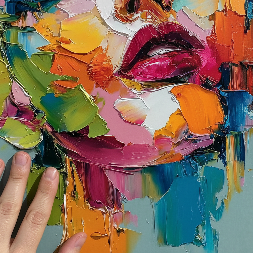
To understand how to light a painting, we must first understand the physics of what we are lighting. A high-definition print is a two-dimensional representation of color. In contrast, an oil painting is a three-dimensional landscape.
Research using optical microprofilometry has proven that the millimetre-scale texture (microtopography) of oil paintings is crucial to their aesthetic impact. According to research published in MDPI Sensors, tactile exploration and the physical relief of the paint reveal data that the human eye misses when the surface is lit flatly. This is why consumers value art labeled "human-made" 62% higher than AI-generated art; the human brain craves the evidence of the "hand," as confirmed by a Columbia Business School perception study.
The Kubelka-Munk Effect
When light hits a hand-painted surface, it doesn't just bounce back. It undergoes a complex process of absorption and scattering. The Getty Conservation Institute utilizes the Kubelka-Munk equation to explain that pigment reflection is dominated by absorption and scattering coefficients. In a textured oil painting, the physical refractive index of the surface changes with every brushstroke. If you use diffused, ambient light, you "wash out" these coefficients, making a premium hand-painted piece look as flat as a $20 poster.
Logic Summary: Our lighting recommendations are based on the physical principle that "impact" in art viewing is a product of shadow definition. By modeling the surface as a series of peaks (impasto) and valleys, we assume that maximizing the shadow-to-highlight ratio is the primary goal for showcasing texture.
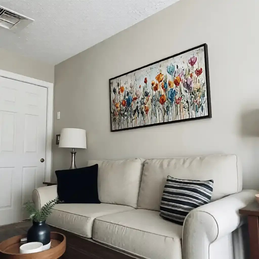
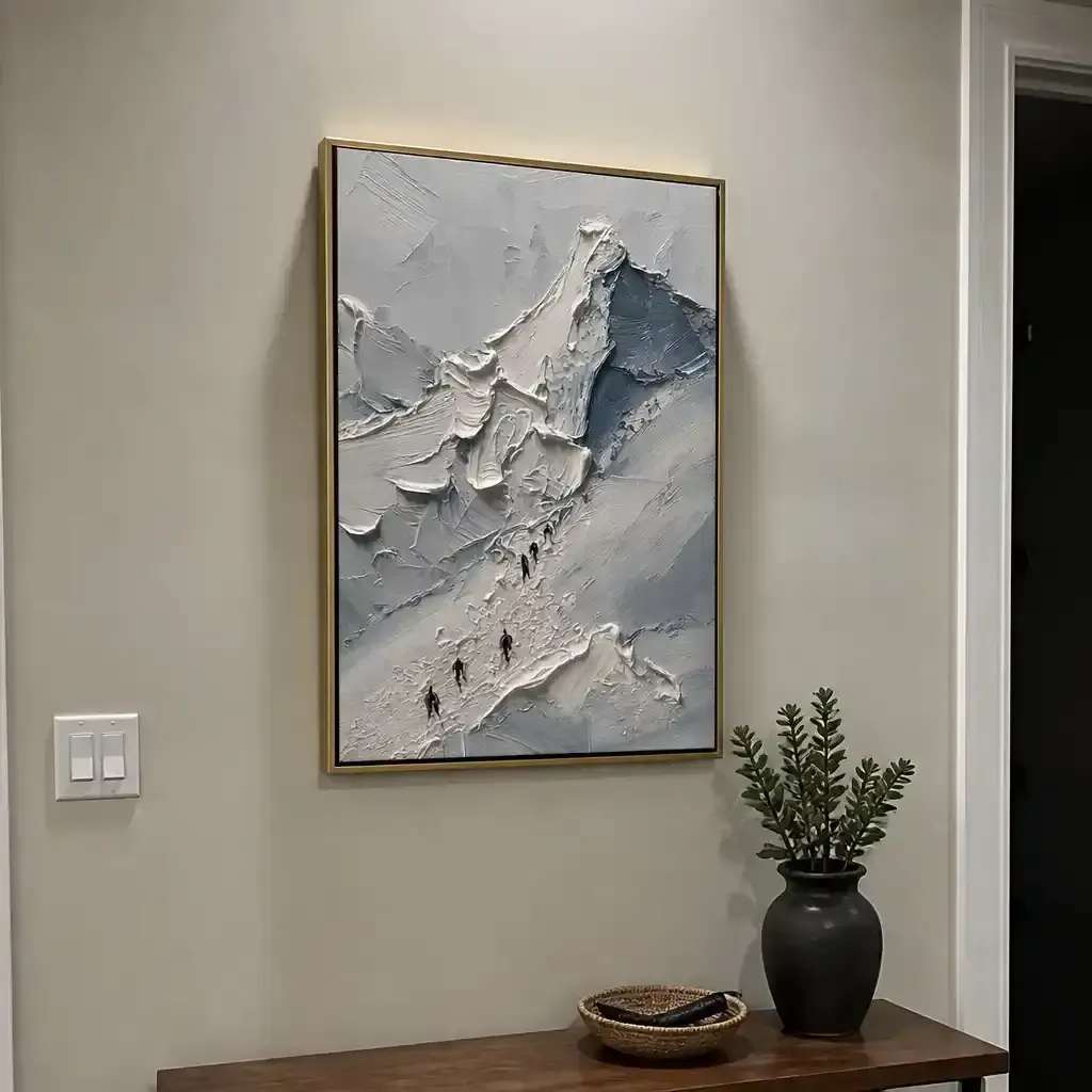
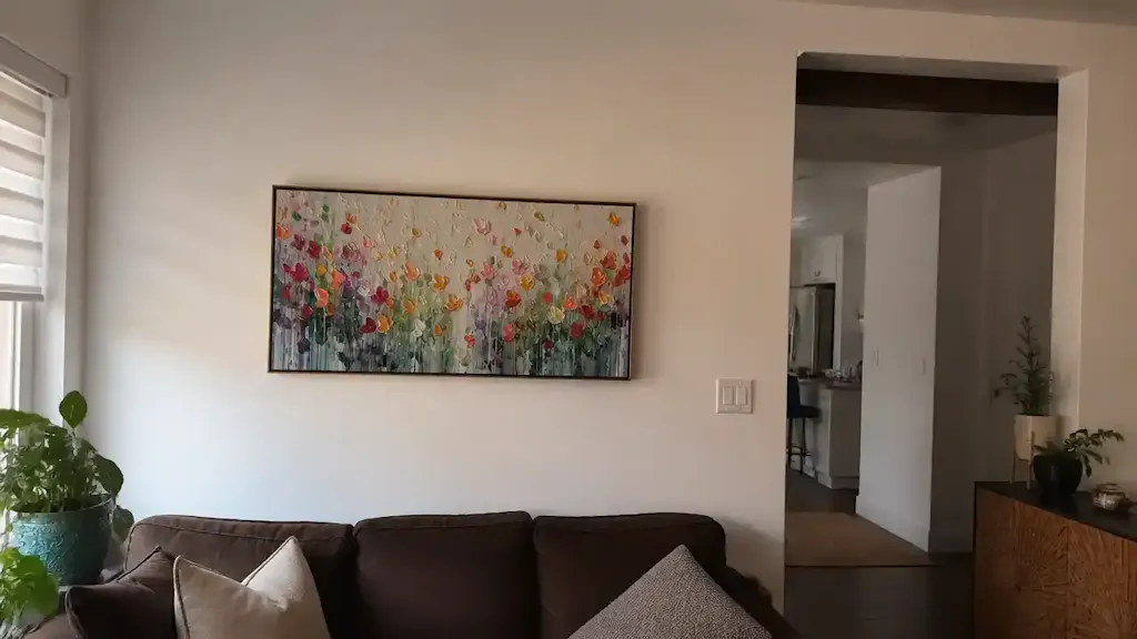
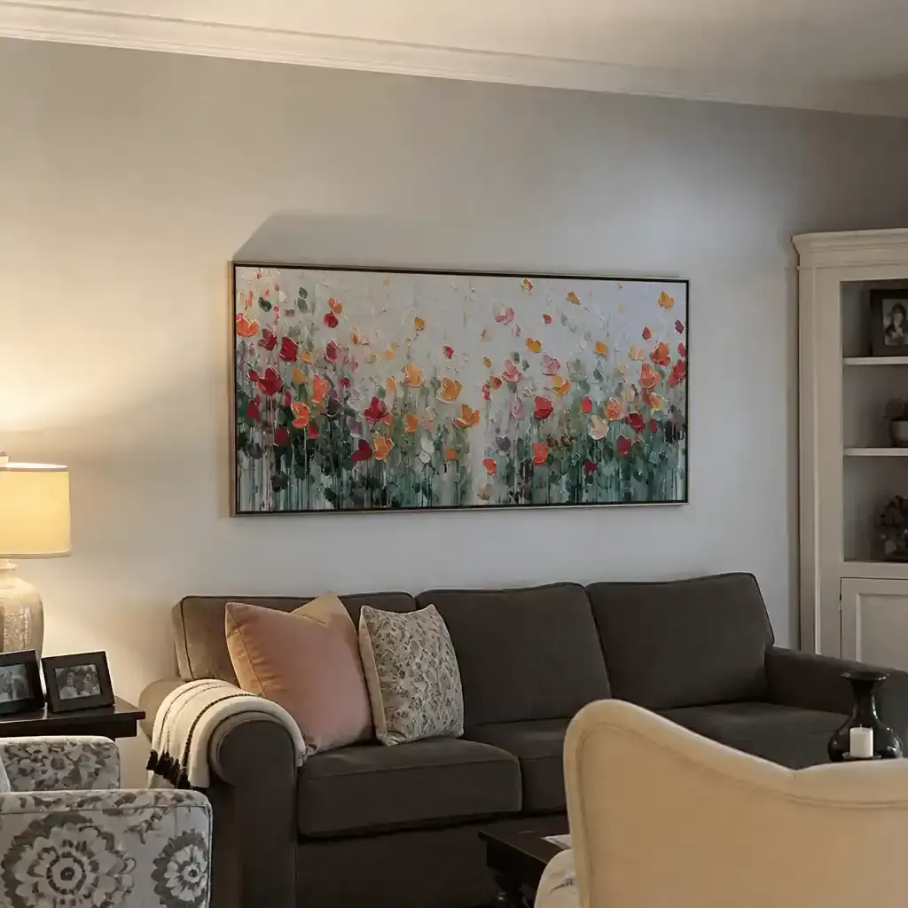
The 30-Degree Rule: Mastering Directional Lighting
The most common mistake we see in home installations is the use of "ambient wash"—large, diffused light sources that fill the room evenly. While great for kitchens, this is a death sentence for texture. To make impasto "pop," you need directional light.
The Paradox of Raking Light
Professional gallery standards often recommend "raking light"—light that hits the surface at an acute angle. According to technical guides from Oil Art Hub, a 30-degree angle from the vertical is the "sweet spot."
- At 45 degrees: You get excellent color saturation but lose the dramatic shadows of the brushwork.
- At 30 degrees: You create a "paradox" where you might see slight glare, but the texture enhancement is maximized.
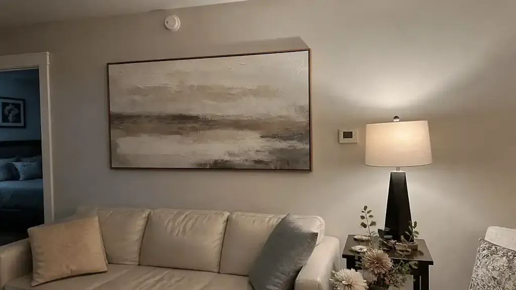
- The "Gotcha": Never use overhead ceiling lights placed directly above the painting. This creates "top-heavy" shadows that obscure the artist's intent and produce a harsh glare on the top edge of the frame.
Practical Troubleshooting: The Smartphone Test
We recommend a simple heuristic used by gallery professionals: before finalizing your light placement, take a photo of the painting with your smartphone. If the texture is visible and defined in the photo, the lighting is correct for the human eye. If the painting looks flat or "blown out" in the image, your light source is likely too diffused or too close to the direct line of sight.

Color Temperature and the "Depth" of Pigments
Lighting isn't just about angle; it's about the "warmth" of the light, measured in Kelvins (K). There is a persistent myth that "Daylight" bulbs (5000K+) are best for art because they are "accurate." However, the reality is more nuanced.
Warm White vs. Cool White
According to Banno Lighting's gallery guidelines, while 5000K-6500K LEDs can replicate the benefits of north light, they often make oil pigments appear "flat" in a residential setting. We typically observe that warm white LEDs (2700K-3000K) enhance the depth of traditional oil pigments much more effectively.
A study published in Nature Scientific Reports suggests that warmer lighting creates a more "intimate" and emotional connection with the viewer. For a piece intended to reduce stress—a benefit cited by 73% of patients in a UPenn neuroaesthetics review—the emotional resonance of 3000K light is often superior to the clinical accuracy of 5000K.
Modeling Light Performance
| Parameter | Optimal Value | Unit | Rationale |
|---|---|---|---|
| Angle of Incidence | 30 - 35 | Degrees | Maximizes shadow definition (raking light). |
| Color Temperature | 2700 - 3000 | Kelvin | Enhances emotional warmth and pigment depth. |
| CRI (Ra) | ≥ 95 | Index | Ensures accurate rendering of complex pigment mixes. |
| Distance from Wall | 2 - 3 | Feet | Prevents "hotspots" and ensures even coverage. |
| UV Emission | < 0.1 | % | Prevents photochemical aging and pigment fading. |
Modeling Note: This table represents a "scenario model" for a standard 36" x 48" canvas in a room with 9-foot ceilings. These values are heuristics derived from common gallery practices and ASTM D4303 lightfastness standards.
The Health and Safety of Your Art Environment
When installing art, especially in nurseries or clinics, lighting serves another purpose: it highlights the quality and safety of the materials used. Hand-painted art is an investment in your environment, and that environment must be non-toxic.
VOCs and Heavy Metals
Indoor air pollution is often more significant than outdoor pollution, and the EPA warns that low-VOC paints are a prerequisite for healthy indoor environments. Furthermore, certain traditional pigments like Cadmium are classified as Group 1 carcinogens by the International Agency for Research on Cancer (IARC).
When you light a painting correctly, you are showcasing the "purity" of the medium. High-quality, modern acrylics and oils often use titanium dioxide, which dominates 90% of the white pigment market due to its chemical inertness and safety, as noted by the NCBI. Proper lighting reveals the clean, vibrant finish of these safer alternatives.
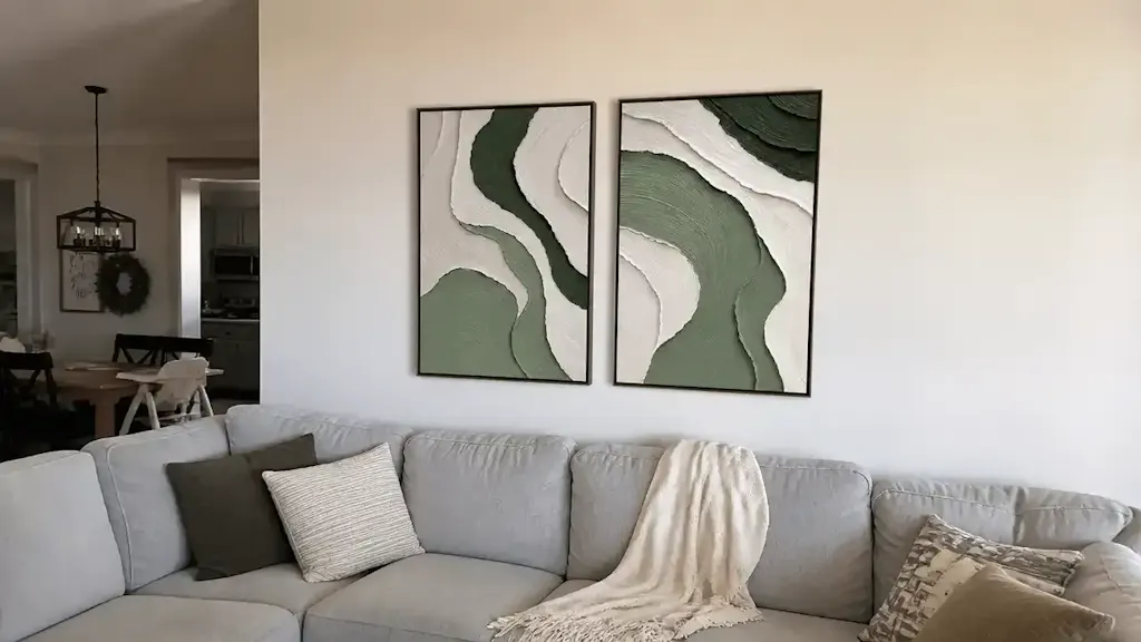
Biophilic Benefits
Correct lighting also amplifies the "biophilic" effect of art. Nature-themed murals and paintings can produce the same stress-reduction effects in the brain as being outdoors, according to the University of Central Arkansas. In high-density environments like Tokyo offices, biophilic design has been shown to intervene in employee burnout. By using directional lighting to emphasize the "organic" textures of a nature scene, you maximize this neurological "healing" effect.
Economic Value: Art as Property Infrastructure
Investing in hand-painted art and the lighting to support it isn't just an aesthetic choice; it’s a financial one. A Royal Society CAR model analysis found that neighborhoods with higher "art" geo-tags saw greater relative house price gains.
For commercial property owners, the data is even more striking. Public art projects, like Chicago’s Millennium Park, drove $1.4 billion in real estate growth (NC Realtors). In the residential sector, "artisan craftsmanship" mentions in Zillow listings rose 21% recently, as buyers seek "whimsy" and authenticity over mass-produced decor (PA Realtors).
Two Installation Scenarios
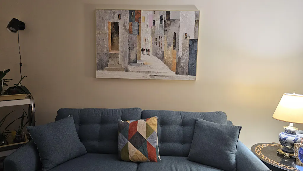
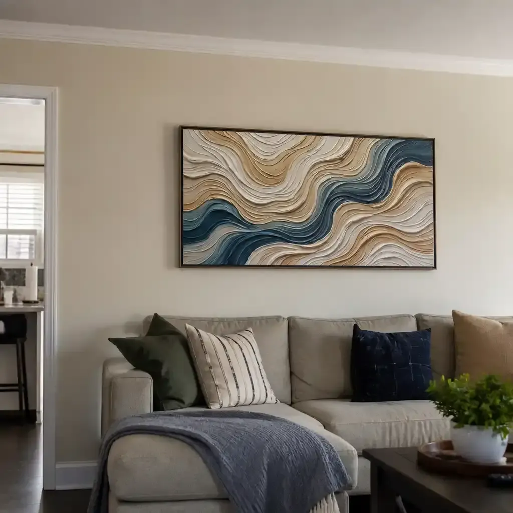
Scenario A: The Modern Living Room (Standard Case)
- Goal: Create a focal point above a sofa.
- Setup: Use a track lighting system with three "warm white" LED heads.
- Execution: Angle the center light at 30 degrees to hit the top third of the painting. Use the two side lights at 45 degrees to fill the color. This "hybrid" approach provides both texture and color saturation.
Scenario B: The High-End Powder Room (The "Escapism" Trend)
- Goal: Create an immersive, 360-degree environment.
- Setup: Since space is tight, use recessed "wall washer" LEDs.
- Execution: Wrap the mural or painting entirely around the walls, a dominant trend in the 2025 NKBA Powder Room awards. Use diffused lighting here to prevent the room from feeling claustrophobic, but keep one directional light focused on the main "hero" texture.

Preservation: Protecting the Texture You Love
While lighting is essential for beauty, it can be a threat to longevity. The "deathly fade" of pigments like Prussian Blue is a real concern for collectors. Interestingly, experiments by the National Gallery in London showed that the fading rate of Prussian Blue is nearly identical whether it is in oil, acrylic, or egg tempera. The medium doesn't protect the color; the lighting does.
The UV Factor
Modern LED systems are a breakthrough for art preservation because they emit minimal UV radiation—less than 0.1% of total output. This allows you to use the high-intensity light needed for texture without the "chalking" or "embrittlement" associated with older halogen bulbs. To further protect your investment, we recommend using a UV-protective varnish, which acts as a molecular shield against photochemical aging.
Final Installation Checklist
Before you lock in your lighting, run through this professional audit:
- Check the Angle: Is the light hitting at ~30 degrees? (Use a protractor app on your phone if necessary).
- Verify the CRI: Does your bulb have a Color Rendering Index of 95 or higher?
- Eliminate the "Hotspot": Is the light source at least 2 feet away from the canvas?
- Smartphone Test: Does the texture look as good in a photo as it does in person?
- Safety Check: Are you using low-VOC materials and ensuring the room is well-ventilated during the "curing" phase of any new installation?
By treating lighting as an extension of the art itself, you move beyond mere decoration. You are creating a space that respects the "essential identity" of the artist's work, enhances your property value, and—most importantly—provides a daily source of neurological comfort and visual delight.
Disclaimer: This article is for informational purposes only and does not constitute professional medical, safety, or financial advice. Always consult with a certified lighting designer or art conservator for high-value installations, and follow all manufacturer safety guidelines regarding paint VOCs and electrical installations.
Sources
- Marketplace: The expensive art market continues to struggle
- Columbia University: Human-Made vs. AI Art Study
- UChicago: Does Artwork Preserve Essential Identity?
- Royal Society: Quantifying the link between art and property prices
- NCBI: Titanium Dioxide Pigment Toxicity & Market
- EPA: Indoor Air Quality and Low-VOC Paints
- Nature: Effect of color temperature on appearance of paintings