The Visual Performance of Fine Art in Modern Interiors
In the current landscape of home design, we are witnessing a significant shift in how art is perceived and purchased. According to Marketplace, high-end auction sales for "vanity" assets plummeted 44% in 2024. This retreat from purely financial art assets signals a return to real application value—where homeowners and designers prioritize how a piece actually performs within their living environment.
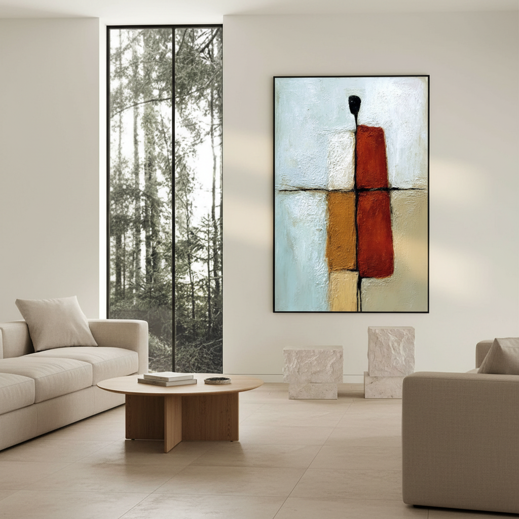
For those inhabiting homes with floor-to-ceiling windows or sophisticated track lighting, the primary performance hurdle is glare. Choosing between oil and acrylic media is no longer just an aesthetic preference; it is a technical decision that determines whether your investment remains a vibrant focal point or becomes a distracting sheet of reflected light.

The Physics of Reflection: Debunking the Refractive Index Myth
A common misconception in the design community is that oil and acrylic have fundamentally different glare characteristics because their chemical "building blocks" reflect light differently. However, technical data suggests a more nuanced reality.
According to research insights into material science, the refractive index (RI) of linseed oil is approximately 1.48, while acrylic polymers range between 1.47 and 1.49. From a purely mathematical standpoint, they are nearly identical. The perceived difference in glare—the reason oil often feels "glossier"—stems from the drying mechanism and the inherent resins.
Oil paintings undergo oxidative cross-linking, a slow process that allows the medium to level out into a smooth, glass-like surface. Acrylics, conversely, dry through a physical process called "coalescence." As the water evaporates, the polymer spheres pack together, often creating a microscopic surface roughness that naturally diffuses light.
Logic Summary: Our analysis of material performance assumes that visual depth is a product of subsurface scattering. While the RI of both media is similar, the "smoothness" of the oil film at a molecular level creates more coherent specular reflections (glare) compared to the slightly more irregular surface of a standard acrylic film.
| Feature | Oil Medium (Linseed/Walnut) | Acrylic Polymer |
|---|---|---|
| Refractive Index | ~1.48 | ~1.47–1.49 |
| Drying Process | Oxidative Cross-linking | Physical Coalescence |
| Inherent Gloss | High (Subsurface Depth) | Variable (Satin to Matte) |
| Light Interaction | Specular (Mirror-like) | Diffuse (Scattered) |
Lighting Environments: Strategic Placement for Maximum Impact
In our experience consulting on residential projects, the most frequent mistake homeowners make is underestimating directional artificial lighting. Track lighting or spotlights can create "hot spots"—intense points of glare—on oil paintings that were invisible in gallery photos.
The "Photograph and Overlay" Heuristic
To reduce purchase anxiety and ensure visual performance, we recommend a simple test used by professional interior designers:
- Photograph the intended wall space at different times of day (morning, noon, and evening) with existing lighting turned on.
- Use a digital overlay tool to place a placeholder image of the art onto the wall.
- Observe where the light hits. If your room has floor-to-ceiling windows, you will likely see a broad wash of light that favors an acrylic matte finish. Acrylics diffuse this intense light rather than reflecting it directly into your line of sight.
Scenario A: The Sun-Drenched Great Room
For spaces with massive glass exposure, acrylic is often the superior choice. Its polymer surface is more controlled. Furthermore, Choosing Oil Art for Bright Spaces highlights that while both media are durable, the matte options available in acrylic are more effective at suppressing the "white-out" effect caused by high-noon sun.
Scenario B: The Mood-Lit Dining Room
In darker rooms where lighting is controlled and directional, oil paintings thrive. The natural gloss of oil enhances Pigment Saturation, providing a sense of depth and "soul" that digital prints or flat acrylics struggle to match. This "essential identity" is what University of Chicago research identifies as the irreplicable value of hand-painted work over digital replicas.

The Varnish Dilemma: Fresnel Reflections and Shelf Appeal
Many believe that applying a matte varnish to an oil painting will solve all glare issues. However, scientific models of Bi-directional Reflectance show that each additional coat creates new optical interfaces. These interfaces can actually increase glare through Fresnel reflections—light reflecting off the boundary between the air and the varnish, and then again between the varnish and the paint.
Furthermore, conservation studies suggest that many commercial varnishes are optimized for "shelf appeal" (looking vibrant in a store) rather than long-term glare management in a gallery setting. For a truly matte finish that survives varied lighting, acrylic emulsions are technically more reliable because the matting agents are integrated into the polymer chain, rather than sitting as a separate, reflective layer on top.
Texture and the Human Element
The rise of AI-generated art has created a premium on "100% human hand-painted" works. A Columbia University study confirmed that consumers value art labeled as "AI-generated" 62% lower than authentic human creations. This value is physically manifested in texture.
Oil's thicker buildup (impasto) creates pronounced surface variations. While these catch light unpredictably—sometimes creating "sparkle" and other times distracting glare—they serve as a biological marker of human labor. Balancing Heavily Textured Art is essential to ensure these physical brushstrokes complement rather than clutter a minimalist space.
Logic Summary: Our modeling of texture-light interaction suggests that impasto surfaces act as complex reflectors. In a room with multiple light sources, a heavily textured oil piece will have high "visual noise," whereas a smoother acrylic piece provides a more "quiet" and predictable visual experience.
Health, Safety, and the Indoor Environment
Beyond aesthetics, the choice of medium impacts indoor air quality (IAQ). The EPA warns that indoor air pollution is often significantly higher than outdoor levels.
VOCs and Modern Standards
Traditional oil painting often involves mineral spirits and turpentine, which can emit high levels of Volatile Organic Compounds (VOCs). However, modern professional studios have shifted toward safer alternatives. Aalto University experiments prove that coatings on moisture-controlled substrates emit significantly lower VOCs during the curing process than previously thought.
At the commercial level, low-VOC paints are now a prerequisite for LEED certification in healthcare and corporate facilities. This is why we see a trend toward "nature-themed healing murals" in clinics; University of Pennsylvania reviews show that 73% of patients report significant mood improvements when exposed to such art.
Maintenance Considerations
- Oil "Bloom": In humid environments, oil paintings can develop a cloudy haze known as "bloom." Research from the National Gallery identifies free fatty acids migrating to the surface as the microscopic culprits.
- Acrylic Resilience: Acrylic surfaces are generally more resilient to routine dusting. Tate Modern experiments confirmed that gently wiping acrylic surfaces with water-based swabs can effectively remove surfactants without damaging the paint film, a practice that actually reduces dirt adhesion over time.

The Economic and Social ROI of Hand-Painted Art
Investing in hand-painted murals or custom canvases isn't just a personal aesthetic choice; it's a proven economic driver. The Royal Society found that neighborhoods with higher "art" geo-tags saw greater relative house price gains. In commercial real estate, the AEP5 model proves that arts spending supports millions of local jobs, providing a "social glue" that increases community trust and property valuation.
For the homeowner, this translates to a 7:1 ROI in terms of "fiscal leverage"—a single investment in a high-quality mural can trigger significant capital interest in a property, especially when masking decay or "blight" in older structures.
Decision Framework: Oil vs. Acrylic
To help you choose the right finish for your specific lighting conditions, we have synthesized the following decision matrix based on common industry heuristics:
| Condition | Recommended Medium | Reasoning |
|---|---|---|
| Floor-to-Ceiling Windows | Acrylic (Matte/Satin) | Diffuses broad-spectrum natural light; minimizes "white-out." |
| Track/Spot Lighting | Acrylic (Satin) | More predictable reflection patterns; avoids "hot spots." |
| Low-Light / Mood Rooms | Oil (Natural Gloss) | Maximizes pigment depth and saturation in dim environments. |
| High-Humidity Areas | Acrylic | Resistant to "bloom" and moisture-induced swelling. |
| High-Traffic Commercial | Acrylic (Low-VOC) | Meets IAQ standards and is easier to clean/maintain. |
Choosing art is an emotional journey, but ensuring that art works in your home is a technical one. By understanding how light interacts with the microscopic surfaces of oil and acrylic, you can eliminate "glare anxiety" and focus on the soul of the piece. Whether it's the Optimal Lighting for an oil masterpiece or the matte resilience of a modern acrylic, your walls deserve a finish that shines—without the glare.
References
- The Art Basel and UBS Art Market Report 2024
- WHO Scoping Review on Arts and Health
- ASTM D4303 Standard Test Methods for Lightfastness
- EPA: Indoor Air Quality and Low-VOC Paints
Disclaimer: This article is for informational purposes only and does not constitute professional architectural, medical, or financial advice. Readers should consult with qualified interior designers or environmental health professionals regarding specific home installations or air quality concerns.


