Choose a mountain landscape painting by the feeling you want the room to carry—not simply by the prettiest peak or most dramatic view. Start by naming one dominant mood, such as quiet, dramatic, expansive, grounded, or luminous. Then consider the scene’s softness, contrast, openness, horizon, palette, and surface texture alongside your wall, furniture, lighting, and viewing distance.
Choose a Mountain Landscape Painting by Mood
The best first question is: How should this room feel when the painting is part of it? A bedroom or reading corner may call for a quieter, more settled impression, while a living room or entryway may benefit from a stronger focal point. An office might need visual steadiness without looking flat, and a bright room may suit a scene that feels open or luminous.
Use mood as a filter, not a rigid style category. For a quiet or grounded result, look for softened forms, restrained contrast, layered distance, and neutral or earth-leaning tones. For drama, compare sharper peaks, stronger tonal separation, and a tighter focal structure. For an expansive impression, inspect open valleys, visible depth, and a lower horizon. Lighter values and carefully placed highlights may support a more luminous feel.

Once you choose the dominant feeling, compare the painting’s palette, contrast, openness, and surface treatment as a group. The same mountain subject can feel entirely different when it is misty and low-contrast rather than sharply defined and highly textured. That is the practical starting point for how to choose a mountain landscape painting.
Read the Scene’s Cues Before You Choose
A mountain scene gets its atmosphere from several cues working together. Look at how the foreground, middle ground, and background overlap, how much detail recedes into the distance, and whether the horizon opens the view or concentrates attention around the peaks. These structural choices help you compare depth and emphasis without treating any single feature as a guaranteed mood-maker. The Getty’s composition guidance describes foreground, middle ground, background, overlap, and relative scale as tools for creating visual depth.
For Quiet or Grounded Rooms
Mist, softened edges, restrained contrast, and earth-leaning or neutral tones may support a quieter, more grounded presence. Look for a scene with enough open or calm space that it does not compete with the bed, desk, sofa, or reading chair nearby.
Atmospheric perspective gives you a practical way to assess these cues: distant forms often appear lighter, cooler, lower in contrast, and less detailed. In a quiet composition, that gradual separation can make the scene feel more distant or settled, although the full palette and room context still matter. The Getty’s atmospheric perspective explanation provides background on these visual cues.

For Dramatic or Expansive Rooms
Sharp peaks and stronger contrast can create a more commanding focal point, while open valleys and a lower horizon may make the scene feel broader. Use these as tendencies, then compare the painting’s intensity with the room’s scale and existing focal points.
| Visual cue | Likely visual read | Room-use consideration |
|---|---|---|
| Mist or softened forms | Quieter, more distant | Useful when the room already has strong furniture or patterns |
| Sharp peaks or high contrast | More focused, commanding | Works best when the painting has space to act as a focal point |
| Open valleys or lower horizon | Broader, more spacious | Consider for rooms that need visual breathing room |
| Restrained tonal range | More settled, cohesive | Can support a layered room without adding another loud accent |
A tighter peak-focused arrangement may suit a wall that needs emphasis, but it can compete with a bold fireplace, media wall, large window, or sculptural furniture. If you are browsing a broader mountain and valley art collection, compare the overall composition rather than selecting by title or subject alone.
For Luminous Rooms
Lighter values, visible separation between distant forms, and carefully placed brighter areas may make a mountain scene feel more luminous without requiring highly saturated color. Check where the brightest area falls. It should support the room’s natural focal point rather than pull attention away from a window, television, architectural feature, or existing artwork grouping.
Match the Palette to Your Wall and Furniture
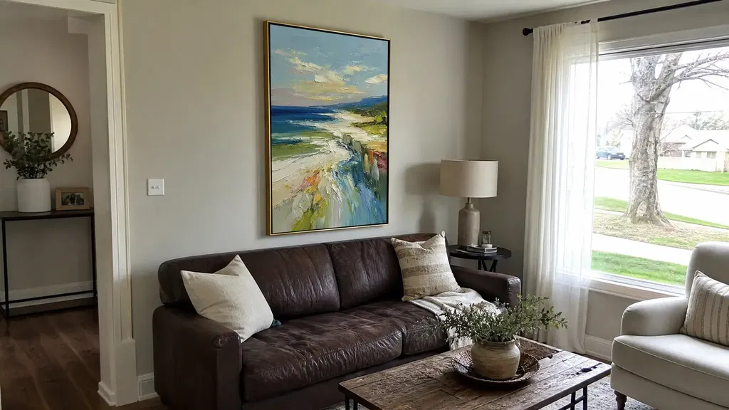
A successful mountain painting color palette does not need to duplicate the wall or every accent in the room. Compare undertone, value, and contrast instead. A painting that relates to the wall’s warmth or coolness can feel connected even when its colors differ, while an exact match to a small accessory may look overly deliberate.
Check the Wall Color and Undertone
Judge the painting against the actual wall, not only against a white product-page background. Warm, cool, gray, beige, and white surfaces can change how the artwork’s neutrals appear. Compare it in the light the room actually receives:
- Check the wall and artwork in daylight and again under evening lighting.
- Identify whether the wall leans warm, cool, gray, beige, or clean white.
- Compare the painting’s lightest and darkest values with the wall rather than matching one isolated color.
- Notice glare or strong direct sun before deciding where the piece will hang; light can change how artwork appears, and GSA artwork-care guidance recommends avoiding direct sunlight for final placement.
This approach is especially useful when comparing mountain landscape wall art for a calm room. Muted art may blend comfortably with a neutral wall, but if both wall and painting are close in value, the scene may lose definition. A controlled difference in lightness or contrast can help it remain legible.
Balance Furniture and Existing Accents
Let the largest nearby furniture pieces establish the room’s visual weight. A heavily patterned sofa, dark wood cabinet, or substantial rug may call for a painting with clearer structure but not necessarily more drama. Conversely, a restrained room may have room for stronger peak definition or visible texture.
Repeat one meaningful color family when it helps connect the painting to the room, but avoid copying a minor pillow, vase, or throw too literally. A neutral painting can work in a colorful room when its values and one established accent relate to the space; a colorful painting can work in a neutral room when its contrast is intentional rather than accidental. Broader modern wall art can provide a useful comparison point when you are deciding whether the mountain piece should blend with or stand apart from the room.
Use Composition and Texture for the Viewing Distance
Choose detail and texture according to where the painting will actually be seen. A piece viewed mainly from a sofa, bed, desk, or entry path needs a structure that remains readable from those positions, while fine detail rewards a closer sightline. Preview the artwork from both seated and standing positions before deciding whether the horizon, peak cluster, and contrast are doing useful work. Viewing-position guidance treats displaying artwork as a practical sightline decision, not a universal height formula.
Choose Composition for the Wall and Sightline
A broad open scene may provide visual breathing room, while a tighter peak-focused view may create a stronger focal point. Use the wall’s surrounding context and the room’s main sightline to decide which emphasis is more useful.
| Composition | What it emphasizes | Where it may fit |
|---|---|---|
| Open valley | Depth and visual breathing room | Broad walls or rooms with several strong furnishings |
| Peak-focused view | Direction and focal emphasis | A simpler arrangement that needs a clear visual anchor |
| Elevated horizon | More sky, distance, or openness | Rooms that can carry a lighter, less crowded upper field |
| Lower horizon | More landform and foreground weight | Spaces where the artwork should feel visually grounded |
The scene’s depth is not only about the mountain outline. A foreground path, overlapping ridge, or change in scale can lead the eye through the image. If the painting will be seen across the room, broad shapes and a clear value structure may remain easier to read than very fine detail.
Decide How Much Surface Texture the Room Can Carry
Texture adds another layer of visual weight, so compare it with the room’s rugs, upholstery, wood grain, lighting, and nearby patterns. Minimal texture may be easier to integrate when the room already has several competing surfaces. More visible texture may suit a restrained room where the wall needs added physical presence.
Do not treat texture as proof of authenticity or automatic quality. When textured mountain landscape art is central to your decision, inspect close-up and side-angle listing images, then look for a clear finish description on the individual product page. Notice how raised areas catch window light or lamps, and remember that the appearance may change with the viewing angle. A collection such as impasto artwork is a browsing path, not a guarantee that every piece has the same surface treatment.
Make the Final Mountain Painting Shortlist
Before adding one painting to your cart, use this five-step sequence. The goal is not to find a universal winner; it is to eliminate the option with the most unresolved room-fit questions.
- Name the mood. Write down one dominant result: quiet, dramatic, expansive, grounded, or luminous.
- Identify the strongest scene cues. Note whether softened distance, sharp peaks, open valleys, horizon placement, contrast, or brighter areas are doing most of the visual work.
- Compare wall and furniture relationships. Check undertone, value, nearby furniture weight, established accent colors, and the painting’s appearance in both daylight and evening light.
- Test composition, texture, and sightlines. View the artwork from the room’s main seated, standing, entry, or desk positions.
- Verify the live listing. Confirm the individual product page’s images, dimensions, finish description, shipping terms, return terms, and warranty information where provided.
If two options pass, favor the one with a clearer relationship to the room’s existing focal point and fewer unresolved mismatches. Inspect the live listing and add one to your cart only after it passes these room-fit checks.
FAQs
Use these questions to check symbolism, room fit, and listing details before checkout.
What Does Mountain Art Symbolize?
Some viewers read mountains as symbols of stillness, endurance, distance, escape, or personal achievement, but meaning is personal. Choose the scene that supports the feeling or memory you want nearby, then check its palette and composition against the room.
How Can I Tell If a Moody Mountain Painting Will Make My Room Feel Too Dark?
Compare its darkest values with the wall, furniture, and available daylight. Check it again under evening lighting; if all three are deep in value, the combined effect may feel heavier than it did online.
Is a Mountain Landscape Painting a Good Choice for a Bedroom?
It can suit a quiet bedroom when the artwork uses softer edges, restrained contrast, and an uncluttered composition. Check it from the bed and doorway, not only at close range.
How Do I Compare Textured Mountain Paintings Online?
Review close-up and side-angle images, finish wording, and listed dimensions on the individual product page. Verify current shipping, return, and warranty terms where provided; missing details remain unresolved purchase questions.