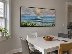
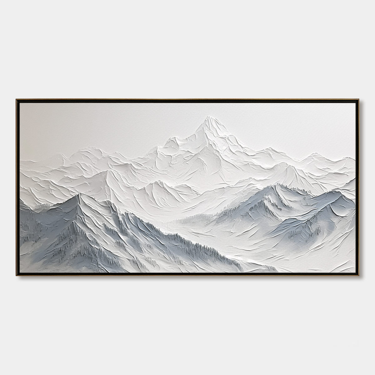
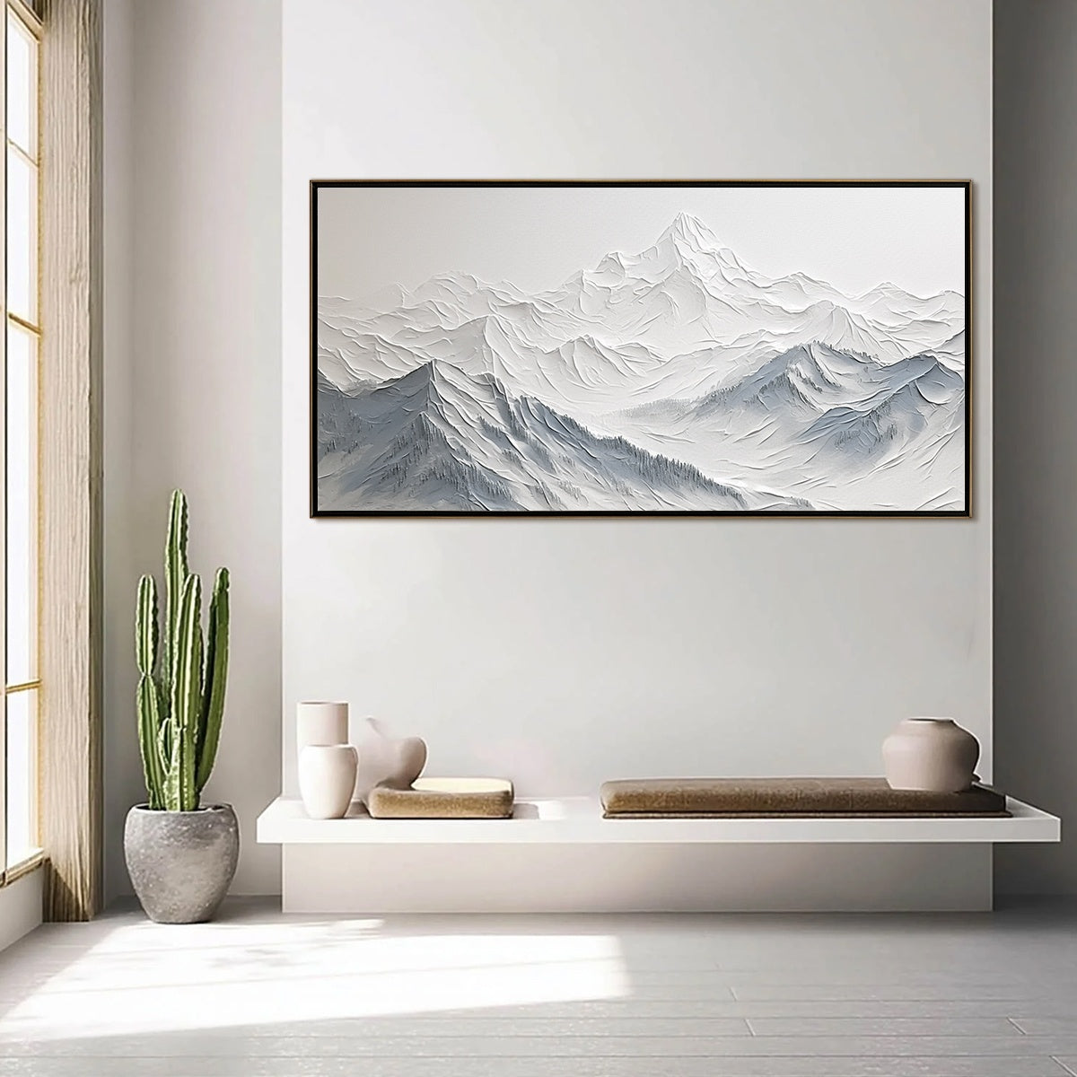
Mountains & valley wall art brings majestic landscapes and tranquil vistas, elevating your space with nature’s grandeur and a sense of peaceful escape.

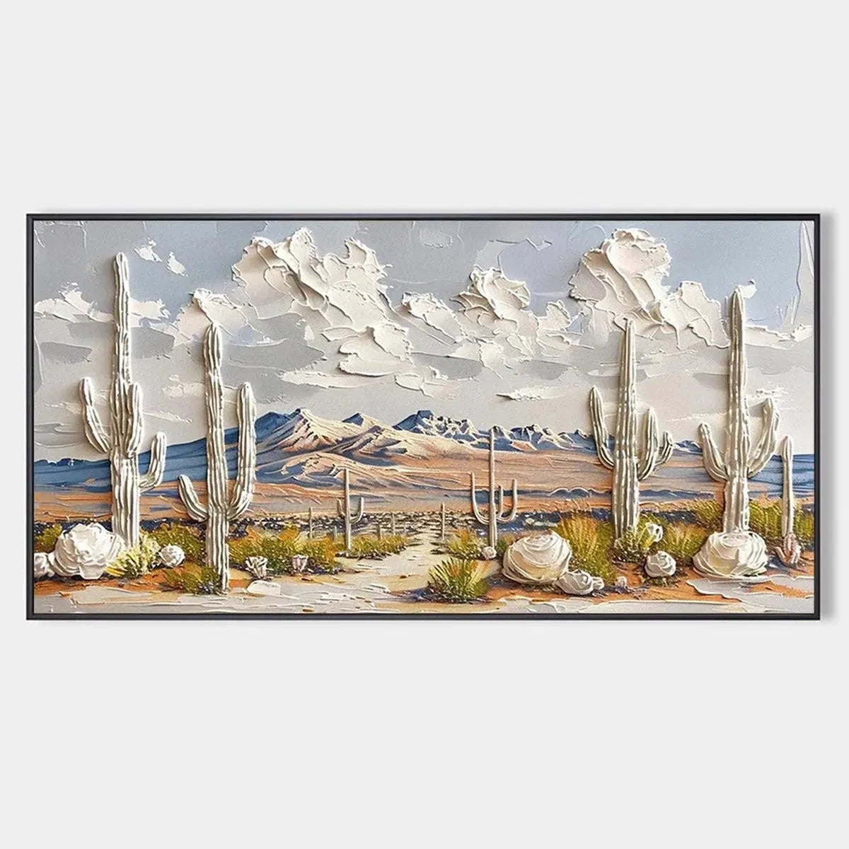









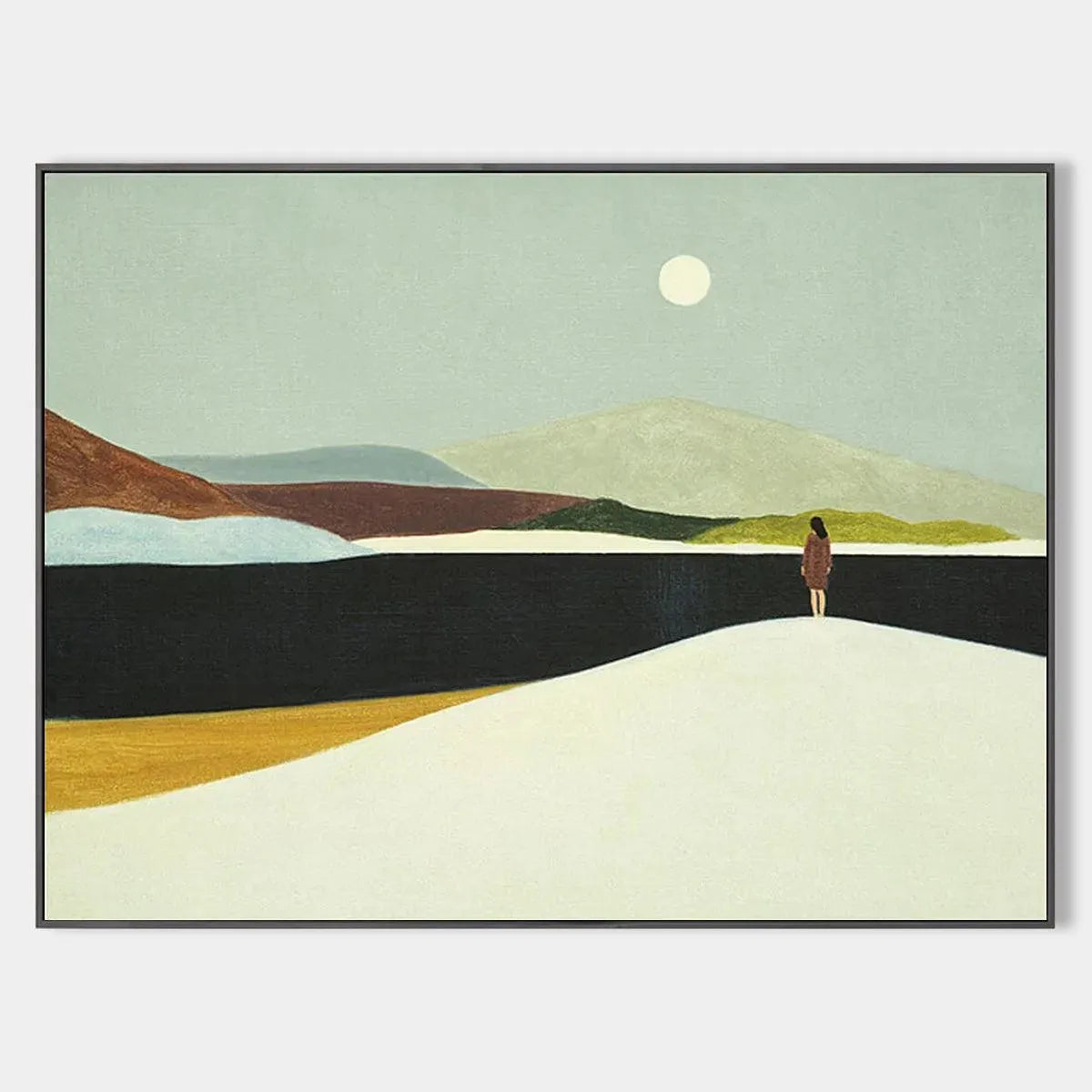
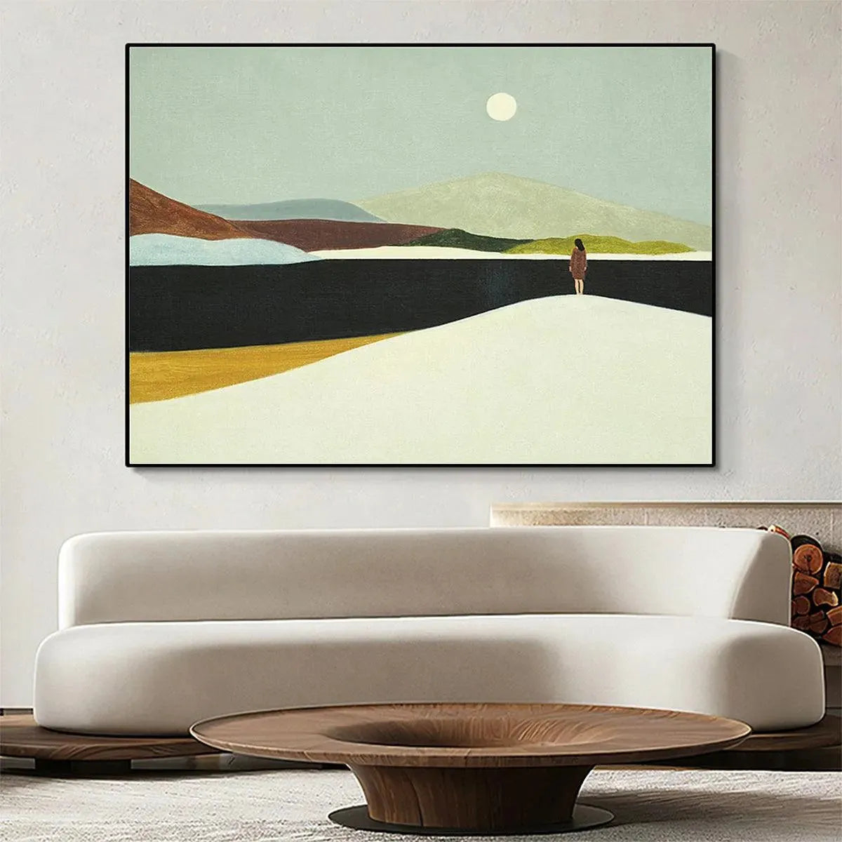

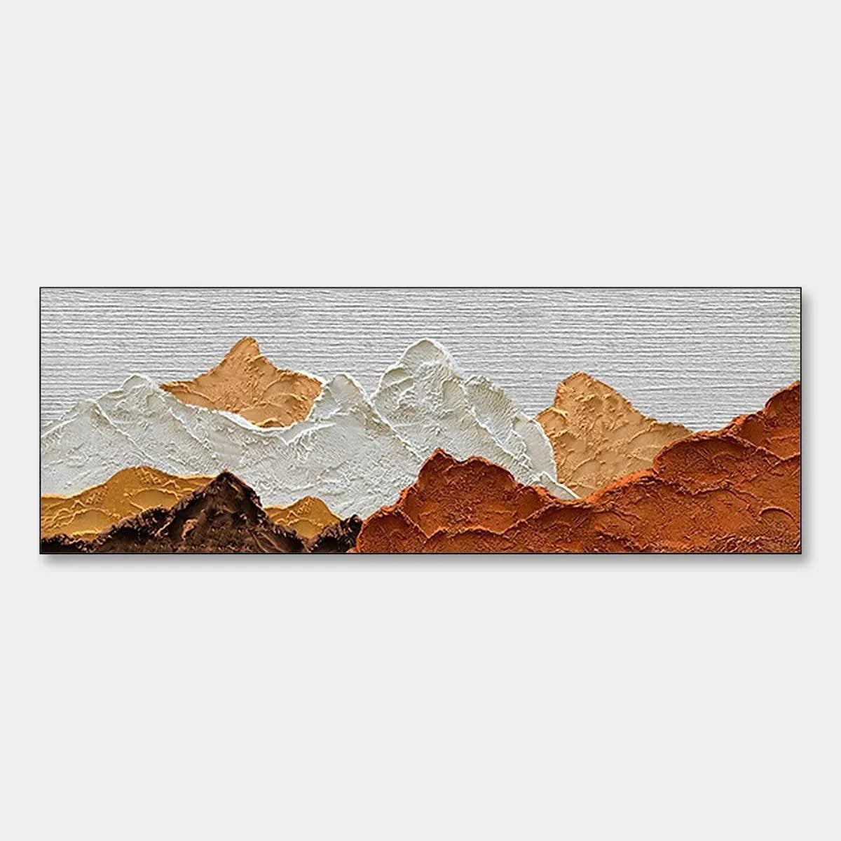
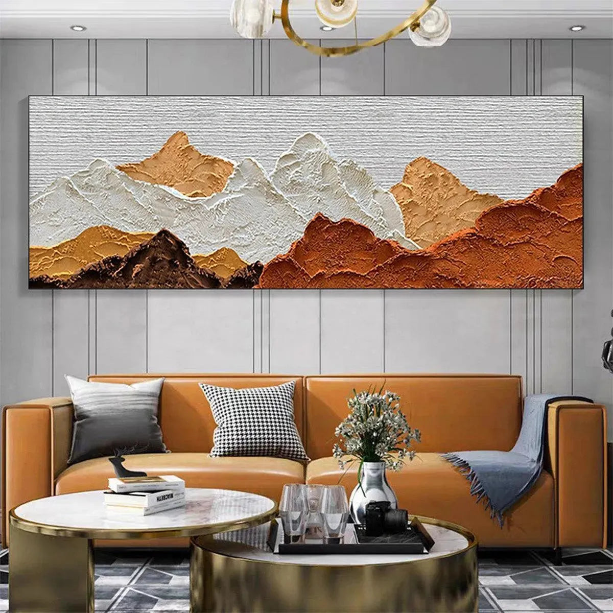




Serene Mountain & Valley Art | Landscape Paintings
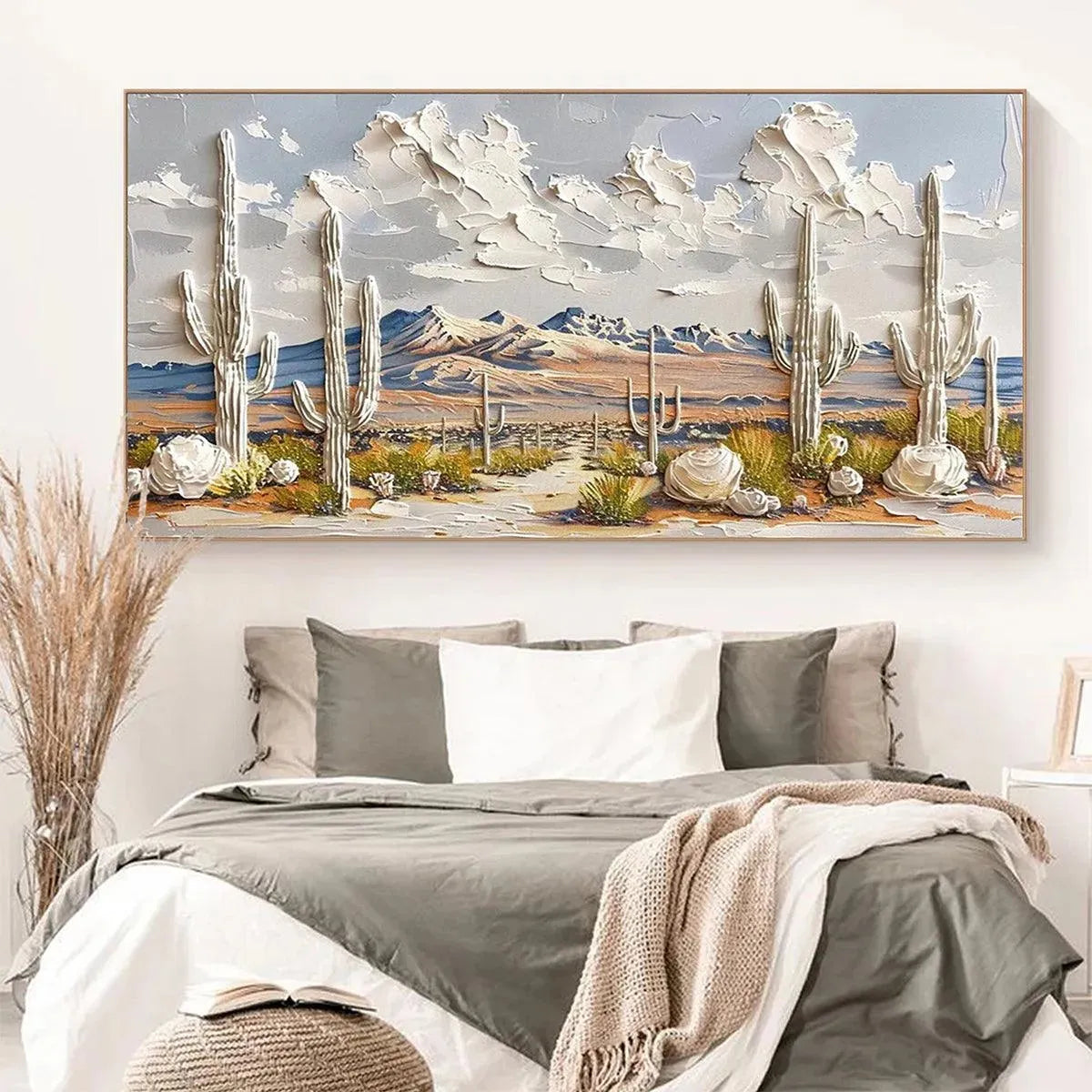
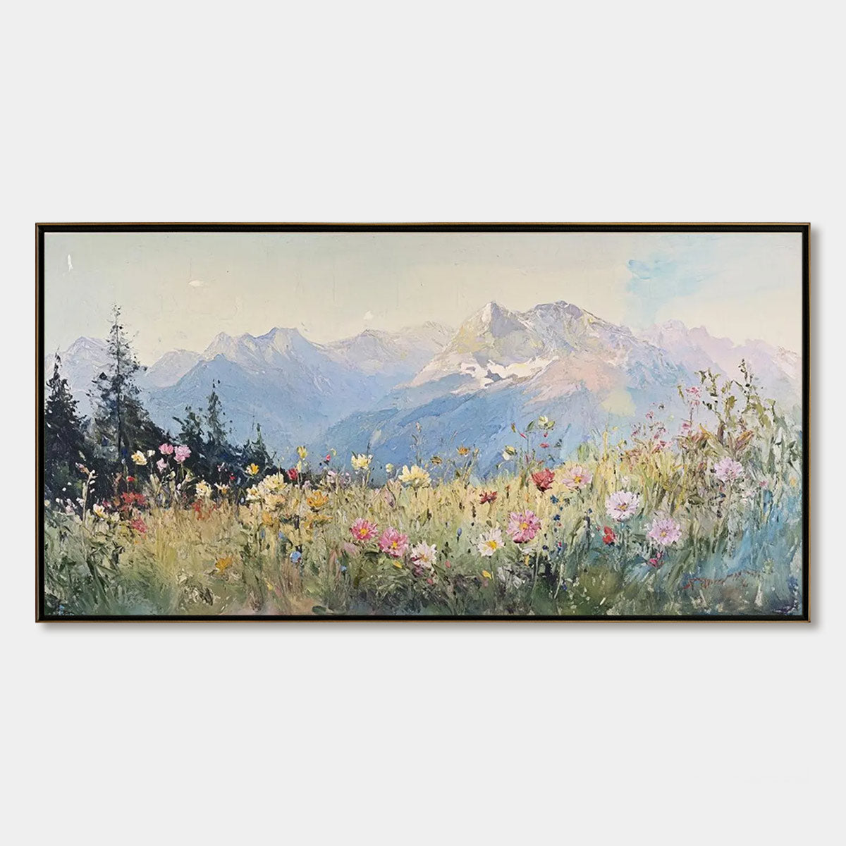
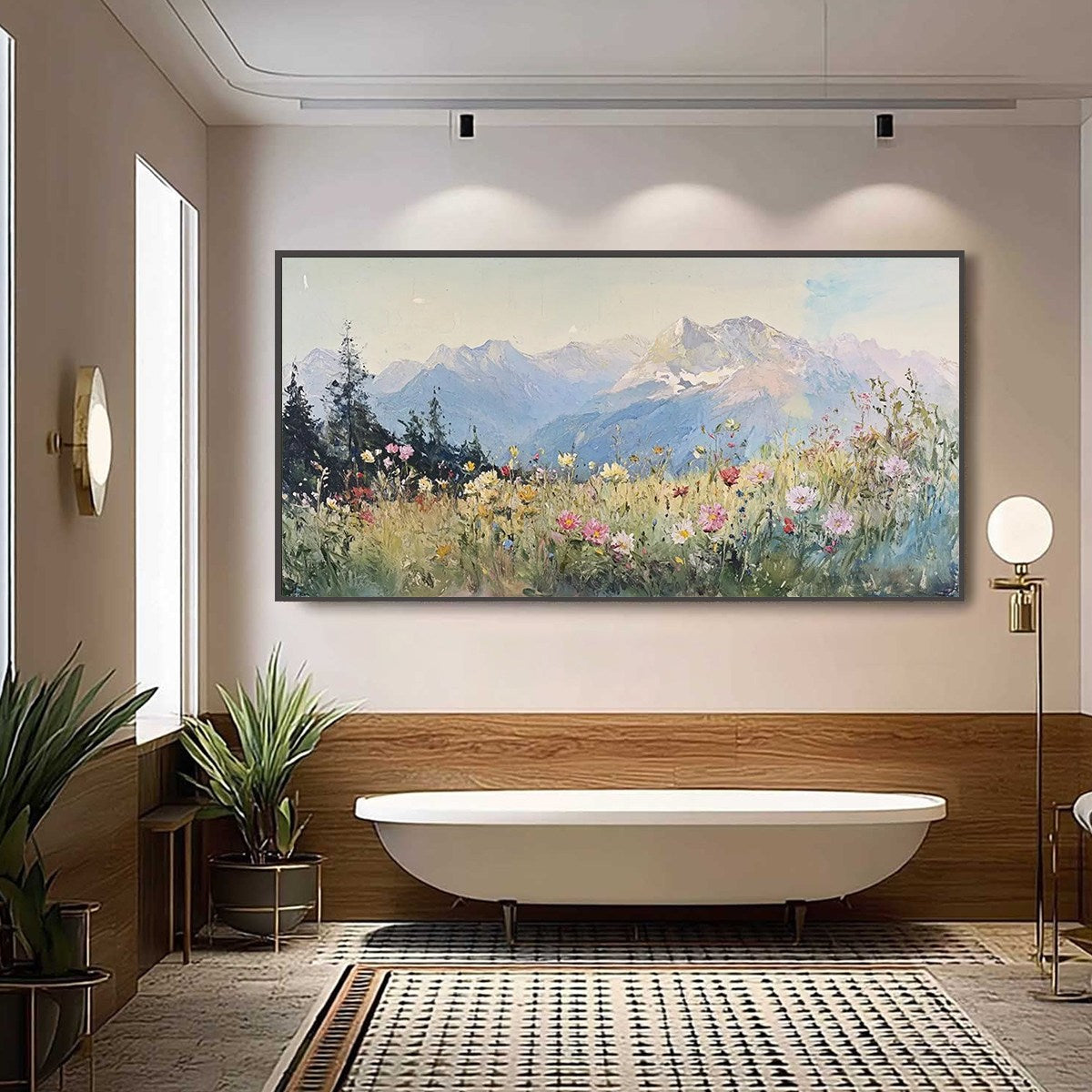
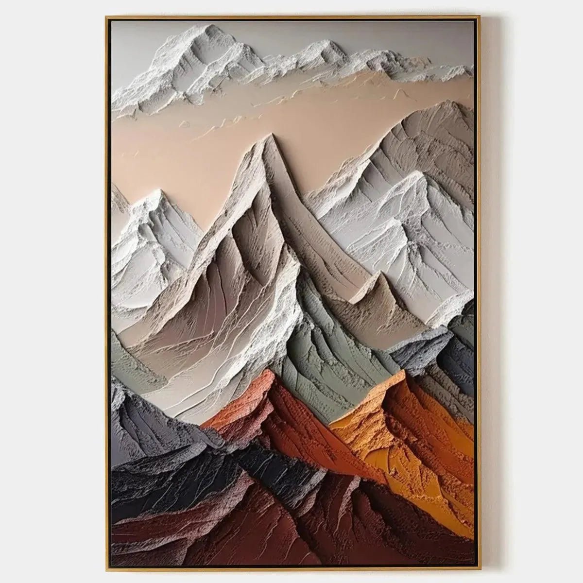
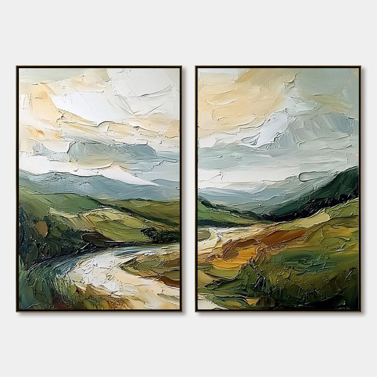
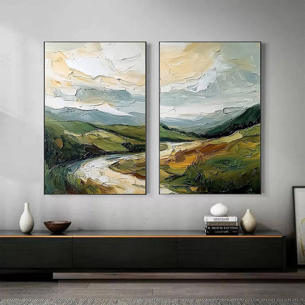
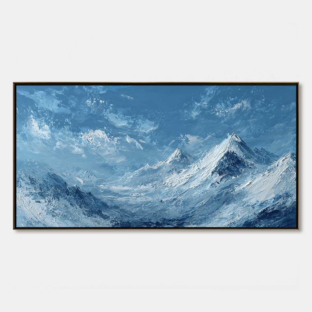
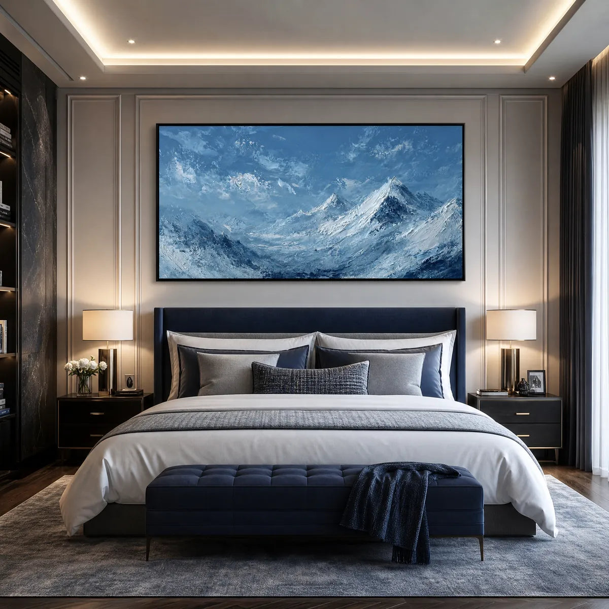
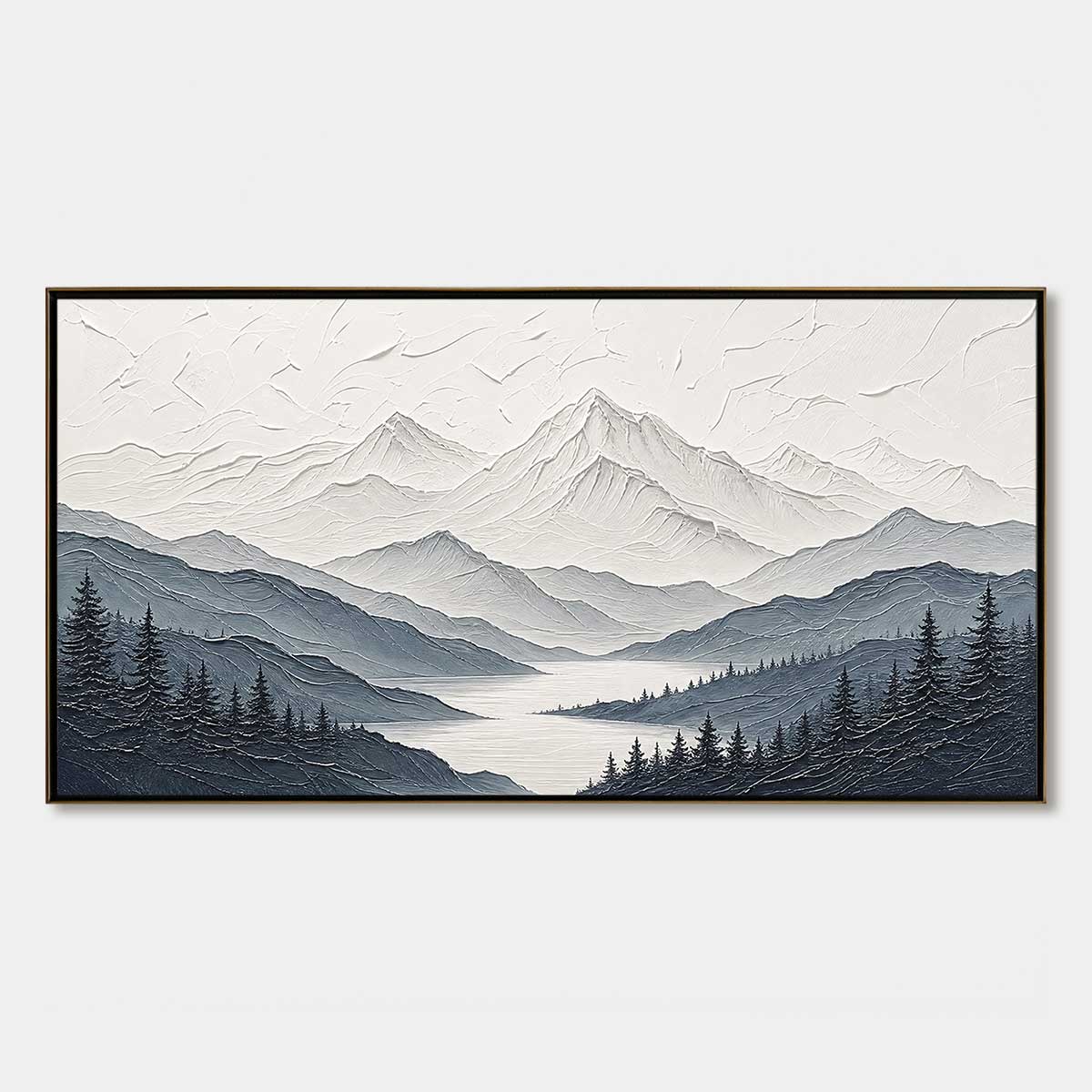
Mountain and valley wall art usually appeals to shoppers who want a room to feel calm, spacious, and grounded. The challenge is that not every mountain painting creates the same effect. Some feel crisp and architectural, others feel warm and reflective, and some are better suited to long walls than standard canvases. This collection helps narrow those choices with hand-painted landscapes that lean textured, atmospheric, and easier to place in everyday interiors.
Find Your Starting Point in the Palette
A useful starting point is asking what the room needs, not just what looks appealing. Does the space feel too busy or too bare? Too warm or too cold? Is the wall long enough that a standard canvas will look undersized? Mountain paintings can do different things depending on palette, texture, and format — and the right answer usually becomes clearer once you frame it as a room problem rather than a style preference.
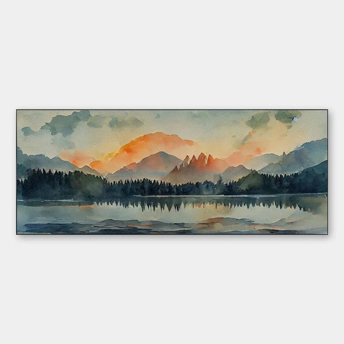
Cooler Mountain Palettes Feel Calm and Easy to Place
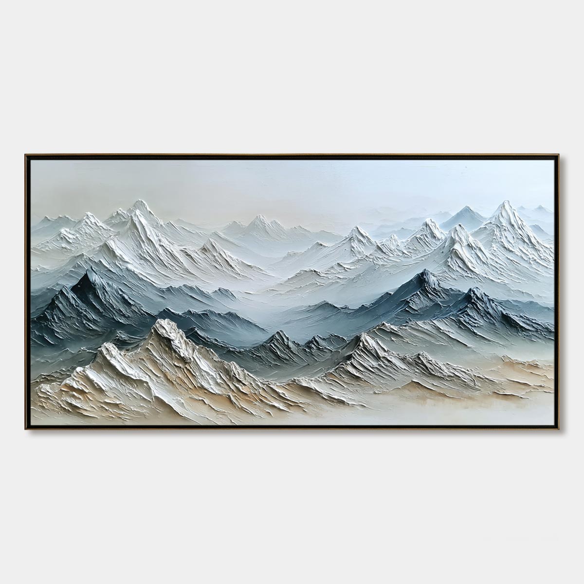
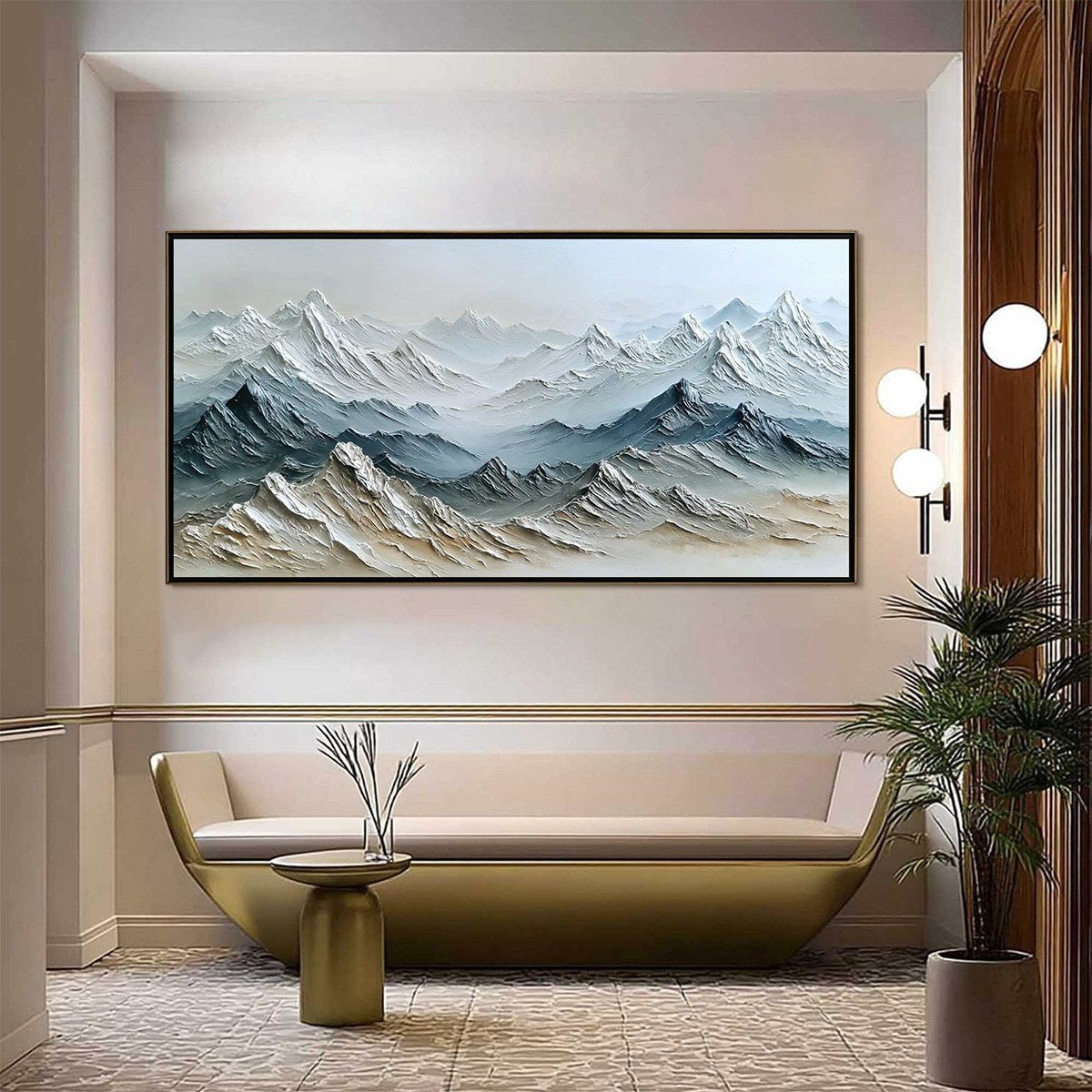
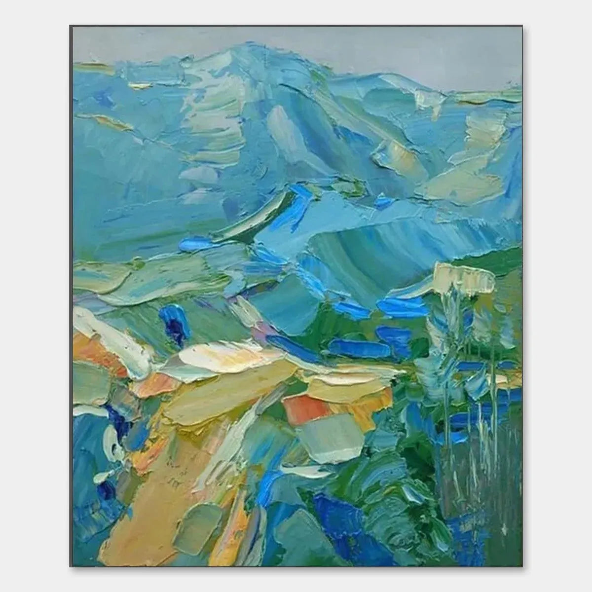
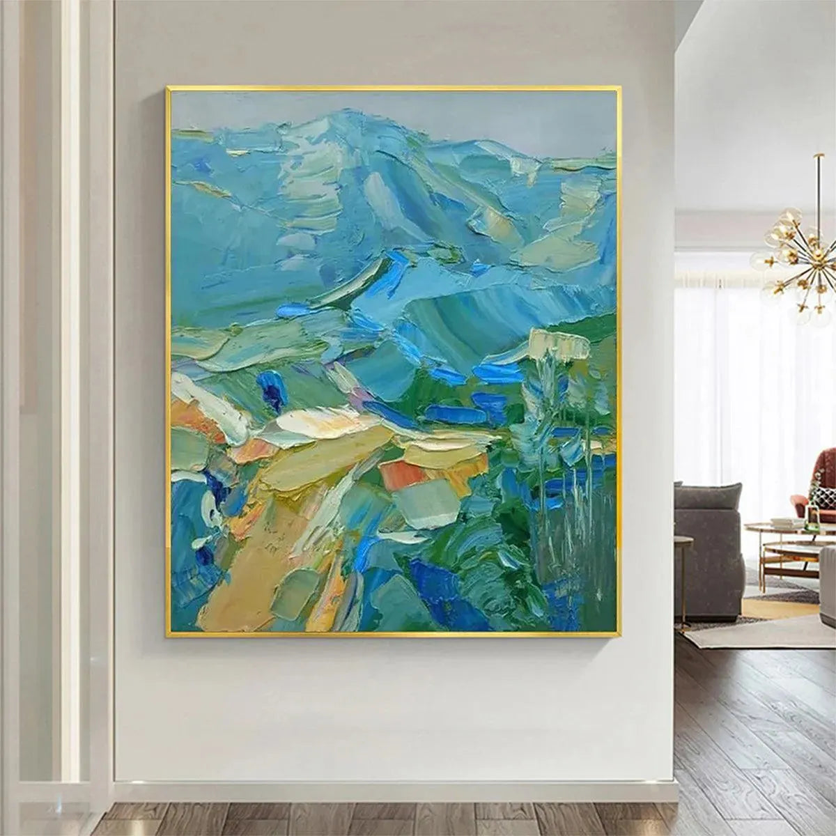
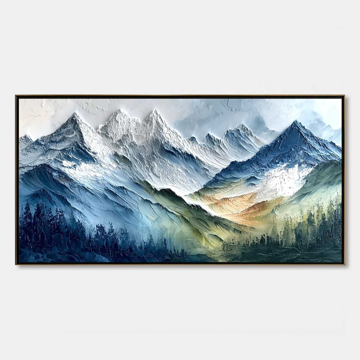
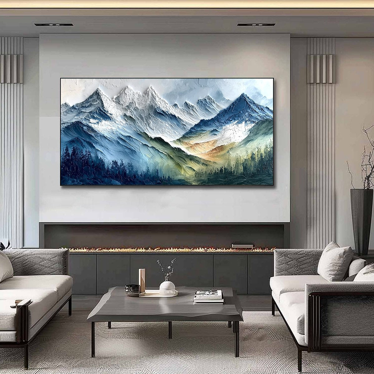
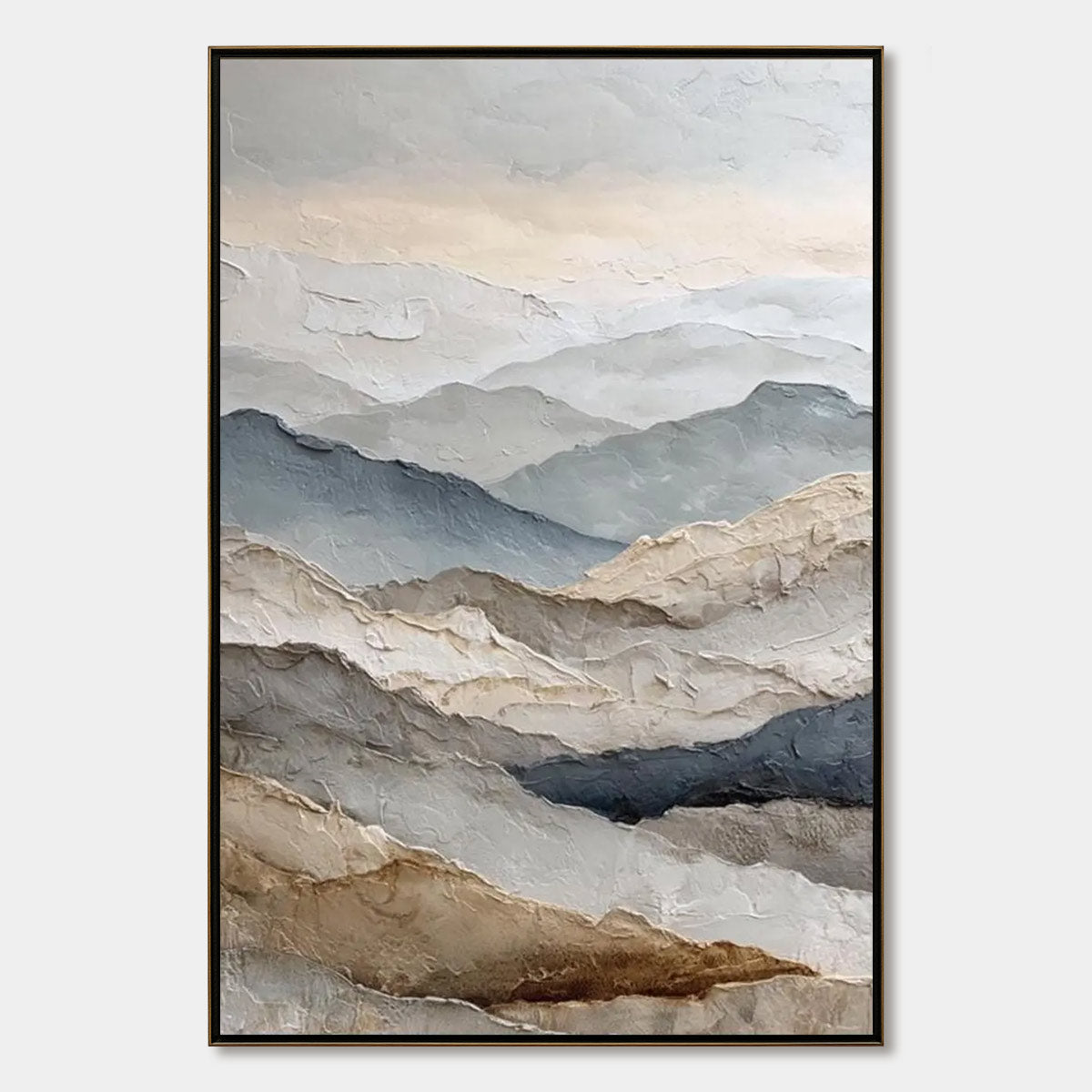
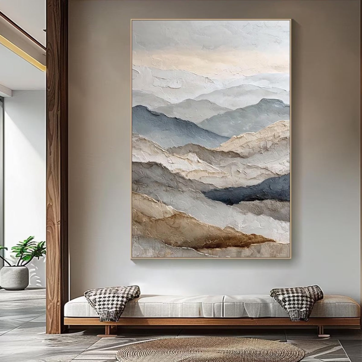
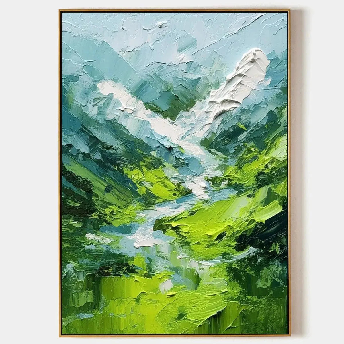
If your room already includes soft neutrals, pale woods, or muted upholstery, a blue-green landscape is often the easiest fit. Blue Ridge Mountains brings layered mountain forms, visible impasto texture, and a square format that works well when you want a natural focal point without making the room feel heavy.
This direction usually makes sense in bedrooms, offices, and quieter living areas where the goal is calm rather than drama.
White and Gold Peaks Add Contrast Without Feeling Cold
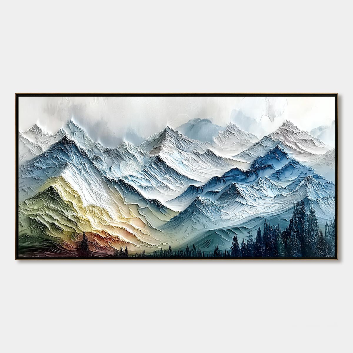
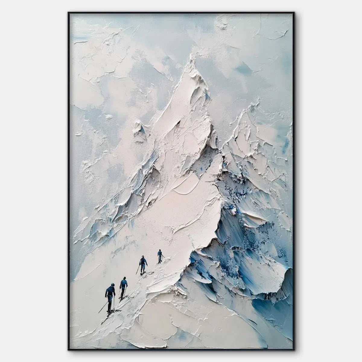
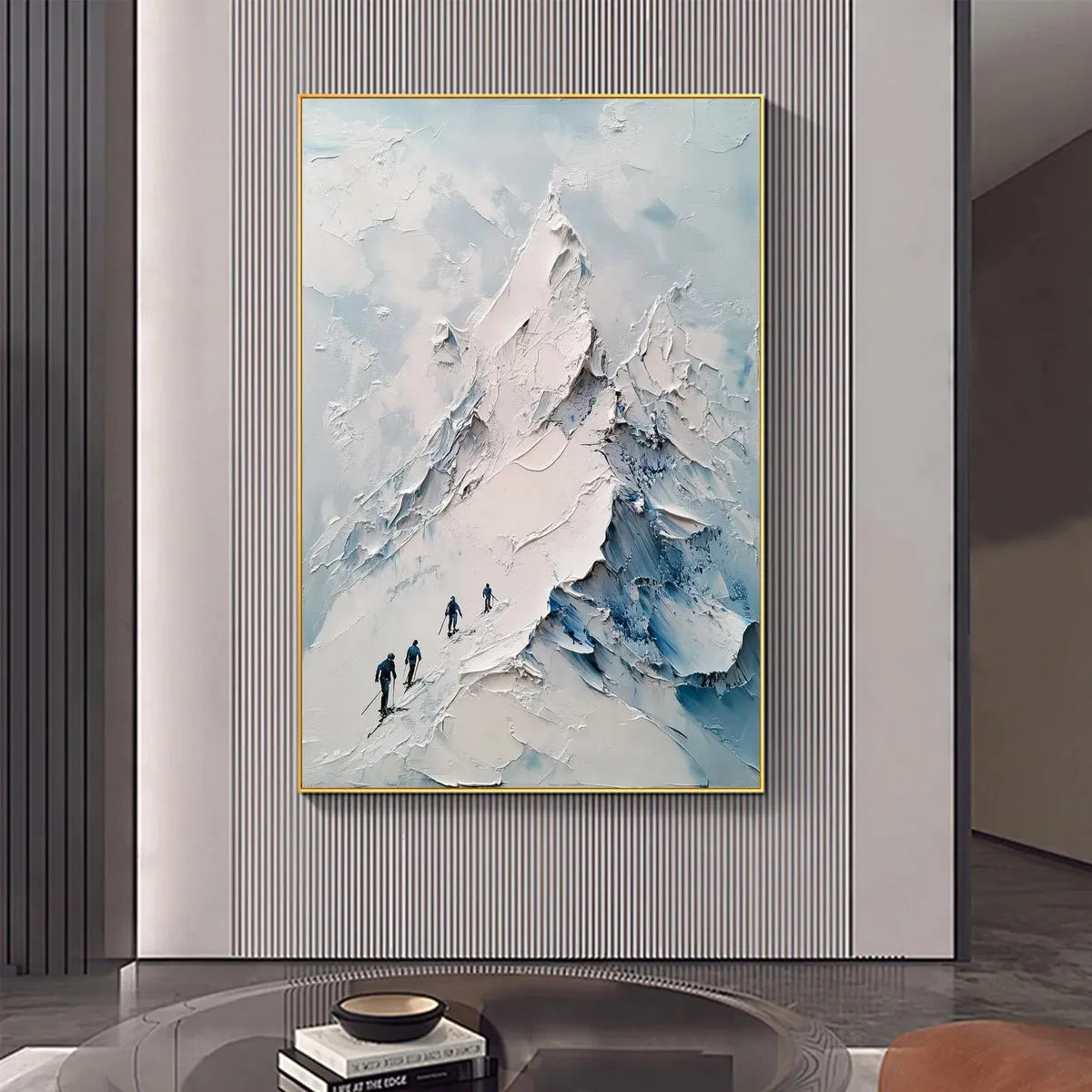
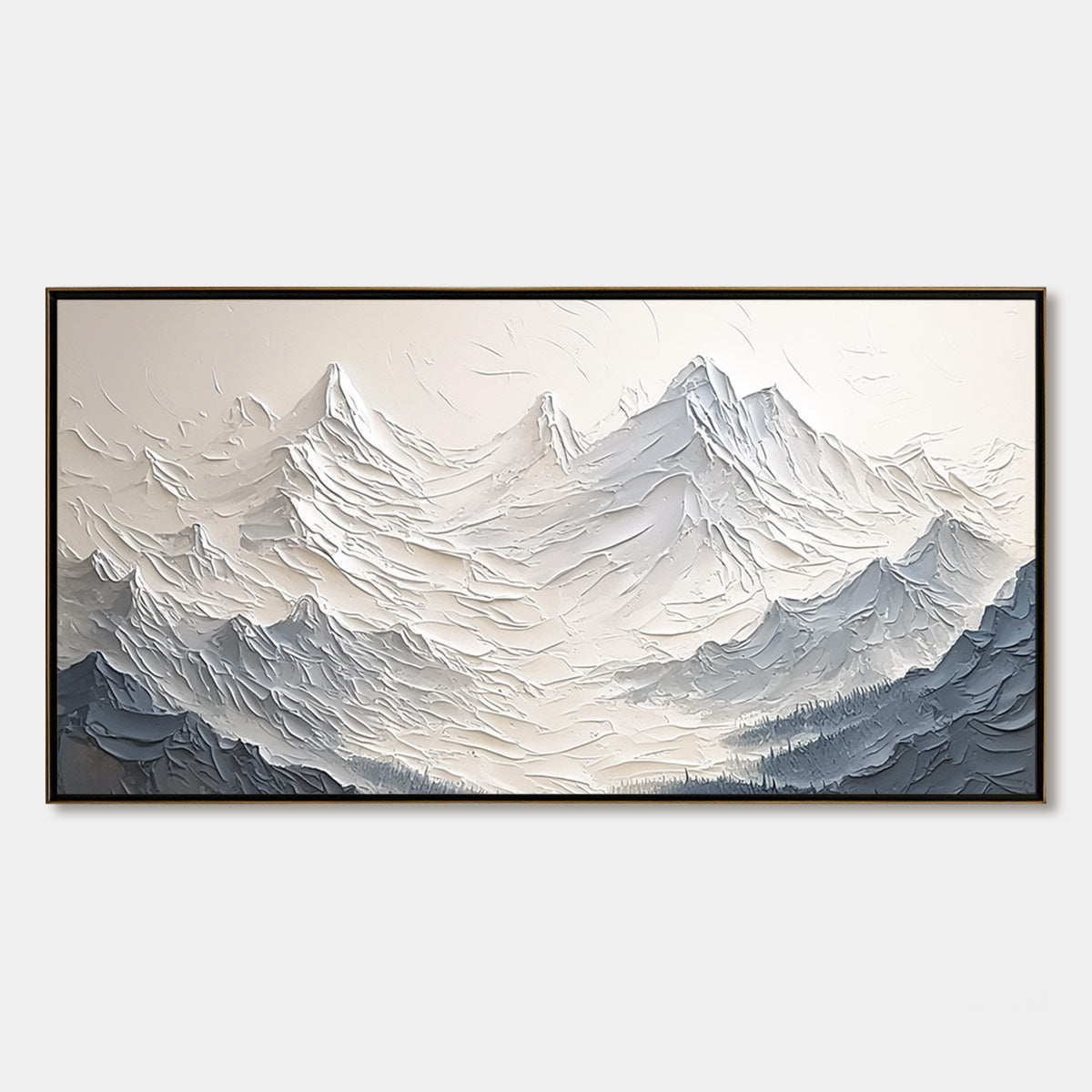
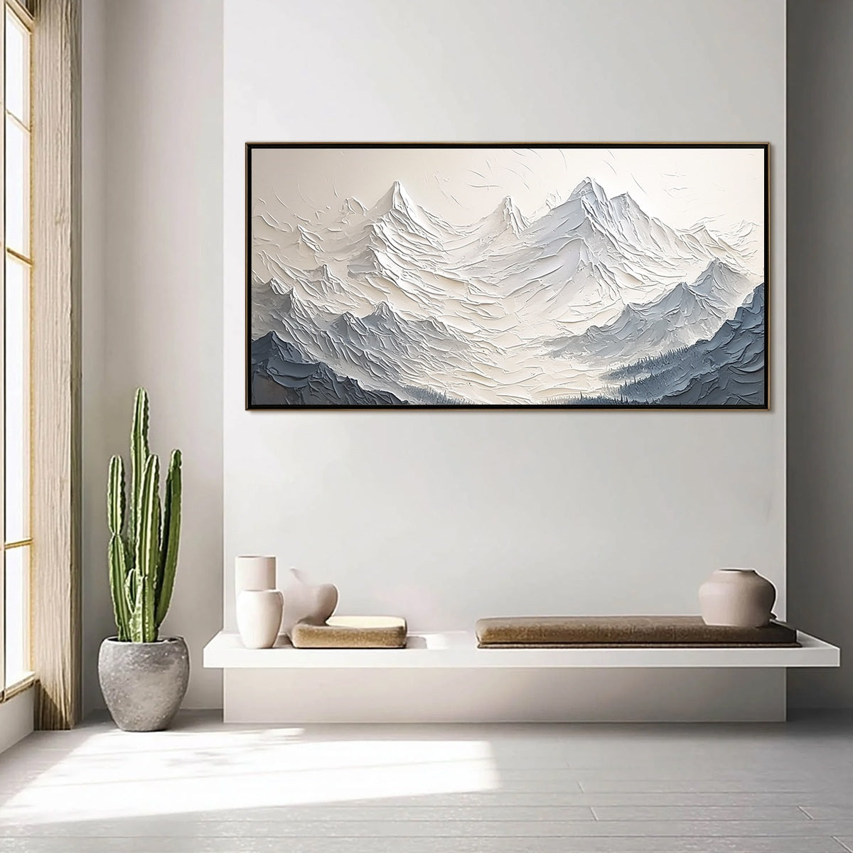
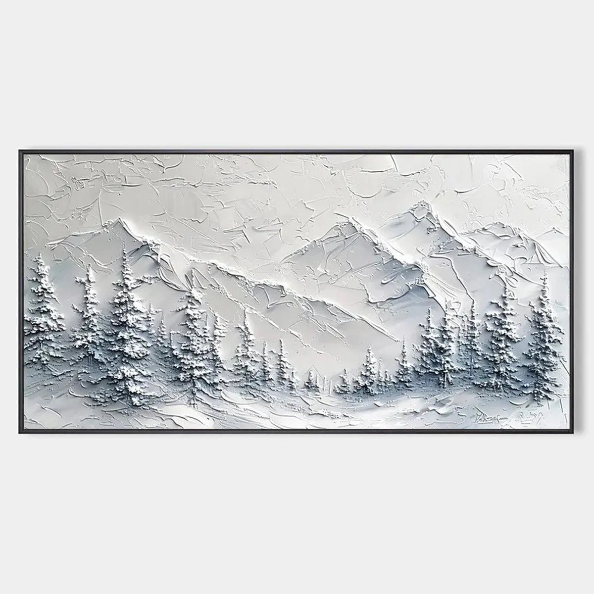
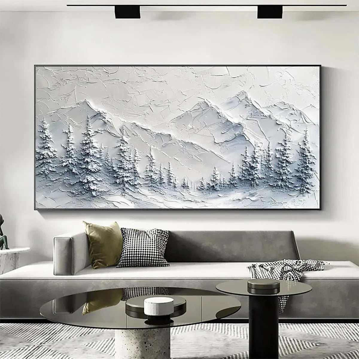
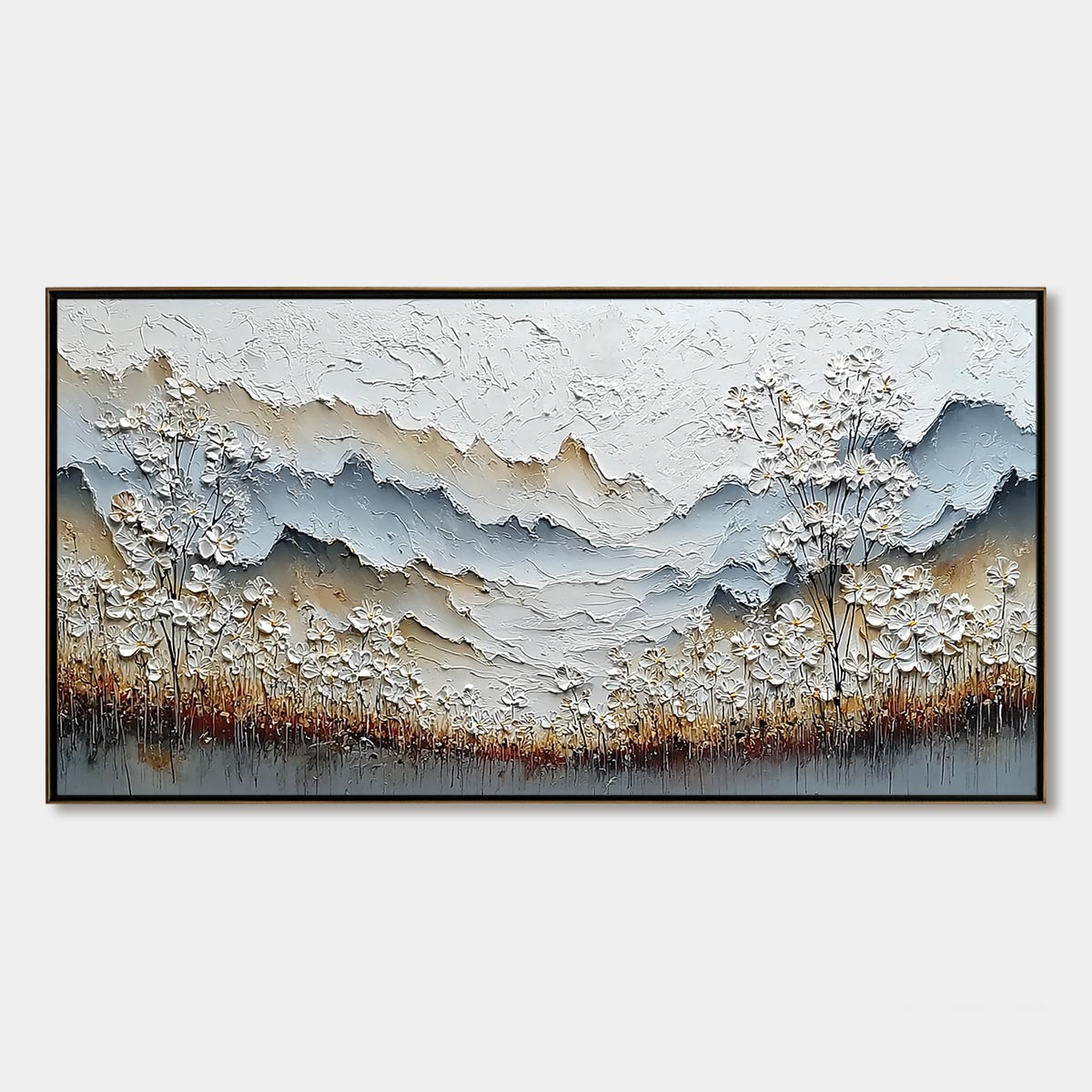
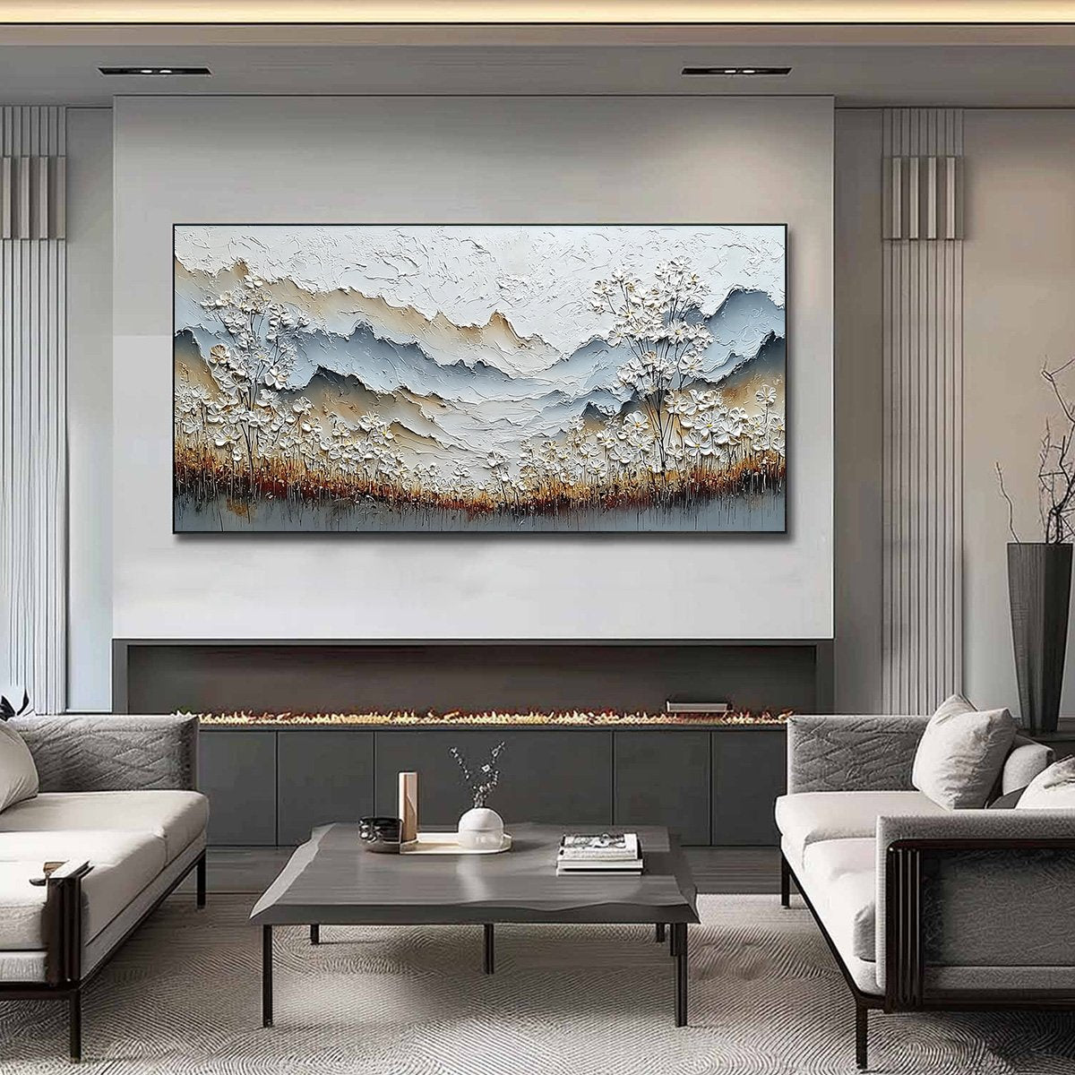
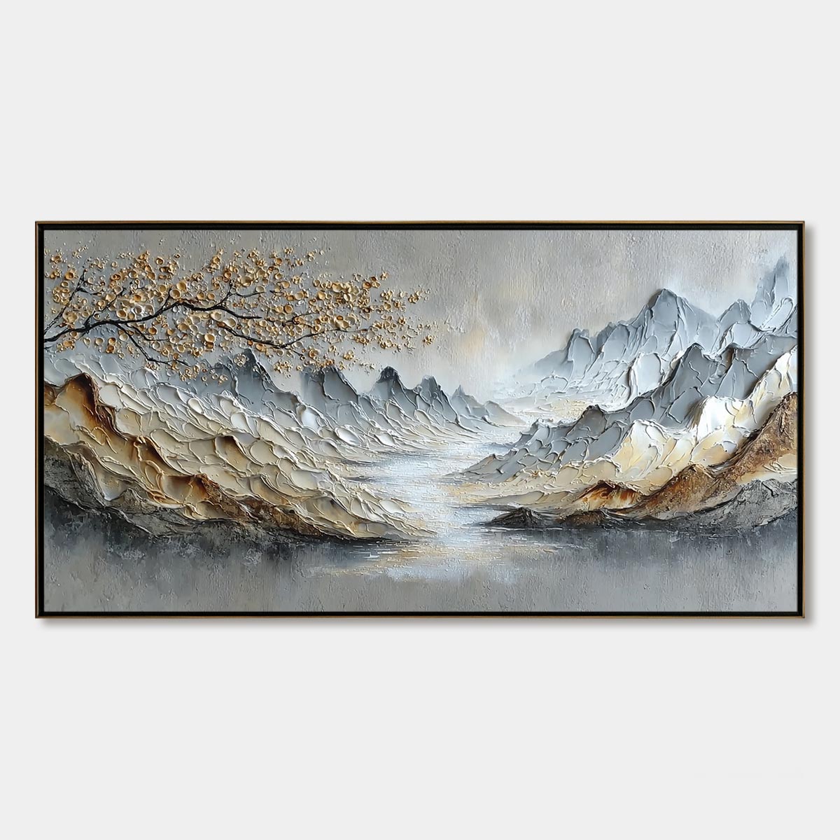
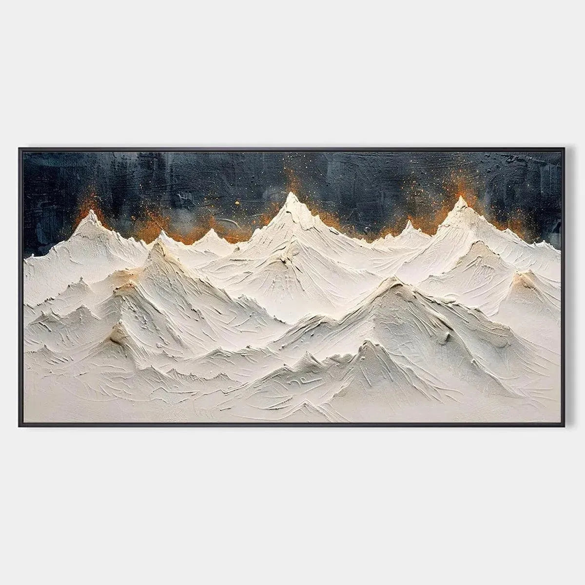
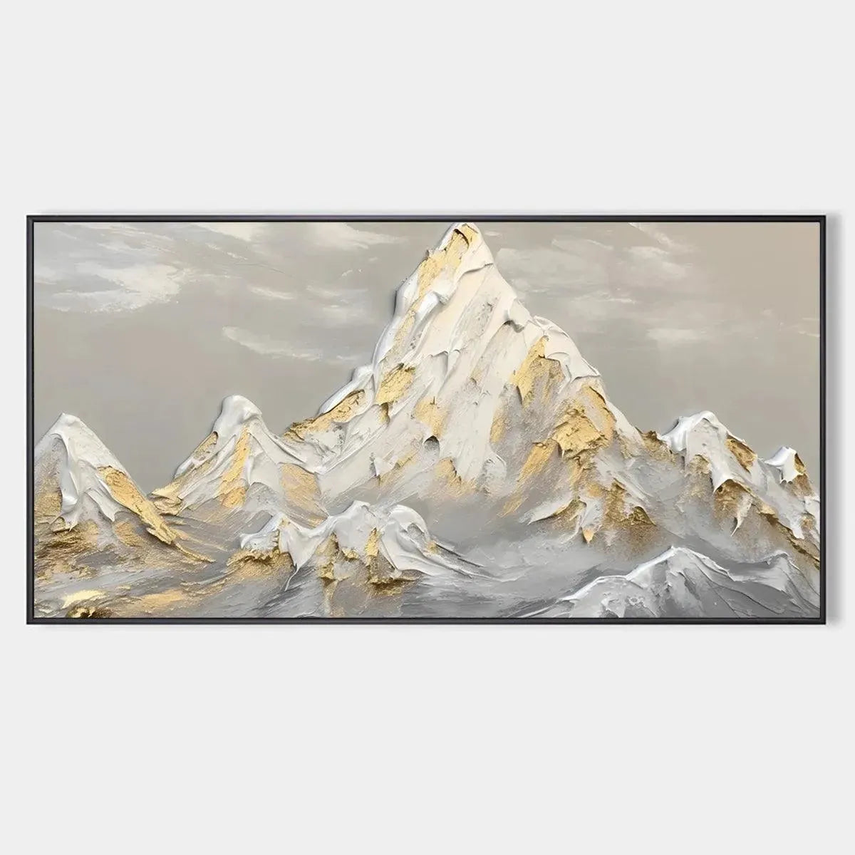
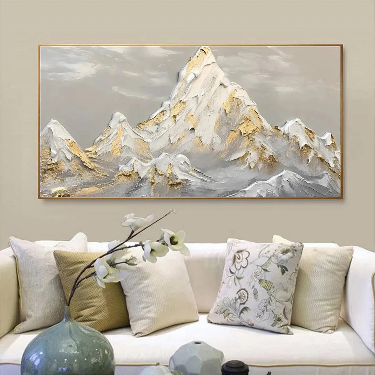
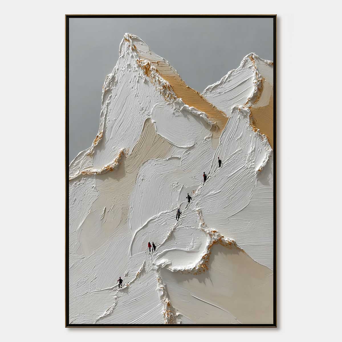
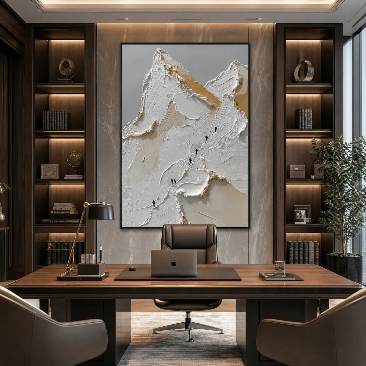
Mountain art does not have to stay strictly cool-toned. If your room needs warmth, metallic accents, or a little more brightness, lighter peaks with gold notes can do more for the space. Snowy Peaks uses textured white forms with subtle gold accents, which makes it a useful option for living rooms and bedrooms that want a cleaner, lighter landscape look.
Golden Peaks pushes that idea further with a gold-and-grey palette that can bridge warm and cool finishes in the same room.
Panoramic Views Work Better When the Wall Is Wide
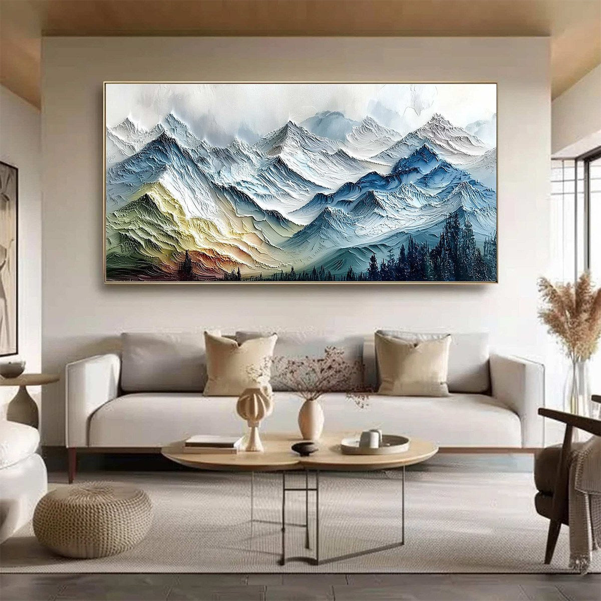
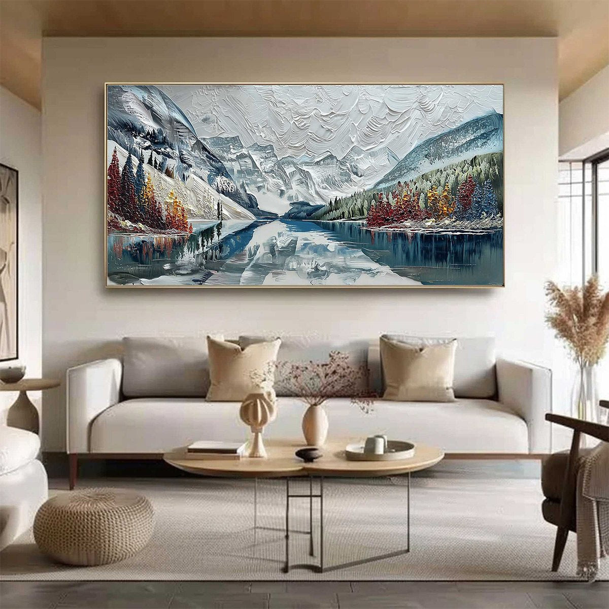
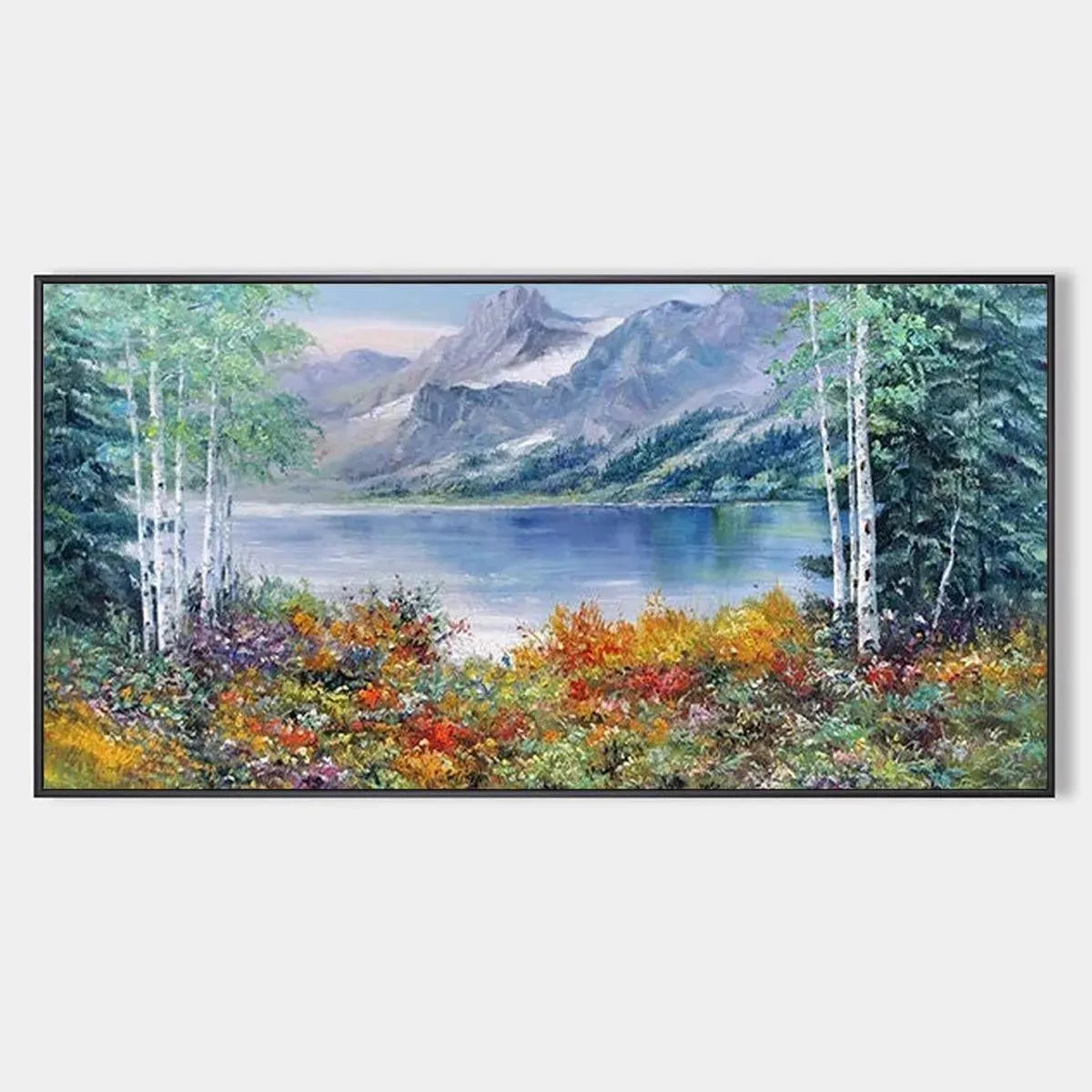
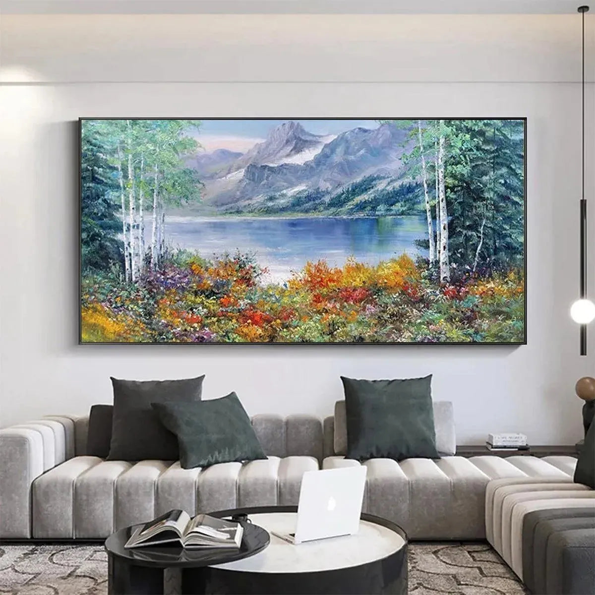
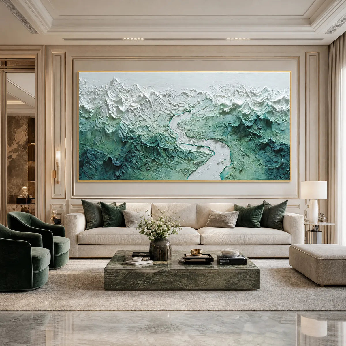
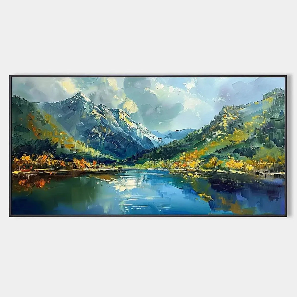
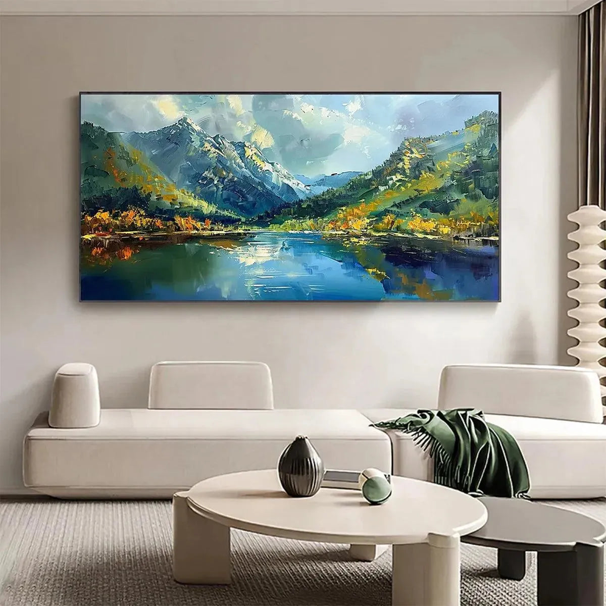
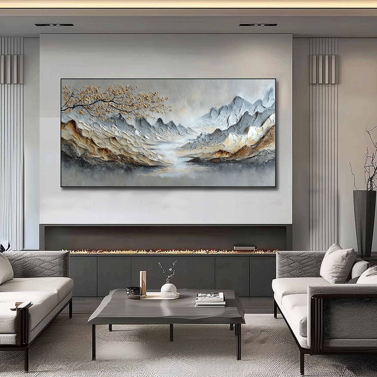
One common mistake with landscape art is choosing a standard canvas for a wall that really needs a wider composition. In those cases, a panoramic scene tends to feel more intentional and more immersive. Alpine Reflection uses reflective water, surrounding peaks, and autumn color to create that broader sense of depth.
Choose a panoramic mountain painting when you want:
- stronger horizontal flow above a sofa or bed
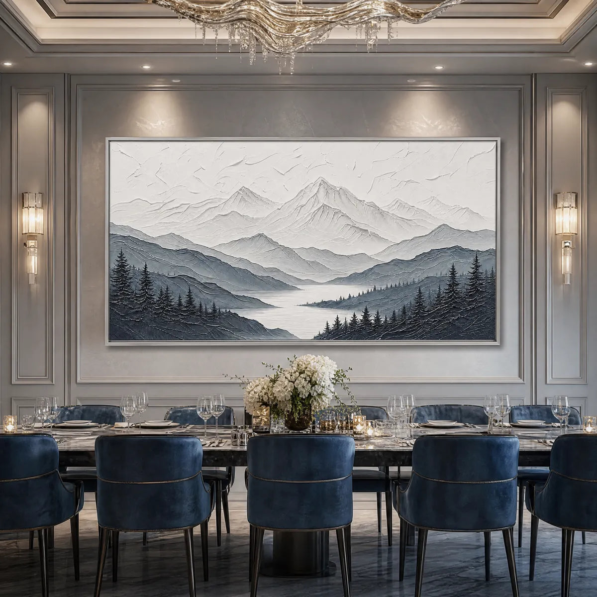
- more visual depth in a hallway or dining area
- a landscape that feels expansive instead of compact
Texture Matters as Much as the Scenery
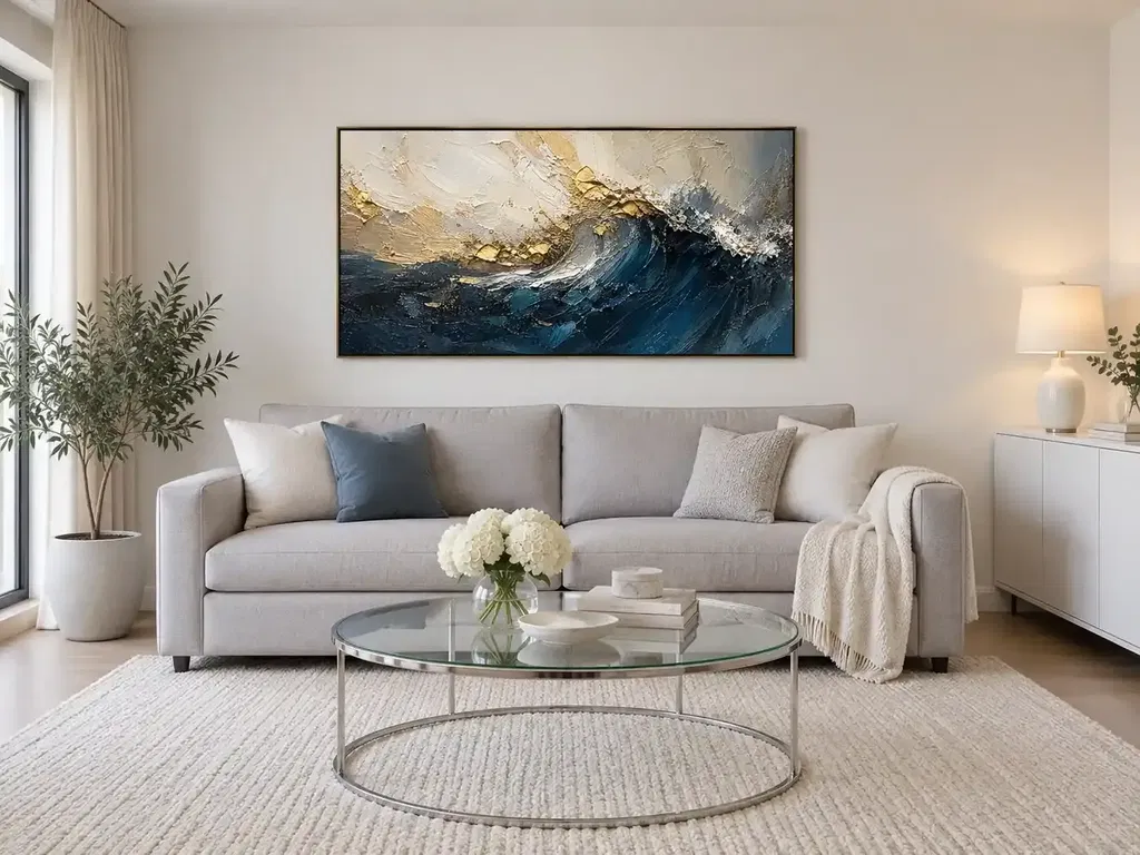
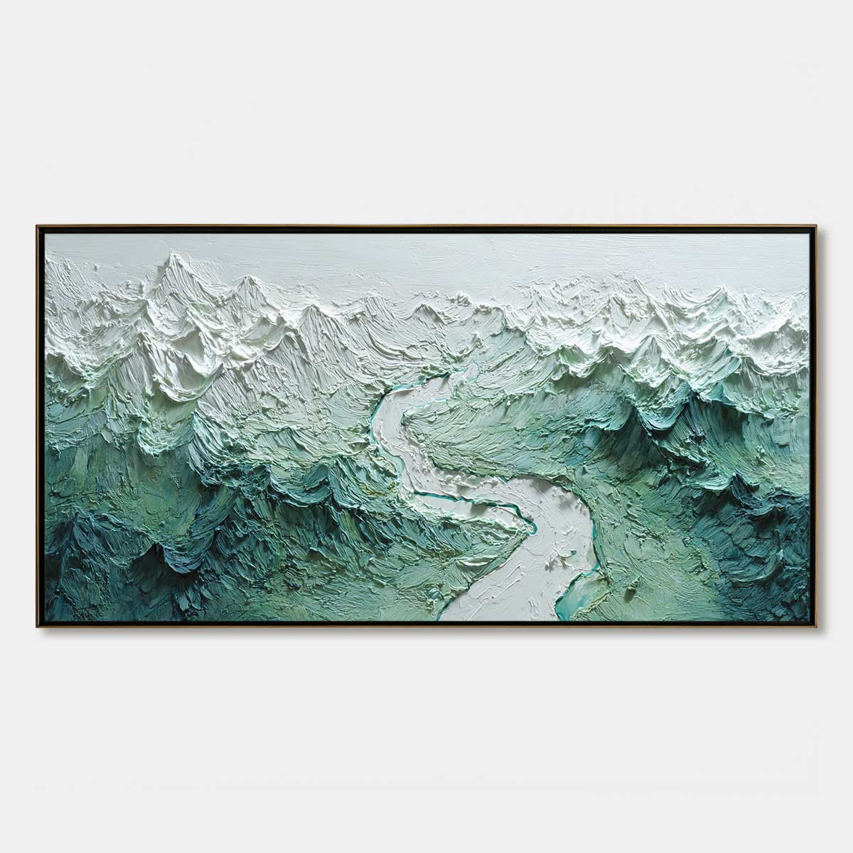
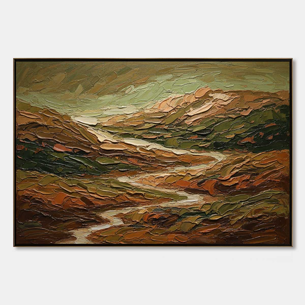
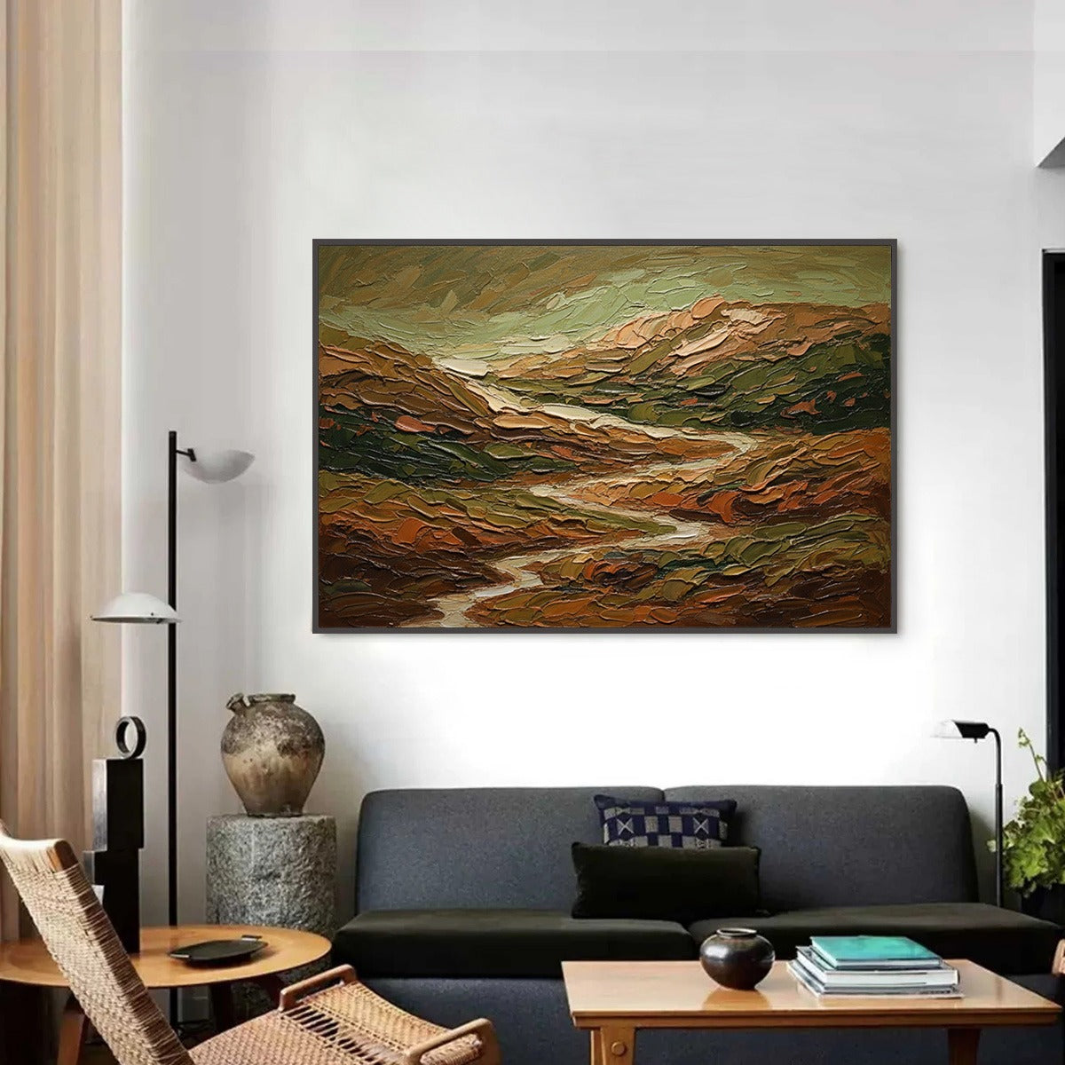
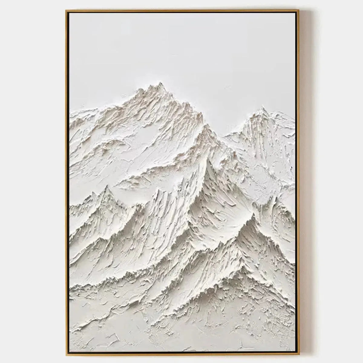
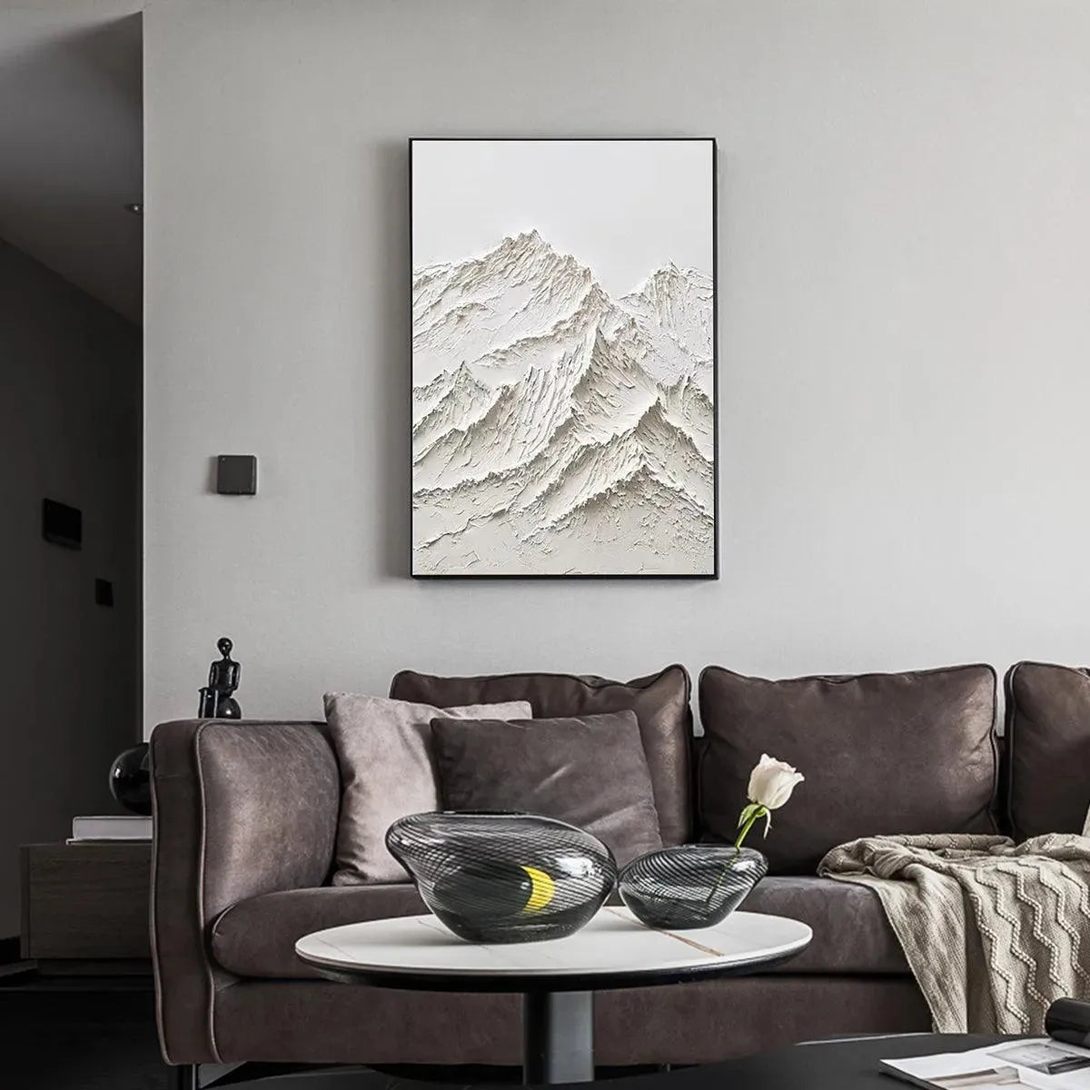
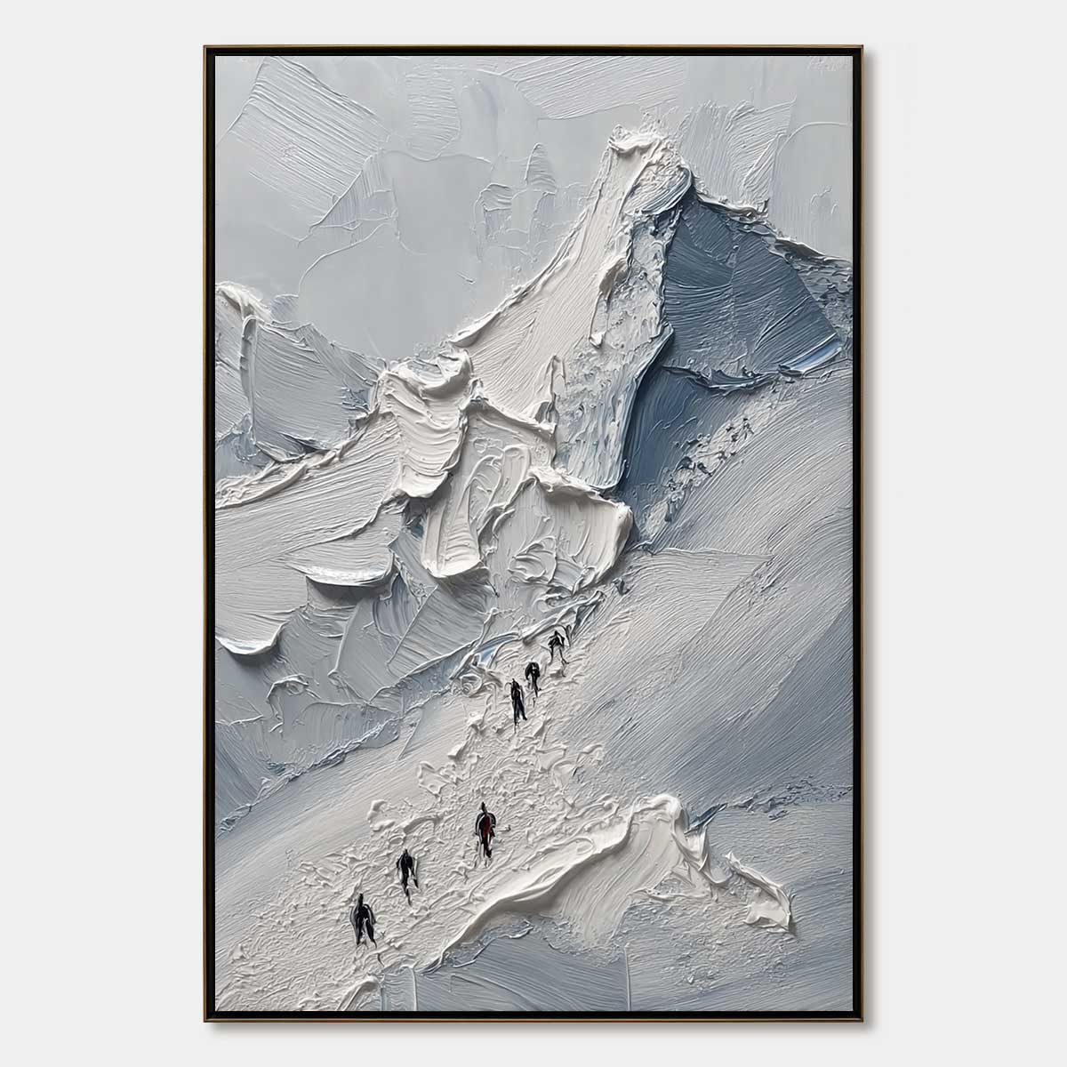
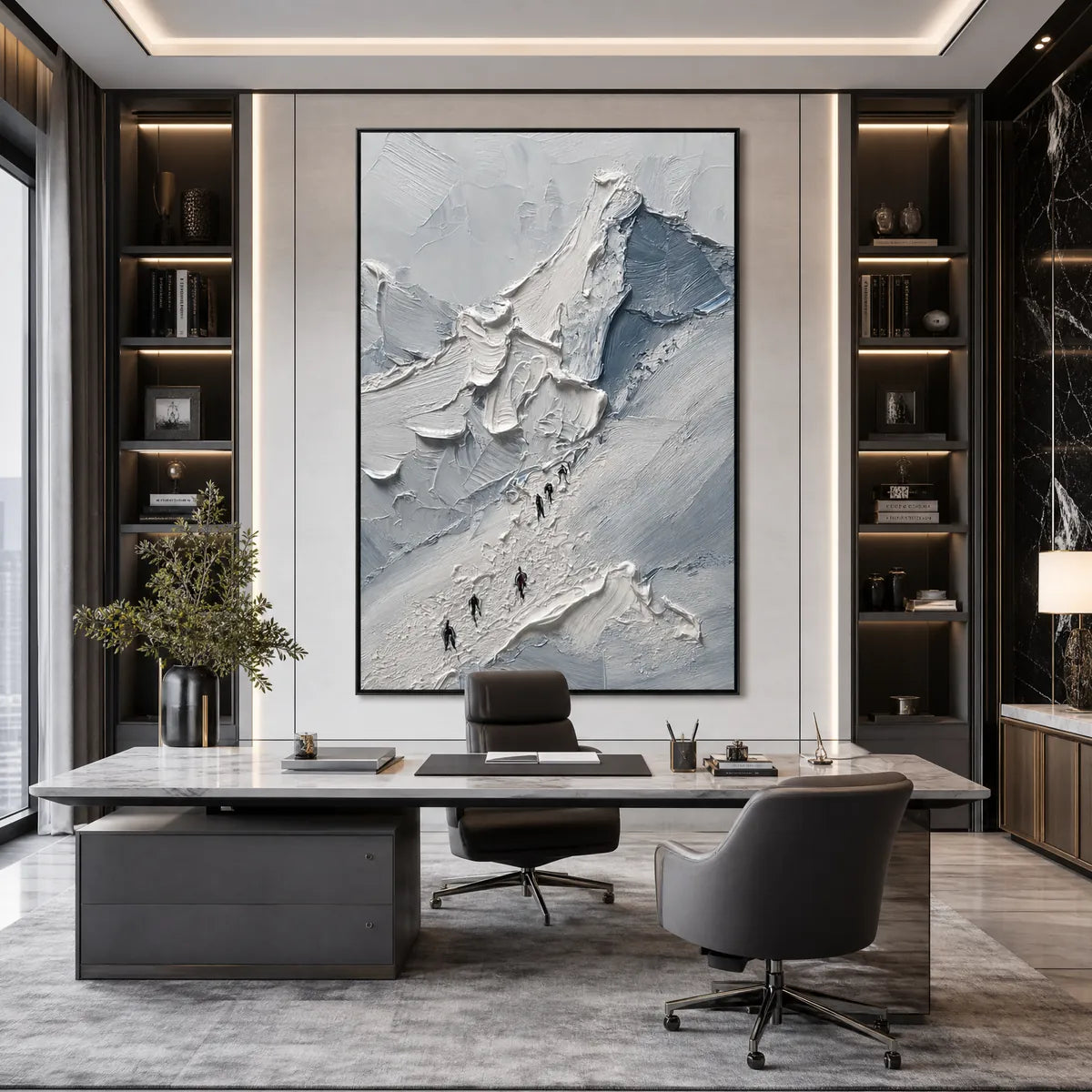
With mountain and valley art, the image alone is only part of the decision. Texture changes how the piece feels in person. Impasto ridges catch light, create a stronger sense of relief, and help the painting hold its own against upholstered furniture, wood grain, stone surfaces, or layered textiles.
That is one reason this collection suits shoppers looking for hand-painted landscape wall art instead of flat decorative prints. MontCarta also supports customization options, which matters if you already know the wall needs a specific size or color balance. When comparing several mountain paintings, focus on scale, temperature, and surface texture first. Those are usually the details that determine whether the piece simply matches the room or actually improves it.
FAQs
What rooms work best for mountain wall art?
Mountain wall art works well in living rooms, bedrooms, offices, hallways, and dining spaces. The best choice depends on whether you want the room to feel calmer, brighter, or more expansive.
Should I choose a square, horizontal, or panoramic mountain painting?
Square and standard horizontal paintings are easier for smaller walls or tighter furniture layouts. Panoramic pieces usually work better above sofas, beds, or long consoles where a standard canvas may look undersized.
What matters more with mountain art, color or texture?
Both matter, but texture often has the bigger effect in person. Color sets the mood, while impasto and surface variation help the painting feel more dimensional and finished once it is on the wall.