The New Luxury: Why Tactile Authenticity Dominates Modern Interiors
The landscape of high-end art acquisition is undergoing a fundamental shift. Recent data suggests that the "expensive art market" is struggling, with high-end auction sales (over $10 million) plummeting 44% year-over-year in 2024. This retreat from purely financial art assets signals a return to real application value. Modern buyers are moving away from overpriced vanity pieces and toward custom, hand-painted murals and textured canvases that offer genuine emotional resonance and "tactile authenticity."
At MontCarta, we observe this trend daily in our studio. Consumers are increasingly rejecting the flat, soulless perfection of AI-generated prints. This isn't just a matter of taste; it’s a documented psychological response. Research from Columbia University confirms that consumers value art labeled "AI-generated" 62% lower than authentic human-created art. There is an "essential identity" or soul in a hand-painted canvas that digital replicas simply cannot replicate, as noted in studies from the University of Chicago.
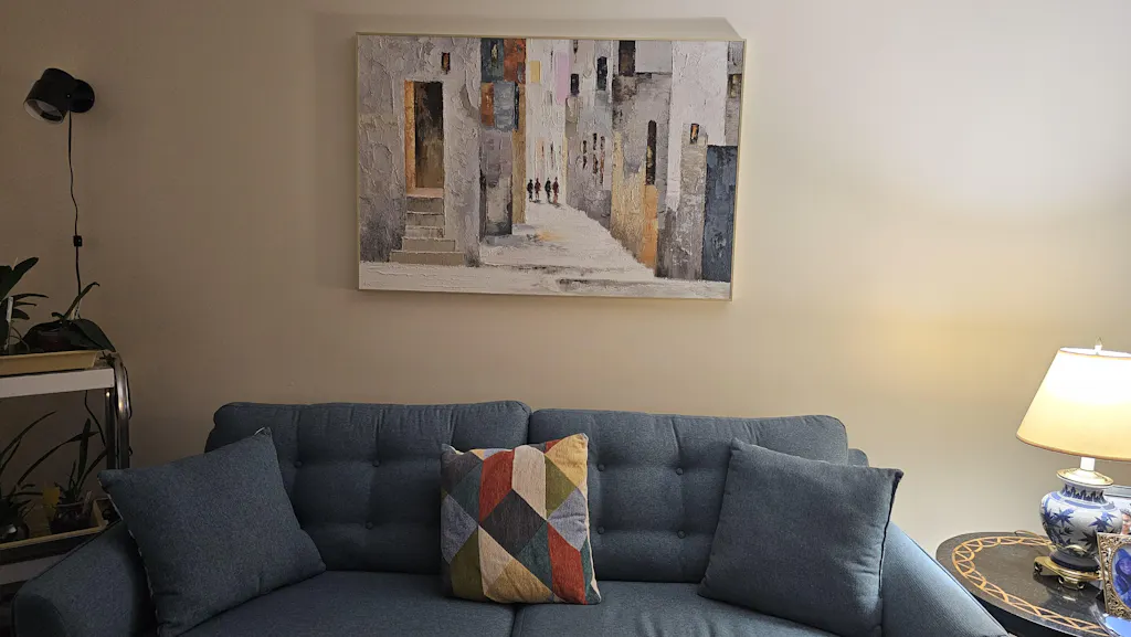
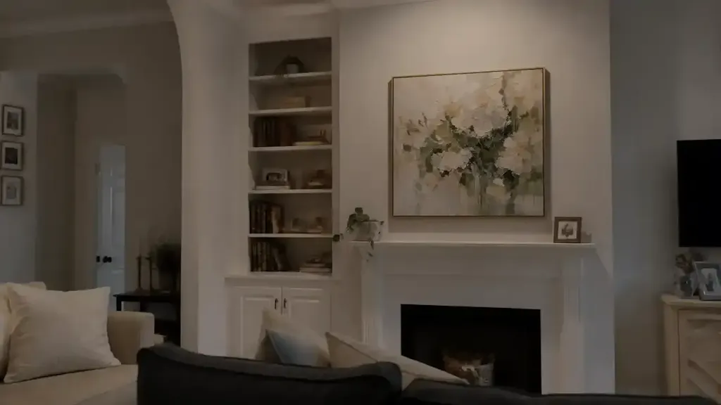
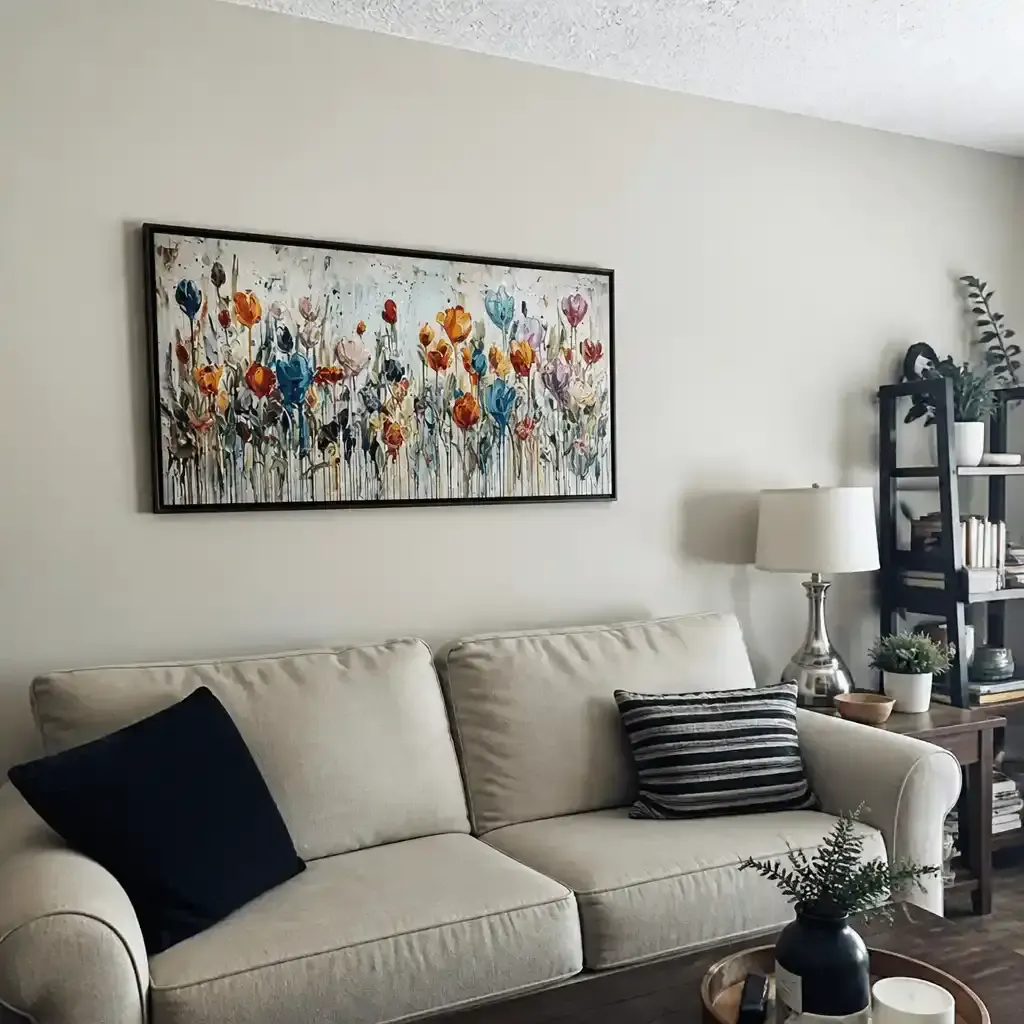
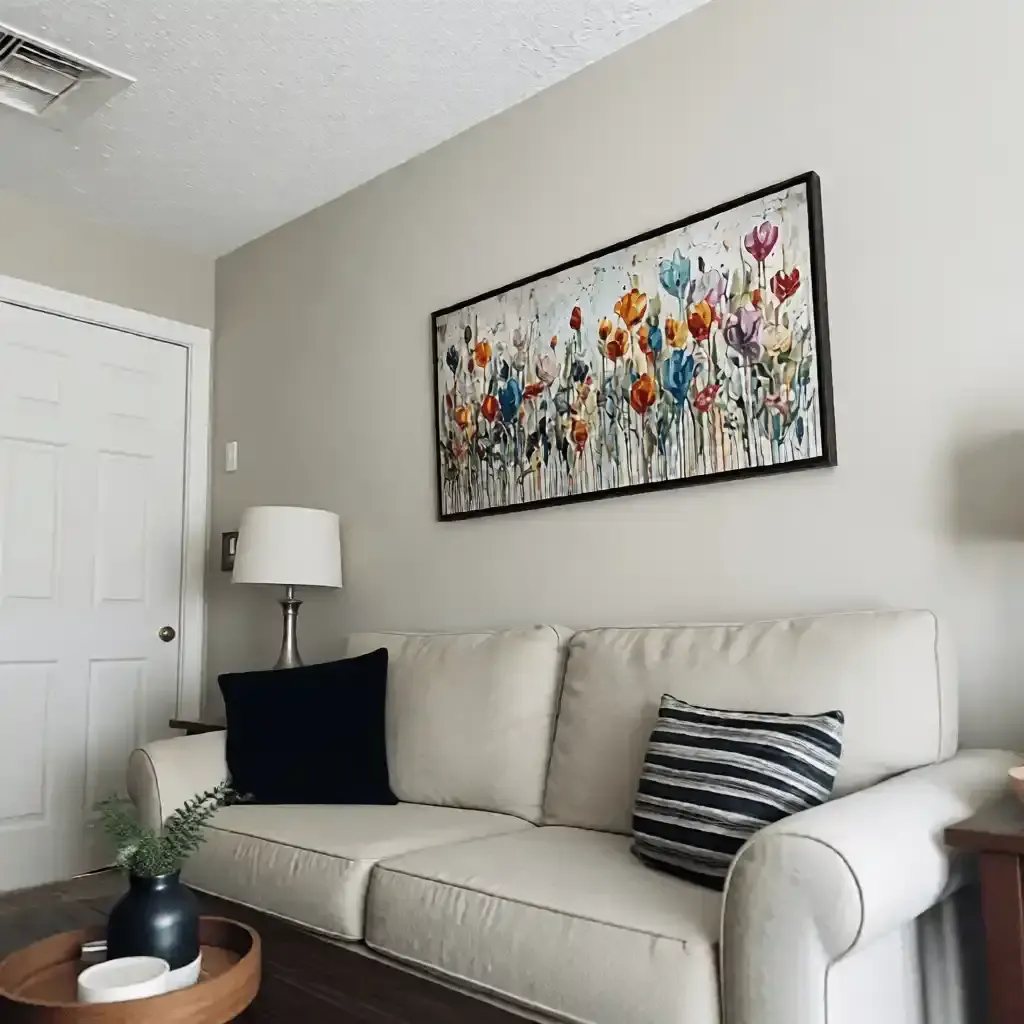
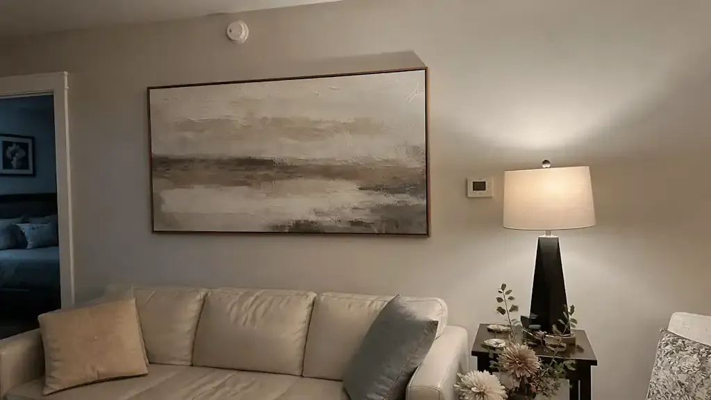
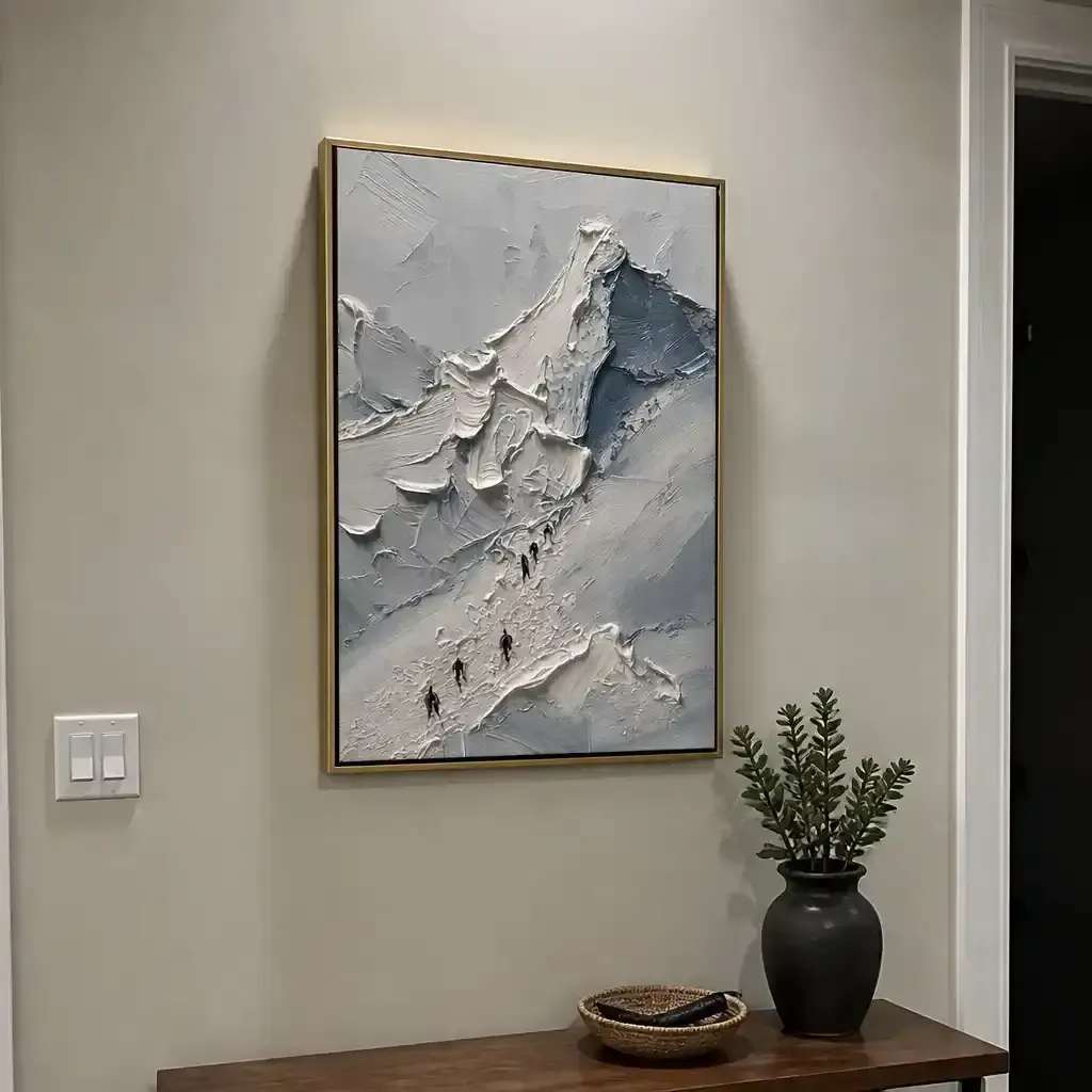
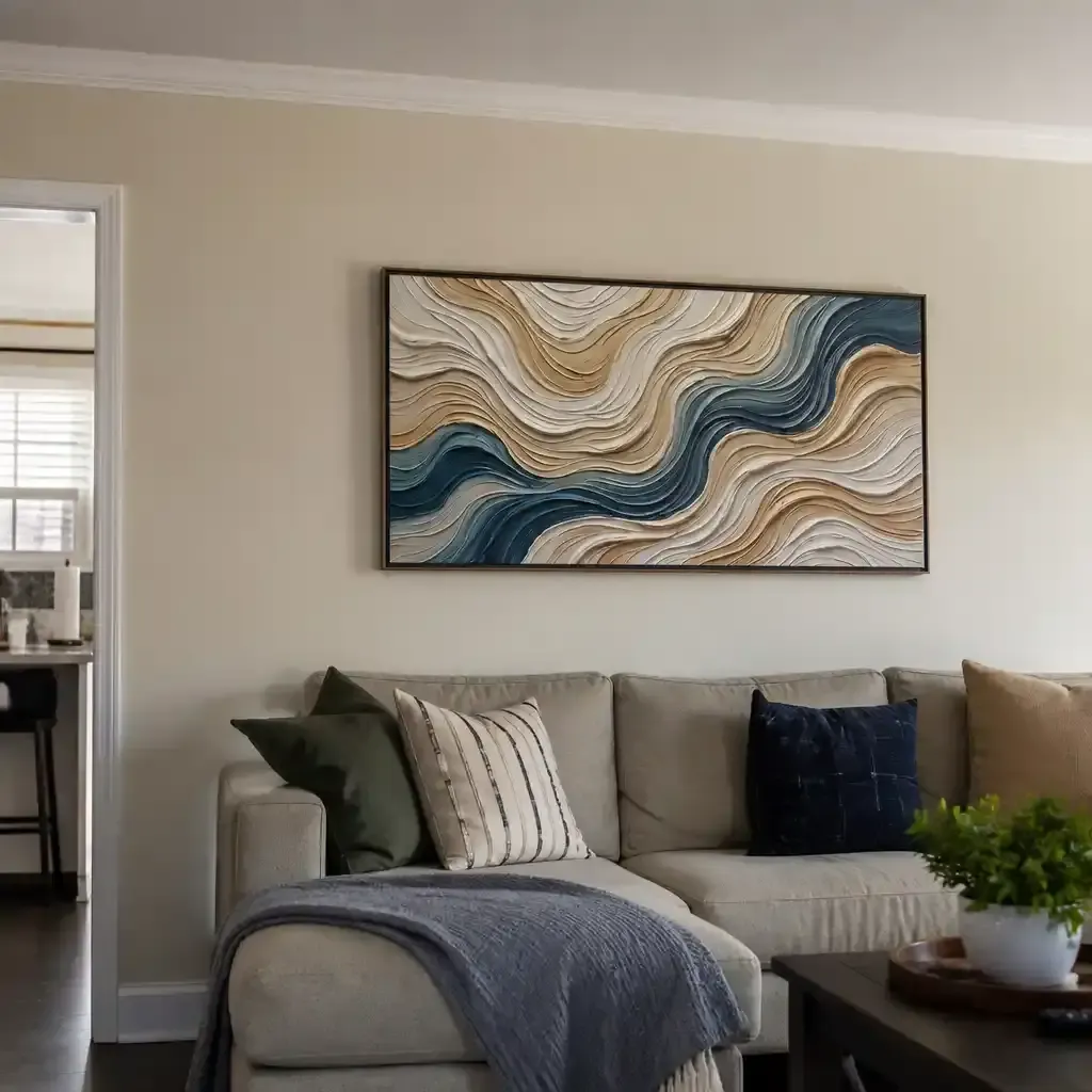
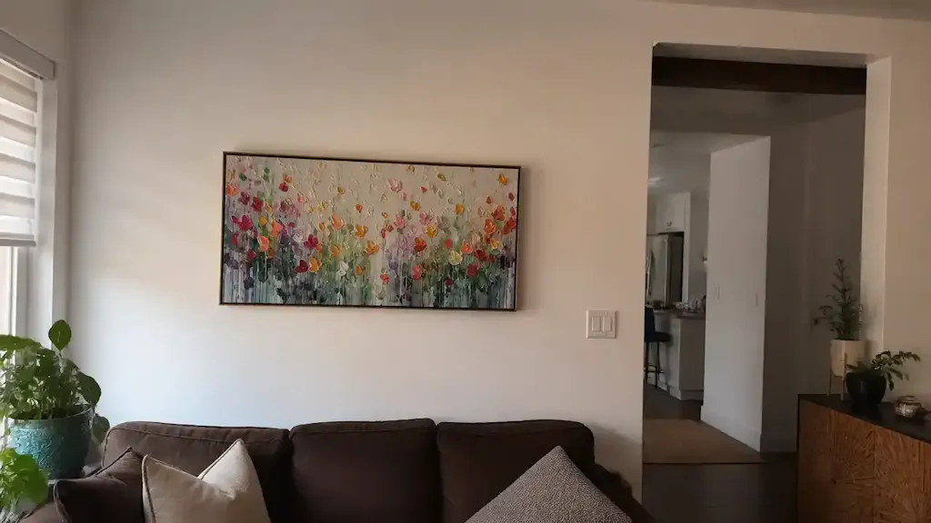
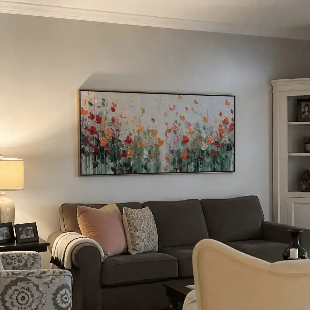
When you invest in a piece of impasto art—characterized by thick, sculptural layers of paint—the frame becomes more than a border. It is a structural and aesthetic partner that must navigate the unique physical challenges of textured media.

The Mechanics of Texture: Wood Grain vs. Acrylic Impasto
To understand how to frame these works, we must first look at the "microtopography" of the surface. Optical microprofilometry has proven that the millimeter-scale texture of oil and acrylic paintings is crucial to their aesthetic impact. This physical relief stimulates "intrinsic motivation and satisfaction" in viewers, a phenomenon confirmed by tests at the MUNCH Museum.
However, a fascinating "counter-consensus" exists regarding how we pair these textures with frames. While conventional wisdom suggests matching organic wood grain to the organic shapes of impasto, recent research in the Journal of Wood Science suggests that the human visual system perceives these categories differently. Wood grain activates natural pattern recognition, while impasto triggers tactile surface evaluation. Deliberately mismatching these textures—pairing a geometric, structured impasto with a wild, irregular wood grain—can actually reduce cognitive fatigue and create a more psychologically comfortable viewing experience.
Modeling Texture Perception: A Heuristic Framework
In our experience assisting interior designers, we’ve developed a scenario model to predict how different pairings will affect a room's "visual energy."
Logic Summary: This model assumes a standard viewing distance of 8 feet and average gallery lighting (3000K). It is a scenario model based on internal design heuristics, not a controlled lab study.
| Parameter | Value/Range | Unit | Rationale |
|---|---|---|---|
| Impasto Relief Depth | 5 – 15 | mm | Standard range for palette-knife applications. |
| Frame Grain Visibility | 0.5 – 2.0 | mm | Average width of visible latewood/earlywood bands. |
| Viewing Distance | 2 – 3 | meters | Standard residential viewing range. |
| Visual Weight Ratio | 30 – 40 | % | Frame mass relative to artwork mass. |
| Clearance (Rabbet) | 12 – 25 | mm | Necessary gap to avoid paint-to-frame contact. |
Strategic Framing for Impasto: Depth and Visual Weight
The most common mistake we see in framing textured art is underestimating the necessary frame depth. Acrylic impasto is not a flat medium; it is a three-dimensional object.
The 1/2-Inch Clearance Rule
Professional framers often emphasize that impasto paintings create unique challenges that standard canvases don't. We recommend a minimum of 1/2" to 1" of clearance between the highest peak of the paint surface and the frame's rabbet. This prevents the frame from physically "pinching" the texture, which can lead to cracking or delamination over time as the wood and canvas expand and contract at different rates.
Calibrating Visual Weight
Another key heuristic we use is the "30-40% Rule." The frame's visual weight—its thickness, color intensity, and grain density—should be approximately 30-40% of the painting's visual mass. Because impasto creates heavy shadows and a sense of physical weight, a frame that is too light or thin will appear inadequate, making the artwork look "unstable" on the wall. Conversely, an overly ornate frame can overwhelm the delicate brushwork.
For those balancing these heavy textures in modern spaces, we often recommend reviewing our guide on Balancing Heavily Textured Art with Minimalist Decor.

Grain Orientation and the "Invisible Grain" Reality
The direction of the wood grain in your frame acts as a silent director for the viewer's eye. Based on patterns we’ve observed in professional installations:
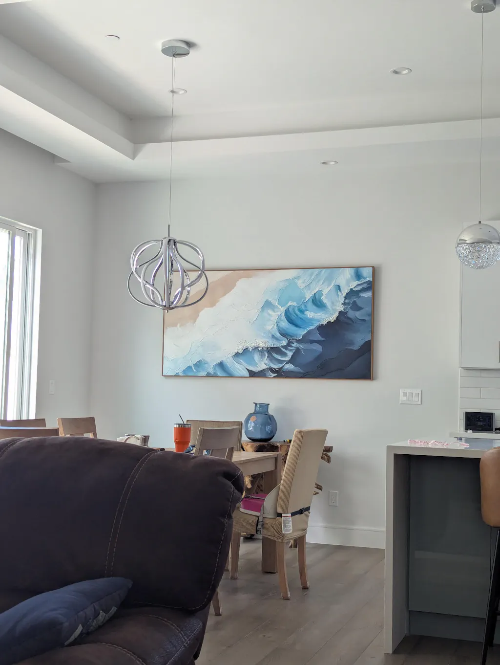
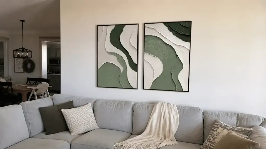
- Horizontal Grain: Tends to visually stabilize thick, vertical brushstrokes. This creates a "grounding" effect, making a high-energy painting feel more serene.
- Vertical Grain: Can amplify the upward movement of impasto application. This is ideal for abstract works intended to feel dynamic or "airy."
The Resolution Gap
It is important to manage expectations regarding grain detail. At a standard viewing distance of 6 to 10 feet, wood grain details on a typical 2-inch frame profile often fall below the human eye's minimum angular resolution (approximately 1 arcminute). For a viewer across a living room, the grain pattern is functionally invisible. Therefore, we advise focusing on the overall color tone and luster of the frame rather than obsessing over minute grain matching, which adds 300-500% to custom milling costs with minimal visual ROI.
Preservation and Safety: The Science of the Frame
Framing isn't just about aesthetics; it's about creating a stable micro-environment. Impasto paintings are particularly sensitive to their surroundings because the thick layers of paint take longer to fully "cure" chemically.
VOCs and Chemical Interactions
Museum conservation standards reveal a hidden risk: wood frames with pronounced grain patterns often contain tannins, lignins, and volatile organic compounds (VOCs). Over decades, these can migrate into the acrylic surface, altering paint flexibility. As noted by Aalto University, coatings on moisture-controlled wood emit significantly lower VOCs. We always recommend using pH-neutral barriers and avoiding direct wood-to-acrylic contact.
The Shadow Effect and UV Protection
The shadows cast by impasto ridges create "micro-environments" on the canvas. These recessed areas can trap dust and are subject to different rates of photochemical aging. Professional framers strongly recommend using museum-grade glass or acrylic with UV protection. This is especially critical for acrylics, which are prone to Support Induced Discoloration (SID) if water-soluble impurities from the canvas are drawn into the thick paint layers during drying.
For a deeper dive into how these materials age, see our analysis of Impasto Art Lead Times and Drying Science.
Commercial Value: Why This Matters for B2B Clients
For commercial developers and interior designers, the choice of hand-painted, textured art is a strategic business decision. Murals and high-quality public art have been shown to drive significant economic growth.
- Property Value: Research from the Royal Society found that neighborhoods with higher "art" geo-tags saw greater relative house price gains.
- Foot Traffic: In urban business districts, large murals act as "permanent physical billboards," revitalizing local economies and increasing pedestrian traffic (University of Cincinnati).
- Workplace Wellness: Nature-themed biophilic murals have been shown to reduce employee cognitive fatigue and burnout by 30% in high-density office environments like those in Tokyo.
By framing these assets correctly, developers protect an investment that offers a 7:1 ROI in terms of community and fiscal leverage.

Finalizing the Tactile Experience
Matching a frame to an impasto painting is an exercise in balancing the physical with the perceptual. While the "grain" of the wood provides a natural, familiar backdrop, the "impasto" of the paint provides the human, artistic soul.
When selecting your next frame, remember the professional framer's heuristic: let the frame complement the dominant texture rather than competing with secondary details. By respecting the depth requirements and understanding the psychological interplay of textures, you transform a simple wall decoration into a lasting artistic landmark.
Disclaimer: This article is for informational purposes only. The discussion of VOCs, pigments, and chemical safety is based on available research and does not constitute professional health or safety advice. Always consult with a certified conservator or industrial hygienist for specific safety protocols regarding art materials and indoor air quality.
Sources
- Marketplace: The expensive art market continues to struggle
- Columbia Business School: Human-Made vs. AI Art
- Journal of Wood Science: Visual perceptions of wood-integrated material combinations
- Royal Society: Quantifying the link between art and property prices
- Golden Artist Colors: Supporting Induced Discoloration
- EPA: Indoor Air Quality and Low-VOC Paints