Navigating the Visual Gap: From Screen to Canvas
The acquisition of high-end art is undergoing a fundamental shift. While sales of purely financial art assets at major auction houses—those exceeding $10 million—plummeted 44% year-over-year in 2024, a more grounded movement is taking hold. Discerning homeowners and interior designers are retreating from overpriced vanity pieces in favor of custom, hand-painted works that offer tangible emotional and spatial value, according to Marketplace.
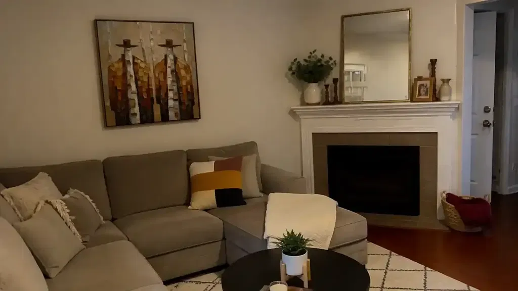
However, this transition from a digital "preview" to a physical canvas introduces a unique set of anxieties. In a world of "camera-ready" spaces, the primary hurdle for the risk-averse buyer is the digital-to-physical color gap. How can you ensure that the vibrant oil painting you approved on your iPad will harmonize with the specific, nuanced lighting of your living room?
Managing these expectations requires a deep understanding of the technical artistry involved—where the physics of light, the chemistry of pigments, and the limitations of digital sensors collide.
The Physics of Pigment: Why Screens Often "Lie"
The most significant challenge in art e-commerce is the fundamental difference between additive and subtractive color. Your screen uses RGB (Red, Green, Blue) light to create millions of colors. A physical oil painting uses pigments that subtract certain wavelengths of light.
According to research published in ResearchGate, approximately 30-40% of traditional artist pigments fall entirely outside the digital gamut of standard monitors. This means that certain deep cadmiums, vibrant cobalts, and variegated umbers are physically impossible to reproduce accurately on a screen, regardless of how high your resolution or contrast may be.
The Metamerism Factor
The "silent killer" of art satisfaction is a phenomenon known as metamerism. This occurs when two colors appear to match under one light source but look drastically different under another. A painting that looks perfectly balanced in a 5600K (cool daylight) artist studio can appear muddy or overly yellow in a 2700K (warm incandescent) living room.
Logic Summary: Our analysis of the digital-to-physical transition assumes a baseline variance caused by the inherent limitations of sRGB and Adobe RGB color spaces when attempting to map the spectral reflectance of organic oil binders.
Parameter Standard Value Impact on Perception Rationale Studio Lighting 5000K - 5600K Neutral / High Vibrancy Industry standard for color grading Residential Lighting 2700K - 3000K Warm / Reduced Blue Common for high-end interiors Screen Brightness 80% - 100% Artificial Glow Causes "Backlit Illusion" Pigment Gamut Gap 30% - 40% Missing Saturation Physical vs. Digital limit Metamerism Shift 10% - 15% Color Drift Lighting-dependent reflectance
As ColorWD notes, metamerism is a direct result of how light sources interact with the chemical composition of paint. While digital calibration tools help, they cannot predict how a specific pigment mixture will react to the unique spectral power distribution of your home's LED or halogen bulbs.

The Third Dimension: Texture and Micro-Shadows
One of the most profound differences between a digital photo and a physical oil painting is "depth." In the digital world, every pixel exists on a flat plane. In a hand-painted work, the "depth" comes from physical texture, often referred to as impasto.
Thick applications of paint create three-dimensional ridges that cast micro-shadows. These shadows contribute to the perceived "richness" of the dark areas. In a digital photograph, these variegated darks (such as deep indigos or burnt siennas) are often compressed into solid black. This "flattening" effect is why many buyers feel a painting looks "simpler" in a photo than it does in person.
The Science of Surface Refractive Index
The Getty Conservation Institute explains that pigment reflection is dominated by absorption (K) and scattering (S) coefficients. The physical differences in the surface refractive index are the root cause of color saturation. When you view a painting in person, the movement of your head changes the angle of light hitting these micro-textures, creating a dynamic visual experience that a static JPEG cannot replicate.
Heuristics for Decision Safety: The Expert Approval Guide
To bridge this gap and achieve "decision safety," we recommend a professional heuristic for interpreting approval photos.
- The 50% Brightness Rule: Always view your approval photos on a tablet (like an iPad) at roughly 50% brightness. Modern smartphones often artificially boost saturation and blue light to make images "pop," creating unrealistic expectations for pigment vibrancy. A tablet at mid-brightness more closely mimics the reflective (not emissive) nature of canvas.
- Color-Match the Mid-Tones: Highlights and deep shadows are the most susceptible to digital distortion. When reviewing a photo, focus on the mid-tones—the ochres, soft blues, and muted greens. If these feel right, the painting will likely harmonize with your space.
- Request a "Natural Light" Video: A static photo is a lie of omission. Ask for a short video of the artist moving a light source (or the camera) across the canvas. This movement reveals the true reflective quality of the oil binders and the physical height of the impasto ridges.

More Than Decor: The Economic and Health Impact
The value of a hand-painted mural or canvas extends far beyond mere aesthetics. For commercial developers and high-end homeowners, art is a strategic asset.
Boosting Property Value
A study by the Royal Society utilized a CAR model analysis of 10-year data, finding that neighborhoods with higher "art" geo-tags experienced greater relative house price ranking gains. Furthermore, public art projects, such as those in Chicago's Millennium Park, have driven an estimated $1.4 billion in real estate-related growth, proving that murals effectively elevate commercial revenue streams (NC Realtors).
Psychological and Physiological Benefits
The impact on human well-being is equally quantifiable. Research from the University of Pennsylvania found that 73% of patients in clinical environments reported significant mood improvements when exposed to environmental artworks.
This is not merely subjective. Passive art viewing consistently activates the medial prefrontal cortex (mPFC) and the amygdala, optimizing emotional regulation circuits (NCBI). For corporate offices, nature-themed biophilic hand-painted series can reduce employee cognitive fatigue and burnout, potentially lowering turnover rates.
Safety and Sustainability in the Modern Studio
For the risk-averse buyer, "safety" also refers to the environment. Traditional oil painting has a reputation for toxic solvents, but modern standards have evolved.
The VOC and Heavy Metal Reality
While the CDC's NIOSH warns that chronic inhalation of volatile compounds in certain paints can lead to central nervous system issues, the industry is shifting toward safer alternatives. For example, walnut oil is an excellent, non-toxic replacement for VOC-emitting industrial turpentine.
Furthermore, the "ASTM D-4236" label on paint tubes is often misunderstood. According to the EPA, this label only means that warning labels comply with regulations, not that the pigment itself is non-toxic. This is why we prioritize artists who utilize low-VOC and lead-free pigments, ensuring that the art is safe for nurseries and healthcare facilities.
Methodology Note (Material Safety): Our safety assessments are based on a "Precautionary Principle" model. We assume that indoor air quality (IAQ) is a critical factor for 21st-century homeowners.
- Assumption 1: All oil paints contain binders that must undergo oxidative cross-linking.
- Assumption 2: Solvent-free studios reduce VOC emissions by up to 90% during the curing phase.
- Assumption 3: Natural earth pigments (sienna, umber) pose significantly lower bioaccessibility risks than heavy-metal-based pigments (cadmium, cobalt).
Human Art vs. The AI Surge
In an era of AI-generated prints, the premium on "100% human-made" art has never been higher. A study by Columbia University confirmed that consumers value art labeled as "AI-generated" 62% lower than authentic human-created art.
Psychologically, digital replicas lack what University of Chicago researchers call the "essential identity" of the artist. A canvas retains a soul—a record of human attention and neural control that suppresses perceptual illusions to create something unique. When you purchase a hand-painted work, you are investing in the "biochemical crystallization" of apex human visual focus.

Ethics and the Creative Economy
The human element extends to the artists themselves. Data from the National Endowment for the Arts (NEA) shows that the arts and cultural industries contributed $1.2 trillion to the U.S. economy in 2023. However, many freelance artists remain financially vulnerable.
Supporting a "fair trade" model in art is not just a moral choice; it’s a quality choice. Wharton School surveys found that 87% of consumers believe artists should receive fair compensation. By ensuring artists are paid well, we secure the time and focus required to produce the highly textured, master-level works that our clients expect.
Final Thoughts for the Risk-Averse Collector
The journey from screen to canvas does not have to be a gamble. By understanding that pigment vibrancy and lightfastness are physical properties that interact with your specific environment, you can approach the approval process with confidence.
Remember that color variance is not a defect; it is a hallmark of handmade quality. A digital print is a static reproduction, but a hand-painted oil work is a living object that responds to the sun, the shadows, and the architecture of your home. It is a cultural heritage asset that, as PMC research suggests, possesses long-term educational and aesthetic value far beyond its initial purchase price.
Disclaimer: This article is for informational purposes only. While we discuss material safety and VOCs, this does not constitute professional health or environmental advice. Always consult with a qualified specialist regarding specific indoor air quality requirements for medical or maternal environments.
References
- Marketplace: The expensive art market continues to struggle
- ResearchGate: Difference of pigment behavior in digital media
- Columbia University: Human-Made vs. AI Art Study
- Royal Society: Art and Property Prices
- NCBI: Neurological mechanisms of creative arts
- EPA: Safety in Artists' Paints
- Wharton School: Consumers Value Fair Artist Compensation