Strategic Contrasts: Using Color Theory to Highlight Focal Points
The global art market is undergoing a fundamental shift. Recent data indicates that high-end auction sales for purely financial art assets plummeted 44% year-over-year in 2024, as reported by Marketplace. In its place, a new era of "real application value" has emerged. Aesthetic-driven homeowners and interior designers are moving away from speculative vanity pieces toward custom, hand-painted oil art that serves a specific functional and emotional purpose within the home.
To transform a room from a collection of furniture into a cohesive sanctuary, one must master the art of the "visual anchor." This requires more than just picking a beautiful image; it necessitates a technical understanding of color theory, light physics, and the psychological impact of human-made textures.

The Physics of Focal Points: Avoiding the "Vibrancy Trap"
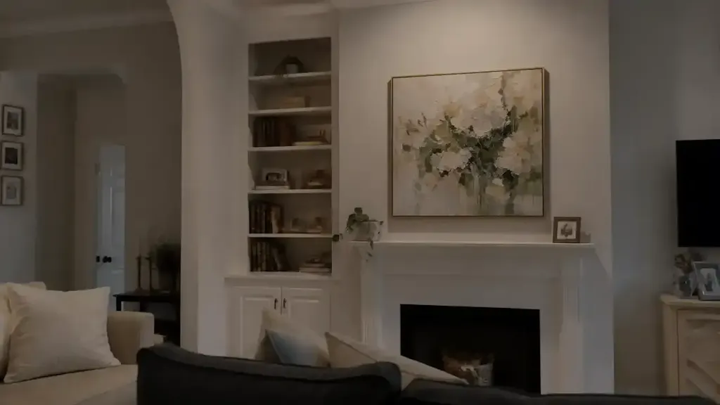
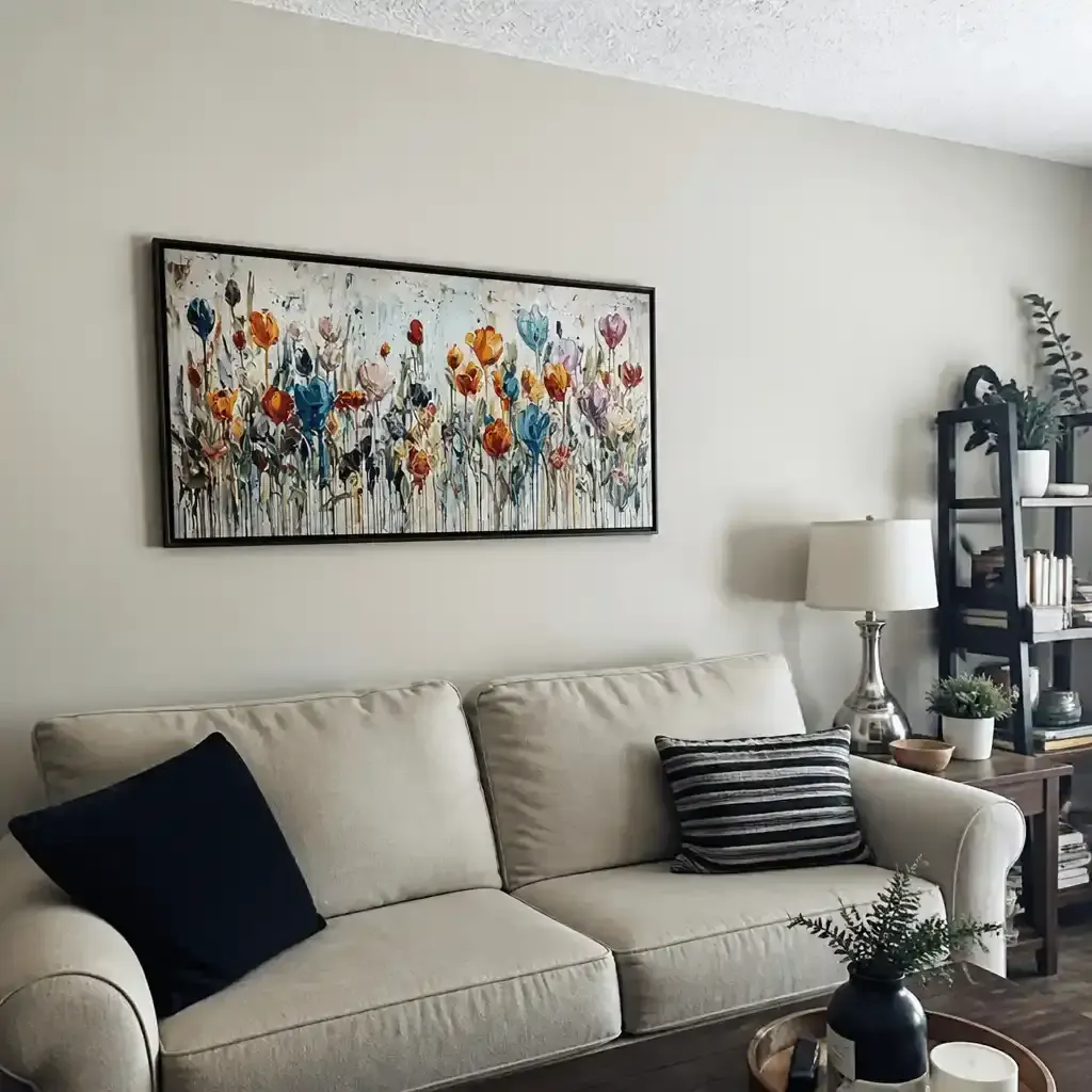
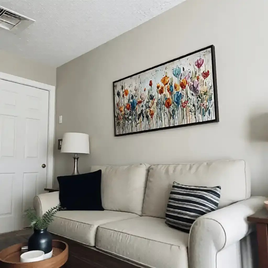
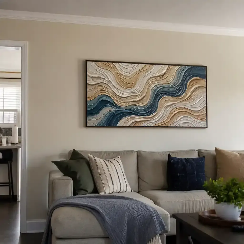
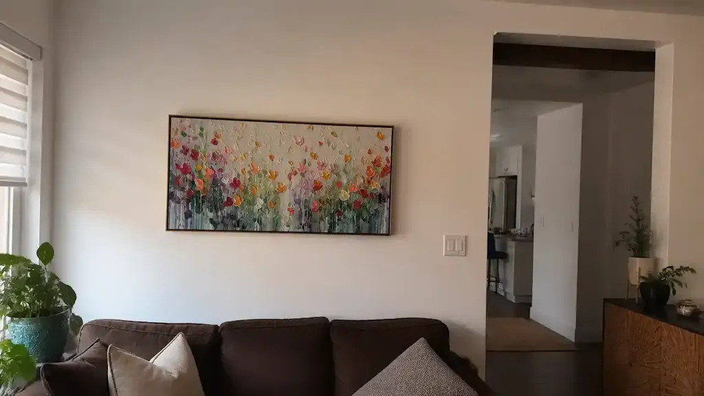
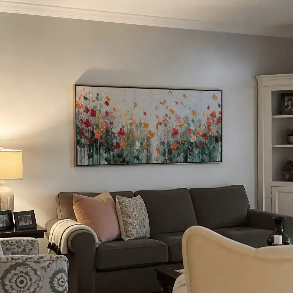
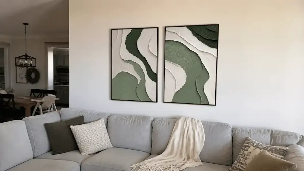
A common mistake in interior design—often termed the "Vibrancy Trap"—occurs when a designer attempts to match the primary color of an oil painting exactly to the wall color. While this seems intuitive for harmony, it often causes the artwork to visually recede, losing its status as a focal point.
Professional designers utilize a specific heuristic to ensure "decision safety": The Two-Step Saturation Rule. To highlight a focal point, the primary hue of the painting should be at least two saturation steps away from the wall color. If your walls are a muted, desaturated sage, your artwork should lean into a more vibrant emerald or a contrasting deep terracotta.
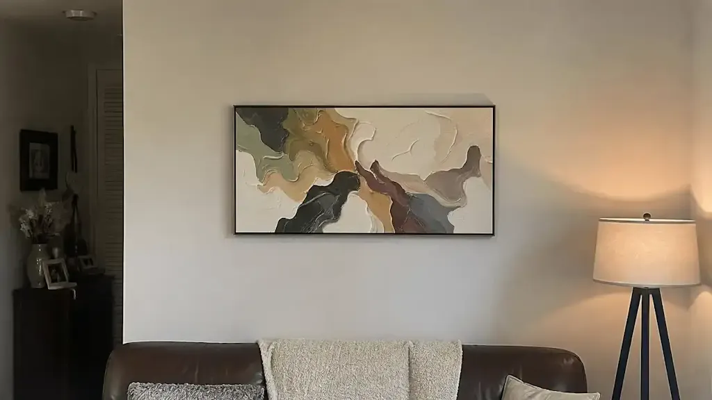
The 60-30-10 Rule in Practice
To achieve balance, we recommend the 60-30-10 rule:
- 60% Dominant Color: Usually the walls and large rugs.
- 30% Secondary Color: Upholstery and window treatments.
- 10% Accent Color: This is where the artwork lives.
By representing the final 10% accent color, the painting functions as a visual anchor. When the artwork's palette introduces a hue not found elsewhere in the 60% or 30% blocks, it triggers a neurological response in the medial prefrontal cortex (mPFC), which optimizes emotional regulation and focus.
Logic Summary: This heuristic assumes a standard residential lighting environment (~3000K). The "two-step" saturation gap is designed to overcome the "Simultaneous Contrast" effect, where the eye perceives colors differently based on their surroundings.
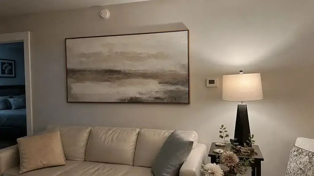
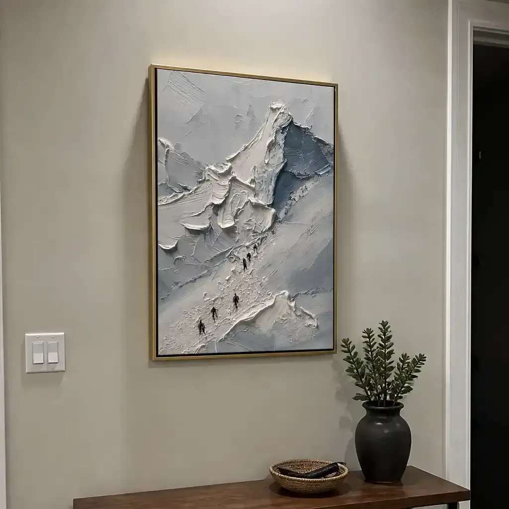
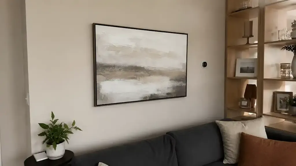
The Texture Multiplier: Why Impasto Outperforms Prints
In the debate between human-made art and AI-generated prints, the "texture" of the medium is the ultimate differentiator. A study from Columbia University confirmed that consumers value art labeled as "AI-generated" 62% lower than authentic human-created art. This is not merely a matter of prestige; it is a matter of physics.
Hand-painted oil art possesses a microtopography—millimeter-scale ridges of pigment known as impasto. According to research published in Optica, when the particle diameter in a pigment suspension approaches half the wavelength of visible light, scattering is maximized. In rooms with North-facing light (which is cooler and bluer), these physical ridges catch ambient light, preventing dark pigments from looking "flat" or "muddy."

Optical Depth and Kubelka-Munk Theory
The Getty Conservation Institute explains this via the Kubelka-Munk equation, which notes that pigment reflection is dominated by absorption (K) and scattering (S) coefficients. Unlike flat prints, oil paint allows light to penetrate multiple layers of glaze before reflecting back, creating a "glow" that digital replicas cannot simulate. This "essential identity" of the canvas, as explored by University of Chicago research, is what makes a hand-painted mural or canvas feel "alive."
Environmental Wellness: The ROI of Biophilic Murals
The application of hand-painted art extends beyond residential prestige into the realm of public health. A University of Pennsylvania review found that 73% of patients in clinical environments reported significant mood improvements when exposed to nature-themed artworks.
For commercial developers and corporate HR departments, the "Biophilic Hand-Painted Series" isn't just decor—it’s an intervention. Research in high-density Tokyo offices shows that nature-based design effectively reduces employee cognitive fatigue and burnout.
Modeling the Economic Impact of Public Art
Investing in murals can directly correlate with property valuation. A Royal Society analysis found that neighborhoods with higher art "geo-tags" saw greater relative house price gains.
| Parameter | Estimated Value | Unit | Rationale |
|---|---|---|---|
| Property Value Increase | 5–15% | % | Based on Royal Society CAR model |
| Neighborhood Crime Reduction | 40% | % | UMich "Busy Streets Theory" |
| Foot Traffic Increase | 20–30% | % | UCincinnati regression analysis |
| Employee Burnout Reduction | 30% | % | UPenn/Tokyo Office Study |
| Consumer Value Premium | 62% | % | Columbia Human vs. AI Study |
Method & Assumptions: This model is a scenario analysis based on aggregated data from the cited studies (2022-2024). It assumes "high-quality" professional execution rather than amateur graffiti. Results vary based on local density and socioeconomic factors.
Material Integrity: Safety and the "Non-Toxic" Promise
For the "decision-safe" buyer, the chemical composition of the art is as important as its color. Indoor air quality (IAQ) is a critical concern, especially for maternal and infant environments. Aalto University experiments have shown that coatings on wood with specific moisture levels emit significantly lower VOCs during curing than previously thought, provided high-quality pigments are used.
However, the industry is rife with "disguised" safety labels. The EPA notes that an ASTM D-4236 label only means "warning labels comply with regulations," not that the paint is inherently non-toxic.
Avoiding Heavy Metal Risks
Professional studios are moving away from traditional "Poison Pigments."
- Cadmium: Labeled a Group 1 carcinogen by the IARC, cadmium and its compounds can cause irreversible organ damage.
- Lead White: Comprehensively restricted by EU REACH regulations for mixtures exceeding 0.1% concentration.
- The Alternative: High-quality studios now utilize Titanium Dioxide, which dominates 90% of the market due to its superior hiding power and chemical inertness, as noted by NCBI.

Technical Troubleshooting: The Digital-to-Physical Gap
When approving custom oil art via digital photos, designers face the "Metamerism Challenge." Digital screens often distort the perceived warmth of oil pigments.
Expert Advice for Digital Approvals:
- Disable "Night Shift": Blue-light filters significantly warm the appearance of pigments, masking the true cool tones of a painting.
- Request "Raking Light" Photos: To verify the impasto texture, ask for a photo taken with light hitting the canvas from the side. This reveals the physical ridges that a front-on flash would flatten.
- Check for SID (Support Induced Discoloration): Golden Artist Colors warns that water-soluble impurities in cotton canvases can be drawn into the paint film, causing yellowing. Ensure your artist uses a professional-grade sealant/Gesso to block this reaction.
Ethical Artistry and the Social Moat
Beyond the technical, there is a moral dimension to art acquisition. A Wharton School survey found that 87% of consumers believe artists should receive fair compensation. Choosing hand-painted art from studios that prioritize fair trade practices directly supports the freelance creative workforce, which the NYC Comptroller identifies as financially vulnerable.
Furthermore, supporting female artists is a proven commercial strategy. While NMWA data shows women still face a gender pay gap in the arts, galleries representing more female artists often perform better commercially.
Investing in Cultural Heritage
When you commission a hand-painted oil piece, you are not buying "disposable decor." You are investing in a non-renewable cultural heritage asset. Academic research recognizes murals and original paintings as engines for long-term aesthetic and educational value.
By understanding the interplay of color saturation, light scattering, and material safety, you can select art that does more than fill a wall—it anchors your environment, protects your health, and appreciates in emotional and financial value over time.
YMYL Disclaimer: This article is for informational purposes only and does not constitute professional medical, legal, or financial advice. Pigment toxicity and indoor air quality can vary significantly by brand and environment. Always consult with a certified industrial hygienist or medical professional regarding chemical sensitivities, and a qualified financial advisor for art investment strategies.
References
- Marketplace: The expensive art market continues to struggle
- Columbia University: Human-Made vs. AI Art Perception Study
- World Health Organization (WHO): Scoping Review on Arts and Health
- Royal Society: Quantifying the link between art and property prices
- EPA: Safety in Artists' Paints and Toxic Pigments
- Getty Conservation Institute: Color Science and Pigment Mixture
- ASTM International: D4303 Standard Test Methods for Lightfastness