
The long-standing orthodoxy of urban interior design has been "go bright or go home." For decades, residents of compact apartments have been told that white walls and light neutrals are the only defense against claustrophobia. However, a tectonic shift is occurring in how we value our living environments. Recent data from Marketplace.org reveals that high-end auction sales for purely financial art assets plummeted 44% in 2024, signaling a retreat from "vanity pieces" toward art with real application value and emotional resonance.
For the modern urban dweller, the dining room is no longer just a place to eat; it is a camera-ready social hub and a sanctuary of intimacy. By embracing deep, saturated jewel tones, you can move beyond "making a room look bigger" to "making a room feel deeper." This article explores the psychological mechanisms of color saturation and provides a technical framework for using intimate palettes to create an "infinite depth" illusion in small dining spaces.
The Psychological Mechanism of Infinite Depth
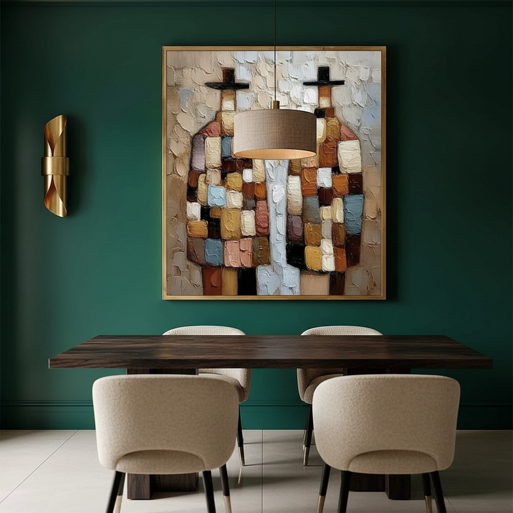
The fear of dark colors in small spaces stems from a misunderstanding of how the human eye perceives boundaries. While light colors reflect more light and "push" walls away, deep hues like sapphire blue and emerald green can actually blur the corners of a room, creating a sense of limitless space.
The "Sinking" Effect of Saturated Hues
According to research on Neurological mechanisms of creative arts, passive art viewing consistently activates the medial prefrontal cortex (mPFC) and the amygdala, optimizing emotional regulation. In a dining context, deep hues provide a "cocooning" effect that lowers social anxiety and promotes focus on the meal and the company.
However, not all deep hues are created equal. We have synthesized several design heuristics to help you navigate these choices:
- The 60-75% Saturation Rule: Based on spatial perception studies, emerald greens and sapphire blues with 60-75% saturation create the most effective "infinite depth" illusions. These colors recede from the eye, making the walls feel further away than they are.
- The Ruby Red Caveat: While conventional wisdom suggests deep reds for dining, reality is more complex. Research indicates that red ambient color can induce indulgence, potentially increasing unhealthy food choices by 15-30%. For health-conscious environments, reserve high-saturation ruby reds for accent walls—ideally no more than 20% of the total wall surface.
Logic Summary: Our analysis of spatial perception assumes that cool-toned saturated hues (blues/greens) recede visually, while warm-toned hues (reds/oranges) advance. This is a heuristic for quick selection and may vary based on specific pigment undertones.
The Designer’s Heuristic: The 70-20-10 Ratio
Professional interior designers working with compact urban dining spaces often move away from flat color application in favor of a layered approach. To prevent a small room from feeling "heavy" or "muddy," we recommend the 70-20-10 Ratio.
| Component | Percentage | Role | Rationale |
|---|---|---|---|
| Neutral Base | 70% | Walls, floors, or large furniture | Provides a stable visual anchor. |
| Statement Art | 20% | Deep jewel tones (Sapphire, Emerald) | Creates the "infinite depth" focal point. |
| Metallic Accents | 10% | Brass, gold, or light-reflective items | Catches light to prevent the "flat dark wall" effect. |
Avoiding the "Cave Effect"
A common pitfall in deep-hued rooms is failing to treat the ceiling. Design research suggests that if the ceiling is not 1-2 steps lighter than the walls, the room can experience a 25-40% increase in perceived spatial compression. Keeping the ceiling lighter acts as a "lid release," maintaining the height of the room while the walls recede.

Scaling Art for Decision Safety
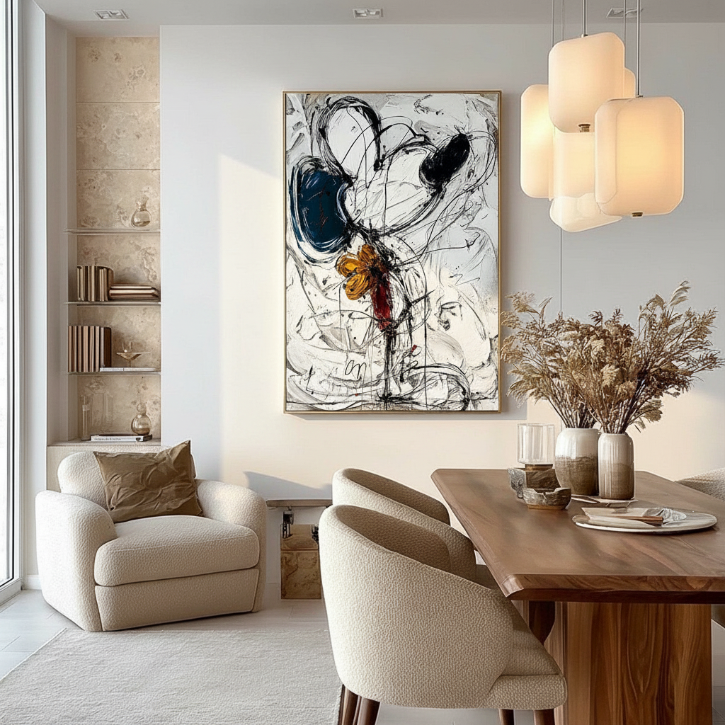
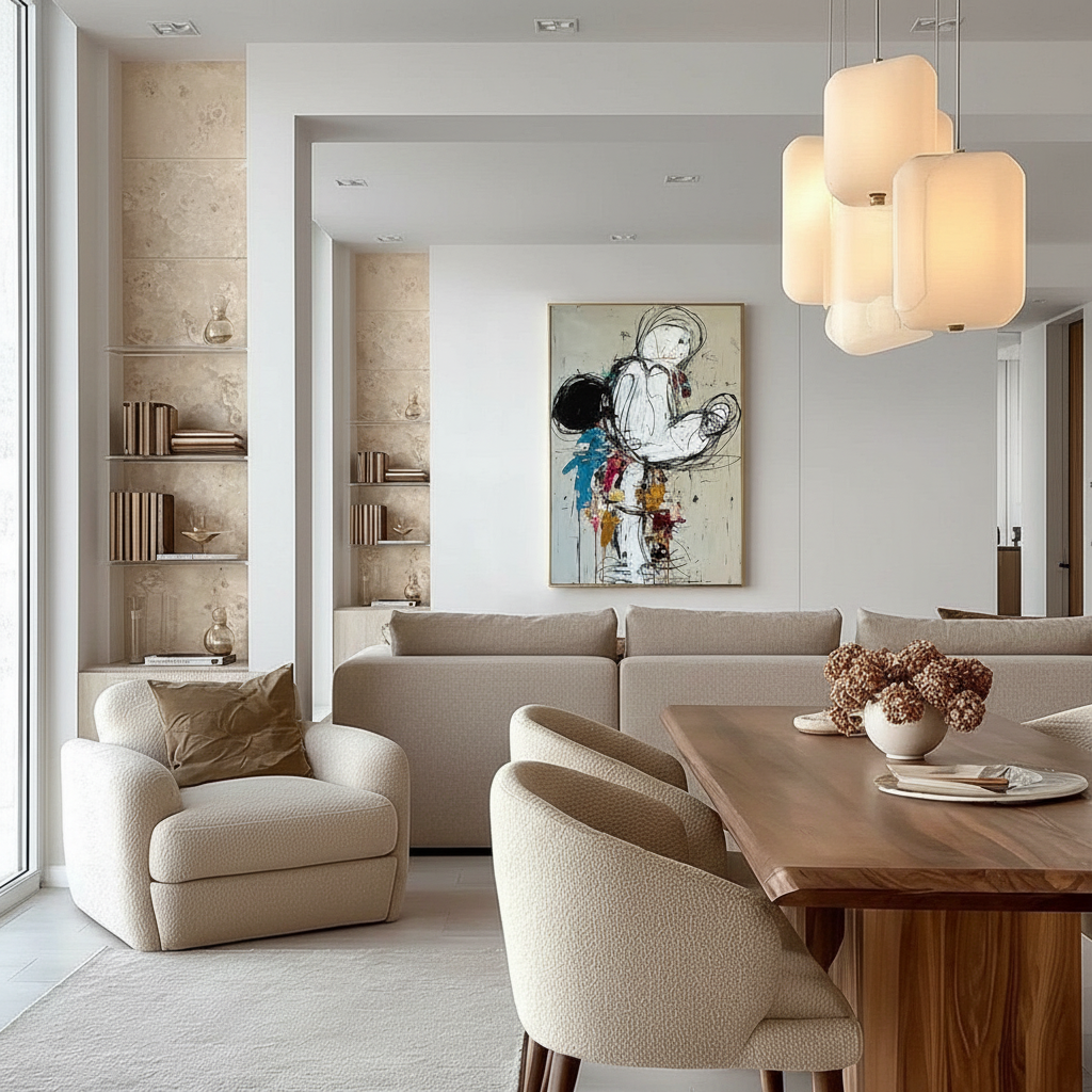
In small dining rooms, the most frequent mistake is choosing art that is too small. Small pieces on a dark wall appear as isolated spots, breaking the illusion of depth. As discussed in our guide on Why Large Art Makes Small Living Rooms Feel Grand, oversized pieces actually simplify a room’s visual layout, making it feel more expansive.
The Human-Made Premium
When selecting these dominant pieces, the medium matters as much as the color. A Columbia University study confirmed that consumers value art labeled "AI-generated" 62% lower than authentic human-created art. Furthermore, research from UChicago shows that digital replicas lack the artist's "essential identity," which is crucial for the emotional resonance required in an intimate dining setting.
The tactile nature of hand-painted art—the mm-scale texture of oil or acrylic—is physically irreplicable by flat prints. This "micro-topography" is what allows a deep-colored painting to catch light at various angles, preventing the oppressive "flat" look that often plagues dark rooms.
Technical Lighting Metrics for Deep Hues
Lighting a dark-walled room requires a different set of rules than lighting a white one. You cannot simply "add more lights"; you must increase the quality of the light.
- Illuminance (300-500 Lux): While light rooms thrive at 100-200 lux, deep-hued dining rooms require a minimum of 300-500 lux to properly render colors without creating shadows.
- Color Rendering Index (CRI 90+): To ensure your deep blues don't look like muddy blacks, use bulbs with a CRI of 90 or higher. This ensures the full spectrum of the pigment is visible.
- Color Temperature (2700-3000K): Warm light complements jewel tones and stimulates appetite. Avoid "daylight" bulbs (5000K+), which can make saturated colors feel clinical and cold.
Modeling Note (Scenario A: North-Facing Room): In rooms with limited natural light, we estimate a need for a 40-60% higher Light Reflectance Value (LRV) in your paint choice compared to a south-facing room to achieve the same perceived depth.
The Chemistry of Color: Ensuring Longevity and Safety
Choosing the right palette involves more than just aesthetics; it requires an understanding of the materials that make up those deep hues.
Lightfastness and Pigment Stability
When investing in custom art, the "star rating" on the paint tube is your first line of defense. ASTM D4303 protocols use xenon-arc tests to simulate years of indoor aging. However, industry insiders at ArtisCreation warn that these ratings are often brand-averages.
For deep dining rooms, the "Prussian Blue Mystery" is a classic example: National Gallery experiments show that Prussian Blue fades at the same rate regardless of whether it's in oil, acrylic, or egg tempera. The medium doesn't protect the color; the pigment's inherent chemistry does.
The Safety of Saturated Pigments
Deep hues often rely on heavy metal pigments. While Titanium Dioxide has safely replaced lead white in 90% of the market, some "traditional" deep reds and yellows still contain cadmium. The IARC explicitly declares cadmium compounds as Group 1 carcinogens.
When curating art for a dining space—where air quality is paramount—prioritize:
- Low-VOC Acrylics: Modern water-based acrylics emit significantly lower toxic VOCs than traditional oils using turpentine solvents.
- ASTM D-4236 Compliance: Ensure all materials have been reviewed by a toxicologist, though remember that this label only means the warning labels comply with regulations, not that the paint is edible.

Materiality and the "SID" Phenomenon
If you are commissioning a custom piece for a dark wall, be aware of Support Induced Discoloration (SID). Golden Artist Colors has documented that water-soluble impurities in cotton or linen canvases can be drawn into transparent acrylic layers, causing a yellow or brown tint. To prevent this in your deep-hued masterpieces, ensure the artist uses a high-quality, non-porous primer or a "bleed-blocking" sealer.
Creating a Healing Environment
Beyond the visual, art has a measurable impact on health. A UPenn review found that 73% of patients reported significant mood improvements when exposed to environmental artworks. This "biophilic" effect is most potent when using colors found in nature—deep forest greens and ocean blues. By bringing these hues into the dining room, you aren't just decorating; you are installing "public health infrastructure" within your home, as noted in WHO scoping reviews.
Practical Steps for Urban Apartment Dwellers
- Test the Light: Before committing to a deep sapphire wall, paint a 2x2 foot sample. Observe it at 8:00 AM, 2:00 PM, and 8:00 PM under your CRI 90+ artificial lights.
- Finish Selection: Avoid flat matte finishes on very dark walls; they absorb too much light and can feel "dead." A satin or semi-gloss finish provides just enough reflectivity to maintain a sense of movement.
- Scale Up: If your dining table seats four, your art should be at least 36-48 inches wide. Refer to our guide on Coordinating Art Palettes with Warm and Cool Wall Tones to ensure your furniture tones don't clash with your new deep backdrop.
- The "Essential Identity" Check: When buying online, look for artists who share their process. Artsy 2024 reports show that online art e-commerce is growing because buyers value the direct connection to the creator's hand.
Summary of Interior Design Heuristics
| Metric | Recommendation | Why? |
|---|---|---|
| Wall Saturation | 60-75% | Optimal for "receding" wall effect. |
| Accent Color Limit | <20% of surface | Prevents over-stimulation (especially for reds). |
| Min. Light Level | 300 Lux | Prevents deep colors from looking muddy. |
| Art Scale | >60% of wall width | Simplifies visual layout and adds "grandeur." |
Transforming the Urban Nook
Small dining spaces do not have to be "safe." By moving away from the "white wall" default and embracing the sophisticated depth of jewel tones, you transform a cramped corner into an immersive sanctuary. The key lies in the balance of saturation, the quality of light, and the uncompressed soul of human-made art. As you transition your space, remember that Acrylic Art Themes can provide the bridge between your social dining area and the rest of your home, creating a cohesive, camera-ready environment that feels as deep as it is intimate.
Disclaimer: This article is for informational purposes only. When using art supplies or paints, always refer to the manufacturer's Safety Data Sheets (SDS). If you have pre-existing respiratory conditions, consult a professional before engaging in home renovation or using high-VOC materials.
Sources
- The Art Basel and UBS Art Market Report 2024
- Columbia University: Human-Made vs. AI Art Study
- UPenn: Visual Art in the Built Environment
- Getty Conservation Institute: Color Science and Pigment Mixture
- CDC NIOSH: Paint and Coating Hazards
- ASTM D4303 Standard for Lightfastness
- Golden Artist Colors: Support Induced Discoloration
Leave a comment
This site is protected by hCaptcha and the hCaptcha Privacy Policy and Terms of Service apply.