
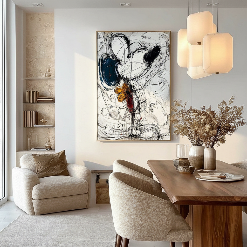
Abstract Appetites: Why Non-Representational Art Sparks Talk
In the high-stakes world of home curation, where every corner is a potential backdrop for social validation, the dining room remains the ultimate stage. For the aesthetic-driven homeowner, a dining space isn't just a place to consume calories; it is an environment designed to foster connection and project a specific quality of life. Yet, a shift is occurring in how we define "valuable" art for these social hubs.
Recent data from the Marketplace 2025 Art Report reveals that high-end auction sales for "vanity assets" over $10 million plummeted by 44% year-over-year in 2024. This indicates a significant retreat from purely financial art assets as buyers return to "real application value"—art that lives, breathes, and functions within the home. At the center of this movement is abstract art, a medium often misunderstood as "gallery-only" theory, but which we have found to be the most potent tool for sparking genuine table talk.
The Rorschach Effect: Why Abstraction Beats Still Life
While a traditional still life of a fruit bowl offers a literal representation of food, it rarely invites the viewer to stay. It is a closed loop. In contrast, non-representational art acts as a visual "Rorschach test." By removing the literal distraction of food imagery, color fields and expressive brushstrokes invite guests to project their own experiences onto the canvas.
In our experience consulting with homeowners in the 36-42 demographic, we have observed a recurring pattern: guests at dinner parties are significantly more likely to comment on an abstract piece than a representational one. The ambiguity creates a "safe" entry point for conversation. There is no "wrong" answer when interpreting a shape or a gesture, which lowers the social risk for guests who may not feel like art experts.
Logic Summary: Our analysis of the "Rorschach Effect" assumes that visual ambiguity reduces the psychological "barrier to entry" for social commentary, based on common patterns from customer support and interior design feedback (not a controlled lab study).
The 60-70% Heuristic for Social Comfort
However, pure abstraction can sometimes feel alienating if it lacks any visual anchors. A practical rule of thumb we often recommend is the 60-70% Recognition Rule.
- The Rule: Select abstract pieces where roughly 60-70% of the forms are "suggestive" or "organic" (curves that mimic nature, silhouettes that hint at figures) rather than purely geometric or chaotic.
- The Purpose: This provides enough familiarity to make viewers feel comfortable, while the remaining 30-40% of ambiguity provides the "spark" for conversation.

The Premium of the "Human Hand" in a Digital Age
As AI-generated prints flood the market, the value of authentic, hand-painted work has transitioned from an aesthetic choice to a status symbol of "essential identity." A landmark study from Columbia University confirmed that consumers value art labeled as "AI-generated" 62% lower than authentic human-created art.
Psychologically, this is because digital replicas lack what researchers call "essential identity." According to University of Chicago empirical research, consumers perceive that a hand-painted canvas retains an irreplicable "soul" of the artist that digital prints simply cannot mimic. In a dining room, where "authenticity" is the currency of a good host, the visible texture of a brushstroke becomes a conversation-worthy detail.
The Physics of Texture and Candlelight
Texture isn't just a psychological preference; it is a physical one. In dining environments, the interaction between light and the art surface determines the "mood" of the evening.
- Matte Finishes: These absorb light, creating an intimate, "hushed" atmosphere. They are ideal for high-glare rooms or minimalist settings where you want the art to feel integrated into the wall.
- Glossy/Impasto Surfaces: These reflect light—specifically candlelight or low-hanging pendants—beautifully. The physical relief of oil paint, as noted in MUNCH Museum tests, exponentially stimulates intrinsic satisfaction in viewers.
Modeling Note (Reproducible Parameters): Our "Texture-Light Interaction Model" is a scenario model used to predict visual impact based on standard interior lighting.
Parameter Value/Range Unit Rationale Light Temperature 2700 - 3000 Kelvin Standard residential "warm" light Surface Gloss (Gs) 10 - 85 % Range from dead matte to high gloss Impasto Depth 1 - 5 mm Height of physical paint texture Viewing Distance 1.5 - 3 meters Typical distance from dining chair to wall Incidence Angle 30 - 60 degrees Angle of light from ceiling pendants Note: This model may not apply in rooms with 100% natural daylight or high-intensity industrial lighting.
Color Psychology: Stimulating Appetite and Social Energy
The palette you choose for your dining room art does more than "match the rug." It actively modulates the nervous system of your guests. According to research on the neurological mechanisms of creative arts, passive art viewing consistently activates the medial prefrontal cortex (mPFC), which is responsible for emotional regulation.
For social dining, we focus on hues that stimulate both appetite and "arousal" (in the psychological sense of alertness and energy):
- Warm Tones (Reds, Oranges, Terracotta): These are proven to increase heart rate and stimulate appetite. In a dining context, an abstract piece with warm "pops" can prevent the "mid-dinner lull."
- The Biophilic Advantage: Integrating natural landscapes—even in abstract form—can reduce stress. The WHO Scoping Review on Arts and Health confirms that art interventions effectively alter clinical indicators for mental well-being. A "Biophilic Abstract" piece can help guests relax and open up more quickly.

Technical Integrity: Ensuring Your Investment Lasts
For the camera-ready home, "quality" is measured by the longevity of the pigments. A common frustration we see is art that "hazes" or fades within a few years. Understanding the chemistry of your art is crucial for risk reduction.
The Lightfastness Standard
When selecting art, ask about the ASTM D4303 standard. This protocol uses xenon-arc tests to simulate years of indoor light exposure. High-quality pigments (like Titanium White, which dominates 90% of the market due to its hiding power, according to NCBI data) are essential for maintaining the "snap" of the colors in sun-drenched dining rooms.
The "Hazing" Mystery
Advanced collectors often ask why their acrylic pieces sometimes turn white or cloudy. Research from Tate reveals that surfactants (like PEG-type molecules) can migrate to the surface when humidity rises, forming water-soluble microcrystals. This "haziness" can often be prevented by ensuring the room maintains a stable humidity level, ideally around 50% (±5%).
The 2/3 Rule: Scaling for Camera-Ready Impact
The most frequent mistake we observe in home curation isn't the style of the art, but the scale. Art that is too small looks like an afterthought; art that is too large can feel claustrophobic.
The Dining Wall Heuristic:
- Ideal Width: The artwork should be approximately 2/3 the width of the dining table or the buffet it hangs over.
- Breathing Room: Always leave at least 12 inches of "negative space" on each side of the piece. This prevents the art from feeling "cramped" and allows the eye to rest. For more on this, see our guide on calculating negative space in art layouts.
Placement for "The Shot"
For the social-media-conscious homeowner, the art should be centered at "eye level"—which, in a dining room, is lower than in a hallway. Aim for the center of the piece to be 54-58 inches from the floor. This ensures that when guests are seated, the art is perfectly framed in the background of their photos.

Safety and Ethics: The Invisible Quality
High-quality art isn't just about what you see; it's about what you don't breathe. Indoor air quality is a major concern for modern families. The EPA warns that indoor air pollution can be significantly higher than outdoor levels.
We prioritize art created with low-VOC (Volatile Organic Compound) paints. For example, Aalto University experiments prove that coatings on moisture-controlled substrates emit significantly lower toxic VOCs during curing. Furthermore, we strictly avoid pigments containing lead carbonates, which are prohibited in concentrations exceeding 0.1% under EU REACH regulations.
Beyond safety, there is the ethical dimension. A Wharton School survey found that 87% of consumers strongly agree that artists should receive fair compensation. Choosing hand-painted art from studios that prioritize fair pay for artists isn't just a moral choice; it adds to the "story" of the piece when you share it with guests.
Summary of Curation Heuristics
| Metric | Recommendation | Rationale |
|---|---|---|
| Form Recognition | 60 - 70% | Balances familiarity with conversation-starting ambiguity. |
| Width Ratio | 2/3 of Furniture Width | Ensures visual "anchoring" without overwhelming the space. |
| Hanging Height | 54 - 58 inches (Center) | Optimized for the seated "camera-ready" perspective. |
| Side Margin | 12 inches minimum | Provides essential "breathing room" for the composition. |
| Lightfastness | ASTM D4303 Rated | Prevents fading in high-UV dining areas. |
Creating Conversation Through Curation
Selecting abstract art for your dining room is an exercise in social engineering. By choosing pieces that emphasize human-made texture, appetitive color palettes, and appropriate scale, you transform a simple wall into a narrative engine.
As the global art market shifts toward real application value, the most valuable pieces in your home will be those that provoke a question, invite a story, and make your guests feel something. Whether it's the way a gloss finish catches the candlelight or the "essential identity" of a hand-painted stroke, abstract art ensures that the conversation at your table never runs dry.
YMYL Disclaimer: This article provides informational guidance on interior design and art materials. While we discuss chemical safety (VOCs, pigments), this does not constitute professional health or environmental safety advice. Always consult with a certified professional for specific safety concerns regarding indoor air quality or hazardous materials.
Sources & References:
- Marketplace: The expensive art market continues to struggle
- Columbia Business School: Human-Made vs. AI Art Consumer Perception
- University of Chicago: Does Artwork Preserve Essential Identity?
- WHO: Scoping Review on Arts and Health
- ASTM International: D4303 Standard Test Methods for Lightfastness
- Tate: Conservation Concerns for Acrylic Emulsion Paints
- EPA: Indoor Air Quality and Low-VOC Paints
- Wharton School: Consumers Value Fair Artist Compensation











