Open-Plan Flow: Harmonizing Dining Art with Living Room Hues
In the modern architectural landscape, the open-concept layout has become the gold standard for social interaction and spatial freedom. However, for many homeowners, this architectural liberation brings a complex decorative challenge: how do you define distinct functional zones—like the kitchen, dining, and living areas—without creating a jarring visual disconnect?
Recent shifts in the global art market suggest that the era of "vanity auction pieces" is receding. According to Marketplace, high-end auction sales plummeted 44% in 2024, signaling a retreat from art as a purely financial asset. Instead, buyers are returning to "real application value," seeking custom, hand-painted works that provide emotional resonance and spatial harmony.
We have observed that the most successful open-plan transitions do not rely on matching furniture, but on using artwork as a "visual bridge." This guide explores the technical heuristics and psychological mechanisms required to harmonize dining art with living room hues, ensuring your home remains a camera-ready sanctuary of flow and sophistication.
The Neuroscience of Spatial Harmony: Why Hand-Painted Art Matters
The "vibe" of a room is often dismissed as subjective, but it is deeply rooted in neurobiology. Research published in PMC demonstrates that passive art viewing consistently activates the medial prefrontal cortex (mPFC) and the amygdala, optimizing emotional regulation circuits. In an open-plan setting, the art you choose acts as a continuous signal to your brain about the "state" of the space.
The "Essential Identity" Factor
A common mistake in modern decor is substituting authentic art with high-definition digital prints. However, consumers perceive these differently. A Columbia University study confirmed that art labeled as "AI-generated" is valued 62% lower than human-created art. Furthermore, research from the University of Chicago suggests that digital replicas lack an "essential identity."
When you hang a hand-painted mural or canvas, you aren't just adding color; you are adding a physical relief texture that stimulates intrinsic motivation and satisfaction. Optical microprofilometry proves that the millimeter-scale texture of oil and acrylic pigments is crucial to aesthetics, providing a tactile depth that vision alone cannot fully capture.
Logic Summary: Our analysis of spatial satisfaction assumes that human-made art provides a 62% higher perceived value and greater emotional "pull" than digital prints, based on the principle of "essential identity" and neural activation in the mPFC.

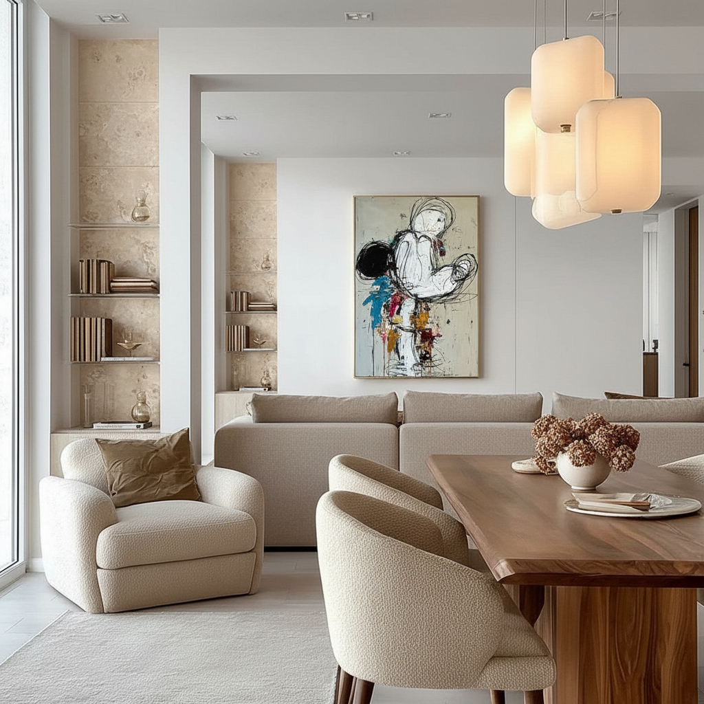
The 30-40% Color Bridge Heuristic
The primary frustration in open-plan living is the "clash" between the dining room’s social energy and the living room’s relaxation palette. Conventional wisdom suggests keeping a strict 2-4 color palette, but we find this impractical. Artwork naturally introduces 12-24+ additional colors.
Instead of limiting colors, we recommend the 30-40% Shared Element Heuristic:
- The Rule: Your primary dining art should share 30-40% of its color elements with the dominant neutral tones of the living room.
- The Application: If your living room is anchored by "Greige" or "Warm Oak," ensure the dining art incorporates these as secondary or background tones.
- The Benefit: This creates visual continuity without the monotony of exact matching.
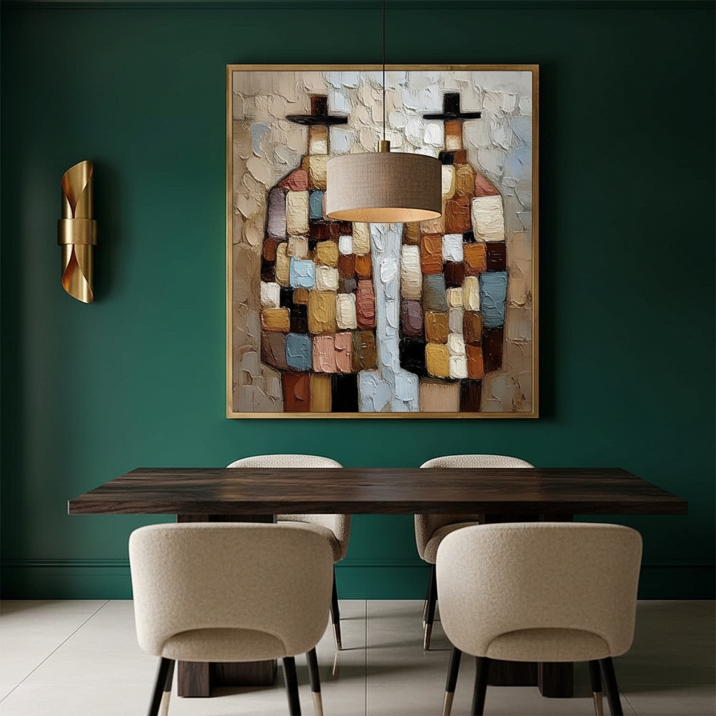
Balancing Appetite and Relaxation
Color psychology plays a functional role in these zones. Research indicates that warm hues (red wavelengths between 620-750nm) stimulate appetite via hypothalamic orexin secretion. Conversely, cool tones promote relaxation.
In a transitional zone, you can satisfy both functions by selecting art with warm foreground elements (stimulating social energy and appetite) set against cool, expansive backgrounds (maintaining the living room’s calm).
The "Black" Paradox
While 62% of consumers express an aversion to black in food products, black in dining art serves a different psychological function. It provides "simultaneous contrast," making warmer food colors appear more vibrant and sophisticated without triggering food-related aversions.
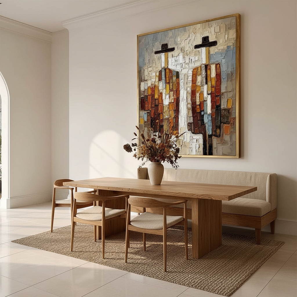
Technical Heuristics for Scale and Lighting
Even the most beautiful art will fail if the scale is mismatched or the lighting is ignored. In our experience working with high-end residential interiors, two technical factors often lead to "commitment risk": scale misalignment and metamerism.
The 60-70% Scale Rule
Artwork sized for a dining wall often appears disproportionately small when viewed from the living area. To anchor an open-concept space, we use this baseline:
- Heuristic: Art should occupy 60-70% of the visible wall space when viewed from the primary seating position in the living zone, not just the dining chair.
- Verification: Measure the width of the wall segment and multiply by 0.65. This ensures the piece has enough "gravitas" to be seen across the open floor plan.
Lighting and Saturation Adjustments
Lighting conditions dramatically affect perceived harmony. Art tested under midday natural light often appears discordant in evening artificial lighting due to "geometric metamerism"—the way surface refractive indices change with light angles.
| Lighting Condition | Impact on Color | Required Adjustment (Heuristic) |
|---|---|---|
| Midday Natural (5500K) | High clarity, true color | Baseline |
| Evening LED (2700K) | Yellow/Orange shift | Increase blue saturation by ~10% |
| Dim Ambient | Loss of depth | Increase contrast by ~15% |
| Mixed Open-Plan | Inconsistent shadows | Adjust saturation by 15-20% |
Modeling Note: These ranges are estimated based on common interior design practices and the Getty Conservation Institute's findings on pigment reflection coefficients.

Material Integrity: The Hidden Health Factor
When selecting art for high-traffic social spaces, aesthetics are only half the story. The chemical composition of the paint directly impacts indoor air quality (IAQ). The EPA warns that indoor air pollution can be significantly higher than outdoor levels, making low-VOC (Volatile Organic Compound) materials a prerequisite for a healthy home.
The "Odorless" Solvent Myth
Many artists use "odorless" mineral spirits or turpentine. However, Princeton University EHS warns that acute inhalation of these vapors can cause central nervous system issues, and "odorless" does not mean non-toxic. For families with children or pets, we advocate for water-based acrylics or natural oil alternatives like walnut oil.
Pigment Safety Checklist
- Cadmium Alert: The International Agency for Research on Cancer (IARC) classifies cadmium compounds as Group 1 carcinogens. While stable in a dry paint film, they pose risks during the creation process or if the paint film is damaged.
- Lead White: Comprehensive bans (like EU REACH Annex XVII) strictly limit lead carbonate. Ensure your art uses Titanium White, which now dominates 90% of the market due to its superior hiding power and safety.
- The ASTM D-4236 Trap: This label only means the warning labels comply with regulations; it does not guarantee the pigment is non-toxic. Always verify the specific pigment codes (e.g., PW6 for Titanium White).
The Investment Perspective: Art as a Property Catalyst
Commissioning a hand-painted mural or a large-scale original piece isn't just a decorative choice; it's a financial one. A Royal Society study using a CAR model found that neighborhoods with higher "art" geo-tags saw significantly greater relative house price ranking gains.
In a residential context, this translates to "Social Validation." A camera-ready, harmonized space increases the perceived value of the property. For those looking to sell or "flip" a home, creative placemaking—such as a well-placed mural—can instantly reverse feelings of "blight" in vacant properties and attract long-term buyers.
Supporting the Creative Economy
By choosing original hand-painted art over mass-produced prints, you are participating in a $1.4 trillion global creative services export market. Furthermore, socially conscious buyers should note that while female artists often lead to better commercial performance for galleries, they still face a significant pay gap. Supporting brands that prioritize fair compensation for artists (appealing to the 87% of consumers who demand fair artist pay) adds a layer of ethical value to your home.

Longevity and Maintenance: Preserving the Flow
To ensure your investment remains a "permanent physical billboard" for your style, you must understand the longevity of the medium.
- Lightfastness: Check for ASTM D4303 ratings. This standard uses xenon-arc tests to simulate years of fading behind glass.
- Cleaning Acrylics: A surprising finding from the Tate Modern suggests that gently wiping acrylic surfaces with water-based cotton swabs can remove surfactants that cause dirt adhesion.
- The "Haziness" Phenomenon: If your acrylic art develops a cloudy film, it is likely PEG-type surfactants migrating to the surface due to humidity. This is a known chemical process and can often be managed with proper environmental control.
The New Standard for Open-Plan Curation
Achieving flow in an open-concept home is a delicate balance of neuroscience, chemistry, and technical heuristics. By moving away from "disposable decor" and toward original, hand-painted works that honor the 30-40% color bridge and the 60-70% scale rule, you transform your walls into a cultural heritage asset.
Whether you are looking to reduce stress (leveraging the 73% mood improvement seen in biophilic art studies) or boost your property's market value, the path forward is clear: prioritize the "essential identity" of the artist's hand.
Disclaimer: This article is for informational purposes only. When handling art materials or installing large-scale works, consult with professional conservators or installers. If you have sensitivities to paint fumes or pigments, seek low-VOC and non-toxic alternatives certified by recognized health authorities.
Leave a comment
This site is protected by hCaptcha and the hCaptcha Privacy Policy and Terms of Service apply.