The New Era of Art Acquisition: Value Over Vanity
For decades, the high-end art market was defined by the spectacle of the auction house. However, recent shifts indicate a profound correction in how collectors and homeowners approach art. According to Marketplace, sales of auction pieces over $10 million plummeted by 44% year-over-year in 2024. This retreat from purely financial art assets marks a return to "real application value"—where the primary driver for a purchase is the emotional and spatial impact of the work within a home.
In this landscape, the distinction between a mass-produced digital print and a hand-painted oil work has never been more critical. Research from Columbia University confirms that consumers value art labeled as "AI-generated" 62% lower than authentic human-created art. This "essential identity," as explored by University of Chicago researchers, suggests that a physical canvas retains an irreplicable soul that digital replicas cannot simulate. For interior designers, this means the choice of art is no longer just about "filling a wall"; it is about integrating a living, breathing asset that interacts dynamically with the room's architecture and color palette.

The Physics of Perception: How Wall Tones Alter Oil Pigments
The interaction between a painting and its environment is not merely aesthetic; it is deeply rooted in optical physics. Oil paint is unique because of its layered structure. Unlike flat digital prints, oil pigments are suspended in binders that allow light to penetrate multiple levels of glaze before reflecting back to the eye.
The Kubelka-Munk Effect and Refractive Indices
According to the Getty Conservation Institute, pigment reflection is dominated by absorption (K) and scattering (S) coefficients. This is mathematically described by the Kubelka-Munk equation. When you place an oil painting on a wall, the ambient light reflecting off the wall surface enters the paint film.
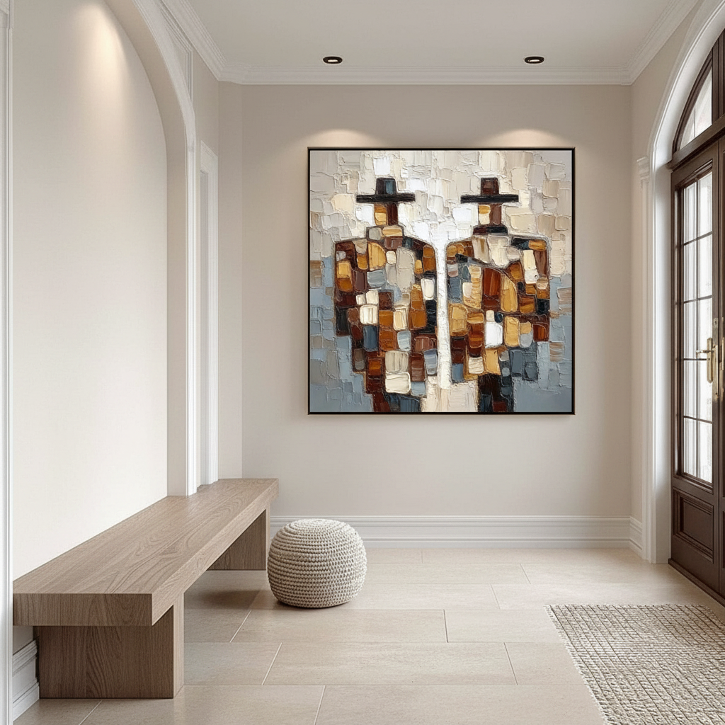
- Warm Wall Tones (Creams, Terracottas, Ochres): These surfaces reflect longer light wavelengths. When this "warm" light hits the oil layers, it enhances the saturation of reds, oranges, and yellows within the painting. This creates what designers call a "harmonious glow," where the art appears to be an extension of the wall itself.
- Cool Wall Tones (Grays, Blues, Slates): These surfaces reflect shorter wavelengths. While they can make a painting appear more luminous and "crisp," they often mute warm tones. If a painting with heavy earth tones is placed on a slate-blue wall without proper lighting adjustment, the pigments may appear "muddy" or lose their perceived depth.
Logic Summary: This analysis of color interaction assumes a standard residential lighting environment (approx. 2700K to 3000K). The perceived shift is based on the physical principle of metamerism, where colors change appearance under different light spectral distributions.
The Support Induced Discoloration (SID) Risk
A non-obvious technical "gotcha" that professional designers must manage is Support Induced Discoloration (SID). As noted by Golden Artist Colors, water-soluble impurities in common cotton or linen canvases can be drawn into the paint layers during the drying process, especially if transparent mediums are applied thicker than 1/16 inch. This can cause a catastrophic yellow or brown tint. Choosing high-quality, professionally primed canvases is the only way to ensure that the wall color you’ve meticulously selected doesn't clash with a painting that is "yellowing from the inside out."

Strategic Coordination: Practical Heuristics for Designers
When coordinating art with wall tones, relying on small paint swatches is a common mistake. Experienced designers observe that the scale of the room and the texture of the wall significantly alter perception.
The 12x12 Rule and Texture Scattering
Designers often use 12x12 inch color samples placed directly next to the intended artwork location. This allows for a realistic observation of how the wall's texture—whether smooth or heavily plastered—affects light.
- Smooth Walls: Create uniform reflection, which can lead to glare on gloss-finished oils.
- Textured Walls: Create nuanced micro-shadows. These shadows can actually enhance the "relief" of a palette-knife painting, making the impasto strokes appear more three-dimensional.
Lighting as the "Third Color"
Circadian rhythm research published in Building and Environment suggests that light source attributes have a greater physiological impact than wall color alone. To maximize the visual depth of the medium, one must balance the wall tone with the light temperature:
- North-Facing Rooms: These rooms receive cool, bluish natural light. To prevent oil paintings from appearing dull on cool-toned walls, stronger artificial lighting (3000K+) is typically required.
- South-Facing Rooms: These receive warm, golden light. Here, cool wall tones can act as a sophisticated "anchor," preventing the room from feeling overly "hot" when paired with warm-hued art.
| Wall Tone Category | Recommended Art Palette | Lighting Strategy | Expected Visual Result |
|---|---|---|---|
| Warm Neutrals | Earth tones, Gold leaf, Ochre | 2700K (Warm White) | Integrated, cozy, "glow" effect |
| Cool Slates/Blues | High-contrast Monochrome, Silver | 3500K (Neutral White) | High luminosity, modern, crisp |
| Deep Jewel Tones | Saturated Primaries, Heavy Glazing | Focused Spotlighting | Dramatic, museum-like depth |
| Textured Plaster | Impasto, Palette Knife works | Grazing (Side) Light | Enhanced 3D relief and shadows |
Beyond Aesthetics: The ROI of Hand-Painted Surfaces
Investing in custom hand-painted art is not just a design choice; it is a strategic real estate move. Data from the Royal Society found that neighborhoods with higher "art" geo-tags saw greater relative house price ranking gains.
Commercial and Public Impact
For commercial developers, the argument is even stronger. The Urban Institute reports that public murals can lead to a 50% drop in pedestrian-involved traffic accidents and a 37% drop in injury crashes by increasing "street awareness." Furthermore, creative placemaking on vacant properties has been shown to instantly reverse feelings of blight, making them more attractive to long-term buyers.
In the hospitality sector, the "Mural-Themed Room" model is gaining traction. As highlighted by Historic Hotels Worldwide, inviting artists to reverse-customize interiors based on the colors and brushstrokes of a central mural provides travelers with a sense of "absolute authenticity" that digital decor cannot match.
The Health and Ethical Imperative: Safety in Pigments
A premium home purchase should never compromise indoor air quality. The EPA warns that indoor air pollution can be significantly higher than outdoor levels. For healthcare facilities and high-end residential projects, low-VOC paints and non-toxic pigments are strict prerequisites for LEED and WELL certifications.
The Hidden Dangers of Traditional Pigments
While classical art history is filled with "poisonous" palettes, modern professional studios have evolved:
- Cadmium: The International Agency for Research on Cancer (IARC) classifies cadmium as a Group 1 carcinogen. While some artists still use it for its unparalleled vibrancy, many are switching to high-performance organic alternatives.
- Lead White: Now strictly regulated by the EU REACH program, lead white has been largely replaced by Titanium Dioxide. According to NCBI, Titanium White now captures 90% of the market due to its superior chemical inertness and hiding power.
Biophilic Design and Mental Health
Beyond physical safety, the subject matter of the art contributes to wellness. A University of Pennsylvania review noted that 73% of patients reported significant mood improvements when exposed to nature-themed environmental art. This "Biophilic Design" produces stress-reduction effects in the brain similar to being outdoors, effectively activating the mPFC (medial prefrontal cortex) for better emotional regulation.
Methodology Note: These health claims are based on a synthesis of peer-reviewed neuroaesthetics studies and EPA indoor air quality guidelines. They represent typical observations in clinical and residential settings, not a guaranteed medical outcome.

Future-Proofing the Home: Artisan Trends for 2026
As we look toward 2026, the trend of "understated elegance" is being replaced by a desire for "texture" and "whimsy." Zillow search data indicates that mentions of "artisan craftsmanship" rose 21%, while "custom framing" searches skyrocketed by 329%.
The Rise of Surrealism and Immersive Escapism
High-end interiors are moving toward Dali-inspired surrealist custom pieces that challenge the traditional "flat" wall. In powder rooms—a traditionally small, high-impact space—the NKBA 2025 awards highlighted "wrapping murals" that create a sense of immersive escapism. By allowing a hand-painted mural to dominate the visual nexus of a room, homeowners can bypass the "decorate first, buy art later" trap and instead build the room's soul around the artist's vision.
Supporting the Human Element
Finally, the ethical dimension of art acquisition is becoming a primary concern for the socially conscious millennial and Gen Z buyer. Wharton School surveys found that 87% of consumers believe artists should receive fair compensation. Choosing a brand that explicitly supports female artists and maintains a "fair trade" narrative—ensuring painters receive the majority of profit shares—aligns with the moral demands of the modern market.
Summary of Best Practices for Homeowners
- Identify the "Color Seed": Prioritize paintings with a clear dominant temperature (warm or cool) to drive the room's perception, rather than assuming a mixture will work everywhere.
- Test at Twilight: The interaction between oil pigments and wall tones changes most drastically during the "blue hour." Observe your 12x12 samples then.
- Invest in Texture: In a world of flat digital screens, the physical relief of a palette-knife oil painting provides a sensory "anchor" that increases occupant satisfaction.
- Verify Safety Standards: Always look for ASTM D-4236 labeling, but remember that the EPA notes this only means the warning labels are compliant, not that the product is inherently edible or dust-safe. Stick to wet mediums (acrylics/oils) over dry powders for better indoor air safety.
By understanding the intersection of optical science, psychological impact, and ethical sourcing, interior designers and homeowners can transform a simple wall into a sophisticated gallery that preserves both health and investment value.
Disclaimer: This article is for informational purposes only and does not constitute professional medical, legal, or financial advice. Readers should consult with qualified interior designers or environmental health specialists regarding specific home renovations or safety concerns.
Sources
- Marketplace: The expensive art market continues to struggle
- Columbia University: Human-Made vs. AI Art Study
- Getty Conservation Institute: Color Science and Pigment Mixture
- Royal Society: Quantifying the link between art and property prices
- WHO/NEA: Scoping Review on Arts and Health
- EPA: Indoor Air Quality and Low-VOC Paints


