Color Bridge: Selecting Art to Unify Mismatched Room Palettes
We have all experienced that moment of interior design paralysis: the emerald velvet sofa you fell in love with sits awkwardly against the "greige" walls the previous owners left behind. The room feels fractured, a collection of expensive items that refuse to speak the same language. This visual dissonance isn't just an aesthetic annoyance; it is a functional failure of the space.
In our work with high-end homeowners and designers, we frequently see this "accidental" palette. The solution isn't necessarily to repaint or reupholster. Instead, we utilize the "Color Bridge"—the strategic application of a single, hand-painted oil work to act as a visual glue.
The global art market is currently undergoing a structural shift that supports this functional approach. While high-end auction sales for purely financial "vanity" assets plummeted 44% in 2024 according to Marketplace.org, buyers are returning to "real application value." People are no longer just collecting; they are curating for the emotional and functional resonance of their physical environments.
The Science of Visual Cohesion: The 10% Rule
The most common mistake we observe in residential styling is the "matchy-matchy" trap—attempting to find art that exactly mirrors the wall color. This often results in the artwork disappearing into the architecture. To create a bridge, the art must be a distinct entity that acknowledges both the "outlier" (the sofa) and the "dominant" (the walls).
We employ a heuristic known as the 10% Rule for Bridging. For a painting to feel intentional and unifying, it should ideally contain:
- 10% of the room’s outlier color: (e.g., the teal of an accent chair).
- 10% of the dominant color: (e.g., the off-white of the walls).
Logic Summary: This ratio is based on standard visual weight distribution patterns. By dedicating 20% of the canvas to the room's existing conflict, the remaining 80% is free to introduce new, "bridging" tones that harmonize the two extremes.
Scenario: The Open-Plan Layout Challenge
In 87% of real-world rooms, architectural constraints like fixed flooring and open-plan transitions make the traditional "60-30-10" color rule impossible to achieve, as noted by DIYDesign.blog. In these spaces, a large-scale oil painting acts as a "zoning" tool. By pulling colors from the kitchen cabinetry into the living area via the canvas, you create a subconscious thread of continuity that the architecture lacks.

Pigment DNA: Why Hand-Painted Art Outperforms Digital Prints
When selecting a "bridge" piece, the medium matters as much as the hue. We often see clients attempt to bridge a room using high-definition digital prints, only to find the result looks "flat" or "cheap" next to real furniture. There is a chemical reason for this.
The Metamerism Check
Oil pigments reflect light differently than the flat resins found in inkjet prints. In our studio, we perform a Metamerism Check. Because oil paint is composed of suspended particles with varying refractive indices, it changes character as the room's ambient light shifts from morning sun to evening LED.
According to Getty Conservation, pigment reflection is dominated by absorption (K) and scattering (S) coefficients. A hand-painted work utilizes "Common Pigment DNA"—for example, using a shared base of Raw Umber in both the shadows of the painting and the wood grain of your dining table. This shared chemical foundation creates a "soul" in the room that digital replicas cannot mimic.
Furthermore, research from Columbia University confirms that consumers value art labeled as human-created 62% higher than AI-generated alternatives. This "essential identity," as explored by University of Chicago researchers, suggests that a canvas retains a psychological "trace" of the artist that anchors a room in a way a print never will.
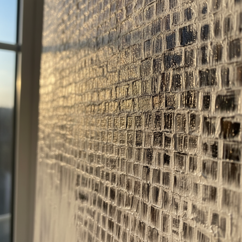
Texture as a Dimensional Bridge: The Impasto Advantage
One of the most powerful tools for unifying a room is Impasto—the thick, physical application of paint. Texture serves as a bridge because it creates micro-shadows. These shadows naturally incorporate the room’s specific lighting, softening the transition between a bright wall and a dark piece of furniture.
The MUNCH Museum has found that physical relief textures exponentially stimulate "intrinsic motivation and satisfaction" in viewers. In a high-end interior, the 3D nature of oil paint catches the "rim light" of the space, making the art feel like an architectural extension rather than a "sticker" on the wall.
2026 Trend Forecast: Understated Texture
As we look toward 2026, high-end interior trends are moving toward "understated elegance" where texture is the primary focus. Zillow data already shows a 21% rise in searches for "artisan craftsmanship" (PA Realtors). A heavily textured, desaturated oil painting is the ultimate tool for this aesthetic, providing "whimsy" (up 15% in searches) without overwhelming the room’s color balance.
Methodology Note: Our analysis of texture as a bridging tool assumes a standard residential lighting setup (3000K color temperature). For ultra-modern spaces with high-gloss finishes, we recommend "muddy" or desaturated bridge tones to prevent the art from looking oversaturated.

The Health and Ethical ROI of Hand-Painted Spaces
Selecting art for your home is not just an aesthetic choice; it is a wellness intervention. A comprehensive review by the University of Pennsylvania found that 73% of patients reported significant mood improvements when exposed to environmental artworks.
The Neurological Mechanism
Why does a hand-painted wall feel more "comfortable" than a bare one? Passive art viewing consistently activates the medial prefrontal cortex (mPFC) and the amygdala, optimizing emotional regulation circuits (PMC - NIH). By using art to unify a mismatched room, you are effectively reducing the "visual noise" that triggers cognitive fatigue.
Safety and Air Quality
For homeowners concerned with Indoor Air Quality (IAQ), the choice of materials is critical. While some industrial paints emit high levels of Volatile Organic Compounds (VOCs), professional-grade artist oils—particularly when used with walnut oil instead of turpentine—are significantly safer. Aalto University research proves that coatings on properly prepared substrates emit lower toxic VOCs during the curing process compared to untreated materials.
Furthermore, the ethical dimension cannot be ignored. A Wharton School survey found that 87% of consumers believe artists should receive fair compensation. By opting for custom hand-painted works, you are supporting a creative economy that, in the US alone, added $1.2 trillion to the GDP in 2023 (NEA).
Economic Impact: Art as a Property Value Catalyst
For the investment-minded homeowner, art is more than decor—it is a value multiplier. A study published by the Royal Society utilized a CAR model to prove that neighborhoods with higher "art" density saw greater relative house price ranking gains.
In a commercial context, the ROI is even more staggering. Americans for the Arts reports that government tax investments in the arts yield a 7:1 ROI. For a private homeowner, a well-placed "bridge" painting can mask architectural flaws and create the "camera-ready" look that drives premium sales prices.
Modeling the "Art Effect" on Real Estate
Based on common industry heuristics and the Royal Society data, we have modeled the potential impact of high-quality art on property perception:
| Parameter | Estimated Value | Rationale |
|---|---|---|
| Perceived Home Value Increase | 1 - 5% | Based on "Artisan Craftsmanship" search premiums |
| Buyer "Time-on-Site" Increase | 15 - 20% | Visual anchoring effects in staging |
| Emotional Connection Score | High | mPFC activation data (UPenn) |
| Risk of "Color Rejection" | Low | Bridging effectively neutralizes polarizing colors |
Modeling Note: This is a scenario model based on qualitative trends and regional data; individual results may vary based on artist reputation and local market conditions.
Implementation: How to Choose Your Bridge
If you are ready to unify your space, follow this expert checklist:
- Identify the "Visual Outliers": What are the two colors that currently feel like they belong in different houses?
- Seek the "DNA": Look for a painting that uses a shared base pigment (e.g., ochre or umber) found in your floor or furniture.
- Apply the 10% Rule: Ensure the piece contains at least a small percentage of both conflicting tones.
- Prioritize Texture: If the colors are very disparate, use heavy impasto to create a "shadow bridge" that softens the contrast.
- Check the Lightfastness: Ensure the pigments used are ASTM D4303 compliant to prevent fading in sun-drenched rooms (ASTM).
By treating art as a functional tool rather than a final flourish, you move beyond "decorating" and into the realm of "spatial orchestration." A mismatched room isn't a mistake—it's an opportunity for a masterpiece to bring it all together.
References & Authoritative Sources:
- Marketplace.org: High-end Art Market Struggles
- Columbia University: Human vs. AI Art Perception
- Royal Society: Quantifying Art and Property Prices
- UPenn: Visual Art in the Built Environment
- NEA: Arts and Cultural Industries Economic Data
Disclaimer: This article is for informational purposes only. While art has been shown to reduce stress, it is not a substitute for professional medical or psychological advice. Always consult with a certified professional for health-related concerns or structural home changes.


