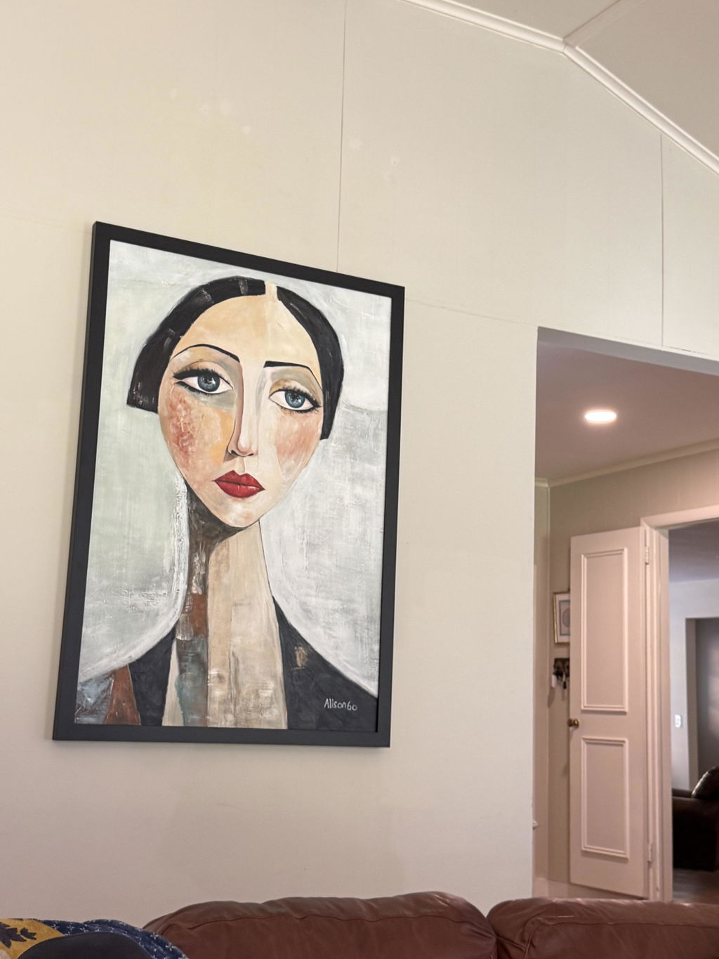
The safest choice for a video-call background is office wall art that passes a real camera-preview check. Sit where you normally take meetings, view the wall through your webcam, and judge the piece for crop, reflections, scale, contrast, texture, and nearby clutter—not from the full-room view or a close-up listing photo.
That approach works for a small apartment wall, a client-facing home office, or a desk setup used for Zoom and Teams. It also keeps style decisions grounded: a matte-looking, neutral, textured, centered, or abstract piece may work in one room and fail in another when the camera angle and lighting change.
Make the Camera Frame the Starting Point
The visible camera frame—not the entire wall—should determine the useful placement, orientation, and scale of your art. Check the camera position before measuring or ordering, because laptop height, monitor placement, and chair position can change what appears behind you.
Check the Crop From Your Usual Seat
Start from the meeting position you actually use. A laptop camera may show more desk and ceiling than an elevated monitor, while a movable chair can shift your head and shoulders across the background.
- Sit in your usual meeting position and set the camera to its normal height and angle.
- Open the camera preview before choosing wall art for an office.
- Mark the visible wall width and height with removable tape or a paper outline.
- Note whether the future piece will sit behind your head, shoulders, desk edge, shelves, or another fixed object.
Use the preview as a practical framing check, not as a guarantee of a professional-looking setup. Zoom's camera guidance provides platform context for adjusting the actual meeting view, but it does not establish a universal art size or centering rule.

Match the Piece to the Visible Wall
Choose an orientation and scale that stay comfortably inside the marked crop. The art should not touch the visible frame edges, collide with furniture, or disappear behind your shoulders when you sit back. Leave enough surrounding wall for the piece to read as a distinct background element without treating a particular margin as mandatory.
For a narrow wall, compare one compact vertical or square piece with a wider arrangement. A single proportionate piece may be easier to evaluate when the camera crop is tight; a multi-piece arrangement requires checking every panel, gap, and edge in the same preview. If you need a separate measuring and placement reference, use this framed wall art checklist as a browsing aid, then make the final decision from your own camera frame.
Control Reflections Before Judging the Finish
Glare is a setup-dependent risk, so inspect the artwork through the camera preview with the daylight and meeting lights you actually use. A change in light position, camera angle, blind position, or artwork placement may solve the problem; do not reject or approve a surface based on its room appearance alone.
Test the Reflection Path
Reflection is usually easier to diagnose when you look for the source instead of judging the artwork on its own. Turn on the lights used for calls and watch the preview while changing the likely angles.
- Turn on your meeting lights and open the blinds or curtains as you normally would.
- View the artwork through the camera preview, looking for a window, lamp, or ceiling-light shape across the visible surface.
- Change the light angle or close the blind briefly to see whether the reflection moves or disappears.
- If possible, shift the camera or artwork slightly and check whether the bright area remains in the crop.
Zoom's lighting guidance warns that glass surfaces can contribute to glare in conferencing environments. That does not mean every framed or textured artwork will reflect in the same way; it supports treating reflective-looking surfaces as something to test. Light placement also affects visible shadows and highlights, so Webex's lighting guidance is useful context when you reposition a lamp or camera. Microsoft Teams' green-screen guidance offers additional platform context for checking how the background behaves in your meeting setup, not a rule for choosing art materials.

Compare Matte-Looking and Reflective Surfaces
A lower-reflection surface is often a safer starting point in a bright room, but let the camera preview decide. A reflective surface may work when the main light is off-axis, as long as the reflection does not cross the artwork or the speaker's visible area.
| Surface appearance | What to check on camera |
|---|---|
| Lower-reflection surface | Confirm that texture, tonal changes, and edges remain visible without a bright patch from a window or light. |
| Reflective surface | Move the light and camera, then check whether reflections disappear or remain across the crop. |
For a more focused browsing path, see this glare and finish guide. Do not treat a named finish as glare-free or universally better; the same wall piece can look different in morning daylight, overhead lighting, and an evening meeting.
Choose Office Wall Art Texture and Color That Survive the Screen
Judge texture, palette, and subject matter at the distance and exposure you use for calls. There is no supported universal ranking for the best finish or color, so use the camera preview to see what stays legible without becoming the strongest competing element.
Match Texture Scale to Viewing Distance
Tiny surface details may vanish in a small webcam view, while broad tonal changes can remain easier to distinguish. That does not make heavy relief automatically better: raised or irregular texture can also create shadow pockets and bright highlights as the light direction changes.
Check the piece at its distance from the camera, then reduce the preview to roughly the size at which meeting participants usually appear on your screen. If the texture disappears entirely, decide whether the color blocks and overall form still work. If the texture creates flickering highlights or dark pockets, test a different light position before ruling out the piece.
If you are exploring textured home office art, treat descriptions and close-up images as starting points only. Side-angle or real-room images can help you inspect physical texture before purchase, but they do not establish how that texture will render on your webcam.
Use Palette Intensity as a Background Decision
Compare the art with the wall, your typical work clothing, the desk, and the camera's exposure. A strong accent can work when it does not compete with the speaker; a restrained palette can blend into a dim wall or disappear when the camera lowers exposure.
| Camera condition | Art choice to consider | On-screen check |
|---|---|---|
| Busy frame | Simpler forms or fewer dominant color changes | Make sure the art is not another cluster of competing edges. |
| Dim or uneven light | Tonal separation that remains visible in shadow | Check that dark areas do not merge with the wall or clothing. |
| Strong clothing or wall color | A palette with clear, measured contrast | Confirm that the artwork remains visible without becoming the brightest element. |
Use the phrase "home office art that is not distracting" as a decision goal, not a product promise. The useful question is whether the piece remains one controlled element in your actual frame.
Decide Whether the Subject Belongs in the Background
Subject matter can change the amount of visual activity in a crop. Abstract or lightly structured forms may be worth considering when you want the background to read as a single field, but no subject type is automatically suitable for every call.
Check for:
- A second focal point that draws attention away from the speaker's face.
- Forms that become confusing or overly prominent at thumbnail size.
- A subject that competes with the room, clothing, shelves, or equipment.
A neutral abstract wall art collection can be a useful place to compare palettes, while impasto wall art offers a way to browse texture-led options. These are navigation paths, not proof that every item will fit your crop, lighting, or camera.
Keep the Background Visually Organized
The artwork is only one part of the image. Keep the full frame visually controlled by checking overlap, side margins, the desk line, upper corners, and contrast beside the speaker rather than judging the wall piece in isolation.
Audit the Full Frame, Not Just the Wall
Use the camera preview to inspect four areas:
- Behind the head and shoulders: remove or reposition objects that overlap the art or sit immediately beside the speaker.
- The art's side margins: look for shelves, lamps, plants, door frames, or strong vertical edges competing with the piece.
- The desk line: account for monitors, microphones, cables, and chair backs that may crowd the lower frame.
- The upper corners: check ceiling fixtures, doorways, windows, and empty high-contrast areas that pull the eye away from the intended background.
This defines a crowded background through visible overlap, competing edges, and frame density—not through a universal spacing formula. If the wall piece works only after several objects are hidden or cropped out, include that cleanup in the buying decision.
Balance Contrast With the Speaker and Room
The art needs enough contrast to remain visible, but the strongest boundary should not sit directly beside your face if that makes the frame feel visually split. Compare the piece with the clothing you commonly wear for meetings and with the wall color behind it.
The same piece can blend into a pale wall in one setup and dominate beside a dark shirt in another. Recheck with typical desk equipment in place, because a bright monitor, microphone, or lamp can change which element appears most prominent. For another browsing option, you can browse modern wall art, then apply the full-frame test to any piece you consider.
Run the Purchase Check in Your Real Setup
Before buying, choose the piece that passes the real camera-preview test under your actual seat, equipment, daylight, and meeting lights. If it fails on crop, glare, scale, contrast, texture, or clutter, reposition the setup, simplify the background, or keep shopping instead of assuming the issue will disappear after hanging.
- Capture the usual camera frame from the seat and camera position used for calls.
- Confirm that the proposed size and orientation fit inside the visible crop with clear, practical margins.
- Check reflections under daylight and the artificial lights used for meetings.
- Inspect texture, color, and contrast at thumbnail size, not only in a close-up image.
- Remove or account for nearby shelves, lamps, plants, cables, doorways, desk equipment, and furniture.
- Recheck the frame with typical clothing and the equipment that remains on the desk.
- Verify the current listing for dimensions, framing, hanging details, shipping, and returns before ordering.
You can use this art buying checklist for a general purchase reference. Once the visual checks pass, browse modern wall art or another relevant collection from the current store navigation. We do not infer product dimensions, finish, framing, shipping, or camera behavior from a collection title, so verify those details on the live listing or policy page.
FAQs
Use the camera preview, actual lighting, and usual seating position to judge whether office wall art fits your calls. These checks are more reliable than a room photo or a universal rule about size, color, or finish.
What Should Be Behind You on a Video Call If You Have Very Little Wall Space?
Use your usual crop and compare one compact vertical or square piece with leaving the wall clear. If the crop cannot leave practical margins, fewer objects may fit better than a gallery arrangement.
Can Textured Art Create Shadows or Bright Spots on Camera?
Yes. Raised or irregular surfaces may show changing highlights or shadow pockets. Check side-angle images, then move the light and view the live preview before deciding.
What Color Art Is Easiest to See Behind a Desk on Video?
No color is universally easiest. Compare the palette with the wall, typical clothing, and camera exposure under the setups you regularly use.
Should Wall Art Be Centered Behind Your Head on a Video Call?
Not necessarily. Use the camera crop and speaker position rather than the wall's geometric center, then recheck if the camera or chair moves regularly.