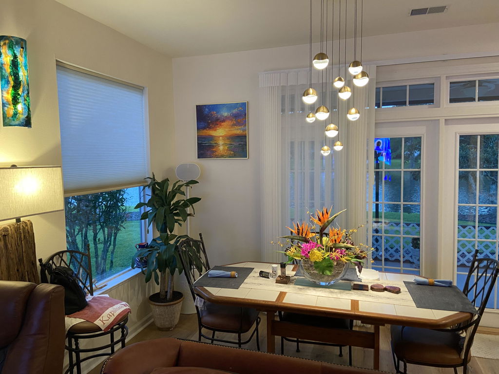
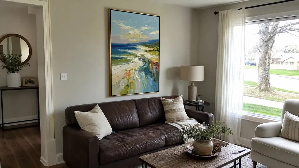
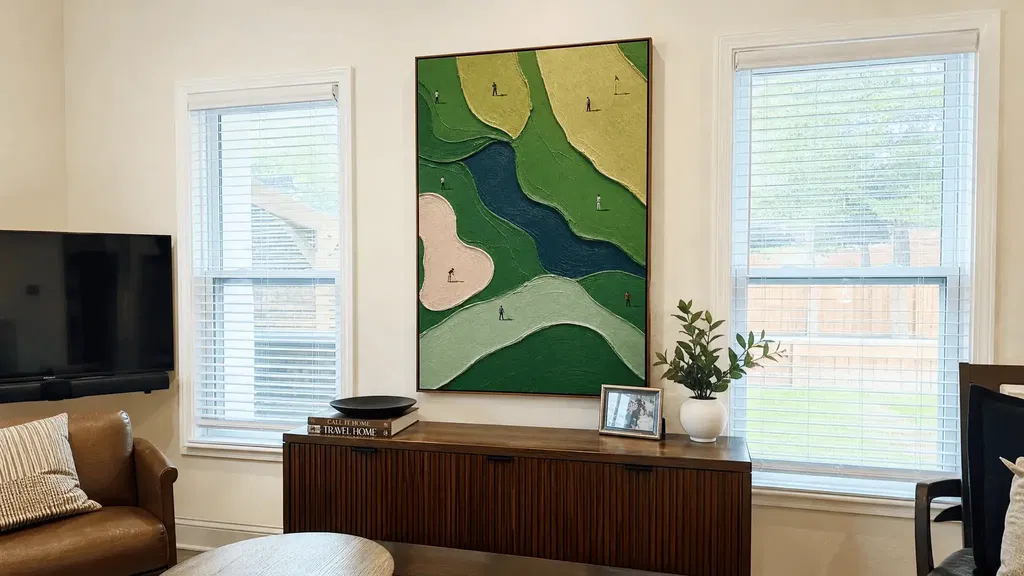
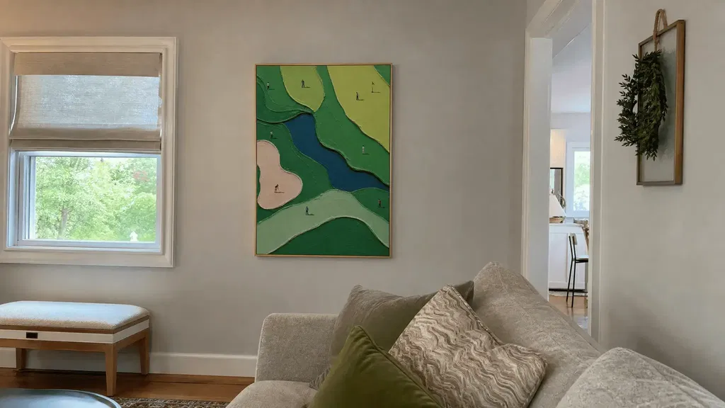
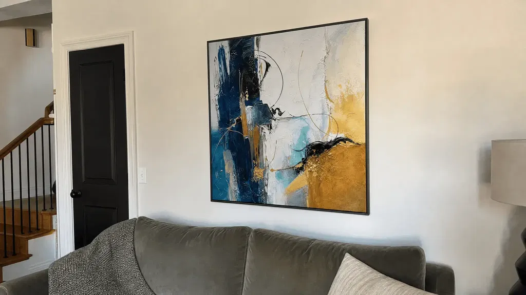
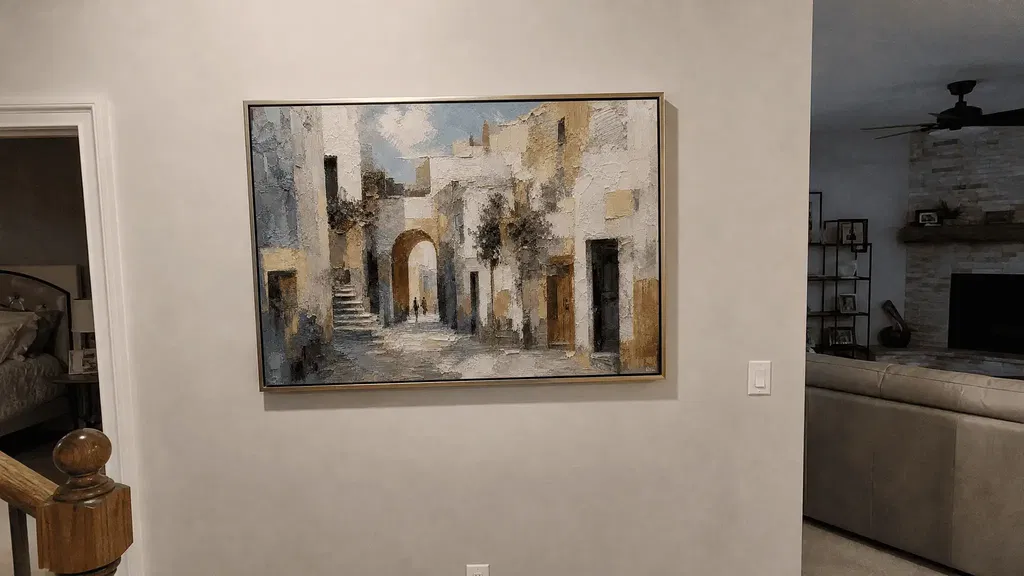
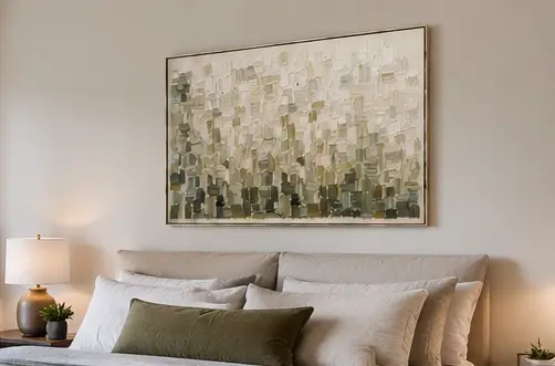
Choose figurative art when you want a recognizable person, place, or scene to anchor the wall. Choose abstract art when color, shape, gesture, or texture should lead the experience. Hybrid work can suit you when you want a subject cue without giving up painterly ambiguity. The most reliable way to compare abstract versus figurative art for the home is to view the specific piece from a normal viewing distance and compare its visual activity with the room—not assume one category is always easier to live with.
For modern paintings for wall display, use this order: decide how much the artwork should reveal, identify the feeling you want to live with, judge its visual quiet, then check the furniture, architecture, and sightlines.
Choose How Much the Artwork Should Reveal
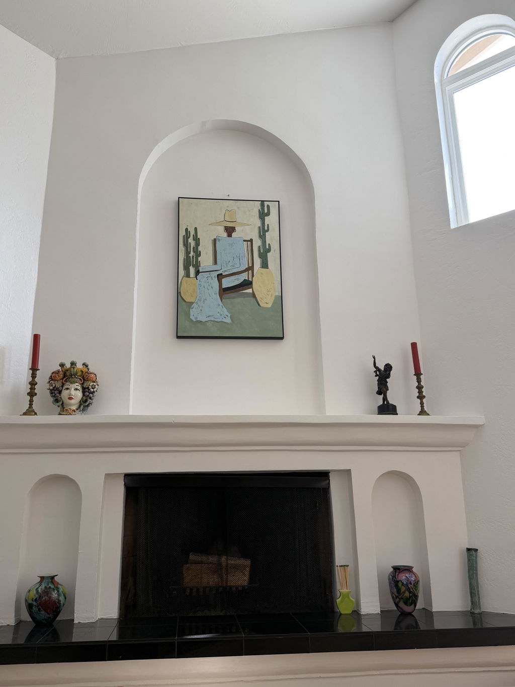
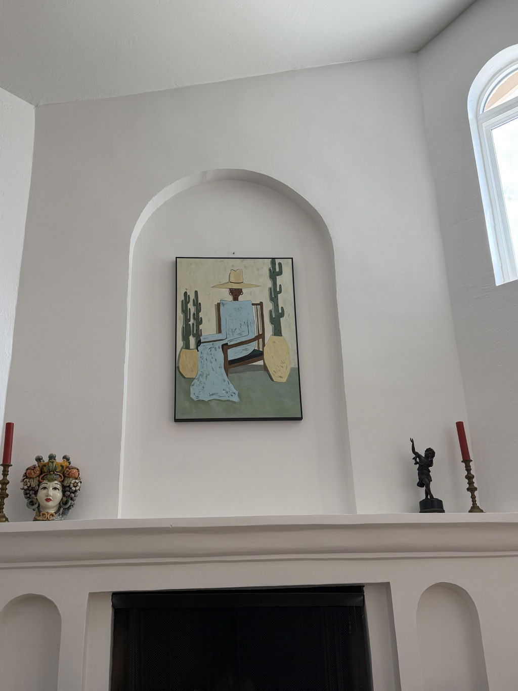
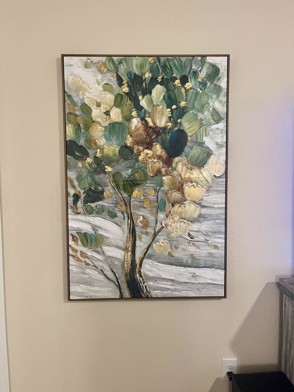
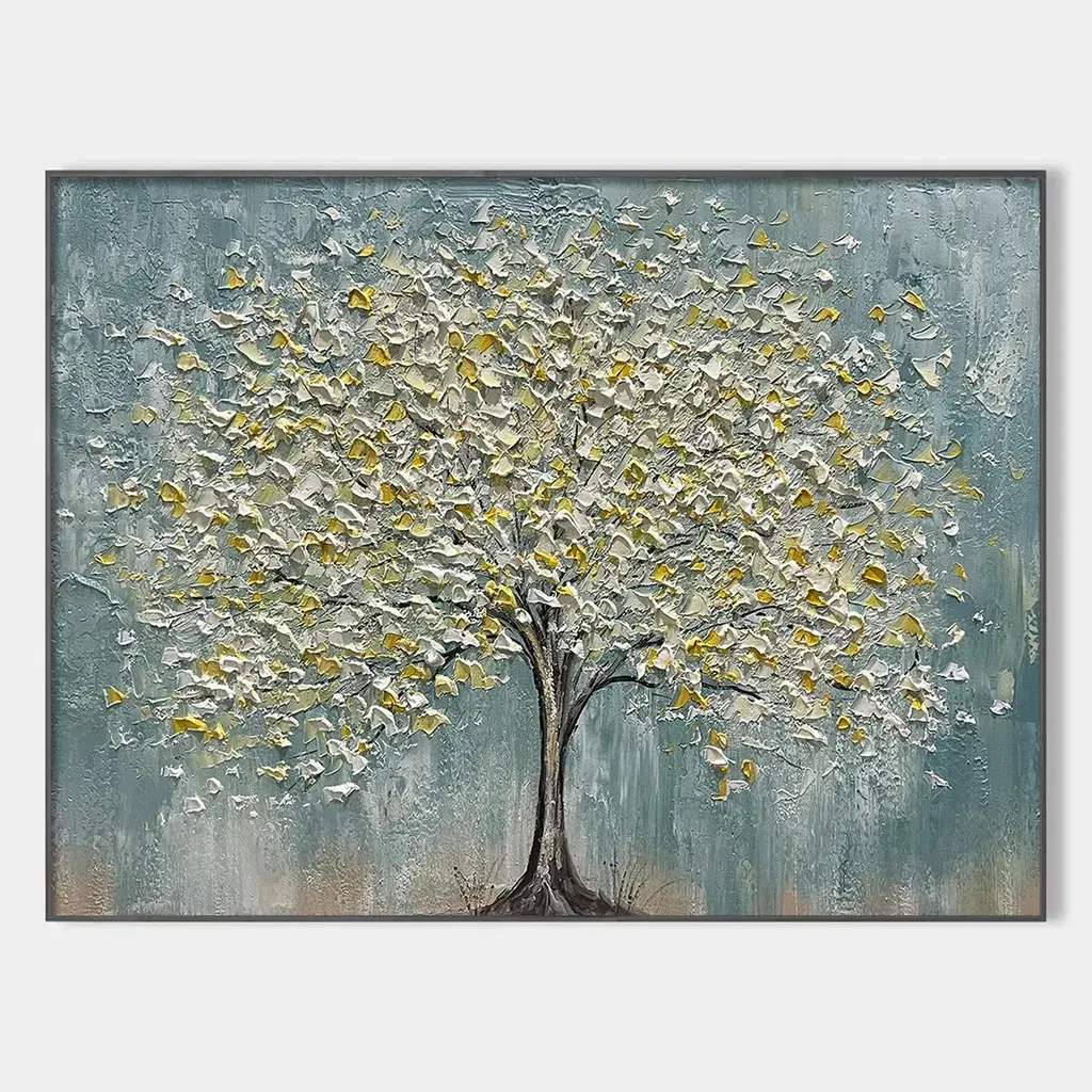
Figurative art suits a wall that needs a recognizable person, place, or scene. Abstract art shifts attention toward shape, color, form, or gesture, while hybrid work leaves some subject cues open to interpretation. Treat the categories as overlapping ranges, then judge the individual painting's contrast, texture, and density.
| Style direction | What the viewer can recognize | Choose it when |
|---|---|---|
| Abstract | The subject may be unclear, suggested, or absent; visual elements take the lead. | You want interpretation, color, form, or movement to carry the wall. |
| Figurative | A person, place, object, or scene remains identifiable, even if it is stylized. | You want the artwork to establish a subject or visual story quickly. |
| Hybrid | A subject cue remains visible while abstraction changes, obscures, or enriches it. | You want recognizability and openness to coexist. |
Tate describes abstract art through elements such as shape, color, and form, while its definition of figurative art keeps the work connected to recognizable subjects (Tate's art glossary; Tate's definition of figurative art). MoMA's explanation of abstraction also helps frame abstraction as a range rather than a single look. Figurative art can be highly stylized; it is not the same as photographic realism.

Ask yourself: Should someone understand the subject in a glance, or discover it over time? If the answer is "in a glance," start with figurative work. If you want the image to unfold, begin with abstract work. If you want both, inspect a hybrid piece from a normal room distance and decide whether enough of its subject remains legible.
This is a low-regret starting point for how to choose abstract or figurative wall art: consider recognition first, visual activity second, and the room relationship third. A category label can narrow your search, but the individual painting still determines its contrast, texture, density, and overall presence. You can begin browsing abstract canvas artwork once you know that an element-led experience is what your wall needs. A hybrid example such as an abstract-figurative cityscape may be more useful when the room needs a subject without a fully literal image.
Set the Room's Emotional Temperature
Choose the artwork's palette, marks, subject, and contrast based on the feeling you want to live with—not on a promise that abstract or figurative art will create a particular mood. A lively, reflective, warm, or restrained impression can come from many combinations, and the same painting may look different in bright daylight, under warm lamps, or in low evening light.
Start by naming the experience in ordinary language. "Warm and grounded" may point you toward earthy colors and a subject with personal resonance. "Lively but not chaotic" may lead you to compare brighter accents with the room's dominant neutral. "Reflective and open-ended" may make abstraction appealing, but a quiet figurative subject could suit the same preference. The useful question is not "Which style creates calm?" but "Which visible qualities do I want to keep seeing every day?"

Place the candidate beside the room's dominant neutral, strongest accent color, and most noticeable finish. Then check whether the artwork's marks repeat, balance, or sharply contrast with those elements. A recognizable subject can make the emotional focus more explicit; abstraction can leave more room for you to decide what the image means. Neither response is guaranteed, and neither is automatically better for a living room.
Lighting deserves its own check. A painting that seems restrained on a bright screen may appear higher in contrast under directional lighting, while texture can become more prominent as shadows cross the surface. If you are drawn to expressive color and visible movement, Expressionist wall art may be a useful browsing path—but treat the collection as a way to explore a preference, not proof of a guaranteed emotional result. Likewise, a textured figurative painting can provide a subject cue and tactile-looking surface without automatically making the room warm, calm, or dramatic.
Use Visual Quiet to Control the Wall
Judge visual quiet by looking at the individual painting's contrast, detail density, texture, and movement in context. Neither abstract nor figurative art is automatically quiet or busy. A restrained geometric abstraction may feel orderly, while expressive abstraction or a detailed figurative scene may demand more attention.
Tate describes non-objective art as usually, though not always, geometric and oriented toward simplicity, making it one possible restrained approach rather than a definition of all abstraction. Use a piece-specific check before deciding that a wall needs something "simple." Stand at the distance from which you will normally see the artwork and ask what reaches you first: the subject, the strongest contrast, the texture, or the overall shape.
Then compare that impression with the room's largest rug pattern, busiest upholstery, wallpaper, cabinetry, or architectural feature. If several elements compete equally, the wall may feel active even if the painting itself is not especially large or colorful. A pattern-rich room may benefit from a candidate whose contrast and detail do not compete with the existing focal point. That could be a restrained abstract work, but it could also be a limited-palette figurative painting.
A quiet room may welcome more texture or contrast, but do not add activity merely because the wall feels empty. The right test is whether the artwork supplies the amount of visual emphasis you actually want. Spend time looking at the actual image rather than relying only on a thumbnail. Tate's guide to slow looking supports taking time with an artwork and noticing what becomes visible; here, use that idea as a practical shopping heuristic.
Inspect the piece from a normal viewing distance. If you are comparing painterly marks with sharper detail, explore painterly versus precise detail as a separate preference question.
Decide Whether the Wall Should Start a Conversation
Choose the kind of attention you would like the artwork to invite: recognizable subject matter for an immediate entry point, or open-ended work that leaves more room for personal interpretation. The choice should reflect what you want to live with, not a guarantee that guests will react in a certain way.
- Personal meaning: If the wall should connect to a person, place, memory, or recurring theme, start with subject matter that gives you a meaningful point of return. The image does not have to be literal, but you should know what association you want it to hold.
- Interpretive openness: If you enjoy noticing new relationships among color, marks, and shapes, choose a work that does not settle its meaning immediately. This can be abstract or hybrid; look for the degree of openness in the actual piece.
- Immediate subject matter: If you want the wall to communicate a person, landscape, city, or scene quickly, prioritize recognizability. Compare the artwork from the doorway and seating area to confirm that the subject still reads at the distances that matter.
Choose one priority before browsing: subject clarity, personal association, interpretive openness, or a strong visual statement. If your preference is still uncertain, browse original wall art across subjects rather than forcing yourself into an abstract-versus-figurative decision too early.
Match Modern Paintings for Wall Display to Furniture and Architecture
Start with the room's palette, scale, patterns, sightlines, and competing focal points. Choose the abstract or figurative piece that complements or deliberately counterpoints those conditions; neither style is automatically better for modern interiors.
| Room condition | More useful starting direction | What to check before buying |
|---|---|---|
| Restrained furniture and few patterns | Either style; choose the amount of contrast or subject clarity the wall needs. | Whether the piece adds enough presence without becoming the only visual event. |
| Pattern-rich upholstery, rugs, or wallpaper | A candidate with controlled contrast and detail, whether abstract or figurative. | Whether its texture, marks, or subject compete with the room's strongest pattern. |
| Strong architectural lines, fireplace, television, or large window | Abstract geometry or a clearly composed figurative piece, depending on the intended focal point. | Whether the artwork reinforces, balances, or competes with the strongest line or feature. |
| Shared seating area with several sightlines | A piece whose subject and visual weight work from both seated and standing views. | What remains legible from the sofa, doorway, and normal standing distance in actual light. |
Before browsing modern paintings for a living room, mark the intended artwork area on the wall with removable tape or paper. This will not predict the finished result perfectly, but it can reveal whether the planned scale feels lost, crowded, or aligned with nearby furniture. Compare the marked area with the sofa, console, fireplace, television, or window rather than judging the wall in isolation.
Then inspect the candidate from seated and standing viewpoints. Notice whether colors shift, texture becomes dominant, or the subject disappears when you move back. The actual-wall test is more useful than a style rule: it can show that an abstract work is too active for a pattern-heavy room, or that a figurative piece is exactly what a sparse wall needs. If no candidate passes, treat that as a not-fit signal instead of forcing the abstract-versus-figurative choice.
For additional room-specific browsing, our living room wall art ideas can help you compare directions. Use the modern abstract canvas art collection only after you have identified the condition you want it to satisfy—such as more open interpretation, stronger color movement, or less literal subject matter. These browsing paths can help narrow the choice, but the wall, light, and sightlines remain the final test.
FAQs
Use subject clarity, visual activity, and the room's actual sightlines to narrow the choice. No category guarantees a particular mood or furniture match.
Should I Choose Abstract or Figurative Art for a First Home?
For a first home, choose a piece that still feels right as your furnishings and style evolve. Figurative art is not photographic realism, so judge the actual work's stylization and visual weight rather than relying on the label.
What Type of Art Works in a Modern Home?
Either style can work when the piece relates to the room's palette, scale, texture, and activity. Mark the intended area and view it from the seating position and doorway before deciding.
Is Figurative Art Harder to Decorate With?
Not necessarily. Compare the subject, colors, scale, and visual weight with the room's strongest pattern or focal point. A stylized subject may be easier to place than a highly active abstract work.
How Can I Test Wall Art Before Buying It?
Mark the intended dimensions, then inspect the candidate from seated and standing sightlines in the room's actual light. If it looks too faint, crowded, or dominant, keep browsing.
Can Abstract-Figurative Art Work as a Compromise?
Yes, when you want a recognizable cue plus painterly ambiguity. Check whether the subject remains legible at a normal viewing distance, especially from the room's main seating area.