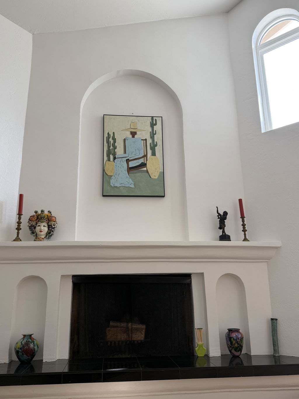
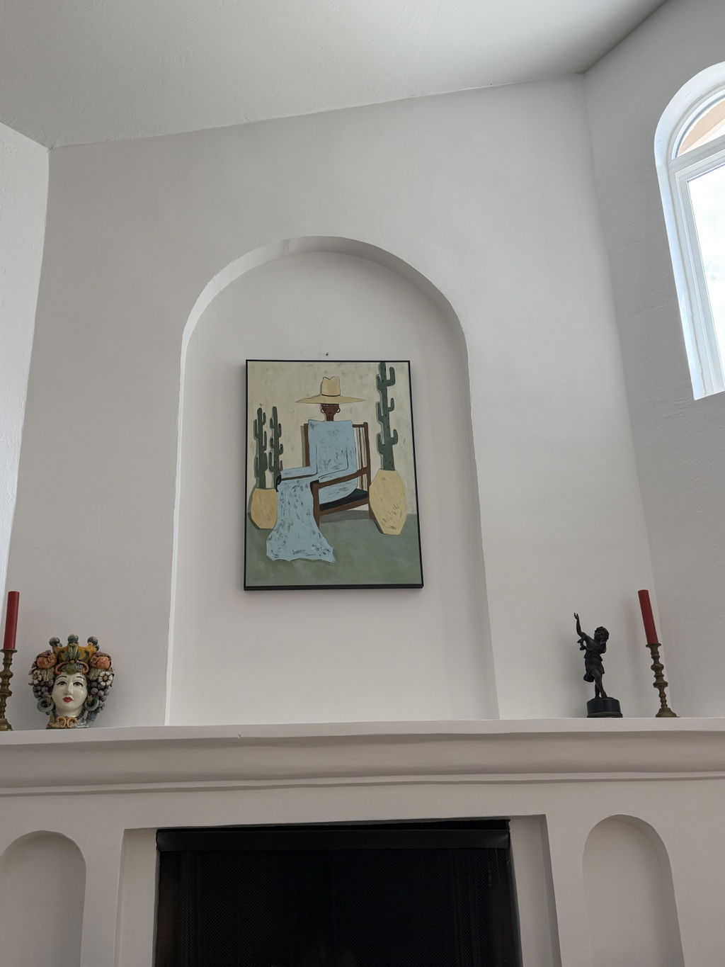
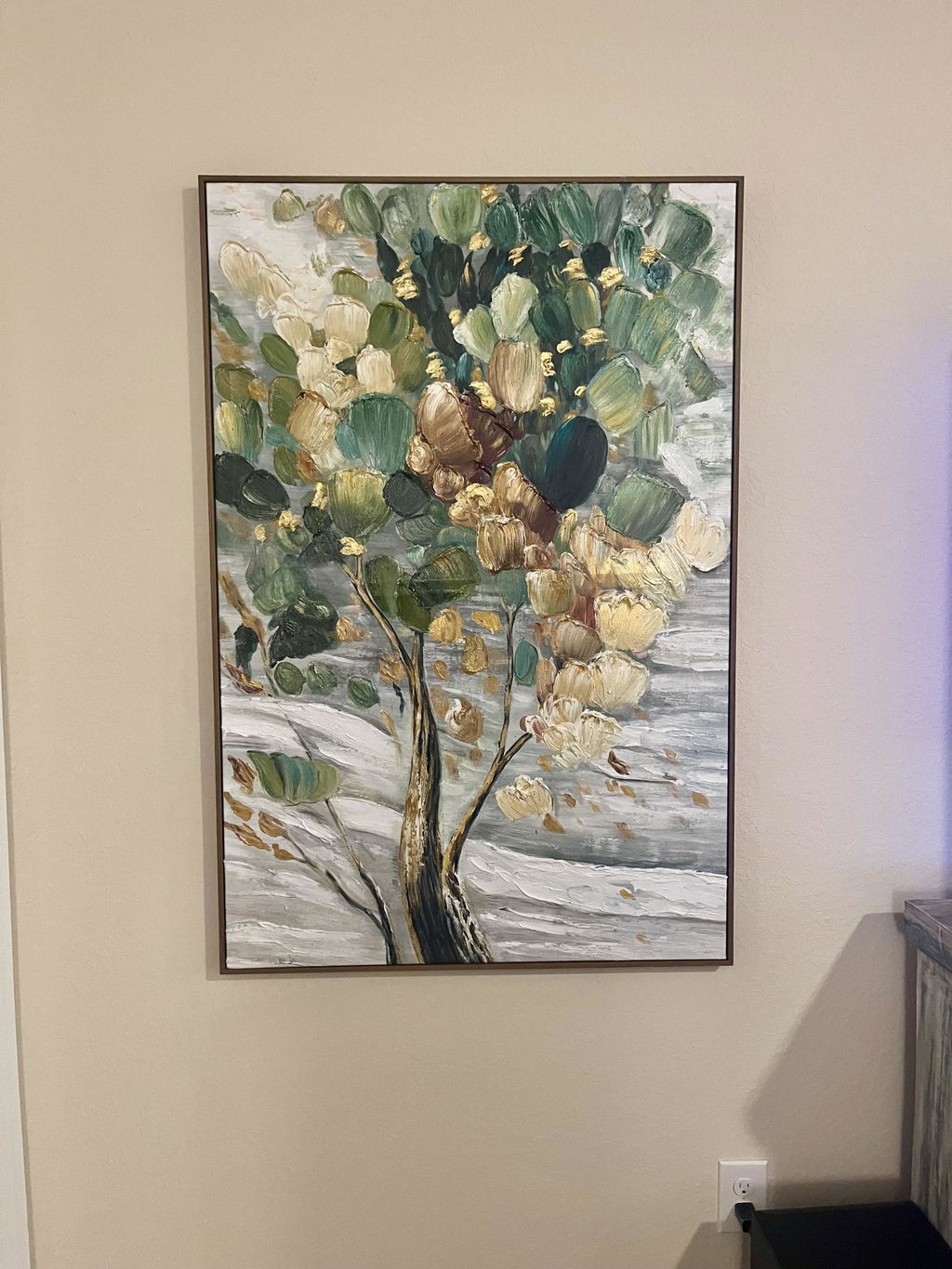
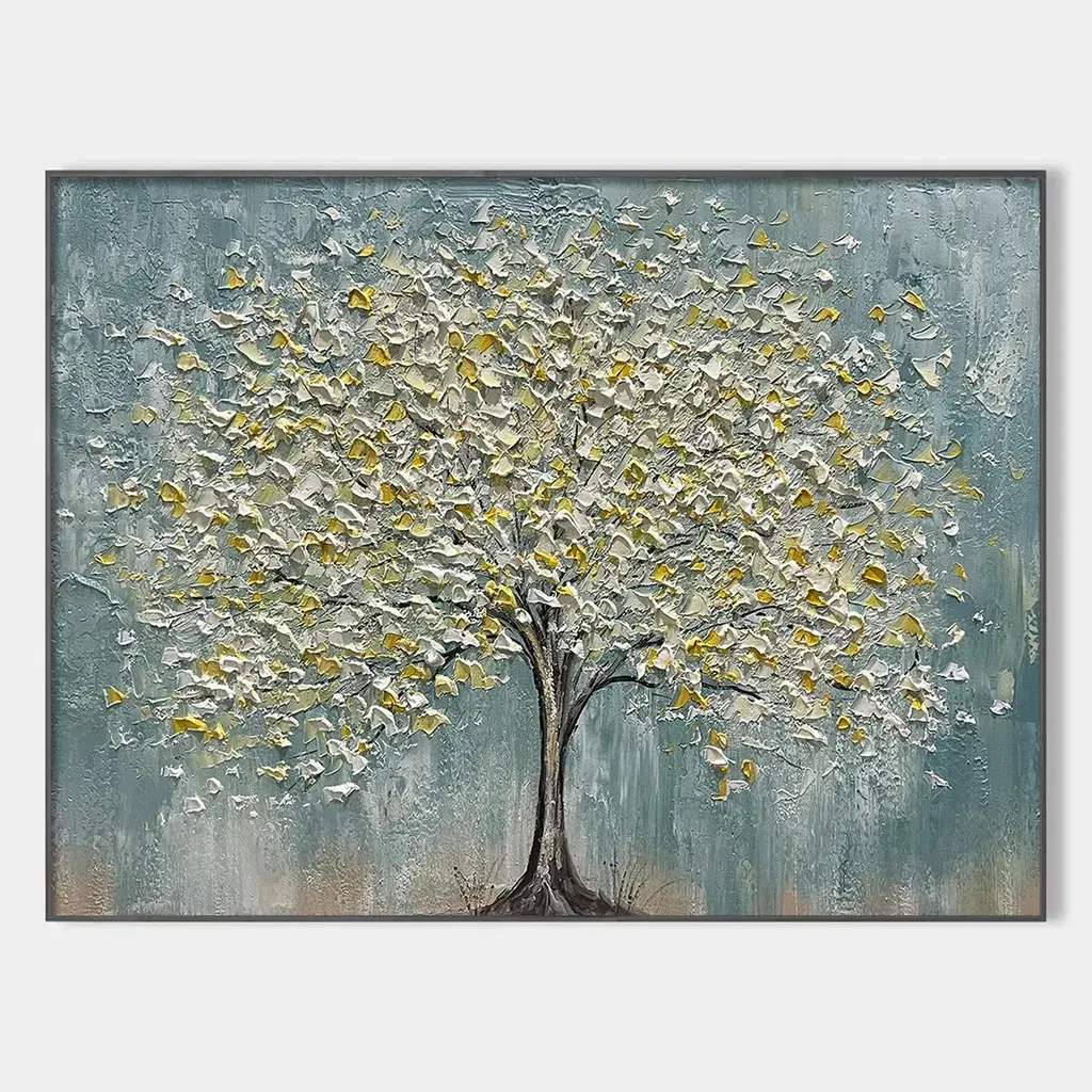
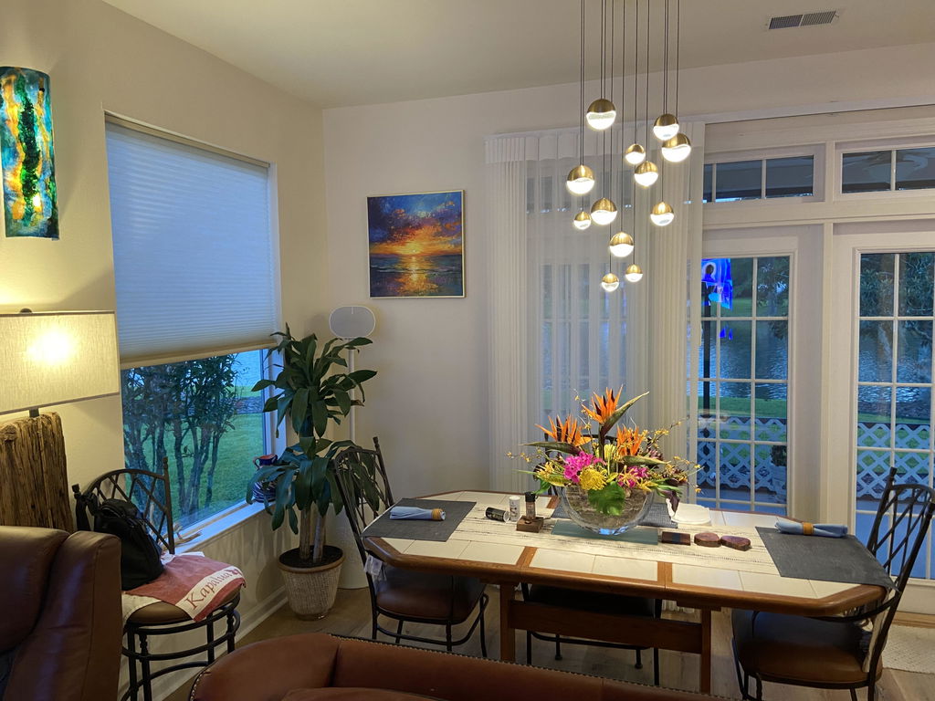
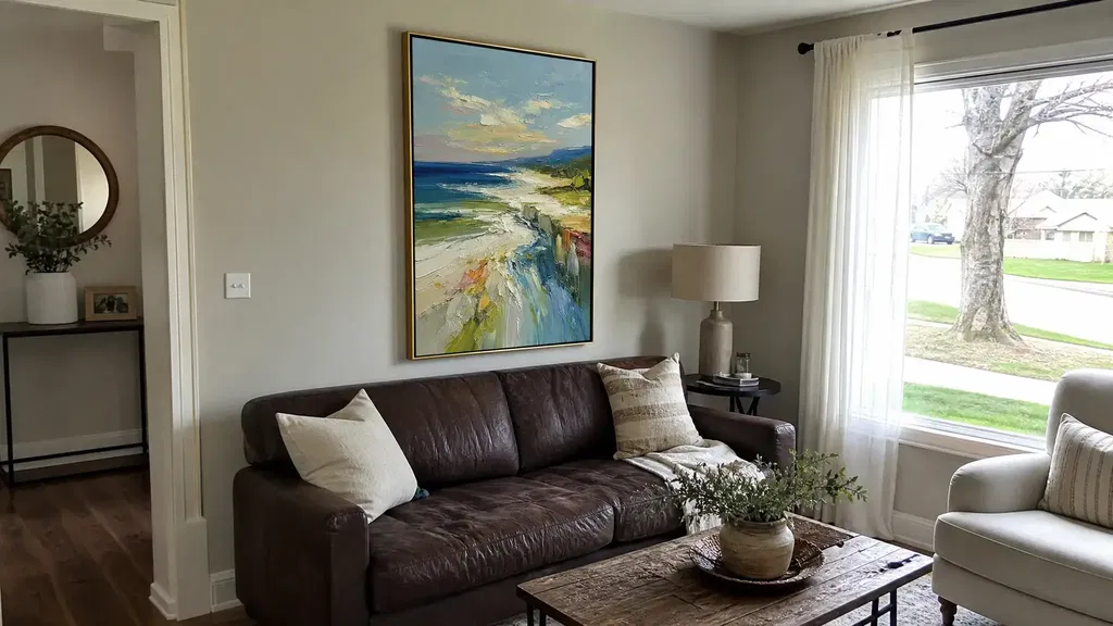
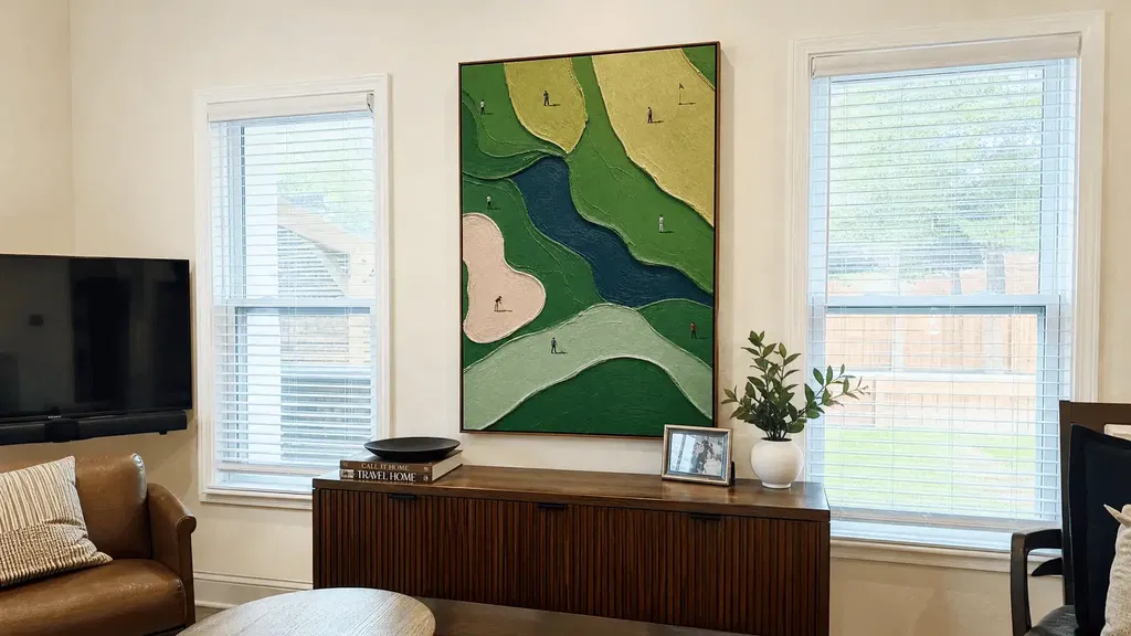
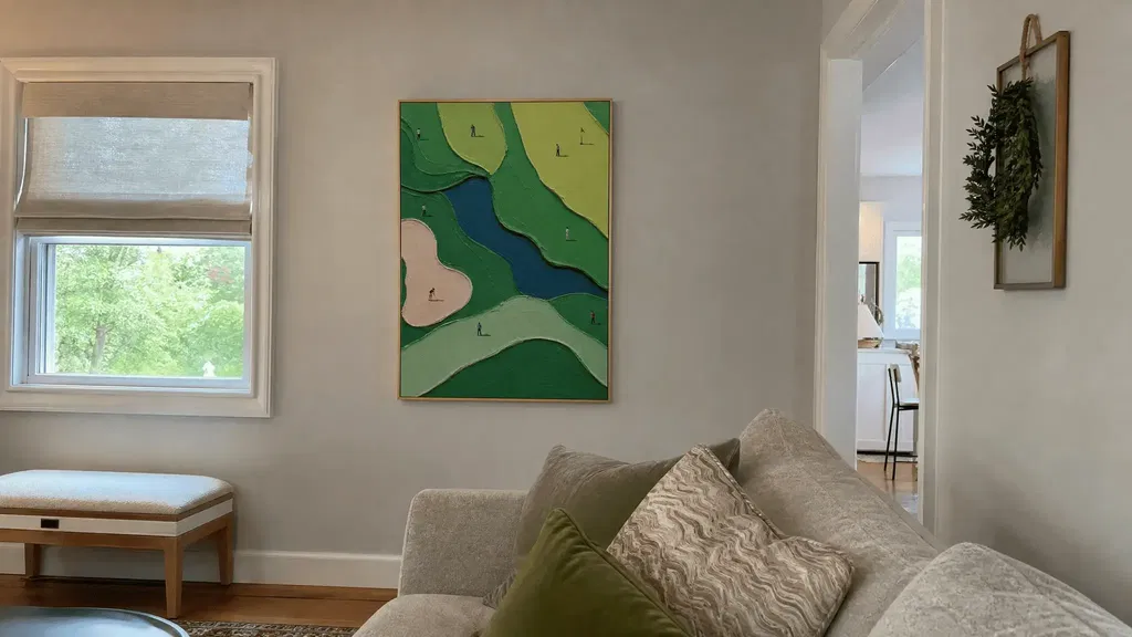
The best wine and art painting choice starts with the room, not the product page. Decide whether your bar or wine room should feel quiet and collected, warm and rustic, or lively and contemporary. Then compare the artwork with the cabinetry, stone, metal, glass, lighting, and strongest guest sightlines. Measure the usable wall, keep the piece away from active service areas, and review the seller’s documented care and purchase details before adding anything to your cart.
Choose the Mood for Wine and Art Painting
Choose the mood for entertaining first, then use the room’s lighting, focal objects, and guest viewpoints to narrow the visual direction. A focal piece should support the bar, wine display, cabinetry, or seating rather than compete with every feature at once. Compare a candidate in the room’s usual evening lighting instead of relying only on a daytime photo or screen image. Lighting can help define spatial hierarchy and visual interest, but it does not guarantee that one palette will work in every room.
Three practical mood directions can make browsing easier:

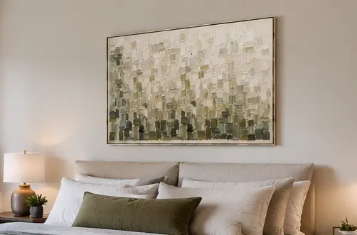
- Quiet and collected: Look for restrained contrast, calm shapes, or a limited palette when the room already has prominent shelving, stone, or glass. A neutral direction may suit a tasting nook where conversation and the bottle display should remain visually prominent.
- Warm and rustic: Consider earthy relationships that echo wood, leather, stone, or muted metal without copying every finish. The goal is a connected palette, not a room where every surface looks matched.
- Lively and contemporary: Use stronger contrast, expressive shapes, or a more noticeable color accent when the cabinetry and walls are relatively quiet. Check whether the piece remains legible from the barstools and seating rather than judging it only from the entry.
Stand at the entry, sit at the bar, and move to the main guest position. Note which wall naturally attracts attention and whether the artwork would become the focal point or simply add a secondary layer. If you are starting with a broad search, abstract paintings can be one discovery path, but the room’s actual mood and viewing conditions should determine whether that category belongs on your shortlist.
Match Color to the Room’s Fixed Finishes
Relate artwork to fixed finishes through a dominant, supporting, or controlled-contrast relationship rather than matching every surface. Start with the elements that are unlikely to change soon—cabinetry, counters, walls, stone, metal, glass, and upholstery—then check the palette under normal evening lighting. A color that looks balanced online can appear heavier, duller, or more reflective beside dark wood or polished surfaces.
| Room condition | Useful color relationship | What to check |
|---|---|---|
| Dark wood or cabinetry | Supporting or controlled contrast | Does the piece separate from the cabinetry without overpowering it? |
| Light stone or walls | Dominant accent or balanced support | Does the artwork add definition without making a pale wall feel busy? |
| Metal, glass, or reflective accents | Restrained support | Do glare and reflections change the apparent contrast from guest viewpoints? |
| Colorful upholstery or accessories | Echo one color or use a quieter counterpoint | Does the artwork connect to the room without competing with the strongest accent? |
A dominant relationship lets the artwork carry the clearest color statement. A supporting relationship borrows a color already present in the room. Controlled contrast introduces a difference—such as a deeper tone against light stone—without turning the wall into a separate visual zone. None of these approaches is automatically right; compare the candidate with the largest fixed surfaces first.

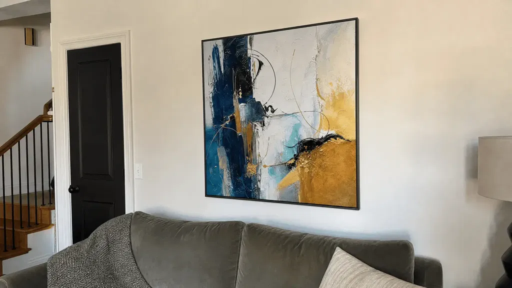
Matching every finish is usually less effective than choosing one clear relationship. For example, if cabinetry, backsplash, and glass already provide several textures, a restrained piece may create a calmer focal wall. If the room is mostly neutral, a more colorful direction may give the bar enough visual presence. Check the result with the bar’s usual lights on, including reflected light from glass or polished metal. A colorful abstract painting may be a useful inspiration path for a stronger accent, while oil paintings offer a broader category to compare; neither link establishes a particular piece’s dimensions, framing, or care properties.
Set Scale Around Sightlines and Focal Walls
Choose scale and orientation by measuring the unobstructed wall and testing it from the positions of the people who will use the room. There is no universal home-bar artwork ratio that fits every layout, so let the wall, furniture relationship, architectural interruptions, and strongest guest viewpoints determine whether one piece, a pair, or a compact grouping makes sense.
- View and photograph the wall from real guest positions. Take one view from the entry, one from the barstools, and one from the main seating or entertaining area. These views reveal whether the artwork will remain readable or become hidden behind a shelf, bottle display, or lighting fixture.
- Record the unobstructed width and height. Measure only the wall area that can actually receive art. Subtract or note shelves, controls, trim, outlets, door swings, and other features that affect the available field. This gives you a practical comparison against the displayed dimensions of each listing.
- Compare orientation, displayed size, and negative space. A horizontal piece may follow a long run of cabinetry, while a vertical work may suit a narrow wall between architectural features. A pair or grouping can help an interrupted wall, but only if the combined footprint and spacing remain clear from the main viewpoints.
Use removable paper or painter’s tape to outline the displayed dimensions before ordering. Step back from each normal viewing position and check whether the outline blocks a control, crowds a trim line, or leaves an awkward gap above a feature. This is a viewpoint-based design test, not a promise of a particular hanging height or universal proportion.
Place Art Away From Spills and Congestion
Place art on a visible, low-contact wall only after checking splash exposure, traffic and service access, glare, and the room conditions relevant to the artwork’s documented care guidance. A wine room, basement bar, or tasting nook should not be treated as automatically suitable for every medium simply because it is designed for entertaining.
- Screen splash exposure. Look near sinks, prep areas, bottle handling, ice service, and surfaces where a glass may be set down or knocked over. A wall outside the active splash and service zone is a more conservative starting point than the wall immediately behind a wet bar.
- Protect traffic and access. Check door swings, equipment access, bottle retrieval, crowded corners, and places where guests may brush against the wall or lean over a counter. Art should not narrow a route or interfere with routine service.
- Test glare from more than one position. Turn on the normal bar lights and check from standing and seated viewpoints. Glass, polished stone, and metal can reflect light into the viewing path, so a piece that looks clear in one position may be difficult to read from another. Broader conservation guidance also treats light exposure as an environmental consideration, not as a reason to promise that a particular bulb or angle prevents damage. A review of artwork-care considerations supports treating light, temperature, and humidity as factors to manage cautiously.
- Review room conditions and the artwork’s care guidance. Before placing artwork near an appliance or in a wine room, check for unusual temperature, humidity, condensation, or heat and follow the piece’s own documented guidance. Temperature and humidity stability guidance supports making that check without calling any artwork humidity-safe or heat-safe. For paper-based artwork, use care guidance for paper-based artwork and confirm that the proposed location is clean, relatively dry, and stable; do not apply paper-specific advice to every painting or framed object.
A wall can still be atmospheric without being the most exposed wall in the room.
Build a Shortlist You Can Confidently Shop
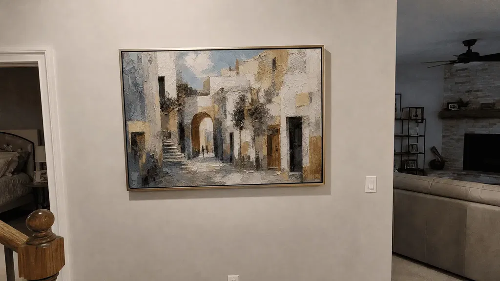
The strongest shortlist passes the mood, color, scale, sightline, and placement checks before style labels decide the final choice. The right wine and art painting should work with those conditions rather than rely on a style label alone. Abstract, landscape, and cityscape art can each work as a conditional direction, but fixed finishes, lighting, orientation, and the room’s viewpoints determine the fit.
| Style direction | May suit when | Tie-breaker for this room |
|---|---|---|
| Abstract | You want energy, interpretation, or a stronger color relationship | Does its contrast support the cabinetry and remain readable from several viewpoints? |
| Landscape | You want a calmer, more grounded visual direction | Does its palette connect to wood, stone, or other natural finishes without disappearing? |
| Cityscape | You want a more urban, social, or contemporary reference | Does the subject reinforce the room’s mood without competing with bottles, shelving, or display lighting? |
Use those categories as shopping filters, not rankings. A quiet textured abstract may be more compatible with a traditional tasting nook than a literal vineyard scene, while a cityscape may suit an open-plan bar with modern metal and glass. Conversely, a landscape can become too low-contrast against dark cabinetry. A neutral textured abstract can serve as a discovery path for a restrained direction, but verify the current listing rather than inferring its dimensions, construction, or environmental suitability.
Before ordering, work through this five-step worksheet:
- Name the mood. Write down quiet and collected, warm and rustic, lively and contemporary, or your own precise description.
- Photograph and measure the wall. Record the usable width and height from the entry, barstools, and main guest position.
- Test the color relationship. Decide whether the candidate is dominant, supporting, or controlled contrast, then review it with normal evening lighting.
- Inspect placement risks. Check splashes, traffic, service access, glare, condensation, heat, and the medium-specific care information available for the piece.
- Verify purchase details. Confirm the listing’s displayed dimensions, orientation, documented product details, stated care or environmental guidance, shipping terms, and returns policy before adding it to the cart. If the listing does not provide information you need, do not fill the gap with assumptions; ask the seller or choose a better-documented option.
If you are still comparing categories after these checks, browse additional room art as a discovery path, then return to the worksheet. We can help you browse our available categories, but the final choice should follow your room’s measurements, lighting, fixed finishes, and documented product information—not a generic promise that one style will transform every bar or wine room.
FAQs
Use these final checks for common home-bar and wine-room layouts before you order.
Can You Hang Art Near a Wine Fridge?
Possibly. Check condensation, heat, vibration, access, and seller care guidance; room type alone does not establish suitability.
Is a Diptych Better in a Narrow Wine Room?
It may fit an interrupted wall, while one piece may suit an uninterrupted wall. Compare total displayed width, spacing, and viewpoints.
How Do You Choose Art With Multiple Viewing Angles?
Photograph the wall from the entry, barstools, and main guest position. Choose the option that stays readable without blocking access.
What Should You Check Before Ordering?
Verify displayed dimensions, orientation, care guidance, shipping, and returns. Ask the seller about any missing detail instead of assuming performance or fit.