Neutral abstract wall art feels warm when the color is soft but the surface still has visible variation. Beige, taupe, cream, and earth tones can all work, but a piece usually feels inviting only when undertone, texture, and contrast give the eye something to hold onto. Warm neutrals help, but depth is what keeps the piece from feeling blank.
Why Some Neutrals Feel Warm
Warm neutrals usually read cozier than cool ones because they carry undertones that lean yellow, orange, or red rather than icy gray. Benjamin Moore’s warm-and-cool color guidance is a useful starting point if you want the artwork to soften a room instead of sharpening it. A 2026 interior color trend roundup also points toward warmer neutrals and texture, but that is best treated as background, not proof that every warm neutral will feel the same in every room.
Warmth alone does not keep a piece from disappearing. If the artwork is close to the wall color, too matte, and too uniform, it can still read blank at normal viewing distance. In practice, neutral abstract wall art feels warm when there is enough difference in tone, surface, or shape for the eye to register layers instead of one quiet field.

Beige, Taupe, and Earth Tones Compared
The easiest way to compare beige, taupe, cream, and earth tones is by how much visual weight they carry in the room. Beige and cream tend to feel lighter and airier, while earth tones usually feel more grounded. Taupe sits in the middle and can add more depth than a pale beige, especially when the undertone shifts a little warmer or grayer, but that effect depends on the lighting and what is around it.
| Palette Family | Visual Feel | Best When You Want | Can Read Flat When... |
|---|---|---|---|
| Cream | Soft, bright, airy | A calm piece that still lightens the wall | It is too close to white walls or pale upholstery |
| Beige | Warm, easy to style, understated | A gentle backdrop that does not dominate | The room is already full of similar tan or sand tones |
| Taupe | Slightly richer, more layered | A neutral that feels a little deeper than beige | Low light makes its undertone disappear |
| Earth tones | Grounded, organic, more present | A warmer focal point with some visual weight | The furniture and wall color are already dark and muted |
Benjamin Moore’s color guidance on warm neutrals supports the basic warmth distinction, and taupe is often described as sitting between gray and beige. The practical takeaway is simple: choose cream if you want softness, beige if you want easy blending, taupe if you want a touch more richness, and earth tones if you want the neutral palette to feel more anchored.

If you are comparing finishes and palette families, neutral art is the safest category path because it lets you scan several looks before you commit. A helpful check is to compare the room’s wall, sofa, and wood tones against the artwork photo, because neutral pieces fail most often when they match too closely.
Texture Cues That Add Depth
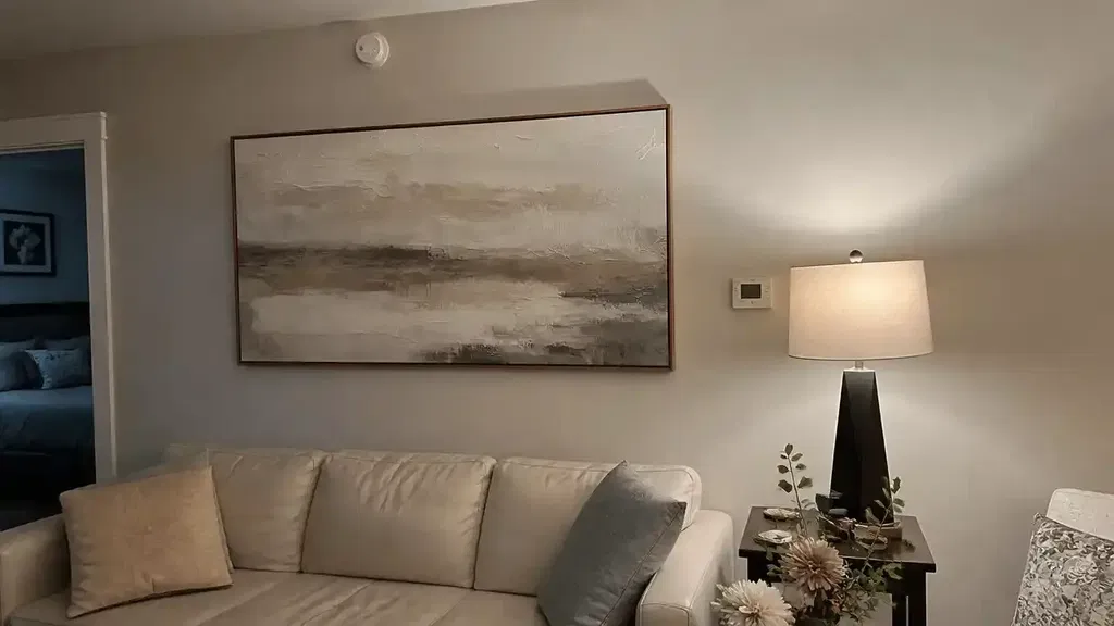
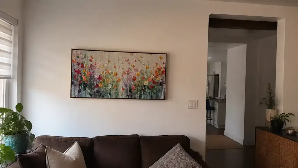
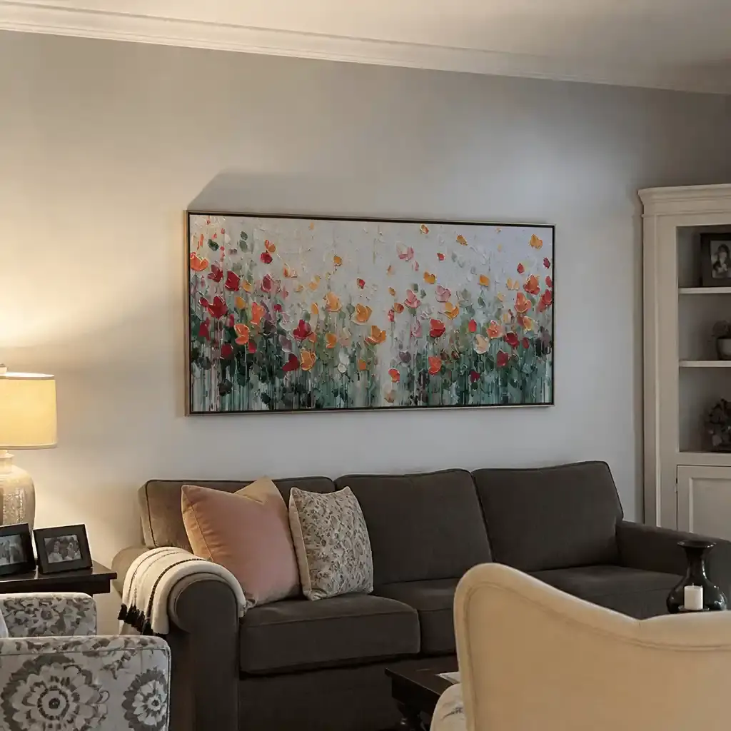
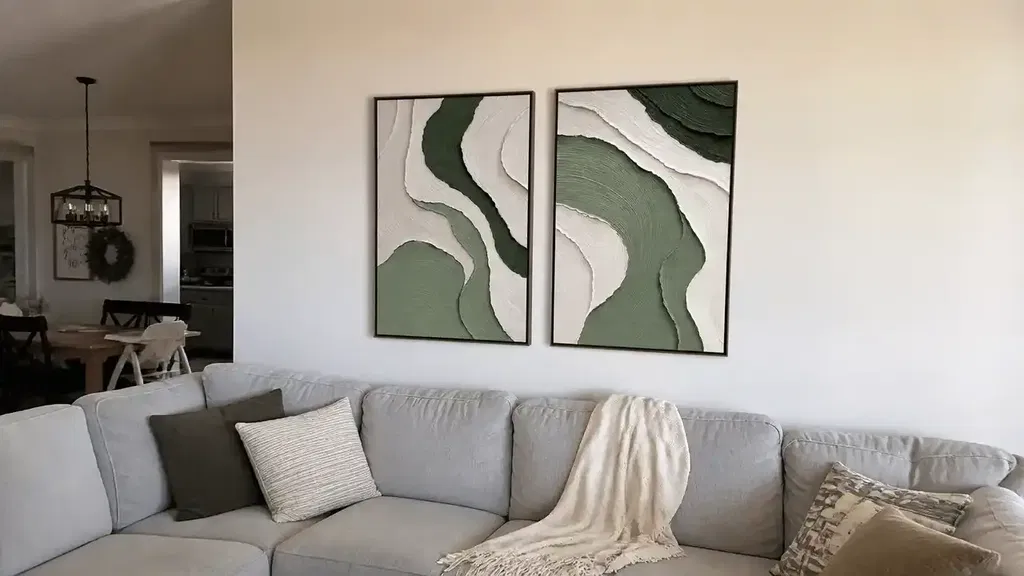
Texture is what keeps a neutral piece from looking like a filled-in blank space. In art terms, impasto painting means thick paint or built-up marks that sit visibly on the canvas instead of lying perfectly flat. For shoppers, that matters because raised or layered surfaces create small shadows and light shifts that make a beige or taupe piece feel more dimensional.
Impasto and Raised Surface
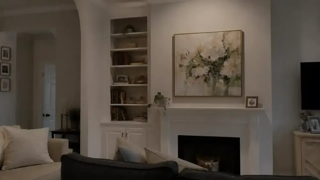
Impasto works best when you want a neutral abstract to feel tactile without adding more color. The raised areas are usually most visible from the side or in angled light, which makes them especially useful above a sofa, headboard, or entry table where the wall needs some presence. A minimalist beige impasto painting can still feel calm, but it will usually look richer than a smooth print because the surface itself does some of the visual work.
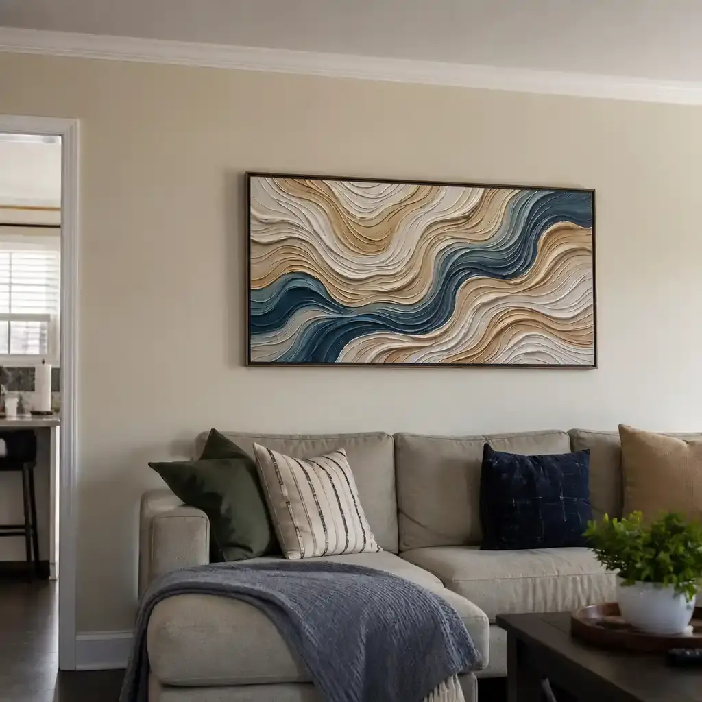
Brushwork and Layered Strokes
Visible brush direction adds movement even when the palette stays quiet. Layered strokes can make warm neutral abstract artwork feel hand-finished and intentional, especially if the marks overlap enough to create slight tonal shifts. This is a good middle ground for buyers who want warmth and depth but do not want a heavy, highly sculptural surface.
Subtle Texture for Minimalist Rooms
In a minimalist room, less texture can actually work better. If the furniture already has strong lines or the layout feels busy, a softer surface keeps the art from competing with everything else. The key is not to eliminate texture completely, but to keep enough variation that the piece still reads as art rather than a beige rectangle.
If you want to compare different levels of relief, textured wall art makes that easier before you choose a final look. The best pieces here usually show visible brushwork, irregular ridges, or layered color transitions rather than a perfectly even finish.
How Contrast Keeps Neutrals Interesting
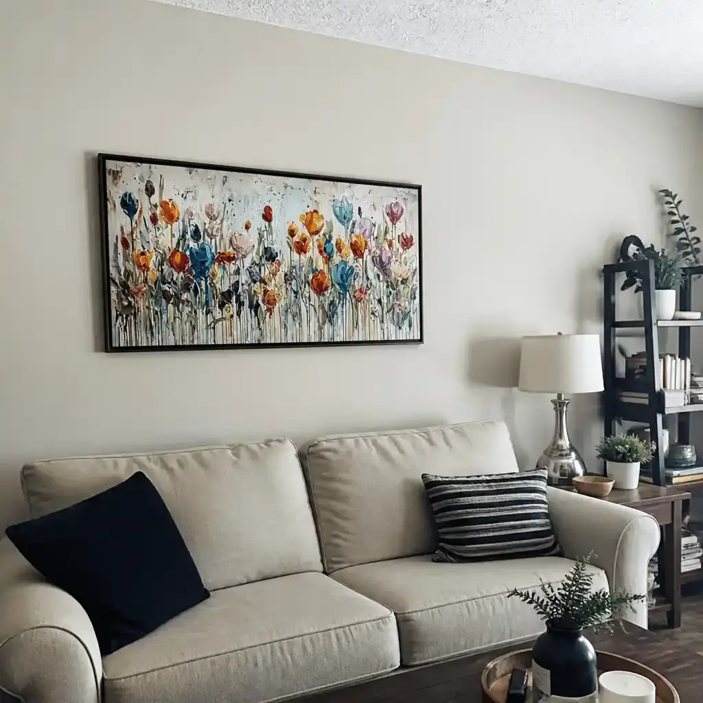
Contrast does not have to mean brighter color. In neutral abstract wall art, contrast can come from value, line, texture, or shape. What matters is whether the piece has enough difference from the wall and nearby furniture to stay legible at a glance.
- If your walls are cream, look for deeper beige, taupe, or earth tones so the art does not vanish into the background.
- If your sofa is a similar neutral, choose a piece with stronger surface relief or more obvious brush direction.
- If the room already has wood tones, aim for artwork that either warms them up or adds a clearer light-dark shift.
- If the room is visually busy, softer contrast and quieter texture usually feel better than a high-energy composition.
- If the wall is large and open, more tonal separation helps the piece read as a focal point instead of just decor.
A warm beige piece can still look flat if it is too close to the surrounding finish, while a slightly deeper taupe or earth-toned canvas can feel more alive simply because it creates a clearer edge against the room.
If the room already leans soft and calm, beige minimalist abstract wall art is a practical checkpoint. The piece should help define the wall, not blend into it.
Choose the Right Size and Placement
- Start with the wall role. A sofa wall, headboard wall, and entry wall all ask for different amounts of visual presence. If the wall needs to anchor furniture, a larger piece usually feels more deliberate than a small one.
- Check the room distance. In a living room, you usually see the art from farther away, so stronger shape or texture helps. In a bedroom or hallway, quieter texture can work because the viewing distance is shorter.
- Match the scale to the surrounding shapes. Tall ceilings, wide sofas, and open-plan rooms generally make a neutral piece feel more intentional when it has enough width or height to hold the space.
- Decide whether the art should blend or lead. If the room already has strong patterns, the artwork can stay softer. If the room is calm, the art may need more relief or more scale to become the focal point.
- Review the photo against the actual room. A piece that looks balanced online can still feel timid if it is too small for the wall or too similar to nearby finishes.
Oversized art can help a quiet palette feel anchored, especially in modern rooms where the rest of the decor is restrained. For that reason, large wall artwork is a smart browse path when you know the wall needs presence more than color.
A Quick Selection Checklist
- Does the piece still show warmth when you look at it beside your wall, sofa, and wood tones?
- Do you see real surface variation, brushwork, or layered marks, not just a flat beige field?
- Is the contrast strong enough that the artwork will stay visible in your room’s lighting?
- Does the size help the wall feel intentional instead of tentative?
- Will the texture feel easy to live with in that room, or will upkeep make it annoying?
- If the art depends on tiny undertone shifts that disappear from the sofa, pass on it.
- If the surface only looks textured in the listing but not in close-up or side-angle photos, pass on it.
If you want a softer, more restrained look, browse abstract paintings for sale and compare pieces by surface depth first, not by color alone. If you want more presence, a textured beige or earth-tone canvas is usually the better fit than a smooth print.
Final Takeaway
The best neutral abstract wall art is warm, but not washed out; simple, but not empty. Start with palette, then check texture, contrast, and scale against the room you already have. If those four pieces line up, the artwork is more likely to feel intentional instead of flat. Browse neutral art or textured wall art once you know whether your room needs softness, depth, or more presence.
FAQs
How Do I Keep Neutral Abstract Wall Art From Looking Flat?
Choose a piece with at least one extra layer of interest, such as raised texture, visible brush direction, or a slightly deeper tone than the wall. If the artwork matches the room too closely and has no visible relief, it is much more likely to blend in than anchor the space.
What Neutral Colors Usually Feel Warmest in Abstract Art?
Beige, cream, taupe, and earth tones usually read warmer than cool gray-based neutrals. The fastest check is undertone: if the color leans softly yellow, orange, or red, it will usually feel cozier, especially in rooms with warm wood or natural light.
Can Beige Textured Abstract Art Work in a Minimalist Room?
Yes, as long as the texture stays restrained and the room still has enough contrast for the piece to show up. In a minimalist room, one strong surface detail is usually better than many competing effects. If the furniture is already bold, keep the art quieter.
What Room Styles Suit Warm Neutral Abstract Artwork?
It usually fits modern, transitional, minimalist, and soft organic rooms because those styles already rely on calm color and simple shapes. The main variable is scale: the more open the wall, the more the piece needs presence to avoid looking like a placeholder.
How Do I Choose Between a Quiet Piece and a Statement Piece?
Choose quiet when the room already has strong furniture, pattern, or color. Choose statement when the wall is large, the room feels unfinished, or you need the art to act as the anchor. If you are unsure, compare the art against the biggest nearby object, not just the wall color.