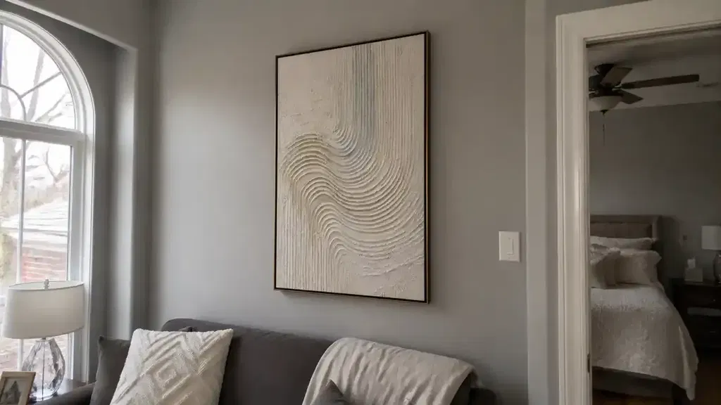
The 70/30 rule in art is a foundational composition principle stating that 70% of an artwork should be dominated by a unifying element, while the remaining 30% should consist of contrasting accents. This deliberate asymmetry creates a clear visual hierarchy, preventing the viewer's eye from becoming lost in a chaotic image or bored by a perfectly symmetrical one. Whether you are working on landscape paintings or intricate oil paintings, mastering this ratio allows you to guide the viewer’s gaze exactly where you want it to land.
By establishing a clear relationship between dominance and subordination, artists can inject life into their work. Without this balance, a piece may feel "unresolved" or static, lacking the tension necessary to keep a viewer engaged. Understanding the 70/30 rule is the first step toward moving beyond basic techniques and toward a professional-level command of visual storytelling.
The Core Principle of the 70/30 Rule in Composition
At its heart, the 70/30 rule is about making a choice. Every painting needs a leader and a supporting cast. The 70% represents your "dominant element"—this is the area that unifies the piece, providing a sense of atmosphere, rest, or consistent texture. The 30% represents your "subordinate accents"—these are the elements that provide contrast, conflict, and interest.
This relationship is crucial because the human brain naturally seeks out patterns but is captivated by anomalies. When 70% of a canvas follows a consistent pattern, the 30% that breaks that pattern becomes the focal point. This is how artists tell the viewer what is most important in a scene.
Dominant Elements vs. Subordinate Accents
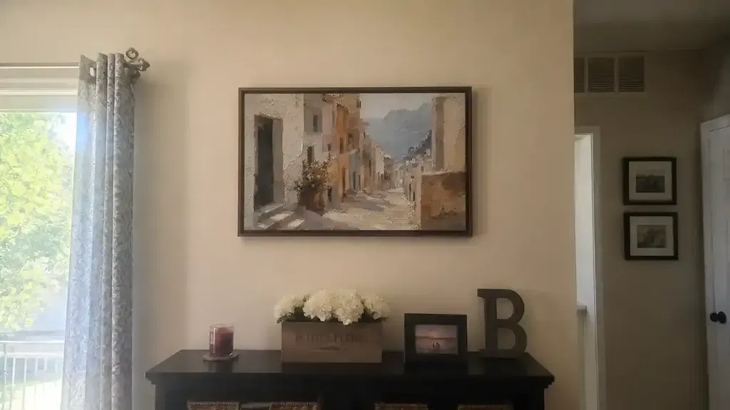
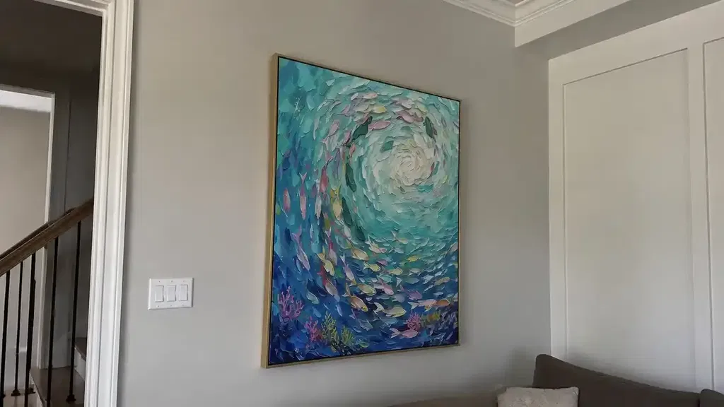
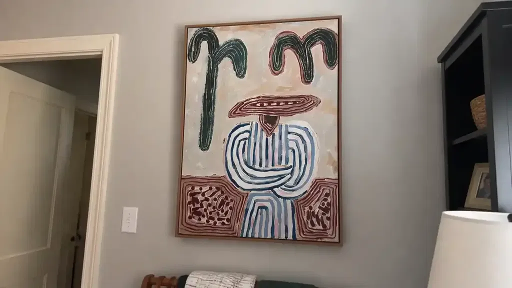
To apply this rule effectively, you must identify which elements will play the dominant role. In most successful landscape paintings, the dominant 70% might be a vast, relatively simple sky or a sweeping field of grass. The 30% would then be reserved for the high-contrast mountain peak or a cluster of detailed trees.
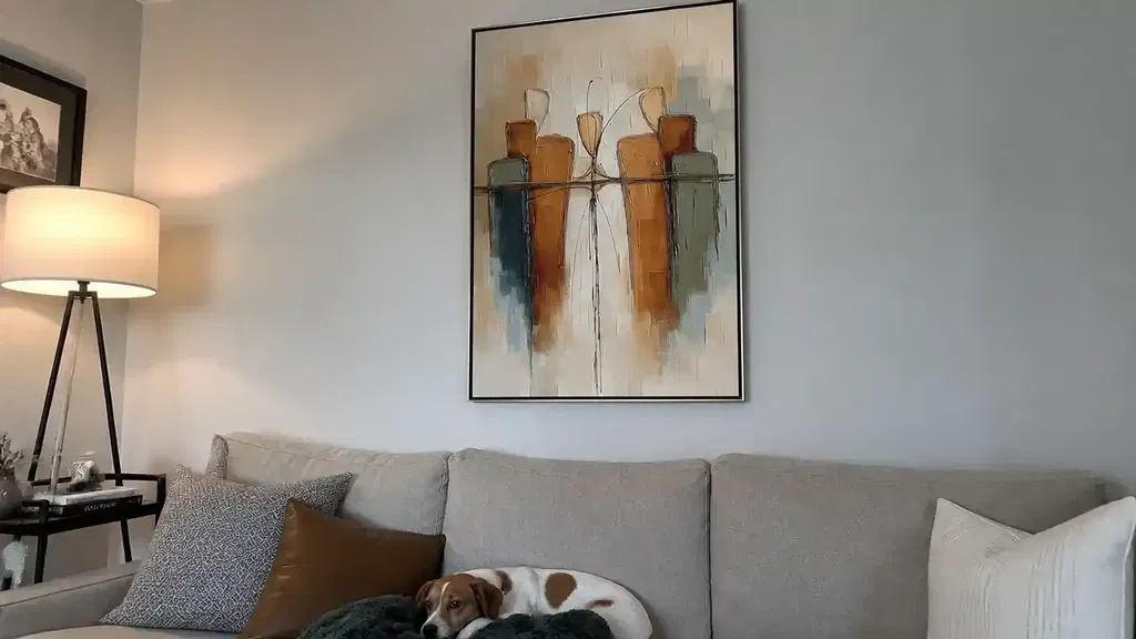
In abstract art, the 70% might be a single color family or a consistent brushwork style, while the 30% introduces a sharp, geometric shape or a splash of a complementary color. This division ensures that the "accent" doesn't fight the rest of the painting for attention; instead, it sits comfortably within the environment established by the dominant majority.

Why the 70/30 Split Beats a 50/50 Balance
A common mistake for beginning artists is the 50/50 split. We have a natural biological pull toward symmetry, which often leads us to place a horizon line exactly in the middle or divide a canvas into equal halves of light and dark. However, in visual art, a 50/50 split often feels static and unresolved. When elements are equal in weight, they compete for the viewer’s attention, causing the eye to bounce back and forth without a place to rest.
Asymmetry creates visual tension. By tilting the scales to a 70/30 ratio, you create a dynamic movement. The 70% acts as a platform that launches the viewer toward the 30% focal point. This psychological effect is why professional contemporary art often feels more energetic than amateur work; it isn't just about the subject matter, but how the proportions of that subject are distributed.
| Composition Ratio | Visual Impact | Viewer Reaction |
|---|---|---|
| 50/50 (Symmetrical) | Static, balanced, but often boring. | The eye feels stuck or indecisive. |
| 70/30 (Asymmetrical) | Dynamic, focused, and intentional. | The eye is guided quickly to a focal point. |
| 90/10 (Minimalist) | Extreme focus, high tension. | The eye is shocked or highly concentrated on the 10%. |
Applying the Rule to Color and Value Distribution
Color and value are perhaps the two most powerful tools for implementing the 70/30 rule. If you use too many vibrant colors in equal amounts, the painting will appear "loud" and difficult to process. Instead, professional artists often use 70% neutral or desaturated tones to allow the 30% of vibrant color to truly pop.
Color Schemes and Saturation
Consider the work of master painters like Seurat. Research indicates that certain color changes in Seurat’s masterworks began during his lifetime, potentially shifting the original intended balance. However, the core principle remains: by using a large area of unifying color, the smaller accents of contrasting hue become much more effective.
In oil paintings, you might use a 70% palette of earthy ochres and umbers, leaving 30% for a brilliant ultramarine blue. This technique is often seen in historical masterpieces where the artist uses a limited palette to maintain harmony, then breaks that harmony at the focal point. For example, Alma Thomas used bright colors against white grounds to create specific rhythmic hierarchies that guide the viewer’s eye through the composition.
Value Patterns
Value—the lightness or darkness of a color—is even more important than the hue itself. A successful value distribution often follows a 70/30 split between light and shadow. If 70% of your painting is in shadow, the 30% that is hit by light will feel like a dramatic spotlight. Conversely, a high-key painting where 70% is light and 30% is dark will feel airy and open. For example, Van Gogh utilized contrasting colors and prominent impasto to create expressive language where the distribution of thick paint and high-contrast values defined the room's energy.
Using 70/30 for Detail Management and Negative Space
One of the most frequent questions from artists is: "Why does my painting look too busy?" The answer is usually a lack of resting areas. If every square inch of your canvas is filled with high-detail work, the viewer's brain becomes overwhelmed. The 70/30 rule suggests that you should keep 70% of your canvas relatively simple, reserving the high-detail work for the remaining 30%.
The Importance of Resting Areas
Negative space is not "empty" space; it is functional space. In modern abstract art, negative space allows the "positive" shapes to breathe. By dedicating 70% of the canvas to simpler shapes, gradients, or flat colors, you create a visual sanctuary. This makes the 30% of intense detail feel like a reward for the viewer.
Artists like Constable demonstrated this by varying paint consistency between thick impasto and thin passages, ensuring that the most tactile and detailed areas were concentrated where they mattered most. This prevented the large-scale works from becoming a cluttered mess of texture.

The 70/30 Rule vs the Rule of Thirds in Visual Arts
It is easy to confuse the 70/30 rule with the Rule of Thirds, but they serve different purposes. The Rule of Thirds is a grid-based system for placement. It tells you where to put your subject (usually at the intersections of a 3x3 grid). The 70/30 rule is about proportion. It tells you how much of an element should be present.
You can use both rules simultaneously. For instance, you might place your main subject on one of the grid lines (Rule of Thirds) and ensure that your subject and its surrounding details only occupy about 30% of the total canvas area (70/30 Rule).
| Feature | 70/30 Rule | Rule of Thirds |
|---|---|---|
| Core Function | Proportional distribution. | Placement and alignment. |
| Primary Goal | Creating dominance and subordination. | Avoiding center-focused, static placement. |
| Metric | Percentage of canvas area. | Grid-based coordinates (1/3rd increments). |
| Extreme Version | 80/20 Rule (Pareto Principle). | Golden Ratio (Spiral placement). |
How to Audit Your Artwork for Better Composition
Implementing the 70/30 rule requires constant checking during the creative process. It is easy to get carried away with detail and accidentally fill 60% or 70% of the canvas with "busy" work. Use this checklist to audit your composition as you work:
- The Squint Test: Squint your eyes until the image becomes blurry. Do you see one clear dominant mass and one clear subordinate mass? If everything looks like a grey smudge of equal value, your 70/30 balance is off.
- The Zoom Test: If working digitally, zoom out until the image is the size of a postage stamp. Does the focal point still stand out? The 30% should remain visible even at a distance.
- The Value Audit: Look at your painting in grayscale. Is about 70% of the piece within a similar value range (e.g., mid-tones), with 30% providing the dark and light extremes?
- The Color Dominance Check: Identify your main color family. Does it cover roughly 70% of the canvas? If you have four or five colors in equal proportions, consider desaturating some to restore dominance.
- Identify Resting Areas: Point to the parts of your painting where the eye can rest. If you cannot find a clear 70% of "quiet" space, you may need to simplify some sections.
Conclusion: Mastering Your Style with the 70/30 Rule in Art
Understanding what the 70/30 rule in art is—and how it differs from other compositional tools—is a significant milestone in any artist's journey. By moving away from the safety of 50/50 symmetry and embracing the dynamic tension of dominance and subordination, you give your work the professional polish it deserves. Whether you are balancing color saturation, value contrast, or the density of detail, this ratio ensures that your viewer always knows where to look and, more importantly, feels the intended emotion of the piece.
Mastering the 70/30 rule in art doesn't mean you can never break it; it means you finally have a baseline from which to make intentional choices. As you audit your next project, remember that the most powerful parts of a painting are often the ones that stand alone against a vast, unifying background. Use your 70% to build the world, and your 30% to tell the story.
FAQs
Is the 70/30 rule the same as the Golden Ratio?
No. While both deal with aesthetic proportions, the Golden Ratio is a specific mathematical ratio (approx. 1:1.618), whereas the 70/30 rule is a flexible compositional guideline for dominance and subordination.
Can I use the 70/30 rule in photography?
Yes. In photography, the 70/30 rule is used to balance subjects against backgrounds, manage color distribution, or ensure that a landscape has a clear focal point rather than a middle-divided horizon.
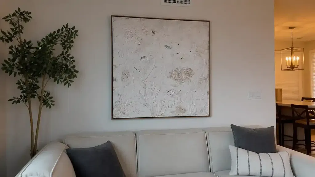
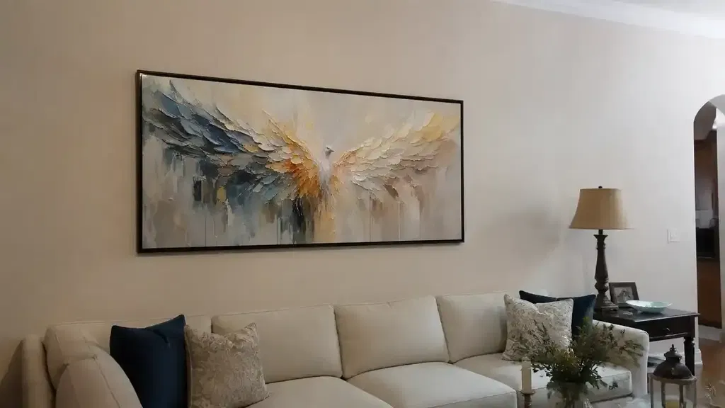
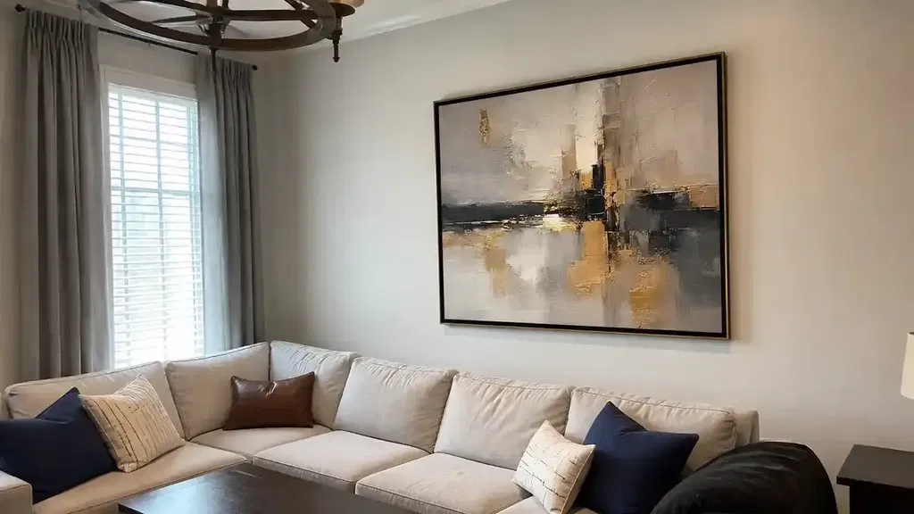
How do I use the 70/30 rule in interior design?
In interior design, this is often a variation of the 60-30-10 rule. You use 70% for the main color (walls/rugs), 20% for a secondary color (upholstery), and 10% for bold accent pieces (pillows/art).