A cohesive abstract gallery wall does not require matching paintings. It needs a shared thread, one clear anchor, controlled visual weight, and enough negative space for each original to remain distinct. Start by deciding the wall’s mood or purpose, then choose the strongest work, build a wall-specific layout, test it at full scale, and remove anything that competes with the composition. Subjects, orientations, frames, and textures can vary when they support a broader direction instead of demanding attention all at once.
Choose the Thread for an Abstract Gallery Wall
Different original paintings can feel like one collection when they share a dominant visual or emotional direction. Choose a thread such as a calm tonal range, energetic mark-making, an earthy material feel, a landscape-inspired direction, or a conversational mix of color. The paintings do not need the same subject, style, or dominant color; they need a reason to belong on the same wall.
Before arranging anything, define the wall’s job. Should it feel calm, grounded, energetic, or collected over time? Then give each painting a quick compatibility screen:
- Keep pieces that support the intended mood and share at least one useful cue, such as palette, intensity, texture, or mark-making.
- Set aside pieces that compete with the mood across several major cues, even if they look appealing on their own.
- Allow variation in subject, orientation, and style when that variation strengthens the larger direction.
This is a practical way to decide which works belong in a gallery wall with original paintings before you buy another piece. If the group needs more options after editing, you can browse original paintings by direction instead of choosing an isolated favorite first.
Build the Layout Around One Anchor Painting
Choose the painting with the clearest visual presence as the anchor, then arrange supporting works around its energy, orientation, color, or texture. The anchor may be the largest piece, but it does not have to be; a smaller work with stronger contrast or more distinctive marks can lead the eye. It also does not need to sit precisely in the center. For a useful comparison of layout approaches, see gallery wall layout ideas, but treat measurements as starting points rather than universal rules.
Let the anchor establish the first compositional axis. A vertical work may organize a taller cluster, while a horizontal work can stabilize a wider arrangement. For varied originals, an organic or salon-style layout usually gives different sizes and orientations more flexibility than a strict grid. A grid or linear arrangement can work when repeated sizes, edges, or furniture lines are already part of the room.

Pair Supporting Pieces by Role
Give each supporting painting one job instead of asking every work to be equally prominent.
| Painting role | What it contributes | What to check |
|---|---|---|
| Anchor echo | Repeats a color, mood, texture, or mark | Does it reinforce the lead without competing? |
| Counterweight | Balances the anchor’s visual mass | Does it offset a strong side, height, or dark area? |
| Bridge | Connects paintings that differ in style or subject | Does it share a cue with both neighboring works? |
| Quiet pause | Creates visual breathing room | Is it calmer in color, texture, or contrast? |
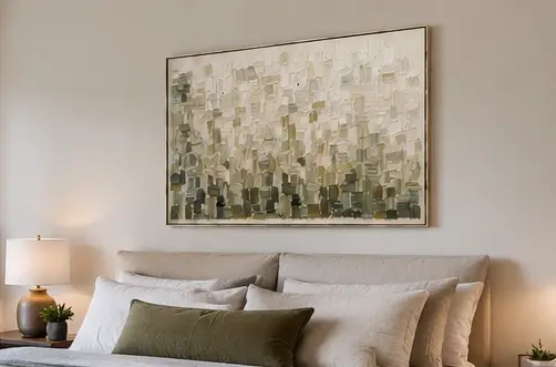
For example, a neutral textured abstract might serve as a visual pause in one arrangement, while a more saturated painting could act as a counterweight in another. Treat those as possible roles, not guaranteed fits; compare the actual dimensions, surface, frame, and palette with your collection.
Handle Portrait and Landscape Orientations
Mix portrait and landscape paintings deliberately rather than forcing every edge into symmetry. Counter a tall portrait with nearby horizontal breadth, a shared alignment, or an intentional open margin. Conversely, a wide painting may need a vertical neighbor to keep the arrangement from spreading too heavily across one band.
Look at total visual mass instead of matching orientations one-for-one. If the mixed arrangement feels accidental, move one work at a time: shift the tallest piece, strengthen a nearby edge, or open the margin beside it. Controlled asymmetry can feel collected; random gaps usually feel unresolved.
Set Spacing and Scale for an Abstract Gallery Wall
Define the usable wall area first, including nearby furniture, door trim, corners, and the portion of the wall you actually want the group to occupy. Begin with a consistent visual gap that makes the works read as one cluster, then adjust it for artwork scale, frame depth, texture, and the density you want. There is no single gap that suits every wall of original paintings. Layout families can help frame the choice: a grid, linear, or organic arrangement may suit different wall shapes, piece counts, and levels of structure.
| Situation | Starting layout response | Adjustment to test |
|---|---|---|
| Small wall or narrow hallway | Use a compact cluster with fewer works | Remove a piece before squeezing the gaps; preserve a readable outer margin |
| Wide wall | Give the group room to spread or use larger outer margins | Compare the cluster with the furniture and wall boundaries, not the empty wall alone |
| Mixed orientations | Balance total visual mass rather than identical edges | Shift a horizontal, vertical, or open margin until the group feels controlled |
| Many small paintings | Strengthen the anchor and outer boundary | Group the works by rhythm and reduce fragments if the wall reads as scattered |
The first variable to change depends on the problem. If the wall feels crowded, reduce the piece count. If the group feels timid on a broad wall, test a wider spread or stronger outer boundary. If one side feels heavy, adjust the anchor position or counterweight before changing every gap. Consistency within the chosen layout matters more than following a fixed measurement.
Repeat Color Without Flattening the Composition
Use a few meaningful visual echoes to connect the paintings without making them look like a manufactured set. A secondary color, tonal family, frame warmth, edge treatment, or mark-making rhythm can link different subjects while preserving individual character. Distribute those cues across the grouping so one corner does not carry all the visual energy. Color echoes across a gallery wall can help connect varied works, but use them as a flexible cue rather than a matching requirement.
Use a Limited Color Echo
Use this color checklist before you finalize the group:
- Dominant mood: Decide whether the overall direction is soft, deep, bright, earthy, or high-contrast.
- Secondary echo: Find a supporting color or tonal family that appears in more than one work.
- Neutral bridge: Include a quieter painting or open area when stronger colors compete.
- Final distribution: Check that related hues are not clustered in one corner or isolated beside unrelated intensity.
Matching every dominant color can flatten the composition. A blue detail echoed in two works may be enough to connect a warm abstract, a landscape-inspired piece, and a neutral painting without making them identical.
Balance Frames, Canvas Edges, and Texture
Frames and surface qualities are part of the composition, not afterthoughts. When finishes differ, let another cue—such as palette, spacing, or mood—do the organizing work. If both the frames and the paintings vary widely, simplify the louder system rather than forcing every finish to match.
| Variation | Cohesion move | Avoid |
|---|---|---|
| Mixed frame finishes | Repeat a general warmth or distribute finishes across the group | Letting one unusual frame become the only strong pattern |
| Framed and unframed work | Use alignment, palette, or consistent visual gaps to connect edges | Treating the canvas edge as an accidental gap |
| Heavy texture | Place it beside a smoother surface or more open space | Clustering the most dimensional works together |
| Smooth and highly detailed surfaces | Use the smoother piece as a visual pause | Filling every quiet area with another high-contrast work |
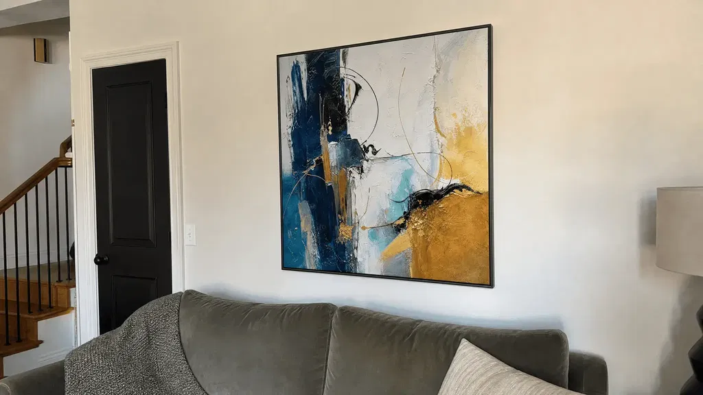
Treat heavily textured paintings as strong accents. A blue and gold abstract, for instance, may carry more visual force than its footprint suggests if its color contrast and surface are both pronounced. Judge that effect beside the actual neighboring works, not by the title or category alone.
Test the Composition With Paper Templates
Paper templates let you evaluate the full arrangement before drilling holes or buying another painting. They test composition and placement only; they do not confirm hardware capacity, artwork weight, or wall safety.
- Measure the actual outside footprint. Trace the full frame or canvas dimensions that will occupy the wall, not just the painted image area.
- Label every template. Write the painting’s name or identifier on the paper and mark the top edge so portrait and landscape orientation remain accurate.
- Mark the usable boundary. Show the wall edges, furniture boundary, trim, corners, and any area that should remain clear.
- Tape the anchor first. Place the lead painting, then add supporting templates according to their roles. Use removable tape so you can rearrange without committing.
- Photograph and compare. View the arrangement from normal room distance as well as close up. Photograph alternatives, then change one variable at a time—anchor position, outer margin, one gap, or one supporting piece.
Assess the wall as a complete composition. A template can look attractive by itself while making the entire group too dense, too low, too heavy on one side, or disconnected from nearby furniture. Once the layout works visually, complete separate checks for hanging hardware, artwork weight, and the wall surface. If you need a separate placement reference, plan art placement without treating any single hanging-height rule as universal.
Make the Final Edit Before Hanging
If the tested arrangement still feels cluttered, remove the painting that contributes least to the shared thread, hierarchy, balance, or rhythm. A smaller, clearer group often serves the wall better than a full collection included only to fill an opening.
Run this final edit from both close and far viewing distances:
- Thread: Does every remaining work support the wall’s mood or broader direction?
- Hierarchy: Is the anchor still the clearest visual lead?
- Orientation: Do portrait and landscape pieces create controlled movement rather than abrupt stops?
- Color: Are repeated hues distributed, with a neutral pause where needed?
- Texture: Is a dense surface beside something calmer or more open?
- Outer space: Does the group have a readable boundary instead of expanding into random gaps?
- Furniture relationship: Does the total mass feel connected to the furniture or architectural feature nearby?
Make one deliberate subtraction test: remove the piece you trust least, step back, and compare the result. Keep it only if its absence weakens the whole composition. After the arrangement is approved, you can explore abstract paintings for a future addition—but shop to solve a specific role, such as bridge or counterweight, rather than adding another attractive piece without a job.
FAQs
Start with the wall’s purpose and strongest visual thread, then test the anchor, spacing, and supporting roles at full scale. The answers below address common exceptions without turning any one gap, height, or frame choice into a universal rule.
Can Paintings in Different Art Styles Work on the Same Gallery Wall?
Yes, if at least one stronger thread connects them: palette, mood, frame treatment, scale relationship, or repeated mark-making. Set aside pieces that compete across nearly every major cue; variety is useful only when the group still has a recognizable direction.
How Should Spacing Change on a Very Small Wall?
Reduce the number of paintings before compressing the gaps. Preserve a readable outer margin and choose a compact cluster whose total visual mass fits the wall section and nearby furniture. If it still feels cramped, keep the strongest anchor and supporting roles.
What Should I Do If None of My Frames Match?
Group the frame differences by general warmth or finish, then repeat one frame cue where you can. Use color echoes, aligned edges, and consistent visual gaps to keep the frames from becoming the loudest pattern; replacing every frame is not the only way to make the arrangement feel intentional.
Should Every Painting in a Gallery Wall Be the Same Size?
No. Varied sizes can create hierarchy and rhythm, but they need an anchor, a controlled outer boundary, and enough counterweight to prevent a lopsided cluster. If one large work overwhelms several small ones, spread the smaller visual mass around it or remove a piece rather than automatically adding more small art.