Breaking the Grid: When to Shift from Symmetry to Asymmetry
For many home improvers, symmetry is the ultimate safety net. It offers a predictable, "correct" aesthetic that mirrors the biological comfort of a balanced face or a centered fireplace. However, as the global art market shifts away from overpriced vanity auction pieces—which saw a 44% year-over-year decline in high-end sales in 2024—the demand for authentic, "real application value" in home decor is rising, according to Marketplace.
Moving from "safe" to "stylish" often requires breaking the grid. While symmetry provides stability, asymmetry introduces personality, movement, and a "camera-ready" sophistication that defines modern, high-end interiors. This transition isn't about creating chaos; it is about "controlled imbalance." This guide provides the practical heuristics needed to determine when your space requires a shift in curation logic and how to execute it without the risk of visual mismatch.
The Psychology of Visual Weight and Authentic Identity
The hesitation to move away from symmetry often stems from a fear of commitment to a "wrong" look. Yet, research suggests that the value of a room is anchored not just by its arrangement, but by the "essential identity" of the objects within it. A study by UChicago found that digital replicas often lack the perceived "soul" of original works. This is particularly relevant when choosing between a mass-produced print and a hand-painted mural or canvas.
Furthermore, consumers are increasingly discerning about the origins of their decor. Columbia University research confirms that art labeled "AI-generated" is valued 62% lower than authentic human-created art. In an asymmetrical layout, where the "anchor" piece carries significant visual weight, the authenticity of that piece becomes the room's psychological foundation.
Methodology Note: Visual Perception Modeling
Logic Summary: Our analysis of visual weight assumes a "Standard Observer" model (Persona 36-42 segment) where visual interest is calculated based on the interaction of scale, color saturation, and surface texture.
Parameter Value/Range Unit Rationale Focal Point Dominance 60% Visual Area The "Anchor" side of an asymmetrical layout Counter-Balance Weight 40% Visual Area The "Complementary" side providing contrast Texture Depth (Impasto) 1-5 mm Physical relief that increases perceived weight Negative Space Buffer 15-20 % Required "breathing room" to prevent clutter Viewing Distance 2.5 - 4 Meters Standard residential living room focal length
Design Triggers: When to Abandon Symmetry
Symmetry works exceptionally well in formal dining rooms or entryways where you want to signal order and tradition. However, specific "design triggers" suggest that a shift to asymmetry is necessary to optimize the space.
1. Architectural Imbalances
A common mistake is trying to "fix" an off-center window or a non-centered fireplace with symmetrical art. Professionals recommend acknowledging the imbalance rather than fighting it. If a window sits to the left of a wall, placing a substantial, high-texture hand-painted piece on the "lighter" (right) side of the room creates a more sophisticated balance than trying to force a center point that doesn't exist.
2. High-Traffic Open Plans
In open-plan spaces, treating every wall as an independent symmetrical unit leads to a fragmented feel. Instead, asymmetry allows you to create a "visual journey" that guides the eye across different zones. By varying the height and scale of art groupings, you can define "pockets" of interest that feel connected yet distinct.
3. The Need for "Emotional Regulation"
The environment we live in has a direct impact on our neurological state. According to a systematic review in PMC, passive art viewing consistently activates emotional regulation circuits in the brain. Asymmetrical arrangements, which require more active "scanning" by the eye, can create a more engaging and restorative environment than the static nature of symmetry.

The 60-40 Rule: The Heuristic for Controlled Imbalance
To transition safely, we recommend the 60-40 Visual Weight Rule. This is a practical heuristic—not a rigid law—designed to reduce the anxiety of visual mismatch.
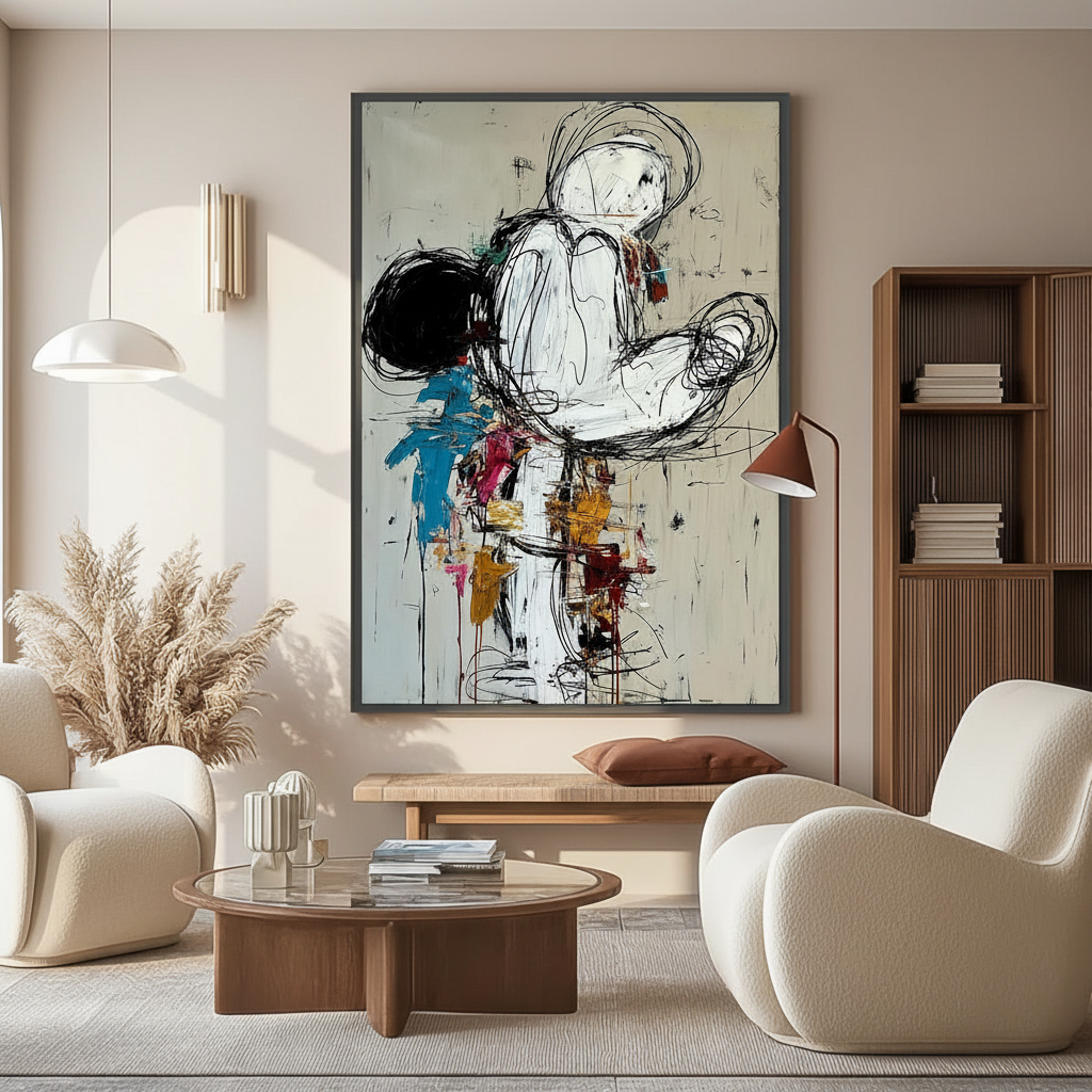
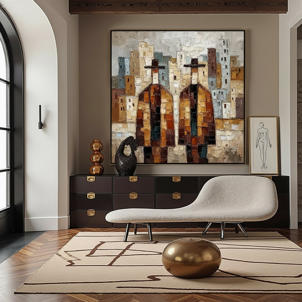
- The 60% (The Anchor): One side of your arrangement should carry roughly 60% of the visual interest. This is achieved through larger scale, bolder colors, or heavy physical texture. For example, a large textured abstract portrait serves as a high-weight anchor.
- The 40% (The Counterweight): The remaining 40% provides complementary contrast. This might be a smaller grouping of art, a floor lamp, or even a piece of furniture that "talks" to the anchor without mimicking its shape.
Common Pitfall: Creating equal visual weight (50-50) in an asymmetrical arrangement. This leads to "visual tension" where the eye doesn't know where to rest, making the room feel restless rather than dynamic.
The Role of Texture in Asymmetric Cohesion
When you break the grid of symmetry, you lose the "safety" of repetitive shapes. To maintain cohesion, you must lean into Materiality.
Texture becomes a crucial tool for differentiating elements while keeping them part of the same "story." Varying finish types—such as a glossy hand-painted oil piece next to a matte-finished wall—helps the eye distinguish between the "anchor" and the "negative space."
The physical nature of hand-painted art is irreplaceable here. According to optical microprofilometry research, the mm-scale texture (microtopography) of oil paintings is crucial to their aesthetic impact. This "physical relief" stimulates intrinsic motivation and satisfaction in viewers, as confirmed by MUNCH Museum tests.
Technical Safety and Material Integrity
For the aesthetic-driven homeowner, "stylish" must also mean "safe." When commissioning large-scale murals or purchasing high-end canvases, the chemical composition of the pigments is a critical, yet often overlooked, factor.
VOCs and Indoor Air Quality
Indoor air pollution is a significant concern for modern households. The EPA warns that indoor air can be more polluted than outdoor air, making low-VOC (Volatile Organic Compound) paints a prerequisite for any indoor mural project. Research from Aalto University shows that coatings on certain substrates emit significantly lower VOCs during the curing process, emphasizing the importance of professional-grade, eco-friendly materials.
Pigment Longevity and Toxicity
The "star rating" on art supplies is more than just marketing; it is a measure of lightfastness. According to ASTM D4303 standards, high-quality pigments are tested under xenon-arc radiation to simulate years of sunlight exposure.
However, some "vibrant" colors come with risks. Cadmium pigments, while prized for their opacity and brilliance, are classified as Group 1 carcinogens by the IARC. For homes with children or pets, we typically recommend water-based acrylics or non-toxic alternatives that pass the BS EN 71-3 safety standards, which regulate heavy metal migration.
| Material Feature | Standard/Regulation | Benefit for Homeowner |
|---|---|---|
| Low-VOC Paints | EPA IAQ Guidelines | Protects respiratory health; LEED-compliant |
| Lightfastness | ASTM D4303 | Prevents fading in sun-drenched rooms |
| Non-Toxic Labels | ASTM D-4236 / LHAMA | Ensures long-term safety for families |
| Heavy Metal Guard | EN 71-3 | Prevents toxic leaching in "touchable" art |
The ROI of "Stylish" Choices: Property Value and Well-being
Investing in unique, hand-painted art is not just an aesthetic choice; it is a financial and health-conscious one.
Real Estate Impact
Data from the Royal Society found a direct correlation between high-quality art "geo-tags" and relative house price gains. In a commercial context, murals have been shown to drive significant foot traffic and revenue growth, as seen in Chicago’s Millennium Park projects. For a homeowner, a custom mural or a large-scale asymmetrical gallery wall can act as a "permanent physical billboard" that elevates the home's perceived value during resale.
Health and Cognitive Benefits
The concept of Biophilic Design—incorporating natural landscapes and organic forms—has been proven to produce stress-reduction effects in the brain identical to being outdoors. A UPenn review noted that 73% of patients reported significant mood improvements when exposed to environmental artworks. For the 36-42 segment balancing career and family, an asymmetrical "nature-themed" mural in a home office can reduce cognitive fatigue and burnout.

Implementation Checklist: Moving to Asymmetry
If you are ready to break the grid, follow these steps to ensure a successful execution:
- Identify the Anchor: Choose one piece that will carry the 60% visual weight. This should be high-quality, hand-painted art to ensure "essential identity."
- Map the Breathing Room: Leave 15-20% negative space around your groupings. Asymmetry feels intentional only when it isn't crowded.
- Coordinate via Palette, Not Shape: Use a consistent color story to tie asymmetrical elements together. This prevents the "thrift store" look and ensures the room feels cohesive.
- Verify Material Safety: Ensure your chosen artist or provider uses low-VOC, non-toxic pigments, especially for large-scale indoor work.
- Leverage the Arches: If your home has arched windows or doorways, use asymmetrical art to "echo" those organic curves rather than trying to box them in with symmetrical frames.
Elevating the Everyday
The transition from symmetry to asymmetry is a journey from "correct" to "expressive." By leveraging the 60-40 rule and prioritizing the physical, authentic nature of hand-painted art, you can create a space that is not only camera-ready but also neurologically restorative. As the global creative economy continues to grow—reaching $1.4 trillion in exports according to the Creative Economy Outlook 2024—the value of the "human touch" in our homes has never been more significant.
Disclaimer: This article is for informational purposes only. When dealing with structural changes or large-scale mural installations involving chemical pigments, always consult with certified interior designers and professional contractors to ensure compliance with local building codes and health safety standards.
Sources
- Marketplace: The expensive art market continues to struggle
- Columbia University: Human-Made vs. AI Art Study
- Royal Society: Quantifying the link between art and property prices
- WHO: Scoping Review on Arts and Health
- EPA: Indoor Air Quality and Low-VOC Paints
- IARC: Cadmium and Cadmium Compounds
- UChicago: Does Artwork Preserve Essential Identity?
Leave a comment
This site is protected by hCaptcha and the hCaptcha Privacy Policy and Terms of Service apply.