Texture as Weight: Balancing Impasto with Minimalist Linework
In the current interior design landscape, we are witnessing a profound shift in how homeowners approach art. The era of "vanity assets"—overpriced auction pieces that serve more as financial instruments than decor—is receding. According to a 2024 report by Marketplace, high-end auction sales for pieces over $10 million plummeted 44% year-over-year. Buyers are returning to "real application value," seeking custom, hand-painted works that provide emotional resonance and visual harmony within their living spaces.
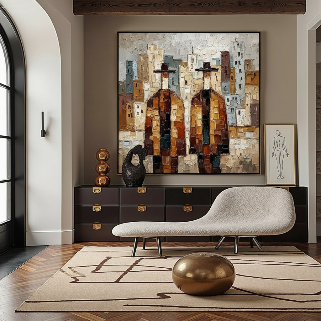
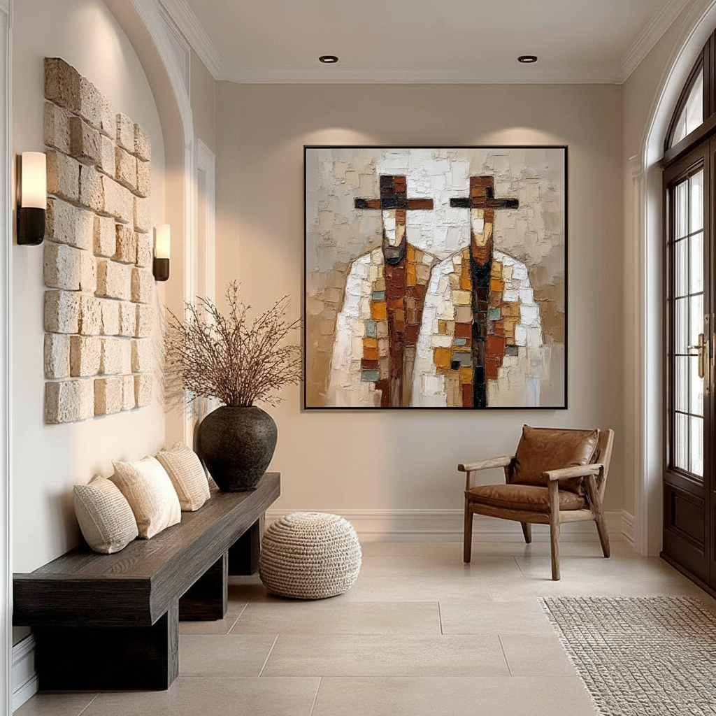
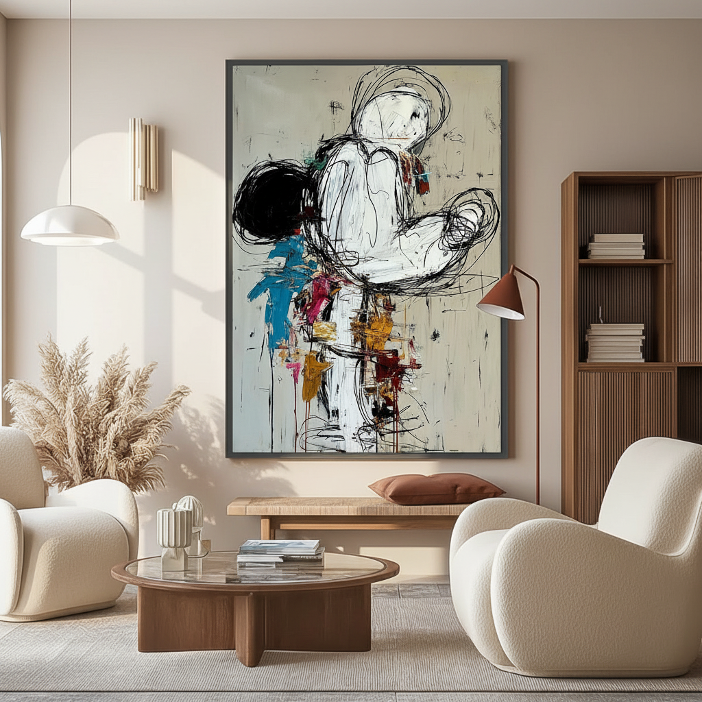
For the modern aesthetic-driven improver, the challenge isn't just finding a beautiful piece; it’s achieving a "camera-ready" balance between different artistic styles. Specifically, the interplay between heavy impasto (thick, textured paint) and minimalist linework (clean, thin-stroke art) has become a hallmark of premium curation. However, managing these two extremes requires an understanding of "visual weight"—the perceived heaviness of an object within a composition.

The Physics of Texture: Why "Weight" Matters
In our experience curating high-end residential spaces, we treat texture as a physical force. Impasto art, characterized by visible brushstrokes and palette knife ridges, carries significant visual mass. But here is the paradox: while texture feels "heavy," it can also be deceptive.
Logic Summary: The Paradox of Visual Shrinkage Our analysis of spatial perception draws on scenario modeling where dense textures are compared to flat surfaces. We often observe that while impasto adds "gravity" to a wall, it can actually make a piece appear smaller than its physical dimensions. This is supported by research in Current Biology (via ScienceDirect), which found that dense textures can reduce perceived object size by 15-20% due to visual adaptation effects.
This "visual shrinkage" means that a heavily textured piece needs more "breathing room" than a flat print of the same size. If you place a large impasto canvas in a cramped corner, the density of the paint can make the space feel suffocating, even if the colors are neutral.
The Optical Depth of Pigments
Beyond size perception, the physical chemistry of the paint dictates how we perceive quality. Original hand-painted works possess a "micro-topography" that digital prints cannot replicate. Research by the Getty Conservation Institute uses the Kubelka-Munk equation to explain that pigment reflection is dominated by absorption and scattering coefficients. In simple terms, the way light hits the peaks and valleys of real oil or acrylic paint creates a depth of color—a saturation—that is physically impossible to achieve on a flat, inkjet-printed surface.
The 30-70 Rule: A Heuristic for Visual Harmony
To prevent a room from feeling cluttered or visually "noisy," we recommend the 30-70 Rule. This is a practical baseline we’ve developed through years of interior styling and client feedback (not a controlled lab study, but a reliable shop heuristic).
- 30% Dominant Texture: Allocate roughly 30% of your total art wall space to heavily textured, high-impasto pieces. These serve as your visual anchors.
- 70% Linear/Minimalist: Fill the remaining 70% with lighter, linear works or negative space. This provides the "visual breathing room" necessary for the textured pieces to stand out without overwhelming the viewer.
| Curation Parameter | Textured (Impasto) | Minimalist (Linework) | Rationale |
|---|---|---|---|
| Visual Mass | High (Dense) | Low (Light) | Balance gravity vs. airiness |
| Space Allocation | ~30% | ~70% | Prevents visual fatigue |
| Substrate Needs | Heavy-duty (Thick) | Standard | Impasto uses 3-8x more paint volume |
| Lighting | Side-lighting (Enhanced) | Diffused | Highlights relief vs. preserves lines |
| Viewing Distance | 3–5 feet (Ideal) | Variable | Texture flattens at long distances |
Methodology Note: This table is based on common industry heuristics for gallery-style arrangements and material studies regarding paint volume and substrate thickness Good Art Company.
Symmetrical vs. Asymmetrical Curation Logic
When mixing these styles, the arrangement logic is just as important as the art itself.
Formal Symmetry for Stability
Symmetrical arrangements—placing two identical-sized frames side-by-side—create a sense of traditional stability and "social validation." This works best in formal dining rooms or entryways. If you use symmetry, ensure the textures are balanced; placing one heavy impasto piece next to one thin line drawing in a symmetrical pair can feel "lopsided" because the impasto piece will "pull" the viewer's eye more strongly.
Asymmetry for Contemporary Energy
For a more modern, "camera-ready" look, we prefer Asymmetrical Balance. This involves placing a large, heavy impasto piece off-center and "counter-balancing" it with a cluster of smaller, minimalist pieces on the opposite side.
We often see a common mistake: placing two impasto pieces too close together. This creates visual competition. Instead, use the minimalist pieces as "connectors" or "buffers." Expert curators often test these arrangements by photographing mock-ups on mobile devices. The camera's flattening effect reveals imbalances in visual weight much better than the naked eye can in 3D space.
The Human Premium: Why Authentic Texture Wins
In an age of AI-generated imagery, the "human touch" has become the ultimate luxury. A study by Columbia University confirmed that consumers value art labeled as "AI-generated" 62% lower than authentic human-created art.
Why? It comes down to what University of Chicago researchers call "essential identity." Digital replicas and NFTs lack the artist's physical "soul" embedded in the material. When you view a hand-painted impasto work, your brain recognizes the biochemical crystallization of human attention and neural control.
This isn't just poetic; it's neurological. A systematic review published in PMC (NCBI) shows that passive art viewing consistently activates the medial prefrontal cortex (mPFC) and the amygdala, optimizing emotional regulation. The physical relief of oil paint—the actual 3D texture—stimulates intrinsic motivation and satisfaction more effectively than flat images, as confirmed by tests at the MUNCH Museum.
Lighting: The Secret Ingredient for Texture
Texture is a collaboration between paint and light. Perceived weight can fluctuate by 30-50% throughout the day depending on the angle of the sun or your interior fixtures.
- Side-Lighting: To enhance the "weight" and drama of an impasto piece, use side-lighting. This casts shadows in the "valleys" of the paint, making the texture pop.
- Direct/Frontal Lighting: This tends to flatten texture. Use this for your minimalist linework to ensure the clean lines remain crisp and aren't obscured by glare.
For maintenance, remember that textured pieces are "dust magnets." We recommend a gentle dry brushing every 2-3 months. Avoid wet cleaning on acrylics unless you are an expert; while Tate research suggests water can remove surfactants, it can also lead to "haziness" if the paint film isn't perfectly cured.
Safety, Ethics, and the "Invisible Labor" of Art
When selecting art for your home, especially for sensitive areas like bedrooms or nurseries, safety is paramount.
The VOC Guardrail
Many traditional oil paints use solvents that emit Volatile Organic Compounds (VOCs). The EPA warns that indoor air pollution is often more concentrated than outdoor. We recommend looking for artists who use low-VOC acrylics or walnut-oil-based paints. A study by Aalto University found that coatings on wood with specific moisture levels emit significantly lower toxic VOCs during curing, a key consideration for custom mural work or large-scale canvases.
Ethical Sourcing
Beyond safety, there is the ethical dimension of "invisible labor." A survey of artists in Cincinnati revealed that the market severely undervalues the mental and physical output of creators. When you see a price tag for an original impasto piece that is 100x higher than an Amazon print, you are paying for the "uncompressible human life-time" contained in every brushstroke. Furthermore, supporting platforms that ensure fair compensation is vital; a Wharton School survey found that 87% of consumers strongly agree artists should be fairly compensated, especially in the face of AI style-mimicry.
The Investment Value: Art and Property
Finally, for the home improver, art is a strategic investment in property value. It’s not just about "pretty walls." The Royal Society utilized a CAR model analysis to prove that neighborhoods with higher "art" geo-tags saw greater relative house price gains.
Whether it's a panoramic hand-painted mural in a high-end powder room (a dominant trend for 2025-2026) or a carefully balanced gallery wall in a living room, art acts as a "permanent physical billboard" of quality.
YMYL Disclaimer: This article is for informational purposes only. While we discuss safety standards and the psychological benefits of art, this content does not constitute professional medical, financial, or legal advice. Always consult with a certified professional regarding indoor air quality (IAQ), structural wall support for heavy artworks, or investment decisions.
Sources and References
- Market Trends: Marketplace - The expensive art market continues to struggle
- Human vs. AI Perception: Columbia University Research Brief
- Visual Weight & Perception: ScienceDirect - Visual Space and Texture Density
- Health & Neuroaesthetics: NCBI - Neurological mechanisms of creative arts
- Safety & VOCs: EPA - Indoor Air Quality and Low-VOC Paints
- Property Value: Royal Society - Quantifying the link between art and property prices
- Pigment Science: Getty Conservation Institute - Color Science and Pigment Mixture
- Conservation: Tate - Modern Paints Project
Leave a comment
This site is protected by hCaptcha and the hCaptcha Privacy Policy and Terms of Service apply.