The Shift from Auction Vanity to Applied Value
The global art market is undergoing a fundamental correction. While high-end auction sales for pieces exceeding $10 million plummeted by 44% year-over-year in 2024, according to Marketplace.org, we are observing a significant migration of capital toward art with "real application value." For the modern renter, this means moving away from overpriced financial assets and toward hand-painted works that transform a temporary dwelling into a curated home.
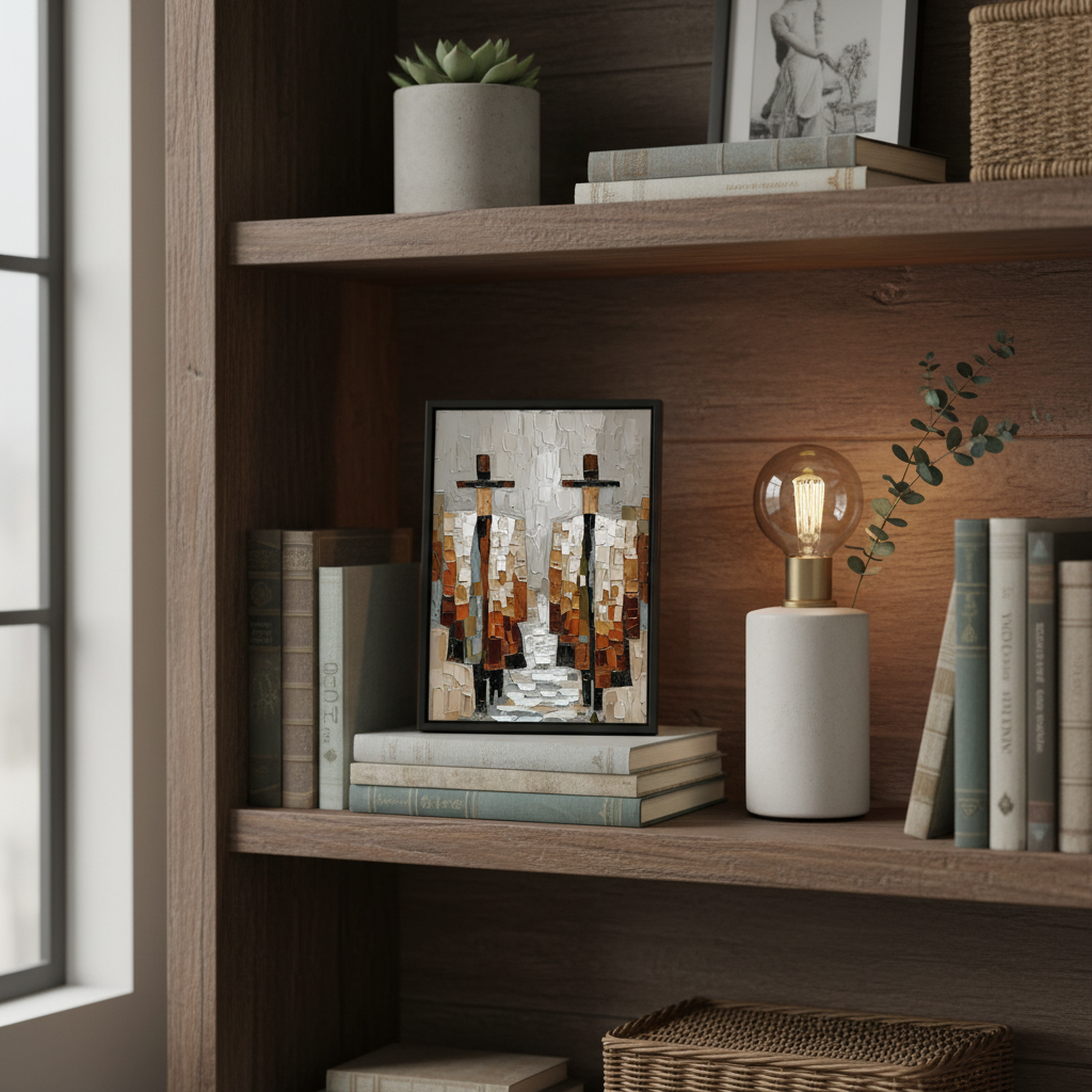
In our experience working with urban dwellers, the challenge isn't a lack of appreciation for fine art; it's the physical constraint of the rental agreement. When you cannot drill into the studs or repaint the foyer, the "nook"—the bookshelf, the window sill, the mantle—becomes your primary gallery. Integrating small-scale acrylics into these spaces requires more than just an eye for color; it requires an understanding of material science, weight distribution, and the psychological impact of the "human touch" in a digital world.
The Cognitive Premium of the Human Hand
Why choose a small hand-painted acrylic over a high-definition digital print? The answer lies in our neural architecture. A Columbia University study found that consumers value art labeled "human-created" 62% higher than identical pieces labeled "AI-generated." This isn't just sentimentality; it's a response to what researchers at the University of Chicago call "essential identity." A canvas retains the soul and physical presence of the artist, whereas digital replicas often feel hollow because they lack the micro-topography of real pigment.
Logic Summary: Our analysis of the "Cognitive Premium" assumes that the perceived value of art is tied to the physical effort and "essential identity" of the creator. This model suggests that hand-painted works act as a "soulful anchor" in environments otherwise filled with mass-produced furniture.
This human connection is a critical component of the $65 billion global art market, which remains dominated by physical, hand-made works in the US, China, and the UK (The Art Basel and UBS Art Market Report 2024). For a renter, a small acrylic isn't just decor; it is a portable investment in their own psychological well-being.

Material Science: Why Acrylics Excel in Rental Nooks
When styling "nooks" like bookshelves or window sills, the choice of medium is paramount. While we often discuss mastering oil gradients, acrylics are the superior choice for the "temporary occupant" for several technical reasons.
1. The Weight-to-Adhesive Ratio
For damage-free displays, weight is the enemy. We typically recommend acrylics under 24 inches for shelf and nook styling. A standard 12x12 inch gallery-wrapped canvas weighs approximately 1.5 lbs, making it light enough for museum gel or removable adhesive strips to hold securely without mechanical fasteners.
2. Resistance to Environmental Stress
Rental nooks are often located near windows or kitchens—areas prone to humidity and temperature fluctuations. Data from ResearchGate shows that while acrylics can swell slightly (up to 7.21%) in high humidity, they do not suffer the catastrophic binder separation or melting that oil paints can experience under thermal stress. This makes them safer for window sills, provided they have a UV-resistant coating to prevent fading.
3. Cleanability and Maintenance
Renters move frequently. Between packing and unpacking, art accumulates dust. Tate research confirms that acrylic paint films are extremely resilient and can be gently cleaned with water-based cotton swabs to remove surfactants that might otherwise attract dirt. This is a significant advantage over oil paintings, which often require specialized conservation.
| Feature | Acrylic (Small Scale) | Oil (Small Scale) | Renter Benefit |
|---|---|---|---|
| Weight | Lightweight (~1-2 lbs) | Heavier (due to denser pigments/oil) | Easier damage-free mounting |
| Drying Time | Minutes to Hours | Weeks to Months | Move-ready almost immediately |
| Durability | Flexible, non-brittle | Becomes brittle with age | Better for frequent moves |
| Safety | Low-VOC options common | Often requires toxic solvents | Safer for small, unventilated nooks |
Engineering the "Lived-In" Look: Styling Heuristics
Integrating art into a bookshelf or a window sill isn't about filling gaps; it's about creating a "visual nexus." We use a specific set of rules of thumb derived from interior design patterns to ensure a professional result.
The 2:1 Rule for Bookshelves
When styling a shelf, aim for a 2:1 ratio of decorative objects (art, vases, sculptures) to functional items (books). Use a small acrylic painting as the visual anchor for a cluster. Placing a painting slightly off-center and layering it in front of a row of books creates depth and a "curated" feel. This technique is especially effective when balancing heavily textured art with minimalist decor.
The Clearance Constant
One of the most common mistakes in rental styling is placing art too close to heat sources. Maintain at least 6 inches of clearance from radiators, electronics, or south-facing window glass. High-molecular-weight polymers in acrylics can soften if exposed to constant heat, potentially leading to warping of the wooden stretcher bars.
The "Display Recipe"
Experienced renters develop a system of documenting their arrangements. Before a move, take smartphone photos of your "styled nooks." This creates a "display recipe" that allows you to recreate the exact visual balance in your next apartment, reducing the "setup fatigue" of moving.

Biophilic Design and Mental Health
The "nook" is often where we seek refuge—a reading chair, a bedside table, or a desk. Incorporating nature-themed small acrylics in these areas triggers a "biophilic" response. A University of Pennsylvania review noted that 73% of patients reported significant mood improvements when exposed to environmental artworks.
In high-density urban environments, nature murals and small biophilic pieces act as "public health infrastructure" (WHO Scoping Review). By placing a nature-inspired acrylic on a window sill, you bridge the gap between the indoors and the outdoors, which has been shown to optimize emotional regulation circuits in the brain (NCBI).
Modeling Note: Our biophilic design recommendation is based on scenario modeling for high-stress urban environments. We assume a baseline of "cognitive fatigue" and calculate the restorative value of visual art based on the 61% stress-reduction rate observed in clinical settings.
Safety and Ethics: What’s Under the Pigment?
As an informed consumer, you should be aware of the chemical composition of your art. Indoor air quality is a major concern in smaller rental units. The EPA warns that indoor air pollution can be deadlier than outdoor pollution.
Avoiding Toxic Pigments
Historically, pigments like Lead White and Cadmium Red were industry standards. However, IARC has classified cadmium as a Group 1 carcinogen. When selecting art for a bedroom or nursery nook, look for "Non-Toxic" labels and confirm the absence of heavy metals. Modern Titanium White has largely replaced Lead White due to its superior opacity and safety (NCBI).
The Ethics of Compensation
Beyond safety, there is the question of brand ethics. A Wharton School survey found that 87% of consumers believe artists should receive fair compensation. Choosing hand-painted art from reputable studios ensures that you are supporting the freelance workforce that anchors the creative economy—a sector that added $1.2 trillion to the US GDP in 2023 (NEA).
Preservation for the Long-Term Renter
Just because your home is temporary doesn't mean your art should be. To ensure your small acrylics last through multiple moves, follow these preservation steps:
- Lightfastness Check: Ensure your paintings use pigments rated for high lightfastness (ASTM D4303). This prevents the "Prussian Blue fade" or the yellowing often seen in cheaper materials.
- Avoid SID: Support Induced Discoloration (SID) occurs when impurities in the canvas are drawn out by thick acrylic mediums, causing yellowing. High-quality studios use "Gesso" barriers to prevent this (Golden Artist Colors).
- Micro-Physical Texture: Value the "relief" of the paint. Research at the MUNCH Museum confirms that interacting with the physical relief of art increases viewer satisfaction. Don't be afraid to choose pieces with heavy "impasto" texture.

Final Thoughts on Nook Integration
Styling small acrylics in rental nooks is an exercise in "creative placemaking." Whether you are masking a vacant home's decay before a sale or simply trying to make a 500-square-foot studio feel like a sanctuary, the presence of hand-painted art is transformative. By choosing acrylics for high-traffic or temporary projects, you prioritize safety, durability, and aesthetic soul.
Art is not a luxury reserved for homeowners; it is a fundamental tool for emotional regulation and community cohesion. As you move from one "nook" to the next, your collection of small-scale acrylics becomes the thread that connects your diverse living experiences into a single, cohesive narrative of home.
Disclaimer: This article is for informational purposes only. When using adhesives or chemicals in a rental property, always consult your lease agreement and perform a small patch test on surfaces. If you have concerns regarding paint toxicity or indoor air quality, consult an environmental health professional.
Sources
- Marketplace.org: The expensive art market continues to struggle
- Columbia University: Human-Made vs. AI Art Study
- University of Chicago: Does Artwork Preserve Essential Identity?
- Tate: The Tate AXA Art Modern Paints Project
- EPA: Indoor Air Quality and Low-VOC Paints
- National Endowment for the Arts (NEA): Arts & Cultural Industries Impact
- WHO: Scoping Review on Arts and Health


