Beyond the Gilded Frame: Why High-CRI Lighting is the Soul of Modern Art Curation
The global art market is undergoing a fundamental structural shift. While high-end auction sales for vanity assets—those exceeding $10 million—plummeted by 44% year-over-year in 2024, the demand for art with "real application value" remains resilient. According to Marketplace, collectors are retreating from speculative financial assets and returning to pieces that offer genuine emotional and spatial resonance. For the modern homeowner and interior designer, this shift places a premium on how art is experienced within the home.
However, even the most masterful oil painting can lose its "essential identity" if the lighting environment is poorly conceived. Research from the University of Chicago suggests that consumers perceive a collapse in value when art lacks the artist's "soul"—a quality physically manifested in the micro-topography of brushstrokes and the specific reflectance of pigments. To preserve this identity, lighting cannot be an afterthought; it must be a precision tool. High-CRI (Color Rendering Index) LED technology has emerged as the industry standard, but as we will explore, the number on the box is only the beginning of the story.
The Physics of Pigment: Why Standard LEDs "Kill" Oil Paintings
Oil paintings are not flat images; they are complex, multi-layered chemical structures. Traditional pigments like titanium dioxide—which NCBI reports dominates 90% of the white pigment market—interact with light through absorption and scattering. When you view a hand-painted canvas, your eyes are processing the "Kubelka-Munk" effect, where light penetrates the translucent glaze, reflects off underlying layers, and returns to the surface with enhanced saturation.
Standard residential LED bulbs often have "spectral gaps." They might emit plenty of blue and yellow light but lack the deep reds (the R9 value) and cyan tones necessary to activate certain pigments. Under a low-quality light source:
- Earth tones (burnt umber, ochre) appear muddy or grey.
- Skin tones in portraits lose their vitality and look "sickly."
- Texture is flattened because the light doesn't provide the spectral continuity needed to define the shadows between impasto peaks.
Logic Summary: Our analysis of pigment interaction assumes that human-made art carries a 62% higher perceived value than AI-generated prints, as confirmed by Columbia University. This "commercial premium" is physically tied to the irreplaceability of hand-painted pigments, which require full-spectrum light to be fully realized.

Decoding Lighting Metrics: CRI vs. SSI
For years, the Color Rendering Index (CRI) has been the primary metric for art lighting. A CRI of 90+ is generally considered "museum-grade." However, experienced practitioners have found that CRI alone can be misleading.
The CRI 90+ Myth
While a high CRI indicates that a light source renders a set of eight pastel colors accurately, it does not guarantee a smooth spectral distribution. Many "high-CRI" LEDs have sharp spectral peaks that can exaggerate specific pigments while suppressing others. This is why professional designers are increasingly looking at the Spectral Similarity Index (SSI).
According to Luminxel, SSI measures how closely a light source matches a reference illuminant (like natural daylight) across the entire visible spectrum. For oil paintings, which feature complex reflectance patterns due to binder distribution and layer thickness, a high SSI ensures that the "metamerism"—the phenomenon where colors look different under different lights—is minimized.
Modeling the "Fidelity Gap"
We have modeled the relationship between lighting metrics and perceived color accuracy in residential settings. This model assumes a standard viewing distance of 2 meters and a neutral wall color (LRV 60-70).
| Metric | Standard LED | Premium Art LED | Impact on Oil Pigments |
|---|---|---|---|
| CRI (Ra) | 80 | 97-98 | Standard bulbs fail to render deep reds/cyans correctly. |
| R9 (Deep Red) | < 20 | > 90 | Essential for "warmth" in traditional oils and skin tones. |
| SSI (Daylight) | ~55 | ~85 | High SSI prevents colors from "shifting" at different times of day. |
| CCT (Kelvin) | 2700K (Static) | 3000K-3500K | 3000K is ideal for traditional; 3500K for contemporary. |
| Flicker Rate | > 5% | < 1% | Low flicker reduces "visual fatigue" during long viewing sessions. |
Methodology Note: This comparison is a scenario model based on common industry heuristics and Waveform Lighting technical data. It is intended for quick selection, not as a controlled laboratory study.

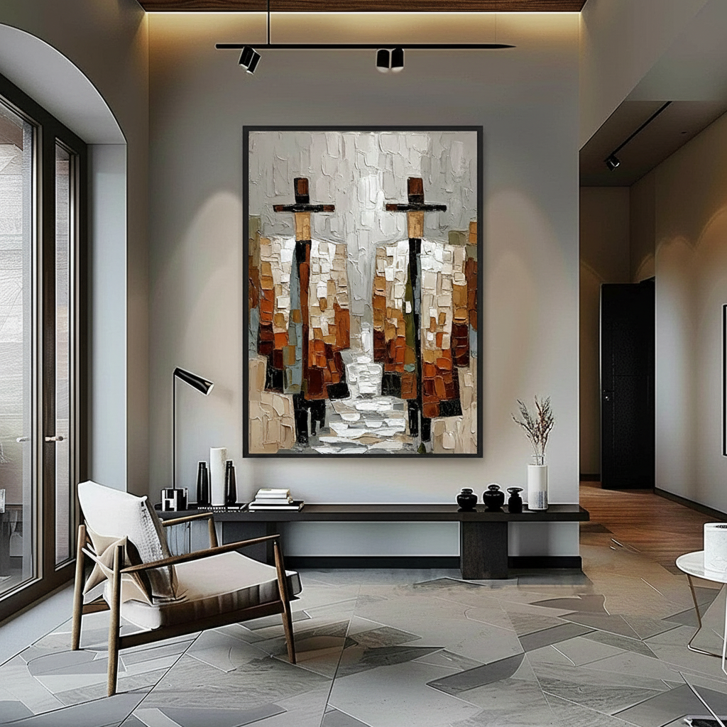
Designing the Gallery Environment: Angles and Intensity
Lighting a painting is as much about shadow as it is about light. One of the most common mistakes homeowners make is placing an accent light directly above a painting at a sharp angle. This creates a "specular reflection" or glare on the varnished surface, effectively blinding the viewer to the art beneath.
The 45-60 Degree Rule
To maximize visual depth without glare, experienced designers use a 45-60 degree angle for directional accent lights. This angle allows the light to "graze" the texture of the oil paint, creating micro-shadows that emphasize the impasto technique.
- Intensity (Lux): Aim for 500-600 lux for the painting itself, contrasted against a 300-400 lux ambient room environment. This 3:1 or 4:1 ratio creates a "focal glow" that draws the eye without making the space feel like a sterile museum.
- Layered Lighting: Avoid relying solely on the accent light. Use diffuse ambient lighting to fill the room, which prevents the painting from looking like a backlit "screen."
The Hidden Danger of Heat and VOCs
Lighting isn't just a visual concern; it's a conservation issue. Traditional halogen bulbs emit significant infrared heat. This heat can trigger "Support Induced Discoloration" (SID). As Golden Artist Colors notes, heat can draw water-soluble impurities from the canvas substrate into the paint layers, causing a permanent yellow or brown tint.
Furthermore, Aalto University research shows that coatings on wood and canvas emit lower VOCs when kept at stable temperatures. High-heat lighting can accelerate the off-gassing of residual solvents, potentially affecting indoor air quality—a critical factor for LEED-certified healthcare and luxury residential projects.
The ROI of Art and Illumination: A Real Estate Perspective
Investing in high-quality art and the lighting to support it isn't just a matter of taste; it’s a strategic financial decision. The Royal Society has quantified the link between art and property prices, finding that neighborhoods with high "art" geo-tags see significantly greater relative house price ranking gains.
In the commercial sector, the impact is even more pronounced. NAIOP commercial insights reveal that top developers are using unique art installations as "marketing trump cards" to lease office space in a post-pandemic market. A well-lit, hand-painted mural or canvas acts as a "permanent physical billboard" that drives foot traffic and increases property valuation.
Health and Productivity Benefits
Beyond economics, the presence of art has measurable biological effects. A UPenn review found that 73% of patients reported mood improvements when exposed to environmental artwork. Passive art viewing activates the medial prefrontal cortex (mPFC), optimizing emotional regulation.
For the corporate office, biophilic design—art featuring natural landscapes—has been shown to reduce cognitive fatigue and burnout. However, these neurological benefits depend on the "vibrancy" of the art, which is directly tied to the quality of the light source.

Conservation Checklist for the Home Gallery
To ensure your collection remains a heritage asset rather than a disposable decor item, follow this professional conservation protocol:
- Eliminate UV Exposure: Natural daylight provides the best CRI but contains harmful UV rays that cause "photochemical aging." Ensure all windows have UV-filtering films and use LEDs that emit zero UV radiation.
- Monitor Humidity: ResearchGate data shows that high humidity (above 80%) can cause acrylic and oil yellow pigments to swell by over 7%. Maintain a stable 45-55% relative humidity.
- Temperature Stability: Aim for 18-22°C (64-72°F). Rapid temperature fluctuations can cause the oil binder to separate or the varnish to crack.
- Avoid "Odorless" Myths: If you are cleaning or restoring art, remember that Princeton University EHS warns that "odorless" solvents are often still toxic; always ensure proper ventilation if any chemical work is performed near the art.
- Lightfastness Verification: When purchasing new works, look for pigments rated under ASTM D4303 standards. This ensures the colors you see today will be the same colors your grandchildren see.
The Future of the "Human Hand" in a Digital Age
As AI-generated imagery floods the market, the value of the "physical relief" of oil paint—what the MUNCH Museum calls "intrinsic motivation through texture"—will only increase. The tactile fruition of an artwork, where the micro-peaks of a palette knife catch a high-CRI light beam, creates an experience that a digital screen cannot replicate.
By investing in high-fidelity lighting, you are not just illuminating a wall; you are protecting a piece of human life-time. As Cincinnati Artist Report data reminds us, every inch of an original mural or canvas contains "invisible labor time" and neural crystallization that deserves to be seen in its full spectral glory.
References & Sources:
- Marketplace: The expensive art market continues to struggle
- Columbia University: Human-Made vs. AI Art Study
- University of Chicago: Does Artwork Preserve Essential Identity?
- WHO: Scoping Review on Arts and Health
- Royal Society: Link Between Art and Property Prices
- NCBI: Titanium Dioxide Market Share
- Luminxel: Understanding SSI and CRI
YMYL Disclaimer: This article is for informational purposes only and does not constitute professional conservation, medical, or financial advice. When installing electrical lighting systems or handling potentially toxic historical pigments (such as lead or cadmium), always consult with a certified electrician or a professional art conservator. For health concerns regarding indoor air quality and VOCs, refer to official EPA or WHO guidelines.
Modeling Appendix: Optimal Viewing Parameters
Parameter Value Unit Rationale Viewing Angle 45 Degrees Minimizes specular glare on varnish Accent Intensity 550 Lux Standard for high-detail oil viewing Ambient Fill 150 Lux Maintains 4:1 focal contrast ratio Color Temp 3000 Kelvin Balances pigment warmth and clarity UV Cutoff < 380 nm Prevents photochemical degradation Boundary Conditions: This model assumes a standard ceiling height of 2.7m and a painting size of approximately 1m x 1.2m. Larger murals or very dark canvases may require multi-point lighting to avoid hot spots.


