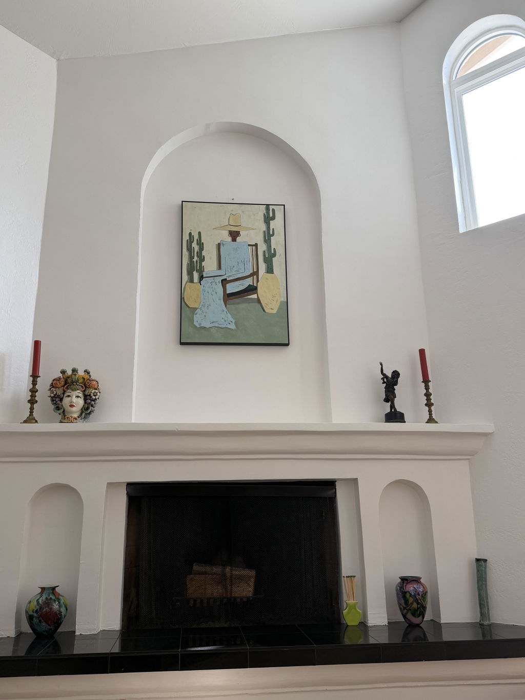
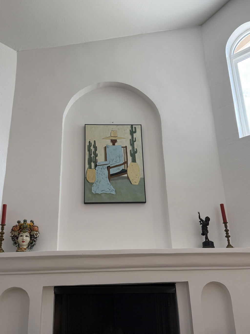
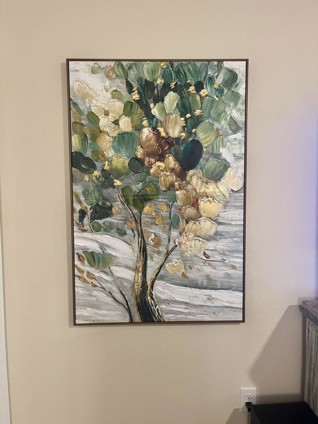
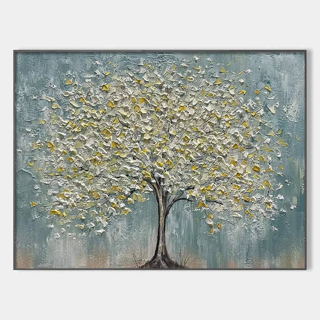
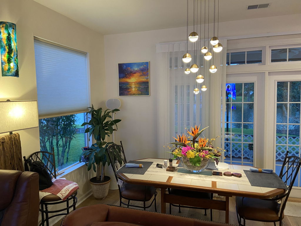
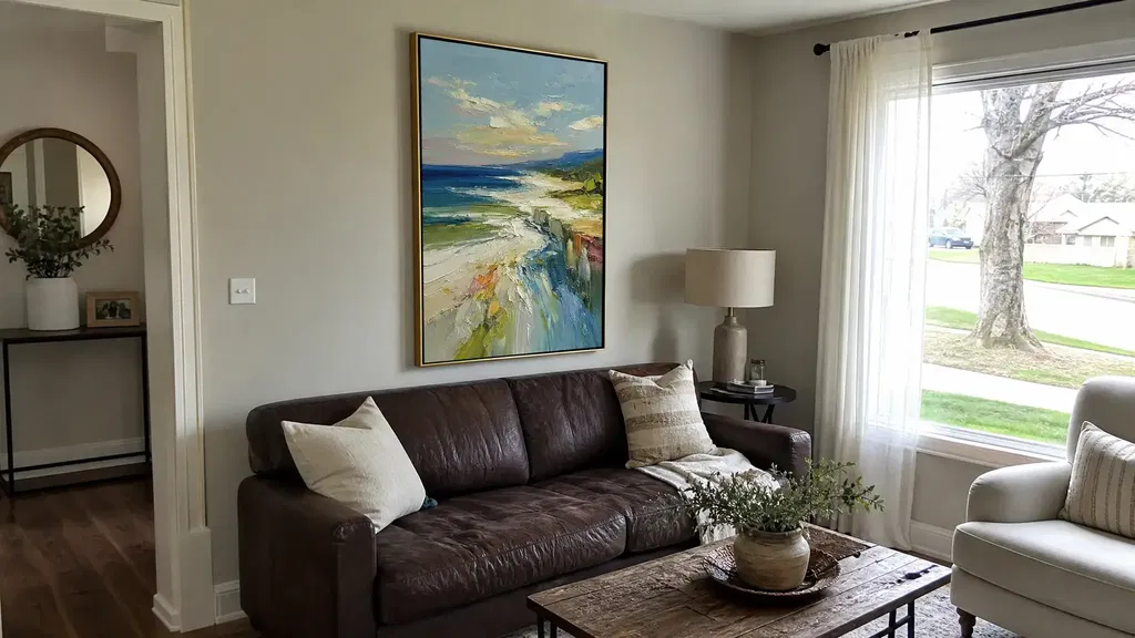
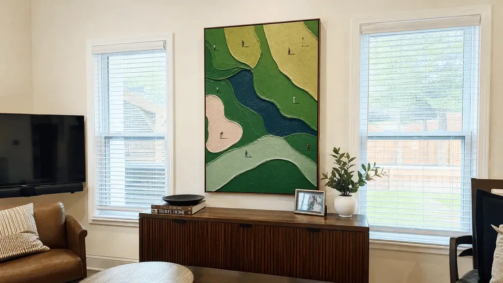
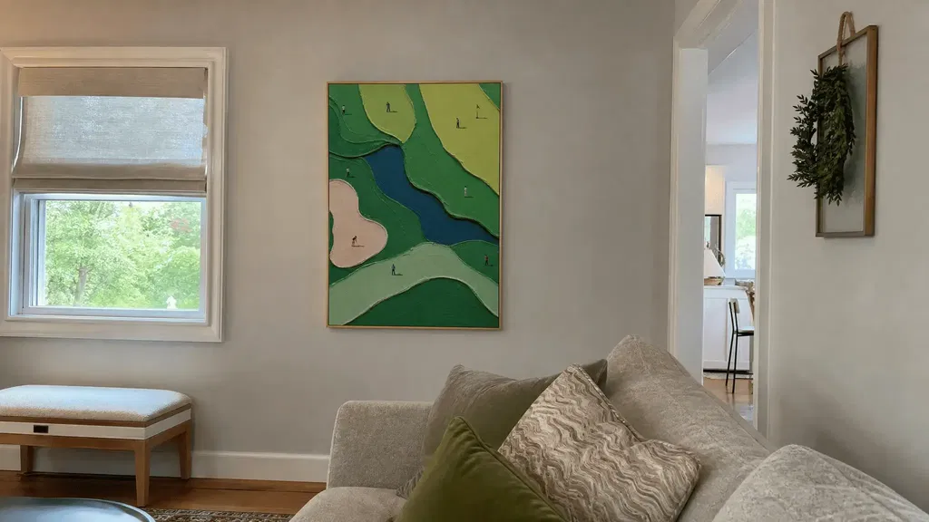
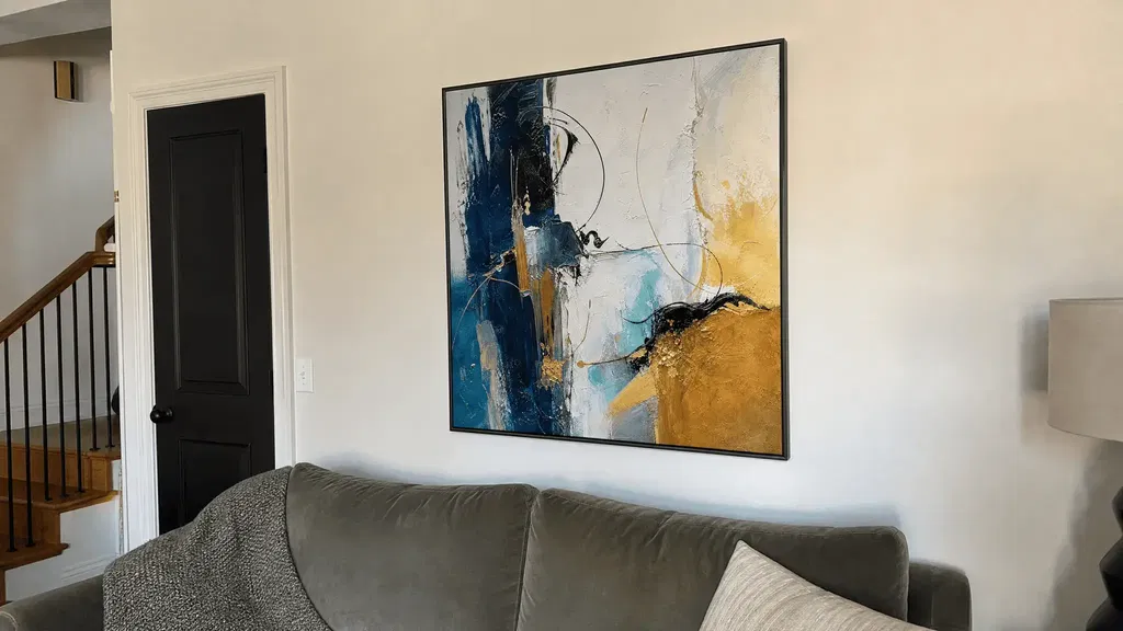
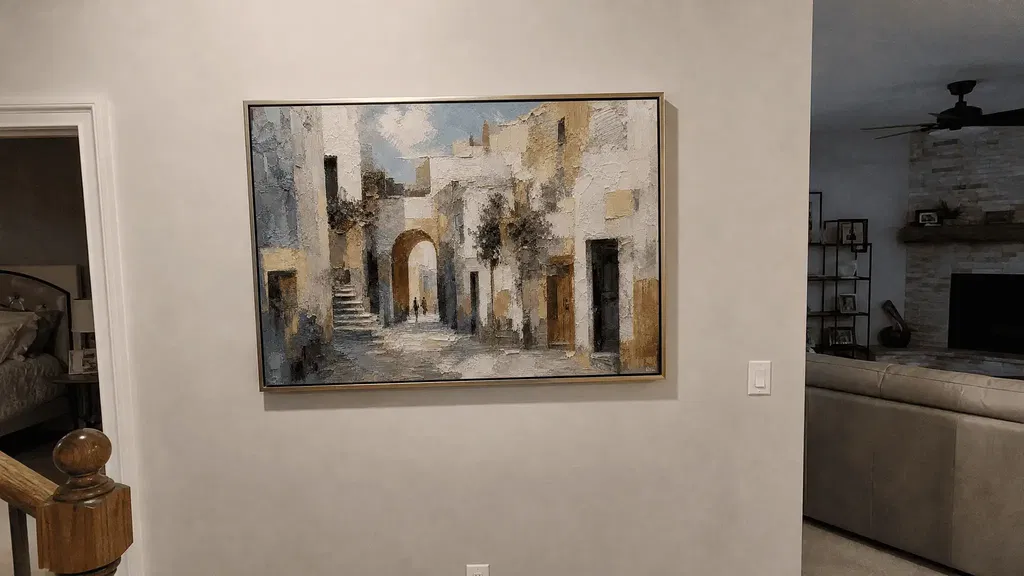
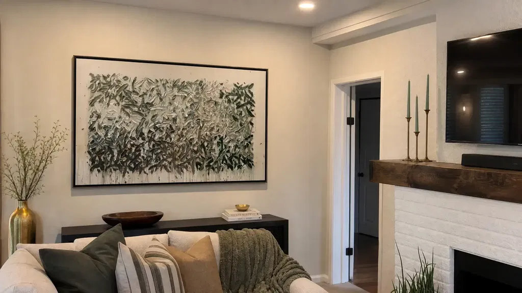
Directional or offset wall art lighting usually reveals raised brushwork more clearly than broad light aimed straight at the surface. As the source moves across the face of the artwork, ridges and recessed areas can develop gentle tonal variation. The best setup is not the one that creates the deepest shadows; it is the one that keeps texture readable from normal seated and standing positions without distracting reflections.
Start by comparing the existing front-facing light with an offset position before adding brightness. Then check the artwork in the room where it will actually hang, both during the day and in the evening. Relief depth, surface finish, frame, windows, and viewing position all affect the result.
How Wall Art Lighting Reveals Texture
Grazing, or raking, light travels across a surface instead of hitting it straight on. That oblique direction can make raised and recessed areas easier to distinguish because each part receives and reflects light differently. It is a useful way to explore how to light textured wall art, not a fixed prescription for every canvas.
Broad, front-facing illumination can make a shallow surface look more even and therefore flatter. Moving the source off to one side may reveal brush ridges or relief, but too much contrast can produce hard shadow bands, bright hotspots, or a distracting pattern that competes with the composition. The useful threshold is reached when the texture is legible without one ridge or recess taking over.

Before changing the fixture, compare two conditions:
- Look at the artwork under its current, relatively front-facing light.
- Shift the source or use another controllable source from an offset direction.
- View the piece from the main seated position, then from a standing position.
- Check whether the new shadows clarify the surface or hide parts of the image.
- Repeat the comparison with the room's normal evening lighting.
If the artwork looks better only from one exact spot, the setup may be too dependent on a single sightline. A related explanation of dimensional paint is available in this guide to palette knife texture explained. Use the same practical standard here: texture should support the artwork while the room is in use, not just during a close inspection.
Daylight, Picture Lights, and Track Lights Compared
Daylight, picture lights, and track lights solve different display problems. Daylight is broad but constantly changing; a picture light is focused around the artwork; and a track light can offer more aiming flexibility. Because light affects relief, color appearance, glare, and viewing experience, compare the actual piece in its room instead of choosing a source by category alone. Research on gallery lighting also supports treating the viewing experience as a tradeoff rather than assuming one setup is universally best (how lighting changes the way artwork is perceived).
| Light source | Direction control | Likely relief effect | Shadow behavior | Glare considerations | Color consistency | Adjustability | Installation and room fit |
|---|---|---|---|---|---|---|---|
| Daylight | Broad and determined by the window | Can show overall surface variation naturally, but may flatten detail when it arrives straight on | Changes with time, season, and sun position | Watch windows, glass, mirrors, and glossy furnishings | Changes as daylight changes | Limited unless shades or other room lighting are involved | Useful for color and placement checks; works best when the window relationship is understood |
| Picture light | Focused around the artwork | Can emphasize the face of the piece when coverage and position suit the surface | May create a defined top or side shadow | Check reflections from the fixture and the artwork's finish from common viewpoints | Depends on the selected fixture and surrounding light | May include aiming or dimming, but verify the actual fixture | Suits a dedicated display when mounting position and coverage work for the wall |
| Track light | Adjustable or aimable, depending on the system | Can direct light toward relief or away from a hotspot | Can be moderated by changing aim and surrounding fill | Check the source from seated, standing, and walking positions | Depends on the fixture and other room lights | Often useful when one wall contains more than one artwork, but confirm coverage | Suits rooms where ceiling placement and aiming options match the sightlines |
Daylight for Broad, Natural Illumination
Use daylight first as an assessment tool, not as a constant display solution. Window direction, time of day, season, direct sun, and the distance between the artwork and the window can all change how the surface reads. A nearby mirror, glass tabletop, polished floor, or screen can also send reflections toward the artwork or viewer.
Daylight is valuable for checking the artwork's overall color in a familiar environment. If the piece looks balanced in the morning but washed out or reflective later, note what changed before choosing a fixture. Direct and prolonged exposure can also be a consideration for artwork, so avoid treating a bright window position as automatically ideal for long-term display.

Picture Lights for Focused Display Lighting
A picture light can be a focused option, but it is not an automatic default for every piece of textured wall art. Check:
- Whether the light covers the artwork without leaving the edges visually neglected.
- How the fixture's relationship to the wall and frame looks from common room angles.
- Whether the surface sends a bright reflection toward the sofa, bed, or walkway.
- Whether dimming, shielding, or softening is available on the selected fixture.
- How the focused source interacts with lamps and overhead lighting already in the room.
A picture light may suit a dedicated display wall when its placement is practical and the resulting reflection is manageable. Judge the actual surface rather than assuming the fixture will produce a particular level of relief.
Track Lights for Adjustable Direction
Track lighting is worth considering when you need to aim a source rather than accept one fixed direction. Test whether the light can sit sufficiently off-axis to reveal the relief, then aim it away from any hotspot that appears in the viewer's normal line of sight.
Check the ceiling position, direction, coverage, and relationship between multiple artworks. A source that works for one canvas may create a different reflection on another. Track lighting can also affect the whole room, so compare the artwork with nearby ambient light instead of judging the beam in isolation. For additional surface-reflection context, see how varnish affects light, while keeping in mind that the actual finish of a particular artwork must be confirmed rather than assumed.
Find the Right Lighting Angle for Raised Relief
For lighting for wall art, begin with an offset direction and adjust gradually. Deeper ridges may show stronger tonal variation, while shallow texture may need a gentler balance between directional definition and ambient fill. Reflective passages may require less direct contrast, not more.
Use Grazing Light With a Shadow Check
Use this sequence to find a workable starting position without relying on an exact angle or distance:
- Begin with the source off to the side rather than aimed directly at the artwork.
- Pivot or move it gradually while watching the shadow pattern across the surface.
- Look for texture that becomes easier to read without one ridge creating a dominant stripe.
- Check the artwork from the main seated and standing positions, not only from directly in front.
- Reassess after the room's evening lights are on.
If the shadows make the image look fragmented, move back toward a broader or more balanced direction. If the surface still looks flat, change direction before increasing brightness. That test separates a lighting-direction problem from a light-level problem.
Balance Relief Against Glare and Color Shift
Texture definition is only useful when the viewer can comfortably see the artwork. When glossy passages or glass reflect toward the room, try these adjustments:
- Reposition or pivot the source so the reflection no longer points toward the primary viewing area.
- Shield or soften the source when the fixture itself becomes a bright point.
- Add compatible ambient light if side lighting makes colors look uneven or shadows too severe.
- Compare the artwork under daytime and evening conditions.
- Recheck the color and surface from normal room positions.
A setup can reveal more relief while making the color feel less even. Treat that as a reason to rebalance the direction or surrounding light, not as proof that the artwork needs a brighter source.
Match the Setup to the Room and Art Placement
Choose the fixture category after checking where the artwork can actually be viewed and lit. A controllable source may be helpful in a living room, while a bedroom or reading nook may call for a less distracting evening effect. Renters should assess mounting limits, outlet access, cord visibility, and the selected product's instructions without assuming that any low-installation approach is universally compatible.
Use this five-step room check:
- Identify existing light. Note windows, lamps, overhead fixtures, screens, and the hours when the artwork is usually viewed.
- Mark the sightlines. Check the primary seated and standing positions, plus walking paths where reflections may appear unexpectedly.
- Inspect competing surfaces. Look for mirrors, glass, polished furniture, glossy paint, and windows that may reflect the source or the artwork.
- Choose controllability and placement together. Consider whether daylight, a focused picture light, or an adjustable source can reach the surface without creating a new hotspot. Confirm the installation method and product instructions separately.
- Test day and night. Do not secure the final position until the artwork works under the room's actual conditions.
Apply the sequence to common spaces:
- Living room: Test across the sofa, chairs, and walking approach. A source that looks excellent from one seat may glare from another. Browse living room textured art ideas only after you know which sightlines and surface qualities your space can support.
- Hallway or entryway: Prioritize workable coverage and a direction that keeps relief visible without making the artwork look busy as people pass. Limited daylight makes an evening test especially important.
- Bedroom: Check the view from the bed and any nearby doorway. Bright reflections can be more distracting in a quiet room, particularly when the artwork is near a lamp, mirror, or screen.
- Reading nook: Judge the piece with the reading light on. The source should not compete with the task light or send a reflection into the usual chair position.
- Display area: Test from more than one distance. Dramatic shadows may be acceptable during close inspection but obscure the composition from across the room.
For a subdued, tactile style, readers can browse calm Wabi Sabi wall art as a visual-navigation option. The collection itself does not establish a lighting or finish recommendation; use the room test to make that decision.
Fix Flat, Washed-Out, or Distracting Texture
If textured wall art looks flat or reflective, check direction and reflections before adding brightness. Front-facing light can reduce visible relief, while a reflection from the surface or a nearby object can hide texture even when the artwork is adequately illuminated. Residential lighting guidance treats glare control and color appearance as important quality checks (residential lighting guidance on glare and color appearance).
Work through the problems in this order:
- Front-facing light: Check whether the source is aimed too directly at the artwork. Try an offset direction first.
- Excessive side shadows: If ridges cast hard bands that obscure the image, soften the source, reduce the contrast, or add compatible ambient light.
- Direct reflections: Look for hotspots from the fixture, window, glass, glossy paint, mirror, screen, or polished furniture. Change the relationship between source, artwork, and viewer.
- Uneven color: Compare light and dark areas under the same viewing conditions. A dramatic side direction may make one section appear much different from another.
- Competing room light: Turn nearby lamps and overhead sources on and off during testing so you know which source is changing the result.
- Changing daylight: Recheck the setup at the times the room is normally used. A window-lit wall may not look the same later in the day.
- Viewer position: Finish from normal seated and standing positions. If the piece works only from a close, centered viewpoint, continue adjusting rather than assuming more brightness will solve it.
If the surface remains distracting after repositioning, softening, or rebalancing the light, reconsider the source or placement. You can browse palette knife textured art for visual comparison, or view the Silent Strata artwork as a navigation option—but neither link proves how a particular piece will respond in your room.
Frequently Asked Questions About Wall Art Lighting
These questions focus on room-specific exceptions and compatibility checks that may affect the choice after the main lighting test.
How Can I Reduce Glare on Textured Wall Art?
First identify whether the bright spot comes from the fixture, a window, glass, varnish, or another glossy surface. Then try changing the source's direction, shielding or softening it, dimming where the fixture allows, or changing the artwork's relationship to the source. Retest from the sofa, bed, or other normal viewing position; a reflection that disappears straight on may remain visible from the side.
Does Textured Wall Art Need Side Lighting to Show Its Texture?
No. Offset light often helps, but shallow texture, reflective finishes, and limited sightlines may look better with softer or more balanced illumination. Test a modest change in direction before redesigning the room. If side light creates hard bands or uneven color, retain some broader ambient light rather than treating the most dramatic shadows as the goal.
What Is the Best Lighting for Textured Wall Art in a Bedroom?
Choose based on evening comfort, viewing distance, nearby lamps, and glare—not on a universal warm-or-dim rule. Art above a bed should be checked from the pillow and doorway, while art near a reading area should be tested with the reading light on. If the fixture creates a bright reflection during rest, prioritize a less distracting position or softer balance.
Can I Light Textured Wall Art Without Installing a Hardwired Fixture?
You can compare lower-installation approaches at a high level, but compatibility depends on the actual product and wall. Check the mounting method, cord visibility, outlet access, product instructions, and any applicable local installation requirements before choosing. Do not assume that a plug-in, battery, or adhesive approach will support the needed direction or work with the artwork's placement.
Should I Use Warm or Cool Light for Textured Canvas Art?
Base the comparison on the artwork's colors, surrounding bulbs, available daylight, and the mood you want in the room. Color appearance can change with the source, so compare the actual piece under the intended evening setup rather than relying on a label alone. If the painting looks muddy or overly stark, compare a different source alongside the existing room light.
Once the artwork reads clearly from the positions where you actually live, stop chasing more dramatic shadows. Test the chosen wall art lighting with the real piece in its intended room, then browse textured art using the surface, sightline, and glare criteria you now know how to evaluate.