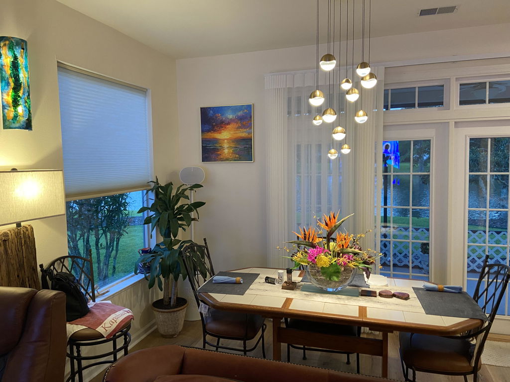
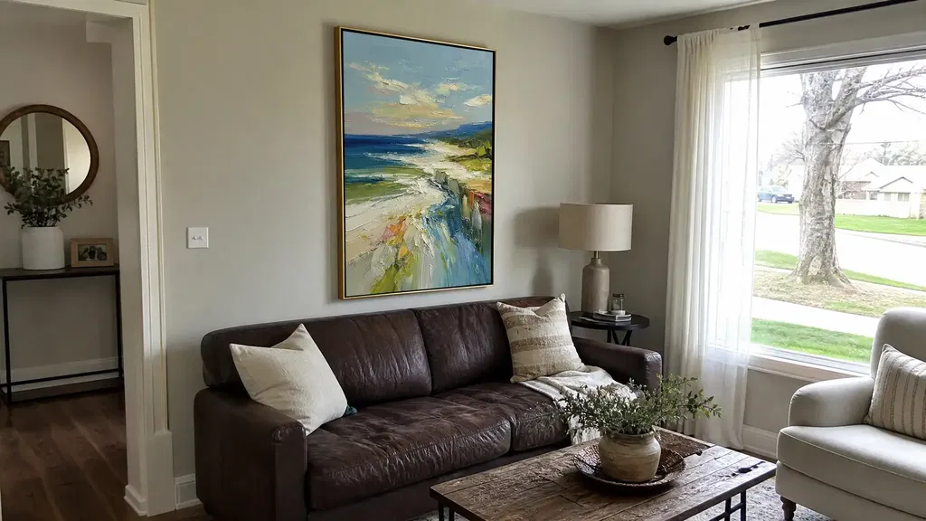
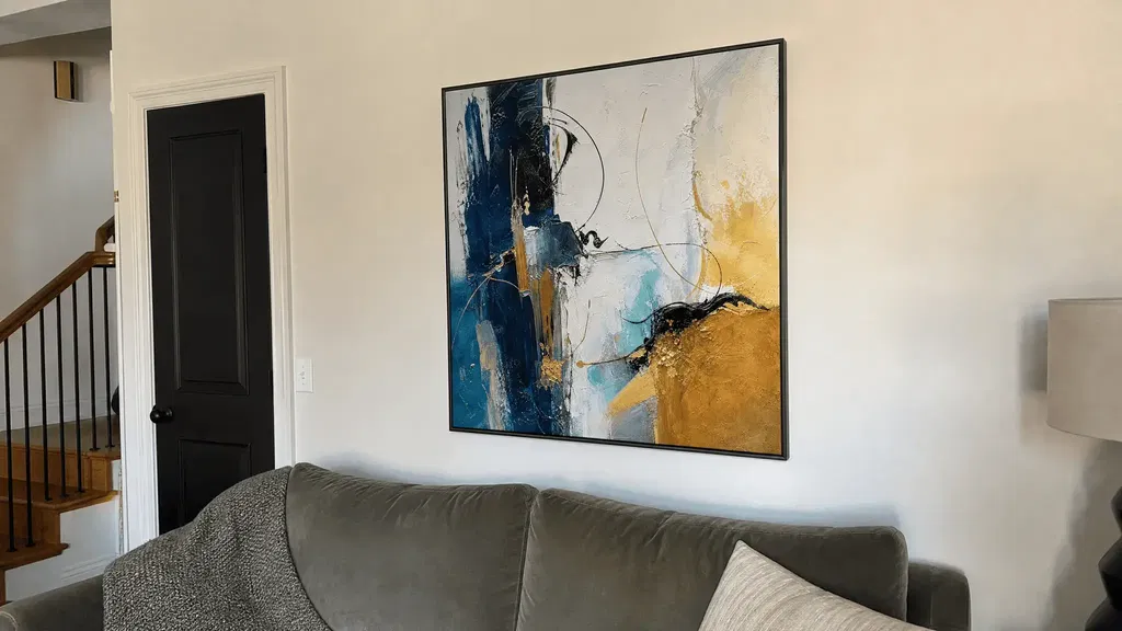
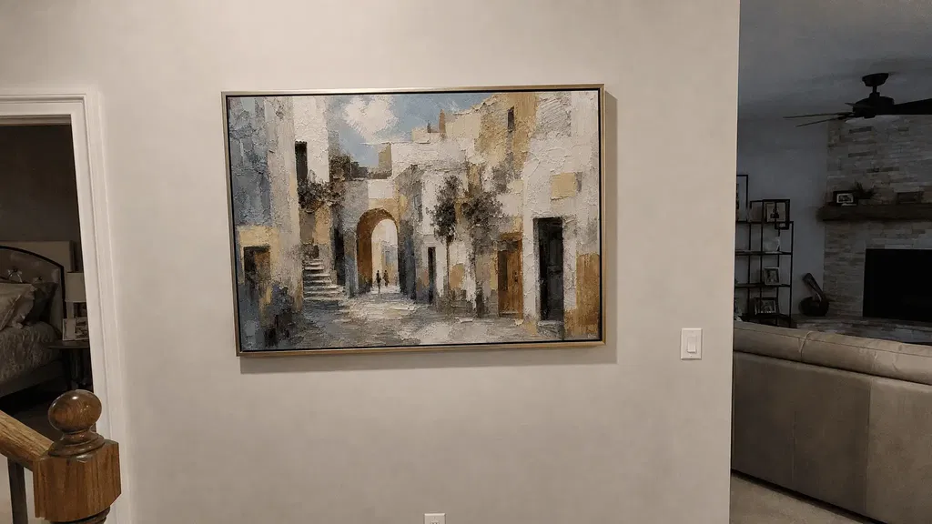
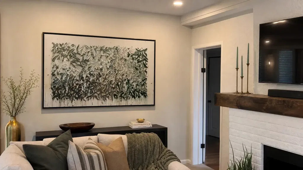
A calm-looking seascape painting usually has readable movement, a balanced horizon, moderated contrast, directional texture, and enough surrounding space to keep the composition open. That impression is not guaranteed by an ocean subject alone: the wall, lighting, furniture, viewing distance, and nearby patterns all affect how the piece reads. Start by deciding whether the artwork should act as a quiet background layer, a focal point, or a coastal accent. Then compare the full composition from a normal viewing distance before judging close-up texture.
What Makes a Textured Seascape Painting Feel Calm
A textured seascape painting tends to look quieter when its main visual choices are easy to follow. Look for a clear route through the waves, an uncomplicated horizon, controlled light-dark contrast, and raised marks that reinforce rather than compete with the broader composition. The word “calm” describes a subjective visual impression, not a guaranteed emotional effect.
Art vocabulary such as line, color, texture, space, balance, proportion, pattern, and rhythm gives you useful inspection points. The raised paint and brushwork may be interesting up close, but the room-view image should still feel organized.

Before focusing on surface detail, view the artwork as a thumbnail or from across the room. Ask three questions:
- Does the piece work as a quiet layer, a focal point, or a coastal accent?
- Do the wave marks and horizon create one readable direction, or do they compete across the frame?
- Does the artwork leave enough visual space around furniture, windows, and neighboring decor?
A close-up can make any raised surface look dramatic. The more useful test is whether the composition remains open and balanced when the texture is no longer the only thing you can see.
Compare Wave Movement and Horizon Placement
Wave direction and horizon height change how a seascape painting divides attention. Compare the order created by the crests, foam, and broad strokes, then judge how the horizon divides the sky, water, and foreground. Use these observations as comparison tools, not as a fixed formula for creating a particular mood.
Art education guidance describes line as a way to direct the eye and create movement, while formal analysis often treats broad horizontal structure as steadier than strongly changing directions. See guidance on directional visual elements and formal analysis for that visual vocabulary.

| What you see | Likely visual read | Room condition to consider | Check before choosing |
|---|---|---|---|
| Low wave movement with a low horizon | More visible sky or water can create an open-looking field | Useful when the wall needs breathing room and nearby furniture is visually substantial | Check whether the large open area leaves the artwork too quiet for the wall |
| Moderate, consistently directed waves with a centered horizon | Structured movement with a clear division between sky and water | A flexible option for a living room, bedroom, or entryway with moderate decor | View it at thumbnail size and compare the horizon with the furniture line |
| Prominent waves with a low or centered horizon | A stronger focal point with more active surface movement | Better suited to a room where the artwork is meant to carry attention | Check whether foam, crests, and nearby patterns compete |
| Any wave treatment with a high horizon | Less sky and more emphasis on water or foreground | Can work when lower wall space needs visual weight or the room already has open upper space | Make sure the horizon does not create an overly strong dividing line |
Read Wave Direction Before Detail
Begin with the dominant direction of the crests, foam, and broad strokes—not the smallest raised marks. A clear visual route can be easier to integrate when the room already contains patterned rugs, curtains, pillows, or several focal points. Sharply changing directions and many competing stroke scales may make the artwork feel more active.
Use both a thumbnail view and an across-room view:
- Identify the direction shared by most crests, foam lines, and broad strokes.
- Ignore isolated marks until you understand the main route through the composition.
- Check whether that route remains legible when the piece is viewed from the room's main seat or entrance.
- Compare the artwork's activity with nearby rugs, curtains, pillows, and other focal points.
If the wave route disappears at a distance, the piece may rely heavily on close-up drama. If it remains legible without every foam mark being visible, the composition may be easier to live with as textured seascape wall art.
Use Horizon Height as a Balance Check
The horizon is the visual division where land or water meets the sky. Raising or lowering it changes how much sky, water, and foreground the composition shows; it does not automatically make the artwork more peaceful. KET's visual arts glossary provides the basic horizon-line definition, while your room supplies the practical test.
Compare the horizon with the top of a sofa, console, headboard, or nearby artwork. A low horizon may leave useful open space, a centered horizon may create a clear structural division, and a high horizon may give the lower part of the image more weight. Choose the version that balances the wall rather than selecting a height because it is supposed to produce a universal feeling.
For more options to compare, browse coastal seascape styles only after you know which movement and horizon relationship suits the room.
Control Visual Energy With Palette and Relief
A limited palette, compatible undertones, controlled contrast, and relief that follows the composition are generally easier to integrate than equally strong colors and scattered surface marks. Evaluate color, texture, contrast, and empty wall space together: balance is a relationship among objects, colors, texture, and space, not a property that belongs to the artwork by itself. The design fundamentals framework offers useful vocabulary for making that comparison.
Choose Coastal Colors by Undertone
Compare the artwork with the room's whites, flooring, upholstery, wood, and metal finishes. The same blue can read gray, green, or sharply cool beside different neutrals, so look at undertone and contrast instead of matching a color name.
| Palette family | What to inspect | Room check |
|---|---|---|
| Blue and white | Whether the white is crisp, warm, or gray-leaning; whether contrast is dominant | Compare with trim, upholstery, and the room's brightest surfaces |
| Blue-green and aqua | Whether the green undertone repeats an existing accent or introduces a new one | Check pillows, plants, rugs, and nearby decor for a compatible echo |
| Sand, beige, and soft gray | Whether the neutrals run warm or cool | Compare with flooring, walls, leather, and wood tones |
| Dark accents with lighter fields | Where the strongest light-dark contrast sits | Decide whether the artwork or another feature should be the room's focal point |
You do not need an exact decor match. One repeated accent, a compatible undertone, or a similar contrast level can create cohesion. A related guide to blue and green wall art can help you name those differences without treating color as a guaranteed emotional trigger.
Inspect Relief Direction and Density
Texture should support the water, horizon, or broader flow rather than appear equally random across the entire frame. Review these details:
- Do raised marks follow a recognizable direction?
- Does relief become much denser at the edges or around the focal area?
- Does side lighting create a distracting pattern of highlights and shadows?
- Does the surface still look integrated in a room-view image?
- Are close-up, side-angle, thumbnail, and room-view images available?
If the listing shows only one flattering angle, lower your purchase confidence rather than assuming the piece is unsuitable or that its construction is confirmed. Multiple views help you judge visual weight, but they do not prove the medium, relief depth, finish, or material.
Match Contrast to Existing Room Energy
Compare the artwork's strongest contrast with the room's intended focal point. In a neutral living room, a restrained accent may add coastal character without requiring a full coastal redesign. In a room with patterned textiles and several dark furnishings, even a moderate wave painting may become the most active element.
Look at the surrounding rugs, curtains, pillows, wall color, and adjacent art as a group. If the seascape has dense relief and high contrast, leave more visual space around it. If it has a restrained field and low contrast, it may work as a background layer—but confirm that it will remain visible under the room's actual lighting.
Match Artwork Scale to the Room and Wall
Choose scale based on the available wall, nearby furniture, viewing distance, orientation, and surrounding visual activity. A small work can feel disconnected from broad furniture, while a large, densely textured piece can compete with windows or other focal points. Always confirm exact dimensions and orientation on the individual current product page; a listing image is not proof of scale.
| Placement situation | Scale and orientation question | Practical test |
|---|---|---|
| Single piece above broad furniture | Does the artwork have enough presence to relate to the furniture without crowding it? | Measure the wall and furniture width, then tape the intended footprint on the wall |
| Narrow hallway or entry wall | Does the proportion follow the wall rather than forcing a wide composition into a tight area? | Mark the product's actual height and width; check it from the normal walking distance |
| Above a bed, console, or sofa | Does the orientation support the furniture line and leave the surrounding wall visually usable? | Compare landscape, portrait, and near-square outlines before browsing final dimensions |
| Wall beside windows or other art | Will the relief and contrast compete with existing focal points? | Check the view from the main seat, doorway, and side angle |
Measure first, then browse. A temporary painter's-tape outline gives you a more honest sense of footprint than a product thumbnail. The living room wall art sizing resource can support that planning, but the product page must supply the final dimensions. If dimensions or orientation are missing, pause instead of treating the image or product title as confirmation.
Use a Final Checklist Before You Buy
Before adding a piece to your cart, confirm its room role, composition, palette, multi-view texture evidence, measured fit, and current listing terms. This sequence keeps an attractive detail from outweighing a practical mismatch.
- Define the job. Decide whether the artwork is a quiet layer, focal point, or coastal accent, and note the room's existing visual energy.
- Inspect movement and horizon. Compare wave direction, stroke scale, horizon height, and the amount of open sky, water, or foreground. View the composition at thumbnail size.
- Check undertones and contrast. Compare blue, blue-green, sand, gray, white, and dark accents with flooring, upholstery, trim, metal, and nearby textiles.
- Verify texture across views. Look for close-up, side-angle, thumbnail, and room-view images. If texture appears controlled in only one view, treat the listing as insufficiently verified.
- Measure the placement. Record the wall width, nearby furniture relationship, viewing distance, and available empty space. Use painter's tape when a footprint check would help.
- Read the current product page. Confirm dimensions, orientation, and any stated materials, finish, or construction details. Then review shipping, returns, and warranty terms; do not infer them from a collection page or another listing.
- Pause when a decision-critical fact is missing. Contact the seller or choose a listing with clearer information rather than filling gaps with assumptions.
Once those checks are complete, use coastal seascape styles as a browsing path. We can help you explore the collection, but only your wall measurements, room context, and the current individual listing can establish whether a specific piece fits your space.
FAQs
Use the questions below to check texture, room compatibility, lighting, and listing information before you choose a piece. The answers focus on conditions that can change how a seascape reads in your space.
What Is Textured Coastal Wall Art?
Textured coastal wall art is ocean- or shoreline-inspired artwork with a visibly raised or dimensional surface treatment. The label does not confirm the medium, finish, or relief depth, so check the individual listing for those details.
How Can I Tell Whether Texture Will Look Too Busy Online?
Compare close-up, side-angle, thumbnail, and room-view images under more than one lighting direction when possible. If the surface looks controlled only in the close-up, treat the listing as higher uncertainty and ask for more imagery.
Should a Seascape Match My Coastal Decor Exactly?
No. A compatible undertone, repeated accent color, or similar contrast level can connect the artwork to the room without matching every finish. Compare it with the three largest nearby color or material fields.
Is a Seascape Painting a Good Choice for a Dark Hallway?
It can work when the hallway has enough light, the wall suits the artwork's proportion, and lighter areas remain legible from the normal viewing distance. Check the room-view image and compare its strongest contrast with the hallway lighting.
How Should I Compare Two Textured Seascapes at Different Prices?
Compare verified dimensions, composition, image coverage, stated medium or finish, visible texture, shipping, returns, and warranty terms before comparing price. Put both listings into the same checklist and mark every unresolved detail.