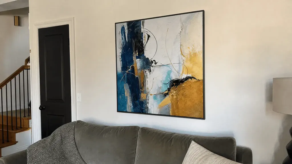
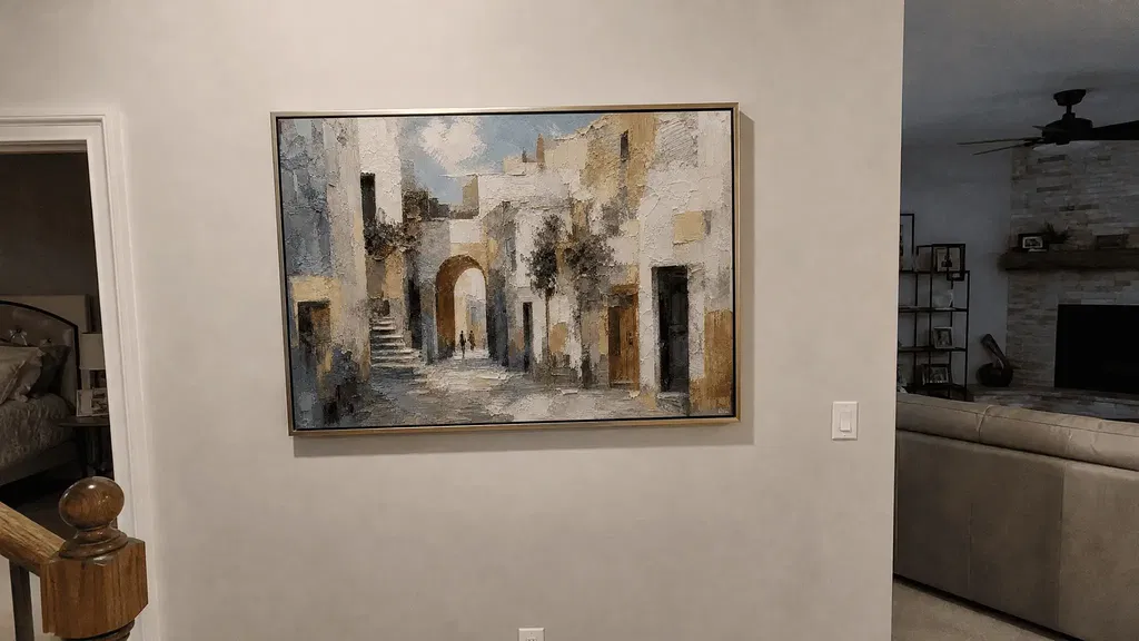
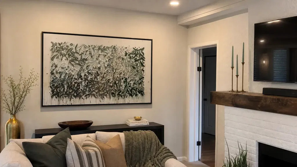
Black abstract art can feel warm and livable when the room balances its dark contrast with compatible undertones, tactile variation, open space, and suitable lighting. The artwork itself is only part of the result: wall color, scale, framing, furniture, sightlines, and surrounding visual density can all change how it reads. Before buying, compare the piece with your actual room in daylight and evening light, then verify the current listing details rather than judging color alone.
Why Black Abstract Art Can Still Feel Warm
Black abstract art works best as a warm focal point when the surrounding room supplies softness, tonal variation, or tactile balance. Warm whites, taupe, wood, leather, woven textiles, and restrained decor can soften the contrast, while visible movement or relief can keep a dark surface from reading as a flat block.
That effect is conditional, not automatic. A large, uninterrupted black composition may feel more severe against a cool white wall, while a smaller or more varied piece may blend more easily with a room that already contains warm materials. Natural light, framing, wall color, and nearby patterns also matter. If you are comparing black abstract paintings, judge the visible composition in relation to the wall and furniture—not as an isolated catalog image.

A useful first question is: what will balance the darkest value in the artwork? If the answer is wood, camel upholstery, linen, wool, cream, or warm metal already present in the room, the piece has a clearer path to feeling grounded. If the room is already dark, glossy, crowded, or strongly cool-toned, look for more tonal variation and breathing room before choosing a highly dominant composition. Broad interior-design guidance also treats color, scale, texture, and light as related parts of how a room is perceived.
Balance Undertones, Contrast, and Negative Space
Choose the artwork's undertone and contrast direction by comparing it with the real wall, flooring, upholstery, and wood tones in the intended room. Black is not a single visual experience: charcoal variation, brown-leaning softness, ivory, gray, and crisp white can each create a different relationship with the space.
Choose the Black's Undertone
Use visible cues rather than assuming a precise pigment or material. Stand back from the image and ask whether the dark areas appear closer to:
- Soft charcoal or gray-black: May sit comfortably with gray upholstery, cool stone, muted blue, or a restrained monochrome palette.
- Brown-leaning black: May connect more naturally with walnut, oak, camel, tan, leather, and earthy textiles.
- Black with beige or ivory variation: Can offer a gentler transition against cream, taupe, warm white, or natural fibers.
- Mostly crisp black: Creates a stronger graphic direction, especially beside bright white, polished metal, or high-contrast furnishings.
Compare the artwork with one or two existing room elements instead of trying to match every color. A small sample of wall paint, a sofa photo, or a flooring image beside the artwork can reveal a mismatch that is easy to miss on a product page.
Use Black-and-White Contrast With Intention
Black-and-white textured canvas can range from softly layered to sharply graphic. Use the contrast level to decide how much visual energy the room can absorb.
| Composition Direction | Likely Visual Effect | May Work With | Watch For |
|---|---|---|---|
| Crisp black and white | Clear, graphic contrast | Clean-lined furniture, bright walls, simple decor | It may feel stark when paired with many hard surfaces or cool lighting. |
| Black and ivory or softened beige | Lower contrast with a warmer transition | Cream upholstery, wood, linen, taupe, and woven materials | The piece may look different under cool daylight versus warm evening light. |
| Mostly black with open or tonal variation | Strong focal weight with quieter contrast inside the composition | Light walls, uncluttered furniture groupings, restrained palettes | Flat uninterrupted areas can feel more severe, especially when glare is present. |
| Black, gray, and white layering | Balanced monochrome with more tonal steps | Gray sofas, concrete tones, black hardware, and neutral rooms | Too many nearby patterns can compete with the artwork's internal structure. |
These are styling directions, not guaranteed room outcomes. The best comparison is the artwork beside your actual wall and furnishings under more than one lighting condition. Research on protecting displayed artwork likewise supports checking how illumination changes what viewers see, rather than relying on one image or setting.
Leave Room for the Composition to Breathe
Negative space does not require an empty home; it means giving the artwork enough visual territory to remain legible. Before installation, check:
- How much usable wall area remains after accounting for doors, windows, switches, and furniture?
- Will shelves, lamps, plants, or a nearby gallery wall compete with the darkest shapes?
- Does a patterned wall, rug, or sofa introduce another strong focal point?
- Can you still identify the artwork's main movement from the usual viewing position?
A busy setting can work when layering is intentional, but it changes the role of the piece. For a more isolated statement, a simpler wall and restrained nearby decor are usually easier to evaluate. See these textured artwork as a room anchor ideas if you are building the room around one major piece.
Let Texture, Relief, and Metallic Accents Add Depth
Texture, relief, and restrained metallic details can add visual variation to dark wall art, but they do not guarantee warmth. Their success depends on how active the room already is and how the surface behaves under the available light.
Match Relief to the Room's Visual Pace
Treat relief direction as a visual-energy choice, not a claim about construction. The listing should provide the evidence for what the artwork is made from and how its surface is formed.
| Surface Movement | Visual Energy | Surrounding Room Conditions | Lighting Sensitivity |
|---|---|---|---|
| Broad, calm variation | Lower and more spacious-looking activity | Quiet bedroom, simple living room, soft textiles | Shadows may be subtle; check whether the variation remains visible. |
| Linear or directional marks | Moderate, organized movement | Clean-lined furniture and rooms with one clear focal point | Light may emphasize the direction of the marks from some angles. |
| Irregular, dense movement | Higher visual activity | Minimal surroundings that can accommodate a stronger statement | Changing light may create more noticeable highlights and shadows. |
If the room already has bold wallpaper, patterned upholstery, or several sculptural accessories, a calmer surface may be easier to live with. If the room feels flat and restrained, more visible movement may supply the needed focal variation.
Use Metallic Accents as a Repeated Detail
A small metallic note is more likely to integrate when it echoes something already in the room. Check for a related lamp finish, picture frame, cabinet hardware, table base, or furniture detail before adding another reflective element.
- Repeat one existing finish rather than introducing several unrelated metallic colors.
- Step back from the artwork and ask whether the metallic detail supports the composition or becomes the first thing you notice.
- Compare the piece from seating and walking positions; reflective areas may change as the viewing angle changes.
- If several surfaces already shine, choose a composition with quieter accents or more matte-looking surrounding materials.
Pair Texture With Nearby Materials
Use a few nearby tactile materials—such as wood, linen, wool, stone, or matte ceramics—to give the dark artwork a broader material context. The goal is not to match every texture. Repeating one or two cues is often enough to make the wall feel connected to the rest of the room.
For more vocabulary around dimensional surfaces, explore textured wall art basics, but verify any specific artwork construction on its current product page. Museum lighting guidance also shows why surface appearance can change with light direction and viewing conditions; apply that as a practical comparison, not as a home lighting specification.
Adjust Placement and Lighting by Room
Black abstract art fits a room when its scale, sightline, surrounding composition, and lighting support the way that room is actually used. A living room, bedroom, entryway, or office can all work, but the room label alone does not determine the fit.
Choose the Best Wall by Sightline and Scale
Use this sequence before deciding that a wall is suitable:
- Identify the natural focal wall. Start with the main seating position, arrival path, desk, bed, or media-viewing area.
- Measure usable wall space. Account for doors, windows, switches, circulation, and the furniture that will sit below or beside the artwork.
- Compare the furniture relationship. The artwork should relate visually to the sofa, console, bed, desk, or entry furnishings rather than float as an unrelated rectangle.
- Check the sightline. View the wall from the positions where people will actually sit, stand, or walk past it.
- Look for competing objects. Shelves, mirrors, patterned walls, and dense decor may change which element reads as the focal point.
There is no universal spacing or hanging measurement that solves every room. Use a paper outline, removable tape, or a temporary digital placement to compare the artwork's apparent scale before ordering. A display-art overview is useful background for thinking about placement, scale, and the surrounding wall without treating any one hanging rule as universal.
Adapt the Mood to Each Room
| Room | Useful Direction | Nearby Materials | Main Caution |
|---|---|---|---|
| Living room | Choose contrast that supports the sofa and existing focal points. A stronger composition may work when the wall has breathing room. | Wood, leather, cream upholstery, woven rugs, or restrained metal | Avoid stacking the artwork against several equally bold patterns. |
| Bedroom | Favor calmer movement, softened contrast, or tonal variation when the goal is drama without visual overstimulation. | Linen, wool, warm white, taupe, wood, and matte finishes | Check the piece under evening light, when reflective details may become more prominent. |
| Entryway or hallway | Prioritize the arrival sightline, usable wall width, and how quickly the composition reads as people pass. | Console wood, neutral paint, simple hardware, and limited accessories | Doors, switches, narrow walls, and adjacent decor can create congestion. |
| Home office or media room | Use contrast that remains visible without dominating screens, work materials, or the viewing area. | Wood, charcoal, gray, black hardware, and controlled accents | Check artificial light, screen reflections, and whether dark surroundings hide tonal variation. |
Light Texture Without Creating Glare
Check the artwork from the room's normal viewing positions in both daylight and evening illumination. Research on reflected glare and luminance distribution supports this practical check: surface reflectance, light position, and viewing angle can change whether relief appears dimensional or whether a bright reflection distracts from it.
- View the piece from the sofa, bed, desk, or arrival path—not only straight on.
- Check whether texture remains readable when the room is dimmer.
- Look for a reflection that moves across the surface as you change position.
- If glare is distracting, consider whether the room's light can be diffused or redirected without adding installation complexity.
- In darker rooms, compare candidates with enough tonal variation or open composition to remain readable.
A surface that looks soft in one controlled image may behave differently in your room. That is why a real-space lighting check is more useful than a promise that any particular finish will always look matte, warm, or highly dimensional.
Use a Simple Pre-Purchase Styling Checklist
Before buying black textured wall art, run this seven-step check:
- Photograph the wall. Take pictures from the main seating, standing, and walking positions. Include nearby furniture, flooring, windows, and competing decor.
- Measure usable space. Record the wall area that remains after doors, switches, furniture, and circulation are considered. Compare the listing's current dimensions with that usable area.
- Identify the room palette. Note the wall color, wood tones, upholstery, metal finishes, and strongest patterns. Choose one or two elements the artwork can visually connect with.
- Assess undertone and contrast. Decide whether the piece leans charcoal, brown-black, ivory, gray, crisp black-and-white, or mostly black. Treat the visible impression as a styling clue, not a guaranteed pigment or material fact.
- Inspect texture and accents. Look for useful close-ups and, when available, side-angle views. Ask whether the visible movement is broad, linear, or dense, and whether metallic details remain restrained.
- Test lighting and sightlines. Compare the artwork in daylight and evening light, then from the positions where it will be viewed. A candidate is less adaptable if it only looks balanced from one angle or under one lighting condition.
- Verify the live listing. Check current dimensions, finish language, framing information, care guidance, shipping terms, and return policy on the product page. Do not infer these details from another seller, a collection page, or a similar-looking image.
As a quick warm-versus-severe filter, keep comparing when the composition combines uninterrupted flat black, hard contrast, strong apparent reflectivity, little open space, and no useful close-up evidence. Any one of those traits may work in the right room; several together deserve a closer look.
When the checklist points toward a dark focal piece, browse our black abstract collection or compare black and white options. We recommend checking the live listing for the details that matter to your wall, lighting, and purchase decision.
FAQs
These questions cover room-specific pairings and online-shopping checks that can change the final choice.
What Colors Work Best With Black Abstract Wall Art?
Start with the artwork's visible undertone and the largest nearby color, such as the wall or sofa. Cream, taupe, camel, and wood may soften a dark composition; ivory, gray, and crisp white may create a more graphic direction. Compare a photo or sample beside the artwork rather than relying on a color name.
Does a Dark Artwork Make a Room Feel Smaller?
It does not change the room's actual size, but it may carry more visual weight when oversized for the wall, surrounded by clutter, or paired with strong contrast and low light. Compare open space, tonal variation, sightline, and wall color before deciding.
Can Dark Wall Art Work Above a Brown or Tan Sofa?
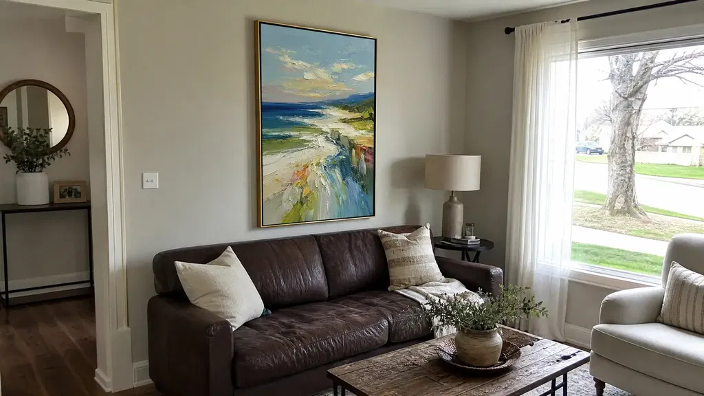
It can work when the wall and accessories bridge the contrast. Compare the dark tone with the sofa, then look for cream pillows, warm white walls, wood, a related metal finish, or a woven rug. If both pieces feel heavy, keep nearby decor simpler.
How Much Wall Space Should I Leave Around It?
Use a visual proportion test instead of a universal inch rule. Compare the artwork with the usable wall, furniture below it, doors or windows, and the main viewing path. On a narrow wall, reduce competing objects and check that the piece does not crowd switches or shelving.
What Should I Check When Viewing Textured Art Online?
Look for multiple views, close-ups, dimensions, finish language, framing information, and current purchase policies. Screens can alter perceived color and relief. If the listing does not show enough detail to judge the surface or fit, investigate further before buying.