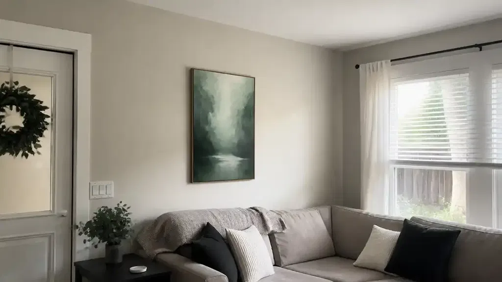
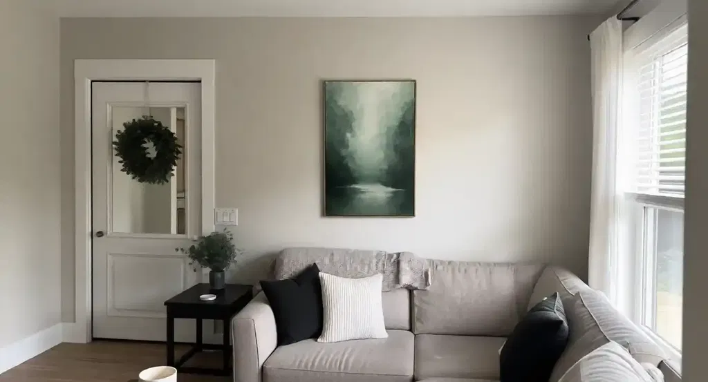
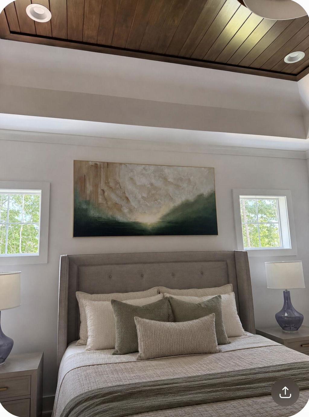
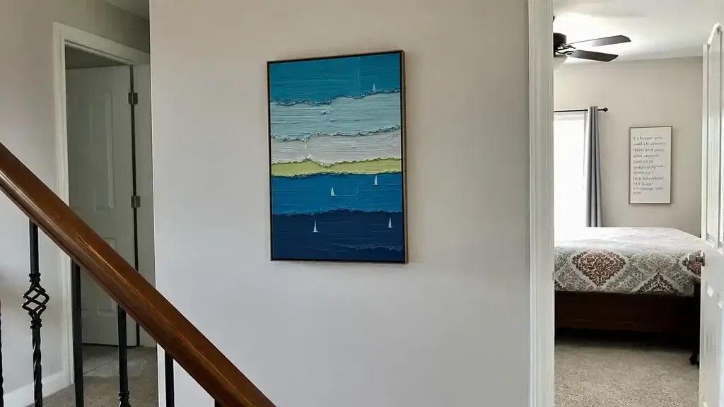
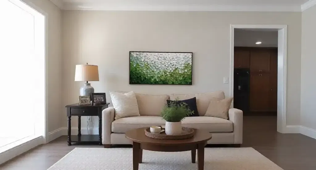
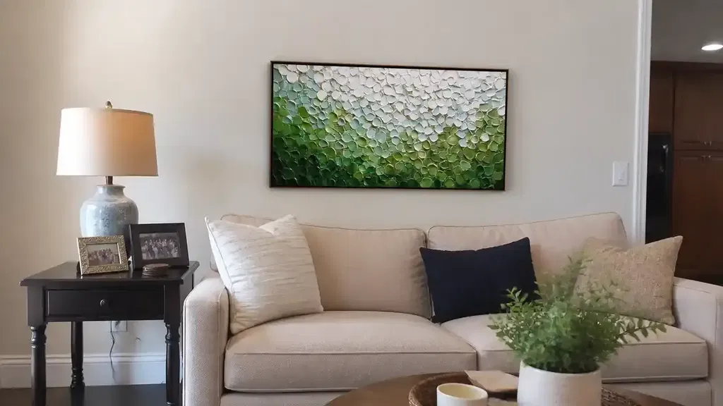
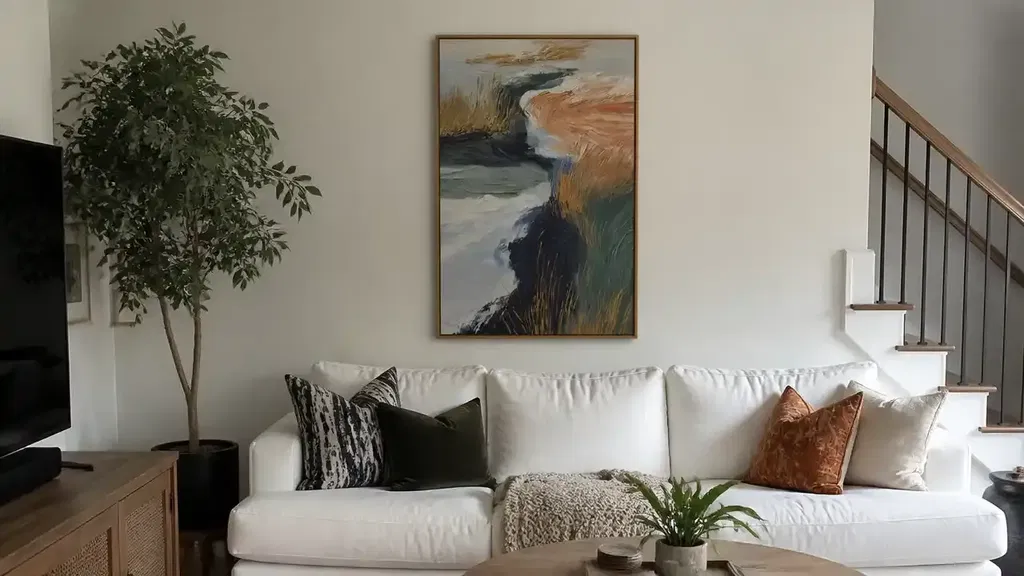
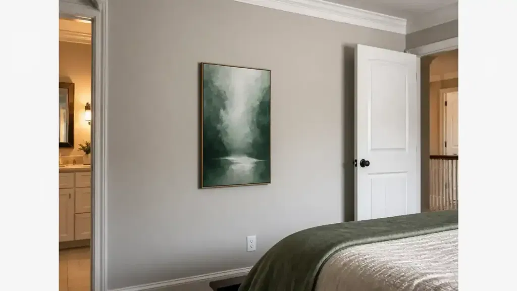
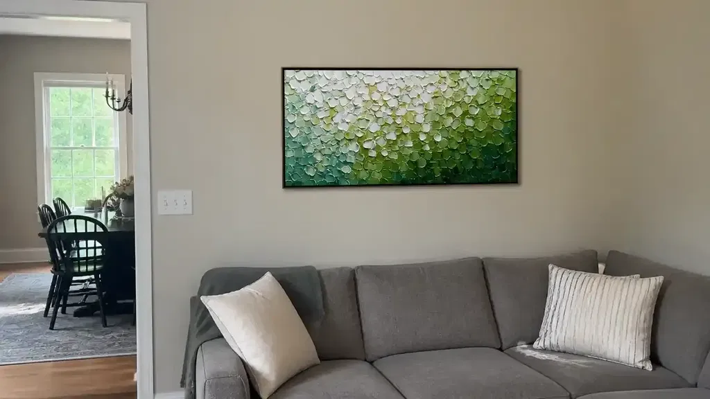
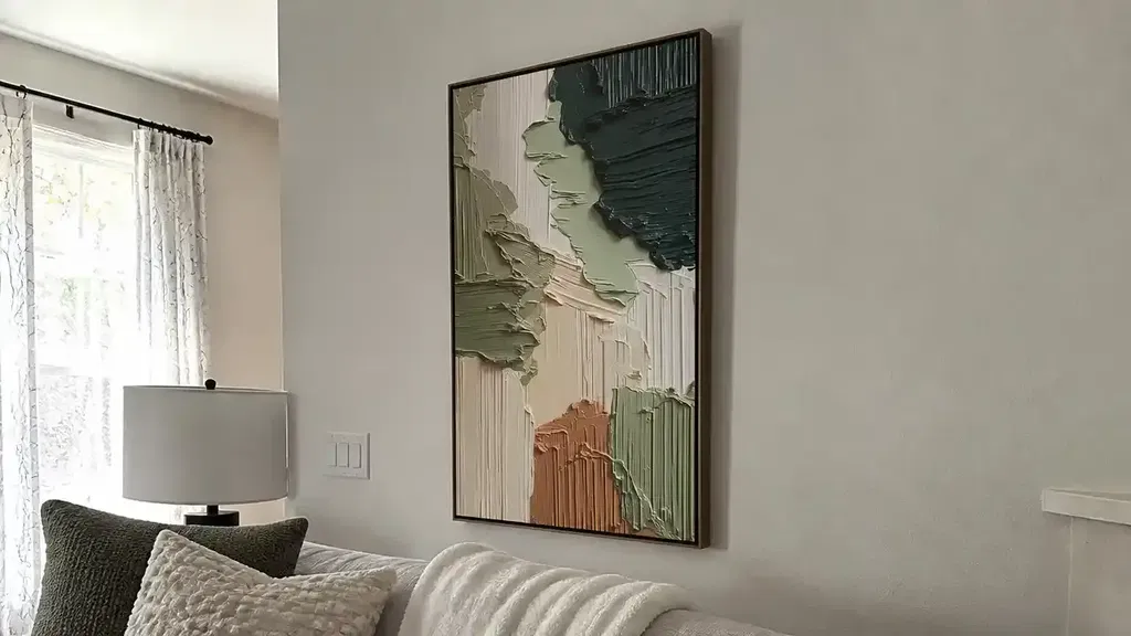
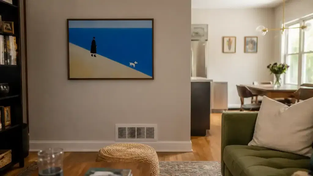
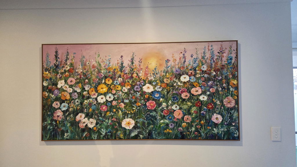
Restaurant wall art can shape a space by coordinating subject, color, contrast, texture, lighting, and placement with the restaurant’s concept. The right choice should support the intended mood without competing with food, conversation, menus, wayfinding, or service activity. It also needs to suit the zone: a piece viewed from a dining table has a different job from one guests see as they approach the host stand or gather at the bar.
Treat the artwork as part of the room’s design system, not as an isolated decoration. Review finalists in the actual space, under representative lighting, and against the wall finishes and furniture around them. That process is more reliable than choosing from an online image alone. For broader hospitality browsing, the hospitality art collection can be a starting point, but verify current product details before ordering.
How Restaurant Wall Art Shapes the Guest Experience
Restaurant wall art contributes to atmosphere when it reinforces the room’s visual language. Subject, palette, contrast, texture, lighting, and sightlines work alongside food presentation, table settings, sound, signage, and permanent finishes. Restaurant atmosphere guidance likewise treats atmosphere as a coordinated design consideration—not something any single artwork can guarantee.
Start by defining the mood in practical terms: calm, social, energetic, refined, or experiential. “Calm” might call for quieter transitions and visual breathing room, while “social” may allow conversational figures or a stronger focal point. An energetic room can handle more saturated color or assertive contrast, as long as menus, tableware, and wayfinding remain easy to read.

The restaurant’s function changes the answer. A textured, high-contrast piece may create an engaging arrival moment in a waiting area yet feel visually demanding behind closely spaced tables. Conversely, quiet tonal art that supports conversation in a dining room may disappear along a long approach path. Judge the work from the positions guests actually occupy, rather than from a single centered viewpoint.
Match Subject, Contrast, and Palette to Brand Mood
Match art to the restaurant’s concept by choosing a subject direction, contrast level, and palette that support the occasion without overpowering the dining environment. Compare finalists in the actual room, because restaurant interior design research treats walls, furniture, finishes, and lighting as part of the design context. The artwork should support those elements rather than stand apart from them.
| Intended mood | Subject direction | Contrast behavior | Palette behavior | Watch for |
|---|---|---|---|---|
| Calm | Abstract, atmospheric, understated local references | Lower or gently graduated contrast | Neutrals, softened earth tones, restrained cools | Art disappearing against a similar wall |
| Social | Figurative groups, conversational abstract forms, selective local references | Medium contrast that rewards closer viewing | Warm or balanced color with room to breathe | A literal theme repeated on every wall |
| Energetic | Geometric, expressive figurative, or ingredient-related references used selectively | Stronger contrast for approach-path visibility | Saturated accents balanced by quieter surroundings | Color competing with food, menus, or signage |
| Refined | Minimal abstract, architectural, or carefully edited figurative work | Controlled contrast with clean visual edges | Coordinated neutrals, stone tones, metal accents | A finish or frame that clashes with permanent materials |
| Experiential | Distinctive abstract, dimensional, or story-led subjects | Lead-piece contrast with supporting works receding | A deliberate accent palette tied to the concept | Too many competing focal points |
Choose Subjects That Support the Dining Occasion
Subject direction should suggest the restaurant’s identity without turning every wall into a literal theme statement. Figurative work can support a sense of gathering; abstract forms can leave room for interpretation; geometric pieces may echo a modern architectural concept; local or ingredient-related references can connect to place when used selectively.
Use a short review before choosing a theme-heavy piece:

- Does the subject feel conversational, or does it distract from the dining occasion?
- Is the reference distinctive enough to support the concept without looking like signage?
- Will it still make sense if the menu, furniture, or brand identity changes?
- Does the room need one narrative focal point or a quieter visual field?
Control Contrast for Different Viewing Distances
Contrast should follow the way guests encounter the piece. Stronger differences in value or color can help art read from an entrance, bar, or long approach, while quieter transitions may be more comfortable near tables or dense architectural details. Neither approach is universally better.
Review finalists from the entrance, host stand, bar, and representative tables. If the piece disappears from the approach but dominates at a table, consider a different location or a less extreme contrast level. This check is especially useful when planning statement art for restaurants across more than one zone.
Build a Palette That Works With Food and Finishes
Coordinate the artwork’s palette with wood, stone, metal, painted walls, upholstery, tableware, and the actual bulbs or daylight in the room. Warm color may echo wood or brass; cooler color can create separation from warm finishes; neutrals can quiet a busy room. These are comparison points, not guarantees about how guests will respond.
| Surrounding finish | Palette direction to test | Coordination check | Likely clash |
|---|---|---|---|
| Warm wood | Earth tones, softened cools, or a controlled accent | Compare undertones under evening light | Orange or red accents becoming visually heavy |
| Stone or concrete | Warm neutrals, restrained color, or deliberate contrast | Check whether the work adds warmth or repeats gray | Low contrast causing the art to vanish |
| Metal and polished surfaces | Matte-looking color relationships or carefully limited saturation | Inspect reflections from several angles | Reflective competition with fixtures or screens |
| Painted walls | Complementary, tonal, or intentionally contrasting palette | Test a physical mockup or scaled image on the wall | Saturated color competing with menus and food |
| Upholstered seating | Repeat one accent or provide measured contrast | View art from seated positions | Too many unrelated accent colors |
Balance Scale, Texture, and Light Before You Buy
Before buying, test the artwork’s footprint, relief, finish, lighting response, care requirements, guest-contact exposure, and mounting conditions in the intended zone. Listed dimensions alone do not show whether a piece will work around furniture, doors, sconces, signs, service paths, and real sightlines.
Size Pieces for Sightlines and Surrounding Furniture
Use this five-step sequence instead of relying on a universal sizing formula:
- Measure the usable wall. Exclude doors, trim, sconces, signs, screens, and areas that service equipment must occupy.
- Identify primary viewpoints. Mark representative tables, the entrance, the host stand, the bar, and any standing queue.
- Account for interruptions. Note chair backs, banquettes, shelving, architectural breaks, and circulation paths.
- Mock up the footprint. Use paper, painter’s tape, or a scaled digital image to judge proportion from the viewpoints that matter.
- Confirm clearance and installation conditions. Check the wall construction, proposed hardware, artwork weight, doors, and local requirements with the responsible installer or designer.
A size that looks balanced on an empty elevation may feel crowded once chairs, menus, lighting, and service activity are restored. Treat any heuristic as a starting point, not a site rule.
Evaluate Texture and Finish for Restaurant Conditions
Texture can add depth and create a more tactile focal point, but its operating fit depends on the material, relief, edges, location, and care routine. Before selecting textured art for restaurants, separate the visual benefit from the maintenance question.
- Ask the maker for current, material-specific care instructions.
- Confirm how the surface should be handled around dust, residue, splashes, and guest reach.
- Review projecting edges or relief near chairs, queues, doors, and service routes.
- Ask whether framing, glazing, or a finish changes the cleaning or display instructions.
- Treat missing care information as an unresolved purchase question, not proof that the work will fail.
The conservation guidance on exhibition conditions illustrates why care and lighting decisions can vary by material and display context. It is background guidance, not a restaurant cleaning standard. Do not assume that textured, glossy, framed, or paper-based work is easy to maintain without documentation for the specific piece.
Check Lighting, Glare, and Reflections in Place
Review artwork under representative daytime and evening conditions, and from seated, standing, entrance, and bar positions. A university study of dining-lighting conditions supports testing the room in use rather than judging color or glare from a catalog image alone.
- Check windows, directional fixtures, mirrors, polished stone, glass, and screens.
- Move through the room at service time and note reflections that create a competing focal point or obscure important details.
- If the lighting plan will change after installation, repeat the review with the proposed fixture settings before approving multiple pieces.
Place Art by Restaurant Zone
Art choices should change with guest behavior, movement, sightlines, and competing information. Dining rooms need seated comfort; bars and waiting areas can use a clearer arrival focal point; private-event spaces need visual support that remains adaptable as layouts, décor, and lighting change.
| Zone | Guest behavior | Useful visual direction | Placement checks |
|---|---|---|---|
| Dining room | Mostly seated, with attention on food and conversation | Engaging but non-dominating work | Tables, banquettes, chair movement, menus, service paths, and seated sightlines |
| Bar | Standing, moving, ordering, and orienting | A stronger focal point may work | Bar sightlines, screens, mirrors, menus, fixtures, and circulation |
| Waiting area or host stand | Approaching, queuing, and looking for information | Immediate, legible visual emphasis | Host visibility, queue movement, signage, doors, and approach-path reflections |
| Private-event space | Changing layouts, photography, and temporary décor | Adaptable statement or quieter supporting work | Movable furniture, catering equipment, event signs, backdrops, and changing lighting |
Dining Rooms: Support Conversation and Comfort
Choose art that remains engaging from seated positions without demanding constant attention. Before using a wall behind tables or banquettes, check chair movement, table sightlines, nearby menus, lighting, and the visual relationship between the art and diners’ primary focus.
A quieter piece may be more useful on a tightly spaced wall, while a single statement work can anchor a more open elevation. The decision should follow the room’s density and sightlines, not a blanket rule about style.
Bars and Waiting Areas: Create a Clear Arrival Focal Point
A more immediate focal point can work where guests are standing, moving, or orienting themselves. Keep that focal point subordinate to essential information:
- Check visibility of the host stand and queue path from the entrance.
- Keep menus, screens, mirrors, and wayfinding visually legible.
- Review the piece from the approach path, not just from directly in front of it.
- Watch for reflections that pull attention away from service information.
Private-Event Spaces: Keep the Backdrop Adaptable
Private-event art should work with more than one layout or booking style. Compare a permanent statement piece, a coordinated group, and quieter background art by photography impact, furniture movement, temporary décor, catering equipment, and event signage.
| Option | Works best when | Check before choosing |
|---|---|---|
| Permanent statement piece | The room has a stable layout and one clear focal wall | Photography angles, equipment placement, and event signage |
| Coordinated group | Furniture and guest flow change but the palette stays consistent | Whether individual works remain legible after rearrangement |
| Quieter background art | The space regularly hosts different event formats | Whether it disappears behind temporary décor or lighting |
If the room regularly changes from a dinner setup to a reception or ceremony, preserve flexible wall areas and avoid making every visual surface depend on one fixed theme. Supporting pieces can recede while one carefully chosen work provides continuity.
Use a Final Selection Checklist Before Ordering
Before adding restaurant wall art to the cart, confirm that the choice passes brand-fit, zone-fit, readability, operating-practicality, and documented-purchase checks. Use a small finalist set and review it with the operator, designer, and installation lead. If several key assumptions remain unresolved, pause rather than treating them as minor details.
- Define the zone and mood. Write down whether the piece belongs in a dining room, bar, waiting area, or private-event space, and choose a working mood such as calm, social, energetic, refined, or experiential.
- Shortlist by visual role. Decide whether the work should lead, support, or create a background layer. You might compare people-gathering artwork, neutral impasto art, or colorful figurative art as browsing references, not as proof of restaurant suitability.
- Measure and mock up. Record usable wall dimensions, viewpoints, furniture, doors, signs, sconces, screens, and service routes. Test the proposed footprint in place.
- Review light and sightlines. Check daytime and evening conditions from seated, standing, entrance, bar, and approach positions. Look for glare, reflections, lost contrast, and competing focal points.
- Verify product information. Confirm current dimensions, materials, finish, framing or mounting information, care guidance, delivery timing, returns, and warranty terms where provided. Do not infer these details from a title or collection placement.
- Confirm installation conditions. Review wall construction, artwork weight, hardware, guest reach, doors, vibration, and local requirements with a qualified installer, designer, or responsible authority when the site calls for it.
- Approve the rollout. For multiple walls, assign one statement piece and let supporting works recede. Confirm budget and rollout timing only after the operating questions have answers.
The practical next step is to shortlist pieces by zone and mood, then verify dimensions, care guidance, lighting fit, installation requirements, and current store terms before ordering. That sequence keeps the aesthetic decision clear while preventing unknown operating conditions from making the decision for you.
FAQs
Use these questions to compare format, testing conditions, and installation needs before ordering.
What Art Looks Good in Restaurants?
No single style works everywhere. Compare figurative, abstract, geometric, local, and ingredient-related subjects with the concept, guest distance, finishes, lighting, and desired visual intensity.
How Can I Test Restaurant Wall Art Under Real Lighting?
Use a temporary mockup and review it during representative daytime and evening conditions from entrances, bars, queues, and typical tables. Note contrast, glare, reflections, and competing focal points.
Are Original Paintings Better Than Prints for a Restaurant?
Neither format is automatically better. Compare visual effect, budget, repeatability, replacement planning, care documentation, framing, and installation requirements for the planned location.
How Should Restaurant Wall Art Be Secured in a High-Traffic Area?
Ask the installer to review wall construction, artwork weight, hardware, guest reach, vibration, doors, and service movement. Obtain site-specific advice when the piece is near circulation or seating.