Dining room art has to do three jobs at once: fit the wall, look good in mixed light, and hold up better when the room sees occasional humidity from cooking or nearby traffic. The best choice is usually the one that matches your buffet or sideboard width, avoids shiny glare under evening light, and uses a finish that suits how you actually eat and host.
What Makes Dining Room Walls Harder to Style
Dining rooms are different from a blank hallway or living room wall because people usually view the art while seated, often under pendants, candles, or nearby windows. That changes how scale and finish read. A piece that looks balanced in a showroom can feel too small once it is floating above a buffet, or too reflective once dinner lighting hits it.
Humidity is the other difference, but it should be treated as an environment check rather than a reason to avoid dining room wall art altogether. If the room stays indoors and only sees occasional moisture, the key is choosing art and framing that are less vulnerable to steam, condensation, and heat from nearby cooking zones.

That is why dining room art, buffet placement, and finish choice need to be judged together instead of one at a time. The right piece should still read clearly from the table, not disappear in reflections or look disconnected from the furniture below it.
Choose the Right Scale for the Wall
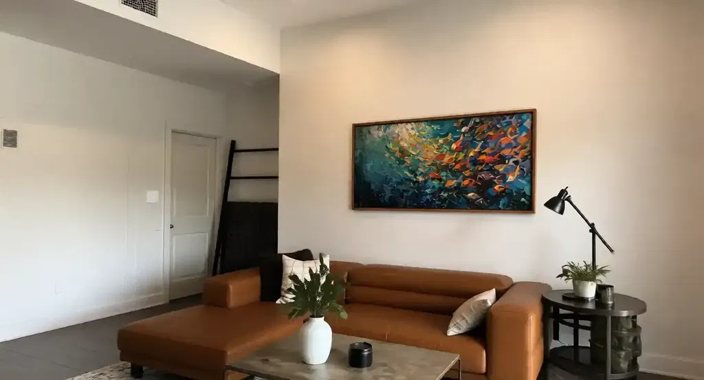
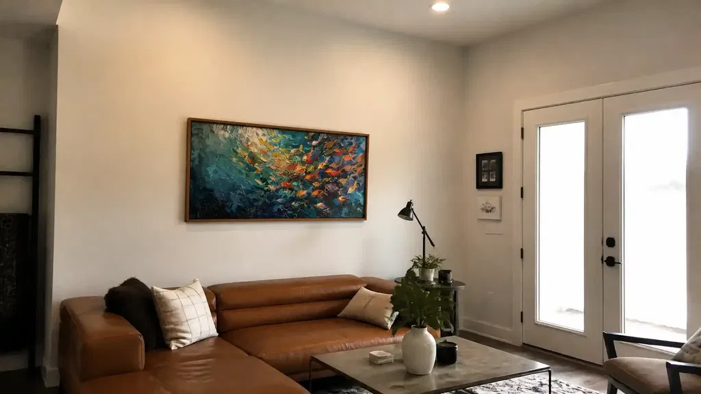
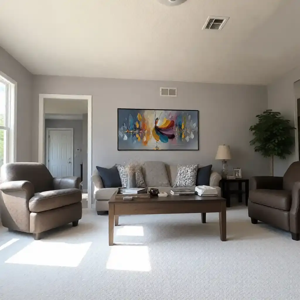
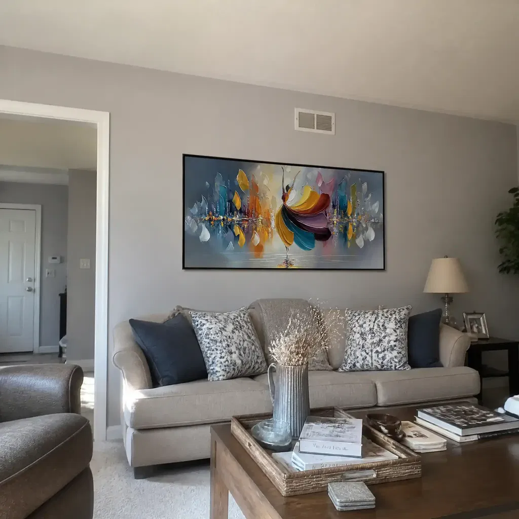
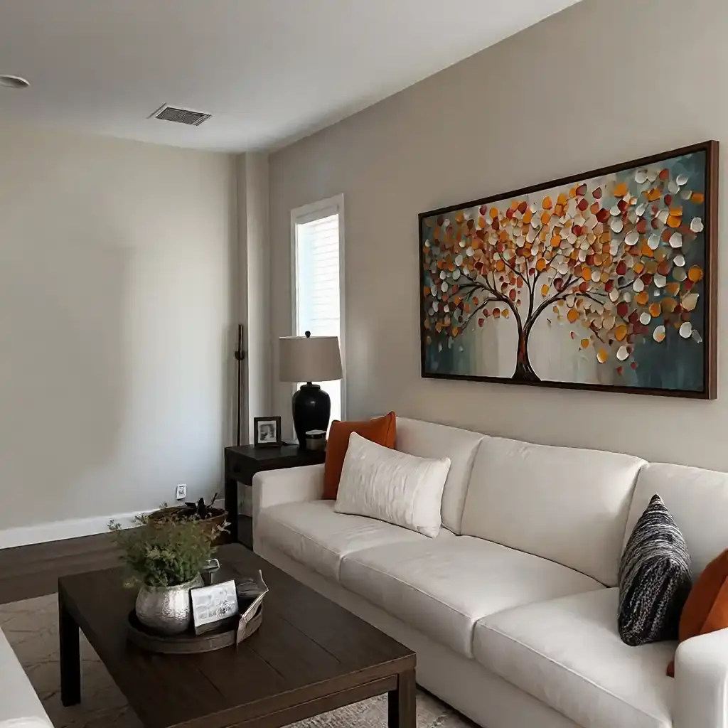
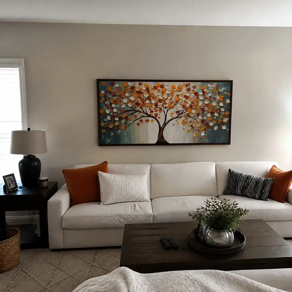
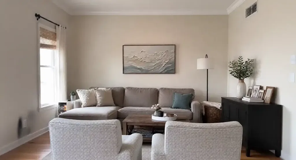
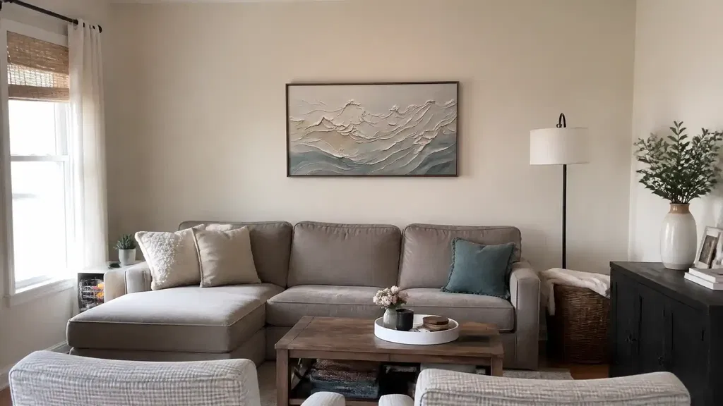
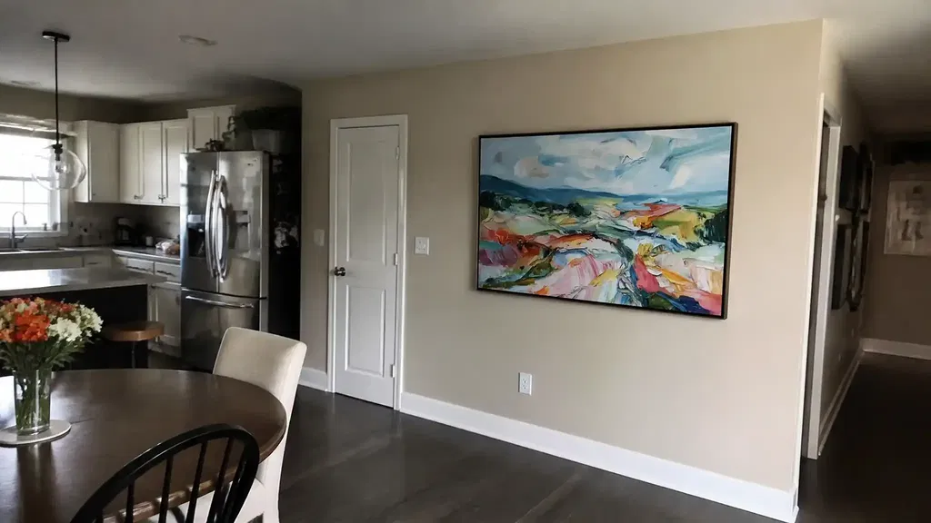
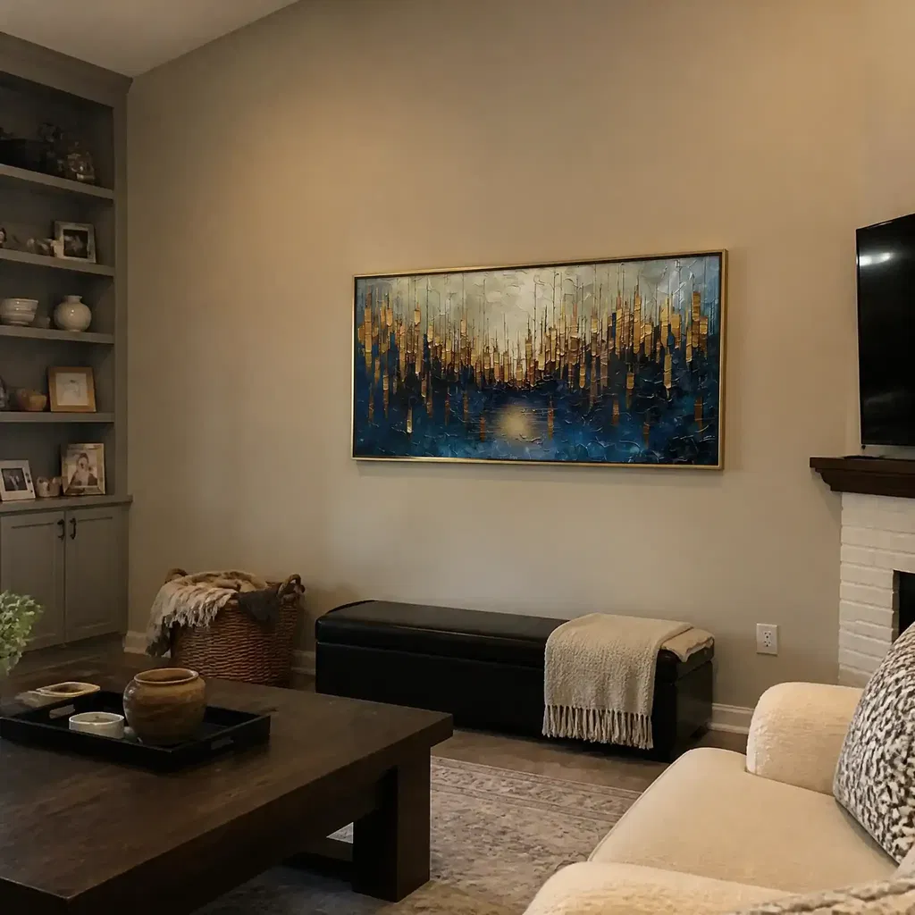
For most dining spaces, the buffet or sideboard is the best width anchor. A piece that visually relates to that furniture usually feels more intentional than art sized only to the whole wall. In practice, that means the wall art should feel wide enough to connect to the furniture, but not so wide that it crowds the trim, sconces, or nearby decor.
A useful starting point is the common buffet-width heuristic from the decorating world: art often feels balanced when it spans roughly two-thirds to three-quarters of the furniture below it. That is a design rule of thumb, not an official standard, but it helps keep dining room wall art proportions from looking undersized. Buffet width as a sizing starting point

Ceiling height and empty wall space change the answer. A taller room can usually support a larger single piece or a stronger pair, while a wide blank wall may need more visual weight so the art does not look like an afterthought. If the wall is open and the furniture is low, undersized art is the most common mistake. It leaves the buffet looking like the main object and the artwork looking like a small accessory.
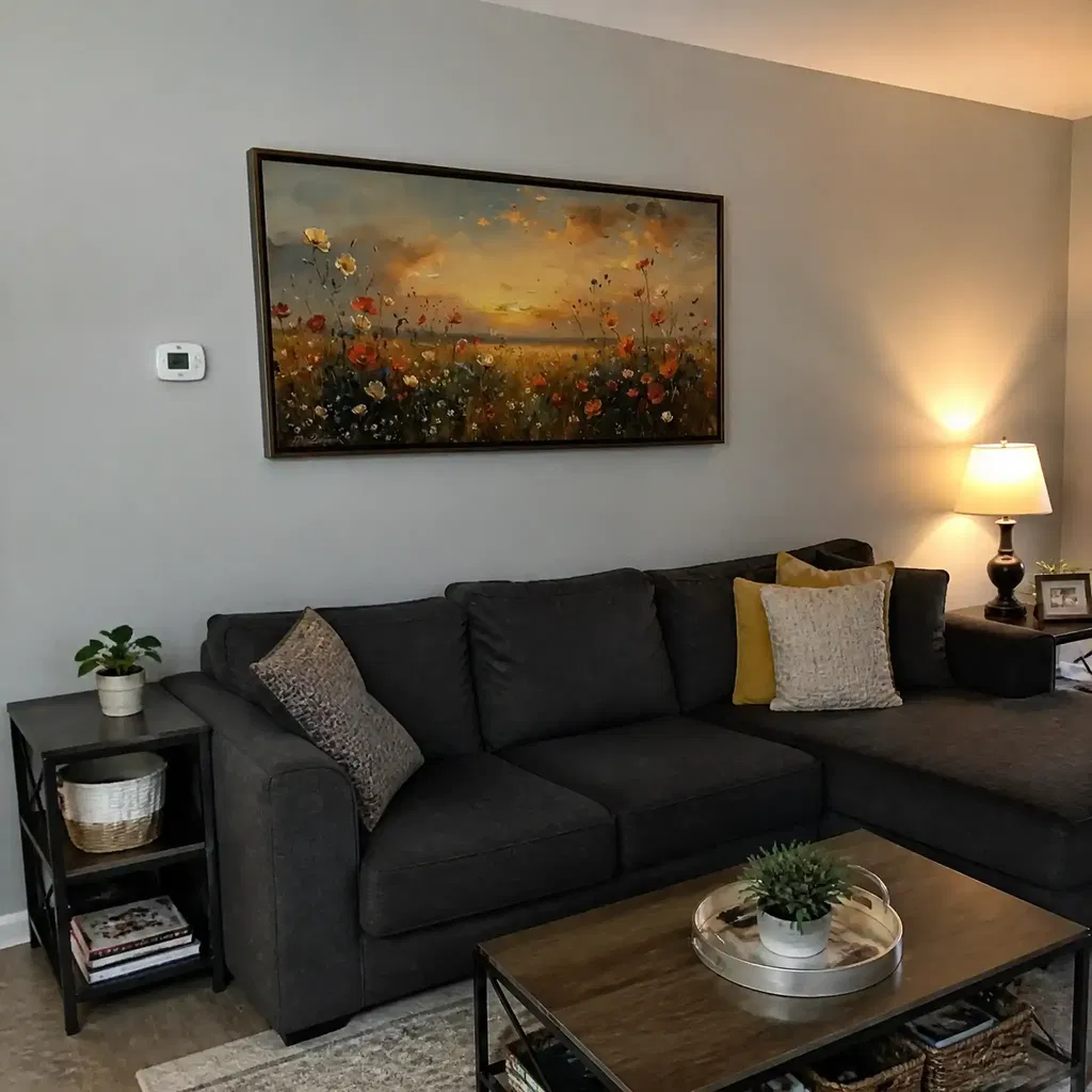
Here is the practical split. Choose one large piece when the buffet is the clear focal point and the wall needs a calm, finished look. Choose a pair when the furniture is long and the room already has symmetry from lamps or candlesticks. Choose a grouping only when the pieces still read as one planned composition from the dining table. If the arrangement breaks into separate little objects, the wall usually feels busier instead of better.
If you are still deciding on scale, our oversized wall art sizing guide can help you tell whether the space needs a statement piece or simply better proportion.
Place Art Above a Buffet or Sideboard
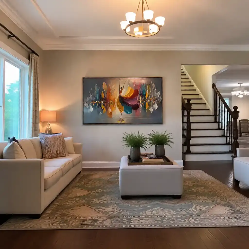
Above a buffet or sideboard, the main goal is connection. The art should feel anchored to the furniture, not suspended high enough to read as a separate wall feature. If the gap gets too large, the arrangement starts to feel disconnected. If the art sits too low, the whole setup can feel cramped, especially once lamps, trays, or candles are added.
A good visual check is to center the artwork over the furniture itself, not automatically over the room's centerline. In dining rooms, the sideboard or buffet is usually the real base of the composition. That matters more than perfect room symmetry when the wall is mainly serving the dining setup. A seated-eye-level preview is useful here because the view from the table often reveals problems that are easy to miss while standing.
The seated-eye-level placement check is not a rigid rule, but it is a reliable way to see whether the composition reads naturally from the dining chairs. In many dining rooms, the right placement feels like a visual bridge between the top of the buffet and the center of the artwork, with enough breathing room for objects on the surface below it.
Do not let decor crowd the setup. Lamps, trays, mirrors, candles, and seasonal pieces can all work with dining room wall art, but they should support the composition instead of competing with it. If the buffet surface is already busy, a simpler artwork usually looks better. If the wall decor starts to fight for attention, the room can feel smaller than it is.
A quick tape or paper template is worth doing before you hang anything. It lets you test how the art reads from across the room and from the dining table before you commit to nails.
Pick Finishes That Work in Dining Light
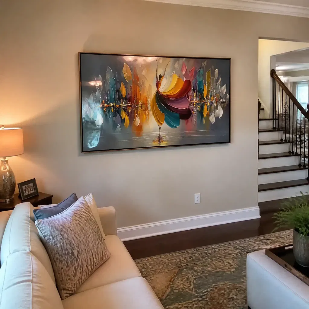
Finish choice matters more in a dining room than many buyers expect. Candlelight, pendant light, and window light all hit artwork differently, and the wrong sheen can create reflections that pull attention away from the piece itself. Lower-sheen surfaces usually reduce obvious glare better than glossy ones because they scatter light instead of bouncing it straight back at the viewer. Matte finishes reduce glare in dining lights
That does not mean matte is always the best answer. Satin can work well in some rooms, especially when the lighting is softer and you want a little more surface richness. Glossy finishes can still be useful when you want more brightness, but they are the most likely to flare under candles or pendants. The right finish depends on the room's dominant light source, not just the art style.
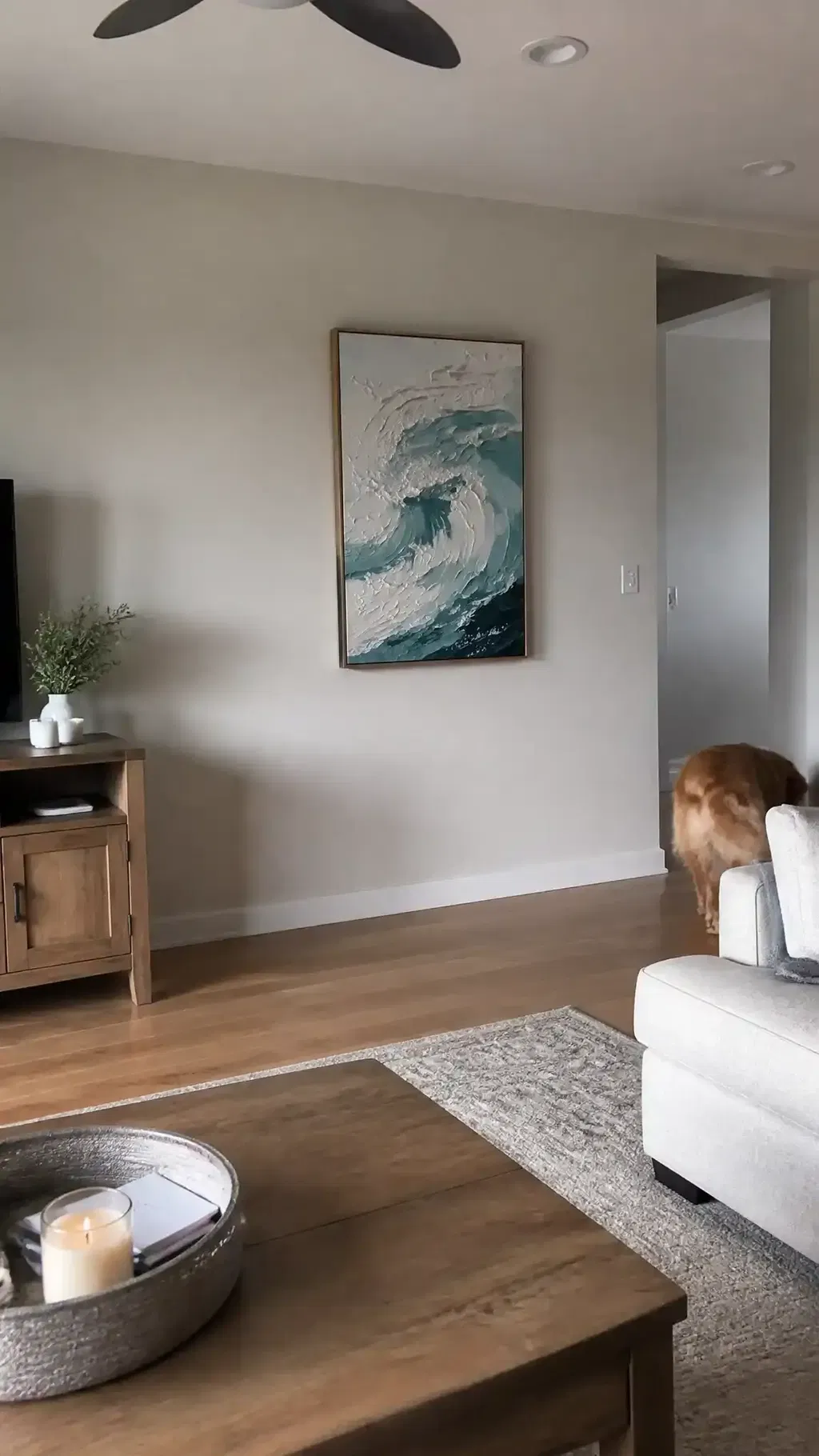
Texture is another useful lever. A textured surface can break up reflected light and soften the look of shine in some dining room setups, which is why textured art for dining area searches often lead to pieces with more depth and surface variation. Texture can break up reflected light is the practical idea to keep in mind. Texture can also make a dining wall feel warmer, especially when the rest of the room has smooth furniture, glass, or metal.
The safest habit is to view the piece in both daytime and evening light before buying if possible. A finish that looks balanced at noon can look harsher once the pendants are on and candles are lit. If you host often, test the artwork from your actual seating position, because that is where glare usually becomes obvious first.
Choose Materials With Humidity in Mind
Humidity in a dining room is usually occasional, not constant, so the goal is to avoid overreacting. You do not need to treat every dining space like a wet room, but you also should not describe dining room art as moisture-proof without product-specific proof. A better approach is to think in terms of stable indoor conditions and sensible protection.
A reliable conservation target for paintings is stable indoor humidity around 45% to 55% when possible, which is a useful benchmark for rooms where temperature and moisture can fluctuate. Stable indoor humidity for paintings is especially helpful if the dining room sits near a kitchen, an exterior wall, or a spot that gets occasional steam.
Framing matters too. For paper-based art, mats or spacers help keep the surface from touching the glass, which can trap moisture and create problems over time. The mats or spacers guidance for paper-based art is a simple but important check if you like prints, drawings, or other works on paper.
Use this short filter before you buy: keep art away from direct steam, avoid placing it right above heat sources, and check whether the room gets regular condensation near the wall. If the dining room is mostly dry and ventilated, many pieces can work well. If the room often swings between warm, humid, and cool conditions, choose more conservative materials and better framing rather than assuming any finish will solve the problem.
Use a Quick Dining Room Wall Art Checklist
Before you buy or hang dining room wall art, run five checks. First, measure the buffet or sideboard width and compare the art to that furniture, not just the wall. Second, test the piece under evening light so you can judge glare from pendants or candles. Third, confirm that the gap above the buffet feels connected rather than floating. Fourth, check whether the finish and texture still read well from the dining table. Fifth, preview the layout with tape or paper before you commit.
If the room already feels busy, choose simpler art with less shine. If the wall is large and the furniture is low, scale up instead of filling the space with smaller pieces that never quite connect. If humidity is a concern, favor stable indoor conditions, protective framing, and a placement away from steam or direct heat. That combination usually does more for long-term results than chasing a supposedly perfect material.
When you are ready to narrow the options, browse our dining room collection or use this checklist to compare scale, finish, and placement with your actual wall. The right piece should look right at the table, not only on the screen.
FAQs
How Big Should Dining Room Wall Art Be Above a Buffet?
A good starting point is art that feels proportionate to the buffet below it, often around two-thirds to three-quarters of the furniture width. Use that as a design check, then adjust for ceiling height and how much open wall surrounds the setup. If the piece looks lost from the dining table, it is probably too small.
Can You Hang Textured Art in a Dining Room With Candlelight?
Yes, and texture can actually help in that setting because it may soften reflections and add depth. The key is to check the piece in the same light you use for dinner, since candlelight can make smooth finishes flare. If the surface still reads clearly from seated view, the texture is likely doing its job.
What Height Should Dining Room Art Hang Above a Sideboard?
Use the sideboard as the anchor and keep the art visually connected to it rather than floating far above it. A seated-eye-level preview helps more than chasing a single universal number, because dining rooms vary in ceiling height and furniture scale. If the gap feels large when viewed from the table, lower the piece.
Is Abstract Art Good for Dining Rooms?
Often, yes. Abstract art works well when you want a flexible focal point that does not compete with furniture or table settings. It is especially useful if the room needs stronger scale or a finish that holds up visually under changing light. The best version is the one that stays readable from both the table and the doorway.
What Should I Avoid When Choosing Dining Room Wall Art?
Avoid pieces that are too small for the buffet, overly shiny under your actual lighting, or so high above the furniture that they feel detached. Also avoid assuming a work is moisture-proof without checking the material and framing. If the wall has candles, lamps, or seasonal decor, make sure the art still has enough visual space to stand out.