The 3-5-7 rule in decorating is a foundational design principle which suggests that grouping objects in odd numbers creates more visual interest, balance, and energy than even-numbered arrangements. While many homeowners are familiar with the basic "rule of three," the 3-5-7 rule expands this concept to larger surfaces, helping you scale your decor to fit everything from a tiny nightstand to an expansive dining table or a 12-foot fireplace mantel. By arranging items in groups of three, five, or seven, you force the human eye to move dynamically across a display rather than getting "stuck" on symmetrical pairs.
In professional interior styling, this rule is the secret to making a home look curated rather than cluttered. It is particularly effective when integrating art and home decor, as it provides a mathematical framework for placing disparate objects—like a vase, a book, and a candle—into a cohesive visual unit.
Understanding the 3-5-7 Rule in Interior Design
At its core, the 3-5-7 rule is about intentional asymmetry. In design, symmetry (even numbers) often feels formal, stiff, and predictable. While symmetry has its place in traditional architecture, odd numbers create a natural rhythm that feels organic and "lived-in."
When you use the 3-5-7 rule, you are creating a focal point that the brain cannot easily categorize as a single pair. Because the eye cannot find a middle point between two items, it is forced to scan the entire grouping. This movement is what designers call "visual interest."
Core Benefits of the 3-5-7 Rule:
- Dynamic Movement: It prevents the eye from resting in one spot, making the room feel more energetic.
- Intentionality: It signals that the items were chosen and placed with care, rather than just being left on a surface.
- Scale Management: It allows you to fill larger spaces without simply adding "more stuff," by using larger groupings of 5 or 7 objects.
- Versatility: The rule works across all styles, from minimalist modernism to maximalist eclectic decor.
Why the Human Eye Prefers Odd Numbered Groupings
The preference for odd numbers isn't just a matter of taste; it’s rooted in how our brains process visual information. When we see an even number of items—say, two identical candles—our brains immediately pair them together. Once they are paired, the brain "completes" the task and stops looking. This creates a static, often boring, visual experience.
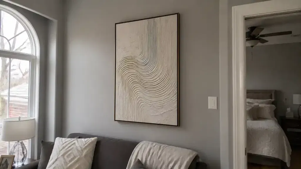
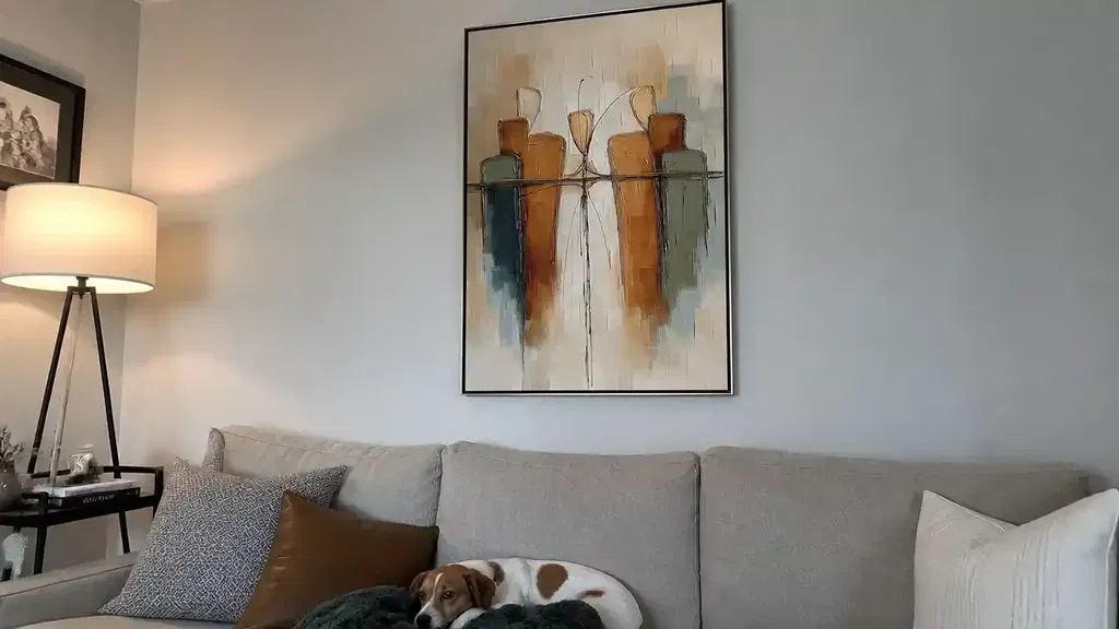
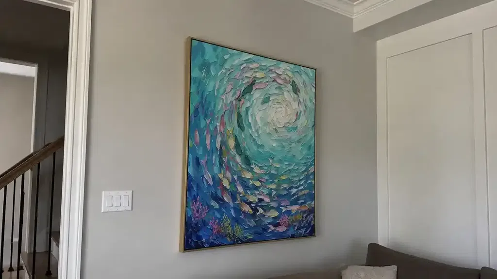
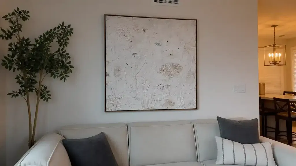
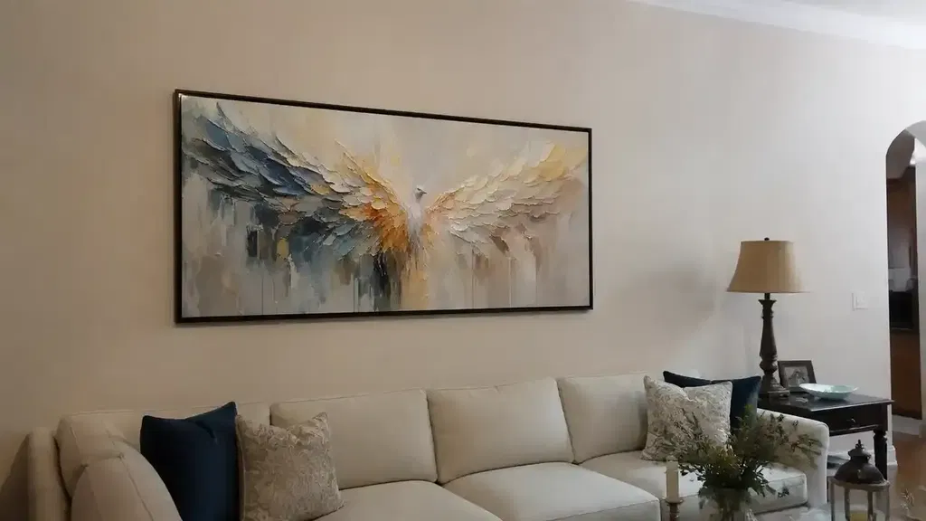
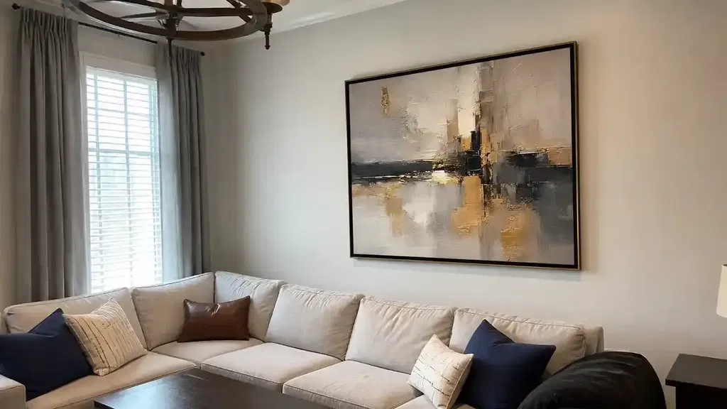
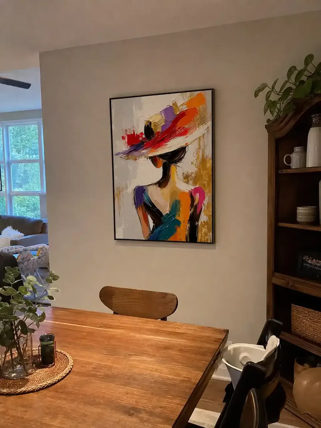
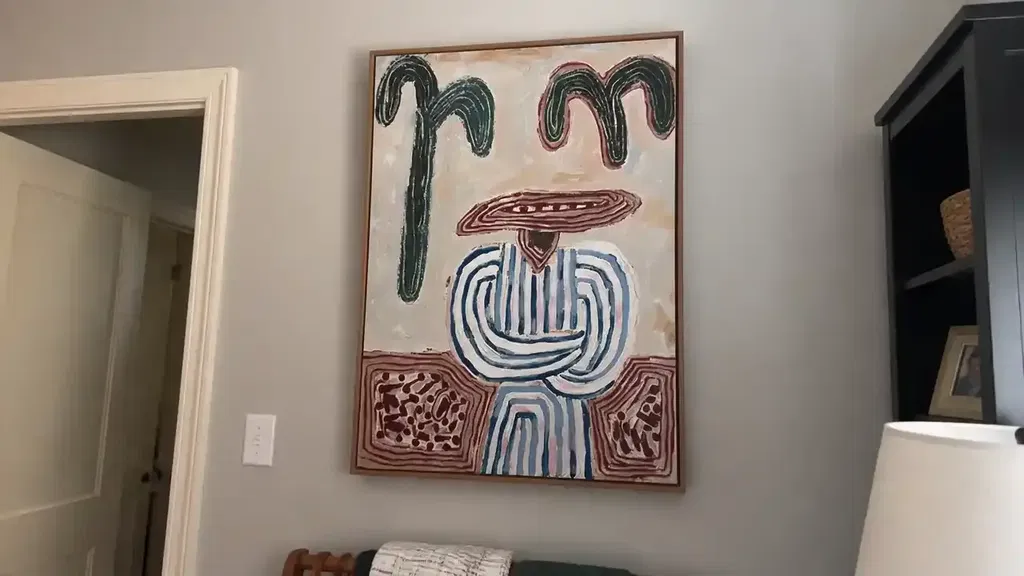
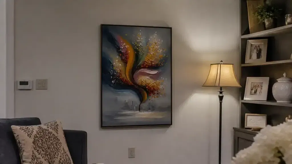
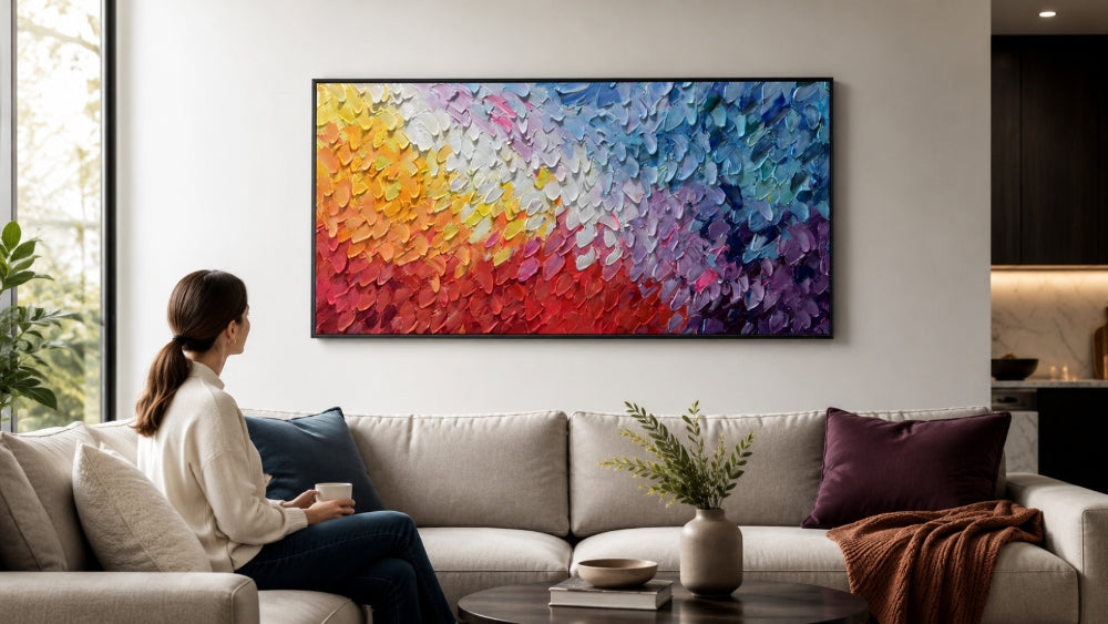
Odd numbers, however, create a sense of competition for the eye. There is always an "extra" item that pulls the gaze in a new direction. This is especially important when displaying high-value items like a wall art abstract painting. A single painting on a wall is a focal point, but three pieces of art in a row create a narrative.
In home staging and high-end design, practitioners use this psychological quirk to lead a visitor's eye through a room. By placing a group of three on a coffee table and a group of five on a nearby bookshelf, you create a visual trail that makes the space feel cohesive and thoughtfully planned.

How to Choose Between 3, 5, or 7 Items
The most common mistake in applying this rule is mismatching the number of items to the size of the surface. A group of seven items on a tiny nightstand will look like a cluttered mess, while three small items on a ten-foot dining table will look lost.
To choose the right number, you must consider the scale of the furniture and the surrounding negative space. Below is a guide for mapping your surfaces to the appropriate item count:
| Surface Type | Recommended Count | Why it Works |
|---|---|---|
| Nightstands, Side Tables, Small Pedestals | 3 Items | Provides enough variety without overwhelming the limited space. |
| Coffee Tables, Standard Mantels, Console Tables | 5 Items | Allows for layering of heights and textures across a medium width. |
| Large Dining Tables, Expansive Bookshelves, Deep Windowsills | 7 Items | Fills the visual field on long surfaces to prevent "empty" gaps. |
| Large Gallery Walls or Wide Corridors | 7+ Items | Creates a sophisticated, museum-like density for abstract gallery wall layouts. |
The High Medium Low Method for Styling Vignettes
Once you have chosen the number of items (let's use three as our starting point), you need a strategy for arranging them. The "High-Medium-Low" method is the standard professional formula for ensuring a grouping has enough vertical variety to stay interesting.
- The High Element: Start with your tallest item. This provides the vertical anchor for the display. Common choices include a tall vase, a high-arched table lamp, or a vertically oriented piece of art.
- The Medium Element: Choose an item that is approximately half to two-thirds the height of your tall item. This bridges the gap between the anchor and the surface. A medium-sized candle, a sculptural bowl, or a smaller framed photo works well here.
- The Low Element: Finally, add a flat or very short item. This "grounds" the grouping. A stack of two books, a decorative tray, or a small organic object like a piece of driftwood or a stone is perfect.
Using the Scale Ladder to Mix Textures and Shapes
Height isn't the only factor in a successful 3-5-7 arrangement. To prevent a display from looking "flat" or like a store-bought set, you must use the "Scale Ladder" to mix materials. This is where you introduce textured decor to add depth.
The Scale Ladder Checklist:
- Material Variety: Mix at least three materials. For example, combine a ceramic vase (earthy), a brass tray (metallic), and a glass cloche (translucent).
- Shape Contrast: Balance geometric shapes (square books, rectangular frames) with organic shapes (round bowls, curvy sculptures, or plants).
- Textural Depth: Combine smooth, polished surfaces with rough or woven elements. A piece of textured decor, such as a plaster sculpture or a woven basket, can soften the hard lines of a wooden table.
- Living Elements: Always try to include one "living" or organic item, such as a small succulent, a single flower in a bud vase, or even a bowl of moss.
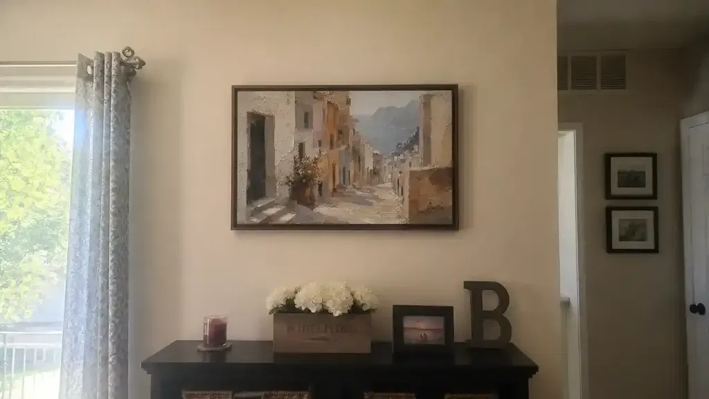
Grounding Your Decor with Anchor Items and Trays
A common complaint when using the 3-5-7 rule is that the items feel like they are "floating" or look like a collection of random trinkets. To solve this, designers use "anchors" to unify the group into a single visual unit.
An anchor acts as a stage for your vignette. By placing your three or five items on an anchor, you tell the eye: "Look at this as one single decoration, not five separate things."
Effective Anchor Items:
- Trays: The ultimate anchor. A rectangular or circular tray physically bounds the items.
- Large Books: A stack of coffee table books creates a platform for smaller items.
- Textured Runners: On a long dining table, a fabric runner can anchor a group of seven items.
- Large Art: A large modern wall art piece hanging behind a console table can serve as the visual backdrop.
When using wall art as part of your 3-5-7 strategy, ensure the structural integrity of your display. According to the Smithsonian Museum Conservation Institute, large panels or canvases should be carried by multiple people and appropriate hanging hardware must be used to prevent damage to the work or the wall.

Symmetrical vs Asymmetrical Decorating Balance
While this guide focuses on the 3-5-7 rule, it is helpful to understand when to choose it over traditional symmetry. Asymmetry, driven by the 3-5-7 rule, is characterized by balance through weight rather than reflection.
| Feature | Symmetrical (Even) | Asymmetrical (3-5-7) |
|---|---|---|
| Feeling | Formal, Stately, Calm | Casual, Curated, Energetic |
| Complexity | Low - Easy to execute | High - Requires layering |
| Eye Movement | Static - Focuses on the center | Dynamic - Scans the group |
How to Prevent Your Displays from Looking Cluttered
One of the biggest risks of moving from the Rule of Three to a Group of Seven is crossing the line into clutter. To avoid this, you must respect "negative space."
Pro-Tips for Avoiding Clutter:
- The Overlap Rule: Instead of lining items up like soldiers, let them overlap slightly.
- Vary the Depth: Place some items toward the front of the surface and others toward the back.
- Mind the Light: If you are displaying an abstract gallery wall, be aware that light can cause cumulative and irreversible damage. The Library of Congress notes that long exposure to low light levels can be just as damaging as short exposure to intense light.
- Edit Ruthlessly: If a grouping feels heavy, remove the smallest item.
Mastering the 3-5-7 Rule in Decorating
Mastering the 3-5-7 rule in decorating is less about following a strict law and more about understanding the relationship between objects, space, and the human eye. By moving beyond simple pairs and embracing the dynamic energy of odd numbers, you can transform any surface in your home into a professional-level vignette.
Whether you are arranging a few small pieces of textured decor on a side table or planning an elaborate abstract gallery wall for your living room, remember to vary your heights, mix your textures, and use anchors to ground your vision. By applying the High-Medium-Low method and respecting the importance of negative space, you will create a home that feels balanced, intentional, and perfectly curated.
For more complex displays involving large-scale art or heavy installations, always prioritize safety. The Canadian Conservation Institute (CCI) advises that environmental factors like humidity fluctuations can stress materials, so choose your display locations carefully to ensure your carefully curated arrangements last for years to come.
FAQs
Can I use the 3-5-7 rule with even numbers?
While you can use even numbers to create formal symmetry, they do not follow the 3-5-7 rule's goal of dynamic movement. Even numbers tend to look more 'stiff' and static, whereas odd numbers force the eye to move across the display.
What is the best 'anchor' for a coffee table group?
Large decorative trays and oversized coffee table books are the most effective anchors. They provide a physical boundary that unifies multiple small items into a single, cohesive visual unit.
Does the 3-5-7 rule apply to wall art?
Yes, it is highly effective for gallery walls. Groupings of 5 or 7 frames create a professional, curated feel. This approach prevents a wall from looking sparse or like an uncoordinated collection.