The Shift Toward Performative Authenticity in Modern Interiors
The global art market is undergoing a structural transformation. While high-end auction sales for purely financial art assets—those exceeding $10 million—plummeted by 44% year-over-year in 2024, a return to "application value" is emerging among discerning homeowners. According to reports from Marketplace, buyers are retreating from overpriced vanity pieces in favor of art that serves a functional, emotional, and environmental purpose within the home.
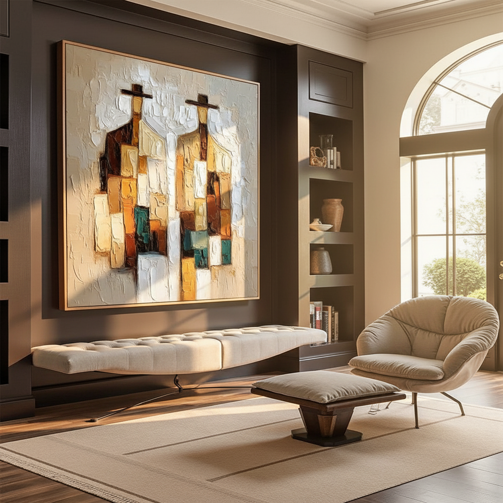
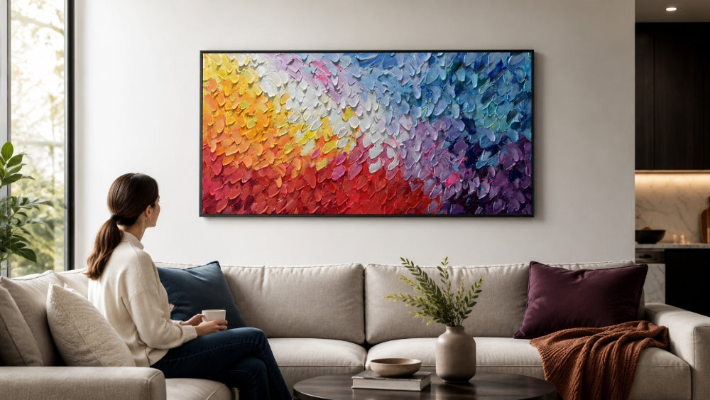
In high-energy living spaces—those characterized by vast windows, "hot" southern light, and active social use—the primary challenge is not just decoration, but atmospheric regulation. This is where the concept of "Visual Temperature" becomes a strategic tool for interior designers and homeowners alike. By leveraging the specific pigment chemistry and tactile depth of hand-painted oils, one can effectively "cool down" a room that feels visually over-stimulated or physically warm due to solar gain.
Logic Summary: This analysis of market shifts assumes that the decline in speculative art purchasing correlates with an increased demand for bespoke, functional aesthetics that prioritize the lived experience over resale value, aligned with current Creative Economy Outlook data.
The Neurobiology of Environmental Calm
Why does a specific shade of blue or a particular brush texture feel "cooler" than a flat, printed surface? The answer lies in how the brain processes visual stimuli. Research published in NCBI indicates that passive art viewing consistently activates the medial prefrontal cortex (mPFC) and the amygdala, areas of the brain responsible for emotional regulation and stress response.
In a high-energy room, the brain can experience "perceptual constancy illusions," where the intensity of natural light and high-contrast decor leads to cognitive fatigue. Hand-painted oil murals and canvases provide a "bottom-up" neural intervention. Unlike digital prints, which lack microscopic topography, the physical relief of oil paint—often measured at the millimeter scale—creates complex light scattering.
A study by University of Pennsylvania researchers found that environmental artworks reduced stress in 61% of subjects, with nature-themed biophilic designs producing stress-reduction effects similar to real outdoor exposure. For the homeowner, this means a cool-toned landscape or abstract oil painting isn't just a visual choice; it is a physiological anchor that optimizes emotional regulation circuits.

The Southern Light Dilemma: Pigment Chemistry and Color Matching
Designing for sun-drenched, Southern-facing rooms requires a deep understanding of how natural light interacts with specific pigments. A common error is selecting artwork based on how it looks under gallery LEDs, only to find it looks "muddy" or "burnt" once installed in a room flooded with golden hour light.
The Zinc vs. Titanium White Distinction
In color theory for interior coordination, the "undertone of the highlights" is more critical than the primary hue. Southern light has a high Correlated Color Temperature (CCT) that leans toward the yellow-orange spectrum.
- Titanium White: While it dominates 90% of the white pigment market due to its hiding power (NCBI), it has a naturally warm, slightly yellow undertone. In a Southern-facing room, this light amplifies the yellow, making the painting appear aged or dull.
- Zinc White: This pigment offers a cooler, more transparent finish. Highlights rendered in Zinc White or "Cool Grey" bases remain crisp and blue-leaning even under intense natural warmth.
Managing Specular Reflection
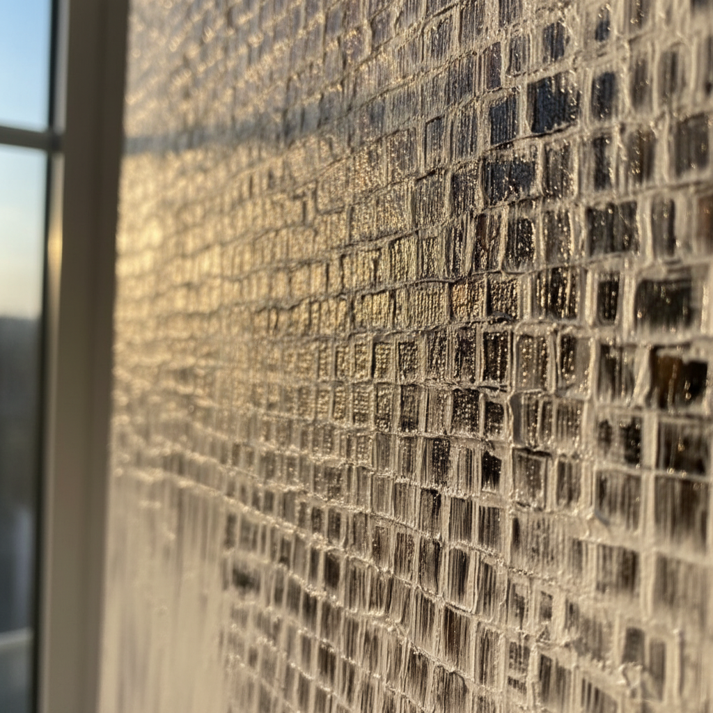
High-energy rooms often suffer from "visual heat" caused by glare. Experienced practitioners recommend avoiding high-gloss varnishes in these spaces. According to Tate conservation research, specular reflection (the mirror-like glint off a surface) increases perceived noise and heat. Opting for a satin or matte finish allows the artwork to absorb harsh light rather than bounce it back into the room, contributing to a more "recessive" and calm atmosphere.
Methodology Note: These pigment recommendations are based on standard optical scattering theories where particle diameter and refractive index differences determine opacity and tinting strength, as detailed in Optica.
| Pigment Type | Undertone | Light Interaction | Recommended Use |
|---|---|---|---|
| Titanium White | Warm / Yellow | High Opacity / Reflective | North-facing rooms (low light) |
| Zinc White | Cool / Blue | Semi-Transparent / Recessive | South-facing rooms (high light) |
| Ultramarine Blue | Deep Cool | Light Absorbing | Large focal points in "hot" rooms |
| Phthalo Green | Sharp Cool | High Tinting Strength | Balancing warm wood floors |
The Architecture of Texture: Why Hand-Painted Media Outperforms Prints
In the era of generative AI, the "essential identity" of a human-made object has become a premium commodity. Columbia University research confirms that consumers value art labeled "AI-generated" 62% lower than authentic human-created art. This valuation isn't just philosophical; it's rooted in the physical "micro-topography" of the medium.
The Physics of Depth
Digital prints are flat. They lack the "Kubelka-Munk" effect—a mathematical model of how light is absorbed and scattered within layers of translucent oil glazes. Hand-painted oils utilize glazing techniques to build depth that digital media cannot replicate. This depth creates a sense of "visual air" in a room, making the walls feel as though they are receding rather than closing in.
Furthermore, the "tactile fruition" of an artwork—the visible brushstrokes and impasto peaks—stimulates intrinsic motivation and satisfaction in viewers. Tests at the MUNCH Museum confirmed that physical relief textures exponentially increase the aesthetic value perceived by the audience.

Implementation Guide: The 25% Rule of Temperature Counter-Balance
To effectively cool a high-energy space, one must move beyond "splashes of color" toward a strategic ratio of visual intervention. Based on common patterns in high-end interior staging, we utilize a heuristic known as the Temperature Counter-Balance.
The Heuristic: If a room features warm-toned "anchors"—such as golden oak floors, brick fireplaces, or heavy sunlight—the artwork should occupy at least 25% of the primary visual field (the wall space at eye level) with receding cool tones.
- Receding Tones: Ultramarine blue, phthalo green, and cool violet. These colors physically appear further away to the human eye, "expanding" the room's perceived volume.
- The "Visual Heat" Check: If the room feels claustrophobic despite being large, it is likely an imbalance of "advancing" warm colors. Introducing a large-scale, cool-toned oil mural can instantly lower the "perceived temperature" of the space by several degrees.
Modeling Note (Heuristic Disclosure): This 25% ratio is a practical baseline for residential selection, not a mandated architectural standard. It assumes a standard ceiling height of 8–10 feet and average window-to-wall ratios. Users with floor-to-ceiling glass may need to increase this ratio to 35% to achieve the same cooling effect.
Investment and Safety: The Multi-Dimensional ROI of Custom Art
Choosing hand-painted art over mass-produced alternatives is a decision that impacts property value, health, and social ethics.
Real Estate Catalysis
High-quality murals and custom art are no longer just "decor"; they are "permanent physical billboards" for a property's value. Data from the Royal Society found that neighborhoods and properties with higher "art density" saw greater relative house price gains. In commercial contexts, such as the Chicago Millennium Park projects, public art installations drove $1.4 billion in related real estate growth. For the homeowner, a custom-commissioned mural can act as a "marketing trump card" that justifies a premium sale price.
The Indoor Air Quality (IAQ) Promise
A significant concern with indoor painting is the emission of Volatile Organic Compounds (VOCs). However, modern professional artist oils and acrylics have evolved. Research from Aalto University shows that high-quality coatings on wood substrates emit significantly lower VOCs than industrial paints, especially during the curing phase. By choosing artists who utilize walnut oil (a non-toxic alternative to turpentine) and hemp or flax canvases, homeowners can ensure their art meets LEED/WELL certification standards for indoor air quality.
Ethical Sourcing and Social Cohesion
The modern consumer highly values fair artist compensation. A Wharton School survey found that 87% of consumers believe artists should be fairly compensated for their style and labor. Supporting real artists—particularly those from underrepresented groups who comprise only 40% of gallery representation—aligns the home's aesthetic with a broader commitment to social equity.

Conclusion: Art as a Strategic Tool for Decision Safety
In high-visibility spaces, the choice of art is a high-stakes decision. By moving away from the "assembly-line" artisan model and embracing the technical nuances of oil pigments, homeowners can achieve "decision safety." This means knowing that a piece will not only fit the wall but will actively improve the room's atmosphere, light management, and psychological comfort.
Whether it is the use of Zinc White to maintain highlight clarity or the strategic application of textured glazes to manage glare, hand-painted oil art remains the definitive choice for those who view their home as a sanctuary of performative authenticity.
References
- Marketplace (2025): The expensive art market continues to struggle
- NCBI (2024): Neurological mechanisms of creative arts
- Columbia Business School: Human-Made vs. AI Art: Consumer Perception Study
- Royal Society: Quantifying the link between art and property prices
- Tate Research: Conservation Concerns for Acrylic Emulsion Paints
- EPA: Indoor Air Quality and Low-VOC Paints
YMYL Disclaimer: This article is for informational purposes only and does not constitute professional medical, psychological, or architectural advice. While visual environmental adjustments can contribute to stress reduction, they are not a substitute for clinical intervention. Always consult with a certified LEED professional or environmental health specialist regarding indoor air quality and paint safety standards.
Leave a comment
This site is protected by hCaptcha and the hCaptcha Privacy Policy and Terms of Service apply.