At a Glance
| If You're Wondering | Quick Answer |
|---|---|
| Why does a colorful painting feel overwhelming? | It's usually high saturation combined with high canvas coverage, not the number of colors |
| Single dominant color or multi-color? | Different challenges, different room requirements |
| How do I pull colors from the painting into my room? | Use the smallest, most vivid color in the painting, not the largest |
| Can I add a bold painting to a room that already has color? | Yes, but one element has to lead and the rest have to follow |
| Where should a colorful abstract painting go? | One main wall, with the surrounding walls kept simple |
A colorful abstract painting can turn a flat white wall into the most interesting surface in your home. It can also make a room feel like it's shouting at you from every direction. The difference comes down to two variables you can control at the selection stage: saturation and composition density. Get those right, and a bold painting adds energy without creating visual noise. This is how to use colorful abstract wall art without regretting it the next morning.
What Actually Causes a Colorful Painting to Feel Overwhelming
The number of colors in a painting is rarely the problem. Two variables are.
Saturation
Saturation is a color's purity. A deep red, a fluorescent orange, a royal blue at full intensity carry far more visual weight than the same hues in muted or dusty versions. A small, high-saturation painting can feel heavier in a room than a piece twice its size in softer tones.
Composition Density
This is how much of the canvas the color fills. A painting where color covers every square inch, with no breathing room, pushes visual pressure up. A painting with the same vivid colors but large areas of white, cream, or raw canvas in between gives your eyes places to rest.
The Practical Takeaway
High saturation + high density = high visual pressure. Lower either one and the painting becomes easier to live with. A colorful abstract painting with bright hues and generous open space can deliver impact without the fatigue. Vibrancy and overwhelm are two separate things.

Single-Color Dominant vs Multi-Color Abstract
Not all colorful abstract paintings create the same challenge. The difference matters for how you use them in a room.
Single-Color Dominant Abstracts
One color occupies 60% or more of the canvas. The remaining colors serve as accents or transitions. Your eye settles quickly because there is a clear hierarchy. The main question with this type is simple: does the dominant color work alongside your room's existing palette? That is a one-variable problem, and it is manageable.
Multi-Color Abstracts
Three or more colors share the canvas without a clear leader. Every color talks to every element in the room at the same time. This type works most easily against a near-white wall, where the painting is the only source of color. Placing it in a room that already has competing colors requires careful coordination.
A Quick Self-Check at the Store or Screen
Look at the painting for a few seconds. Notice how many times your eyes move until they land somewhere. If your gaze finds a resting point quickly, the painting has built-in hierarchy and will be easier to place. If your eyes keep scanning without landing, the composition density is high. That painting needs a quieter backdrop to work well.
How to Pull Colors from a Painting into Your Room
A colorful abstract painting on the wall and the rest of the room living in a completely separate color system is a missed connection. Here is how to close the gap.
Step 1: Pick the Accent Color, Not the Dominant Color
The most common mistake is grabbing the painting's largest color and repeating it across cushions, rugs, and vases. That kills contrast. Look for the smallest, most vivid color in the composition instead. That little flare of orange, that streak of teal.
Put it in one throw pillow, one small object, one book spine on a shelf. The painting and the room start talking to each other.
Step 2: Keep the Echo Quieter Than the Source
The total area of that accent color in your soft furnishings should be smaller than its area in the painting. If the painting is 10% orange, your room should be around 5% orange. An echo works because it is softer than the original sound.
Step 3: Place the Echo Near the Painting
A cushion or object carrying the accent color works best on the same side of the room as the painting, or directly below it. That proximity creates a visual line connecting the art to the space. The painting stops floating on the wall and starts belonging to the room.

What to Do When Your Room Already Has Color
Adding colorful abstract wall art to a room with a teal sofa, a burgundy rug, or patterned curtains is possible. It requires one decision first: which element leads?
If the Furniture Leads
The painting should pull 1-2 colors from the furniture that is already there. A painting that shares your sofa's blue and your rug's warm tone ties the room together.
A painting that introduces three entirely new colors creates a second color center, and the room splits into competing zones.
If the Painting Leads
The furniture needs to step back. Swap bright cushion covers for neutral ones. Layer a cream throw over a colorful sofa to reduce its visual volume. The goal is to clear enough neutral ground for the painting to be the room's single strongest color statement.
A Quick Compatibility Test
Pull up a photo of the painting on your phone. Hold it next to a wide-angle photo of your room. If the two images feel like they belong together, the colors can coexist. If looking at both at once feels tiring, the colors are competing.
Where in the Room a Colorful Abstract Painting Works Best
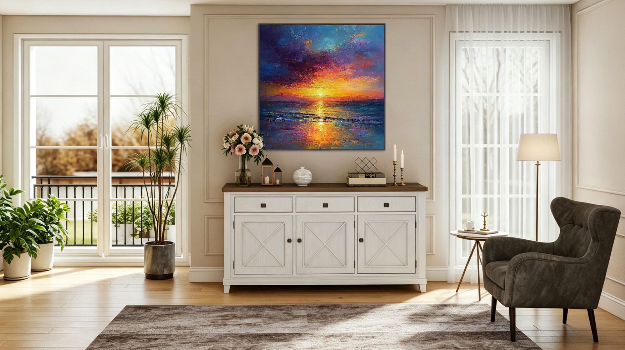
The Focal Wall
The strongest position is the wall your eye lands on naturally when you enter the room: behind the sofa, across from the entryway, or above the headboard. Placing a bold painting on the focal wall gives the room a clear visual destination. Everything else becomes the path that leads to it.
Keep Adjacent Walls Simple
A colorful abstract painting on one wall and a second high-intensity piece on the wall next to it will split the room's attention. After hanging bold wall art, leave the neighboring surfaces clean. One strong voice in a quiet room carries further than two voices competing.
Positions That Need Caution
Narrow hallway walls put your eyes very close to the painting. High-saturation colors at short viewing distance amplify visual pressure.
Walls directly facing a dining table can cause fatigue over long meals, as your gaze returns to the painting repeatedly. Both positions work better with lower-saturation or higher-whitespace compositions.
Bold Color Belongs in Your Home
A colorful abstract painting is not a decorating risk. It is a choice that needs a little direction. Identify if saturation or density is doing the heavy lifting. Decide who leads the room's color hierarchy. Give the painting one wall to speak from and keep the rest of the room quiet enough to listen.
Montcarta's colorful paintings and abstract paintings range from high-saturation impasto pieces to softer, open compositions, so there is something for both bold and cautious rooms. Find the one that fits your wall and your confidence.

FAQs
Q1: Can colorful abstract art work in a small room?
Yes. Choose a piece with vivid color but generous open space in the composition. The color brings energy; the negative space keeps the room from feeling compressed. Avoid high-density paintings where color fills the entire canvas, as those increase visual pressure at close range.
Q2: Should abstract art match the color of the sofa or the wall?
Neither needs to match. Matching removes contrast and makes the painting look like an accessory. A stronger approach: pick one small accent color from the painting and echo it in a cushion or object near the sofa. Let the wall stay neutral so the painting has room to stand on its own.
Q3: Is colorful abstract art a timeless choice or a trend?
The category is enduring. Specific color combinations can feel dated. Colors with natural origins, like ochre, forest green, or deep blue, tend to age better than trend-driven neon or pastel waves. Real brushwork and visible texture also help a piece outlast the season it was bought in.
Q4: Can I put a colorful abstract painting in a bedroom?
Yes. A wall facing the bed often works better than directly above the headboard. The extra viewing distance softens the color's intensity, and a bold painting becomes the first thing you see in the morning rather than the last thing keeping you awake at night.
Q5: How many colorful abstract paintings can I have in one room?
One is usually enough. If you want two, they need to share a color palette so they read as a pair rather than two competing statements. Two paintings with completely independent color systems in the same room will divide the space into rival zones.


