Colors do more than look pretty—they directly affect your nervous system. A red painting can make you feel more alert, while blue helps you relax. When you choose colorful art for your walls, you're actually deciding how you'll feel at home.
Why Does Your Wall Art Color Matter?
When you look at colors, light signals travel from your eyes to your brain's control center. Scientists have proven that certain colors change your heart rate and mood. The art on your walls keeps sending these signals to your brain all day long. The right colors help you feel good, while the wrong colors can make you feel off-balance.
How Colors Change Your Mood
Pablo Picasso once said, Colors, like features, follow the changes of the emotions.
Science backs this up—your brain's emotion center responds strongly to different colors.
- Warm Colors (Red, Orange, Yellow): These colors wake you up. They catch your attention and boost your energy.
- Cool Colors (Blue, Green, Purple): These colors calm you down. Your eyes process them easily, which helps your body relax.
The trick is picking the right color energy for each room.

Picking the Right Painting For Each Room
Match your art to what you do in each room. Here's how to use color in your home.
Living Room: Warm Earth Tones (Ochre, Terracotta & Gold)
You gather with family and friends in your living room. Choose art with warm colors like terracotta and ochre. These colors remind us of sunlight and fire, making people feel safe and welcome. They make your space feel cozy and inviting.
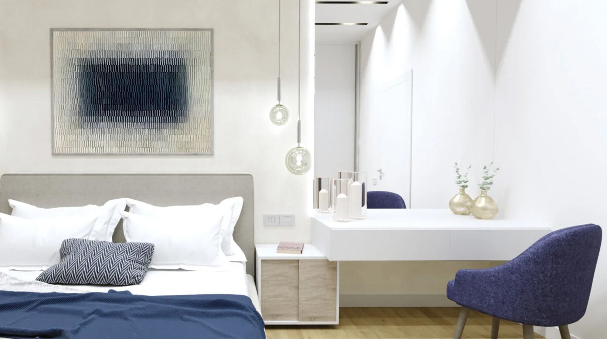
Bedroom: Cool Blues, Indigos, & Lavenders
Cool colors work best in bedrooms. Scientists have proven that blue slows your heart rate and lowers your blood pressure. It tells your body it's time to sleep. Pick calming blue art instead of bright, energizing colors that might keep you awake.
Kitchen & Dining: Energetic Reds, Oranges, & Yellows
Your bedroom helps you rest, but your kitchen needs energy. Red and orange boost your blood flow and make you hungry—scientists call this the "food effect." Art with these colors brings life to your dining space and makes meals more fun. Yellow works especially well because it helps your brain make serotonin, the "happy chemical."
Office: Deep Greens & Focused Blues
Your office needs colors that help you concentrate. Green is the easiest color for your eyes to handle, so it won't tire you out during long work days. Mix green with blue to boost your logical thinking. These colors help you stay focused without getting stressed.
Bathroom: Fresh Aquas, Turquoise & White
Your bathroom should feel clean and relaxing. Blue shades like turquoise with white create a fresh, spa-like feeling. The right art can turn a plain bathroom into a peaceful retreat—perfect for unwinding after a long day.

How Color Combinations Change a Room's Feel
A painting's impact comes from how its colors work together. Different mixes create totally different moods. Here's how to pick the right mix.
One Color in Different Shades: Calm and Clean
Want less visual mess and more order? Pick art that uses different shades of one color—like a painting that goes from dark navy to light sky blue to white. Your eyes don't have to work hard to look at it. This creates a smooth, peaceful feeling and makes rooms look bigger. Perfect for simple bedrooms or quiet home offices.
Opposite Colors: High Energy and Bold
Want to wake up a dull room? Pick art that mixes opposite colors—blue with orange, or red with green. These color pairs create strong contrast that grabs your eye right away. This bold mix adds excitement to dining rooms or flat-feeling living rooms.
Neighbor Colors: Natural and Balanced
Want something comfortable but not boring? Pick colors that sit next to each other on the color wheel—like the greens and blues you see in forests, or the reds, oranges, and pinks in sunsets. These colors flow together smoothly, creating the most natural, relaxing look.
Can Art Really Change Your Space?
Yes—but you need to pick the right piece. Want to calm down a busy bedroom? Choose blue and white art. Want to liven up a boring, neutral living room? Pick warm, textured art. The right art can shift your whole room's energy without a full makeover.
Final Thoughts
Your home shapes how you feel, and color is one of the easiest things you control. Whether you use green to help you focus or blue to calm you down, colorful paintings are tools for feeling better. Pick your art carefully. Visit montcarta.com to find hand-painted textured art that lifts both your walls and your mood.

Common Questions about Color Psychology in Art
Q1: What are the 4 main psychology colors?
Color psychology points to four key colors that affect different parts of your experience:
- Red (The Body): Wakes you up and gets you moving. Speeds up your heart and triggers your fight-or-flight response.
- Blue (The Mind): Calms your thoughts. Helps you think clearly and stay focused.
- Yellow (The Emotions): The strongest mood lifter. Makes you feel confident and optimistic.
- Green (The Balance): Brings everything together. Your eyes see it most naturally, which helps you feel restored.
Q2: Which colors create which feelings?
Here's a quick guide to what different colors make you feel:
- Red: Passion, energy, urgency, and sometimes anger
- Orange: Playfulness, warmth, and social connection
- Yellow: Happiness, hope, and optimism
- Green: Peace, freshness, and balance
- Blue: Confidence, trust, clear thinking, and calm
- Purple: Spirituality, luxury, and imagination
- Pink: Love, gentleness, and compassion
Q3: What colors make me happier?
Yellow and orange work best for boosting your mood. Yellow acts like sunlight on your brain, making it release serotonin (your brain's "happiness chemical"). It strongly connects to positive thinking. Orange mixes red's energy with yellow's joy, making it great for social warmth and connection.
Q4: Which colors boost creative thinking?
Different colors spark creativity in different ways:
- Orange: Helps you come up with new ideas. Makes you less self-conscious and more willing to try new things.
- Purple: Connects to imagination and thinking differently. Boosts artistic and abstract thinking.
- Teal/Turquoise: Great when you're stuck. Calms your nerves enough to let ideas flow freely without stress.


