You painted the walls a warm greige, found the sofa you love, and the room is almost there. Almost. That empty stretch above the sofa keeps pulling your eye, and something black and white feels like the right call. You've seen it work in other homes and other spaces, and the instinct is correct. But why does it work so consistently, and how do you choose the version that actually fits your room? Those are the two questions worth working through.
Quick Reference
| Topic | Key Takeaway |
|---|---|
| Why it's so versatile | Removes color as a variable; never conflicts with existing hues |
| High contrast vs. grayscale | High contrast adds visual impact; grayscale brings quiet depth |
| In colorful rooms | Makes surrounding colors look more vivid, not less |
| What to evaluate when buying | Composition structure and physical texture, not subject matter alone |
| Best spaces for it | Living room, bedroom, gallery walls |
Why Black and White Art Works with Everything
Color is the strongest "exclusion" signal in any room. Hang a painting with teal and blue tones next to an orange sofa, and your brain immediately starts processing the relationship. Are these colors complementary? Do they clash? Whatever the answer, the color relationship becomes a visible variable you have to manage.
Black and white wall art removes that variable entirely.
The Perceptual Shift
A monochrome work operates on three things that every color shares. They belong to a different perceptual layer than hue:
- Brightness: The range from light to dark.
- Contrast: The clarity between shapes and edges.
- Composition: How forms relate to the space around them.
None of these dimensions create conflict with a sage green wall, a burgundy rug, or a warm wood floor.
Try This Simple Test
Hold any black and white object against any colored surface. Your eye does not ask whether the colors match. It goes straight to form and light.
That is the perceptual shift black and white wall art creates in a room. It participates in the space without competing in the color conversation, which is why monochrome wall art stays compatible through:
- Furniture updates
- Paint changes
- Every seasonal decor decision

High Contrast vs. Grayscale: Two Different Visual Languages
Not all black and white abstract art reads the same way. The two main types produce opposite atmospheric effects, and choosing between them matters more than any other decision.
High Contrast Black and White
High contrast pieces use large areas of deep black and crisp white with very little gray in between. The visual effect is sharp, declarative, and commanding. This type of work does not settle quietly onto a wall; it asserts itself.
High contrast is the right choice when:
- The room lacks a strong focal point and needs one
- The space feels too soft or tonally flat and needs visual tension
- The interior style is modern, industrial, or architectural
Tonal Grayscale
Grayscale works spend most of their range in the middle values, with black and white appearing only at the extremes. Transitions are slow and gradual. The mood is restrained, layered, and calm.
Grayscale suits the room when:
- There is already enough visual energy and the space needs somewhere to settle
- The room is a bedroom, reading corner, or spa-adjacent bathroom where calm is the goal
- The art needs to provide background richness without drawing constant attention to itself
Which One Does Your Room Need?
Ask one question: does this wall need a place for the eye to stop and focus, or a place for the eye to rest? The first answer points toward high contrast. The second points toward grayscale. Different walls in the same room can have different answers.
What Black and White Art Does to a Room Full of Color
Here is something that surprises most people: placing a monochrome piece in a colorful room does not neutralize the surrounding colors. It amplifies them.
How the Brain Reads Color
The brain reads color through comparison. When there is a zone in your field of vision with no hue at all, the colors around it appear more saturated and more intentional.
- An orange armchair next to a black and white painting reads as richer than the same chair placed next to another colorful piece.
- The monochrome work functions as a neutral reference point, and everything around it sharpens as a result.
A Practical Application
This has a practical use. If you have a piece of furniture in a color you love but that never quite reads as strongly as you hoped, hang a piece of black and white art on a nearby wall.
- No repainting or rearranging required.
- The art gives the eye a neutral anchor, and the furniture color gains presence through contrast.
One thing to keep in mind: the amplification effect is strongest with some visual distance between the art and the colorful object. When the two sit too close together, the relationship shifts from contrast to direct comparison, which requires more attention to scale and proportion.

How to Choose Black and White Art
Selecting black and white wall art calls for a different evaluation process than selecting a colorful piece. With color paintings, a striking palette can carry a weak composition. Remove color, and that safety net disappears. Two qualities take over as the primary indicators of lasting visual value.
Look for a Clear Starting Point in the Composition
Composition becomes fully visible. A strong composition gives the eye a clear starting point: one place where attention naturally lands, with the rest of the image supporting or responding to it.
Ensure Negative Space Earns Its Position
- Light and dark areas distribute in a way that builds spatial depth.
- The negative space feels placed deliberately, not left over.
- A composition that holds up in black and white holds up for the same reason a well-designed room does: every element earns its position.
Rely on Physical Texture for Visual Interest
Texture becomes the main source of visual interest. In colorful work, surface variation adds depth but is optional. In black and white art for the living room or any other space, physical texture takes on a different role.
Choose Hand-Painted Depth Over Flat Reproductions
- A hand-painted piece with raised brushwork or palette knife marks shifts in appearance across the day as light moves through the room. That depth keeps the piece revealing something new over time.
- A flat, printed reproduction delivers everything it has the moment you look at it, and the surface has nothing more to offer after that.
Look Past the Subject Matter During Evaluation
When evaluating a piece, look past the subject matter and ask:
- Does this composition have a clear visual hierarchy?
- Does the surface hold more than one reading?
Where Black and White Art Works Best in a Home
Living Room
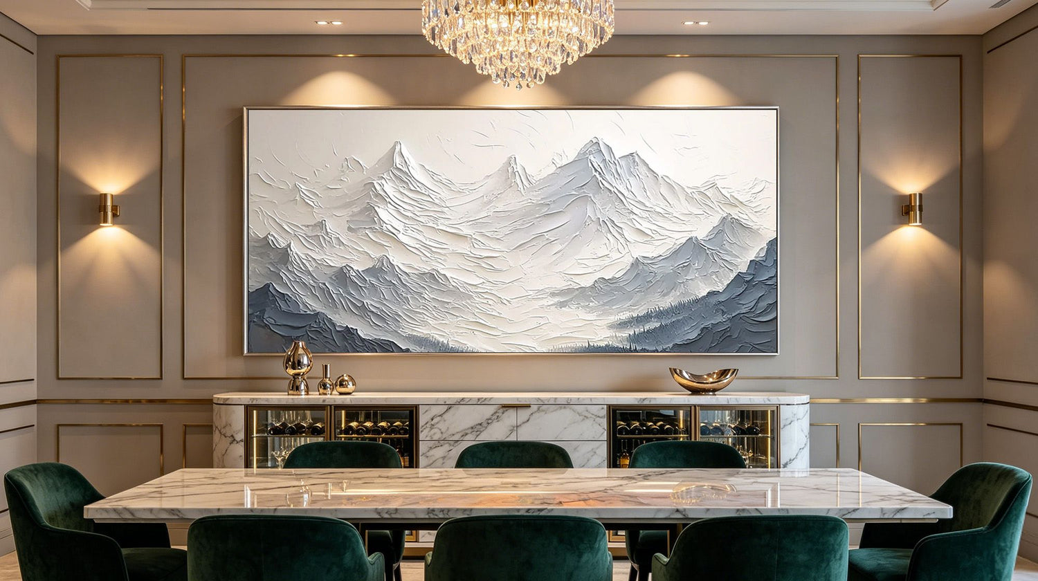
The living room is the strongest environment for large black and white wall art. A high-contrast piece above the sofa gives the entire room a clear visual anchor while leaving every other decorating decision completely open. Swap the throw pillows, change the rug, add or remove color accents as your taste shifts. The art stays compatible with all of it because it never entered the color conversation to begin with.
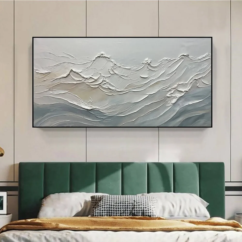
Bedroom and Quiet Spaces
Bedrooms and reading rooms suit the grayscale end of the spectrum. A softly toned black and white painting does not compete for attention when you are trying to sleep or concentrate. It settles into the wall and provides a sense of spatial completeness without stimulating the eye. The room feels finished rather than stimulated.
Next to or Inside a Gallery Wall
Black and white paintings act as visual connectors on gallery walls. A group of mixed works in different colors, styles, and formats can feel scattered. Adding one or two black and white pieces gives the eye neutral ground to travel between the more visually active elements, pulling a varied collection into a coherent whole. Use them as breathing room between the louder pieces, not as the dominant note in the arrangement.
Find the Art That Fits Your Space
Black and white wall art holds its relevance not through trend but through visual logic: it removes color conflict, sharpens what surrounds it, and stays compatible across every decorating change. The remaining decision is which type serves your specific room, and that comes down to whether the space needs tension or calm, a focal point or a backdrop. If you are ready to find a piece with real composition and physical texture, Montcarta's collection of original hand-painted works is worth taking your time with.

FAQ
Q1: Can black and white wall art make a room feel cold?
It can, but the cause is specific. Cold readings usually come from two sources: high-contrast pieces placed in warm-toned rooms, where the temperature gap is abrupt, or grayscale tones that lean cool with blue undertones. Choosing a grayscale with warm undertones (yellow or brown-based), pairing the art with a wood or natural frame, and adding linen or leather nearby will shift the temperature significantly without replacing the art.
Q2: Is black and white art a good fit for a colorful room?
A strong fit, and for a reason that runs counter to intuition. A black and white piece placed in a colorful room gives surrounding colors a neutral reference point, making them appear more saturated and more intentional. A room with multiple saturated hues often feels more coherent, not more crowded, with one monochrome piece added to it.
Q3: What style of black and white art suits a modern interior?
Modern interiors respond best to high-contrast geometric abstraction or organic abstract forms with clear structural logic. The decisive contrast and clean visual hierarchy match the "spare but purposeful" language of contemporary design. Highly narrative or realistic imagery, such as detailed figurative scenes or traditional landscapes, tends to carry a stylistic register that sits at odds with a contemporary setting.
Q4: Should I use a black frame or a white frame for black and white art?
The answer depends on how visible you want the boundary between the art and the wall. A black frame on a light wall draws a sharp edge that lifts the piece forward visually. A white frame on a light wall softens that edge, letting the art integrate more quietly. On dark walls, white or natural wood frames perform better. A black frame against a dark wall causes the perimeter of the piece to disappear into the surface.
Q5: How many black and white pieces can I use in one room?
No fixed ceiling, but there is a useful ratio. If black and white is the room's primary visual language, one large-scale work on the main wall paired with smaller pieces in a gallery arrangement reads as intentional and cohesive. If black and white art is serving as a supporting element in a colorful space, one or two pieces hit the right proportion. Past that point, the monochrome starts setting the room's visual tone rather than amplifying the colors already in it.
Leave a comment
This site is protected by hCaptcha and the hCaptcha Privacy Policy and Terms of Service apply.