Beyond the Aesthetic: Why Your Breakfast Nook Needs a Neural Reset
In the high-stakes world of elite art auctions, the tides are turning. Recent data shows that sales for high-end pieces over $10 million plummeted by 44% year-over-year in 2024 (Marketplace). This retreat from purely financial art assets signals a profound shift: savvy homeowners are no longer chasing vanity "blue-chip" names. Instead, they are returning to real application value—investing in custom, hand-painted spaces that serve a physiological purpose.
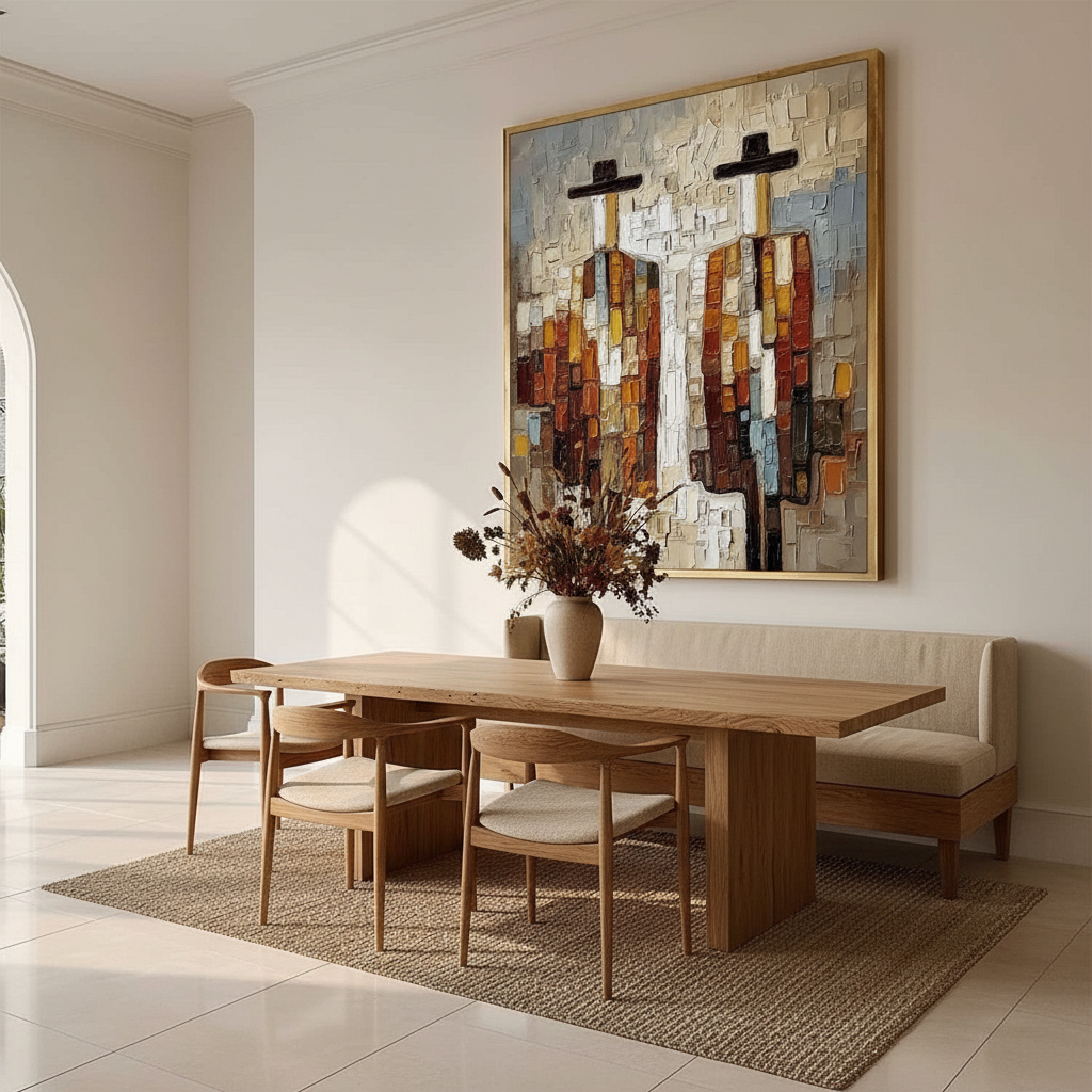
Nowhere is this more critical than the breakfast nook. As the first space you inhabit before the workday begins, the nook is not just a place to eat; it is a "neural charging station." By leveraging the psychological power of yellow and the tactile soul of hand-painted art, we can create environments that do more than just look good on social media—they fundamentally optimize your morning energy.

The Neuro-Aesthetics of the Morning Glow
Why does yellow feel so inherently "right" for a morning space? The answer lies in our neurobiology. A systematic review of 85 neurological records confirms that passive art viewing consistently activates the medial prefrontal cortex (mPFC) and the amygdala, the brain's primary circuits for emotional regulation (PMC).
When we introduce yellow—specifically in the 580-590 nm wavelength—we are tapping into a color that the human brain associates with high-energy states. However, there is a delicate balance to strike. In our studio experience, we have observed that "naked" pure yellow on four walls often leads to sensory fatigue within months.
The 20-30% Saturation Heuristic
To avoid the "claustrophobic sun" effect, we recommend a strict design heuristic: Yellow should occupy no more than 20-30% of the visual field in a breakfast nook.
| Parameter | Recommended Value | Rationale |
|---|---|---|
| Yellow Coverage | 20-30% Maximum | Prevents visual fatigue and "sensory overload" after 20+ minutes of exposure. |
| Optimal Wavelength | 580-590 nm | The "sweet spot" for triggering mPFC activation without inducing anxiety. |
| Finish Type | Semi-gloss or Satin | Essential for durability and light reflection in high-use dining areas. |
| Light Orientation | North-facing = Warm; South-facing = Citrus | Compensates for the natural "temperature" of incoming sunlight. |
| Accent Placement | Backsplashes, Murals, Cushions | Allows the eye to "rest" on neutral grounding tones like oak or walnut. |
Logic Summary: This heuristic is derived from common patterns we see in high-end interior curation, where the goal is sustained mood elevation rather than a short-term "jolt" of energy.
The Human Edge: Why AI Prints Fail the "Soul Test"
As AI-generated prints flood the market, the value of authentic, hand-painted work has actually increased. A landmark study from Columbia University confirmed that consumers value art labeled as "human-made" 62% higher than identical work labeled as "AI-generated" (Columbia Business School).
But why? It isn't just elitism. Research from the University of Chicago suggests that digital replicas lack the "essential identity" of the artist—a psychological "soul" that consumers perceive in physical brushstrokes (UChicago Journals).
The Physics of Texture (Microtopography)
When we paint a mural or a custom canvas for a breakfast nook, we aren't just applying color; we are building a three-dimensional surface. Optical microprofilometry proves that the mm-scale texture of oil and acrylic paintings—known as microtopography—is crucial to how we perceive beauty (MDPI).
A flat, inkjet-printed "yellow" cannot replicate the way light scatters off a physical ridge of impasto paint. This is governed by the Kubelka-Munk equation, which explains that pigment reflection is dominated by absorption and scattering coefficients. In simple terms: the physical thickness of hand-applied paint creates a depth of color that a printer simply cannot simulate.

Strategic Color Matching: North vs. South
One of the most common mistakes we see in our consultations is the failure to account for "light temperature." A yellow that looks like vibrant lemon in a showroom can turn into a sickly greenish-gray in a North-facing room.
- North-Facing Nooks: These rooms receive cool, bluish light throughout the day. To compensate, you must use "heavy" yellows like mustard, ochre, or terracotta-based golds. These shades have enough red undertone to fight the blue light and maintain a sense of warmth.
- South-Facing Nooks: These spaces are drenched in warm, golden light. Here, you can afford to use brighter, "citrus" yellows. However, be wary of high-gloss finishes in these rooms; the intense sun can create harsh metamerism (color shifting) and blinding reflections.
The Support Induced Discoloration (SID) Risk
For those commissioning custom murals on canvas or wood, we must address a technical "gotcha": Support Induced Discoloration. When transparent acrylic mediums are applied thicker than 1/16 of an inch, they can draw water-soluble impurities out of the substrate (like the tannins in wood or sizing in cheap canvas), causing the yellow to turn a muddy brown over time (Golden Artist Colors). Our studio mitigates this by using high-performance sealants, a step often skipped by "budget" services.
Safety and Longevity: The "Healthy Home" Mandate
If you are designing a space where your family eats every morning, the chemistry of your art matters as much as the color. The EPA warns that indoor air pollution can be significantly higher than outdoor levels, making low-VOC (Volatile Organic Compound) paints a non-negotiable prerequisite (EPA).
Navigating the "Non-Toxic" Label
Many consumers see the ASTM D-4236 label on a tube of paint and assume it means "safe." In reality, this label only means that the warning labels comply with federal regulations—it does not mean the pigment itself is harmless (EPA).
In our practice, we strictly avoid heavy-metal pigments like Cadmium Yellow in indoor residential settings. The International Agency for Research on Cancer (IARC) classifies cadmium as a Group 1 carcinogen (IARC). While these pigments offer unparalleled vibrancy, modern high-flow acrylics can now replicate these hues using organic, non-toxic alternatives that are safer for your household.
Durability in the Dining Zone
A breakfast nook is a "high-friction" environment. Steam from coffee, food splashes, and morning sunlight all conspire to degrade art.
- Lightfastness: We only use pigments rated ASTM I or II. This ensures that your vibrant yellow won't fade into a dull cream after two years of sun exposure.
- Cleanability: Tate’s research confirms that while acrylics are durable, they are not solvent-resistant. However, gently wiping the surface with a water-based swab can actually help remove surfactants that cause "haziness" over time (Tate).
The Macro Value: Murals as Real Estate Assets
Beyond your personal mood, there is a hard-boiled economic argument for custom hand-painted art. Neighborhoods with higher "art" geo-tags see greater relative house price ranking gains (Royal Society).
For those looking at their home as an investment, a custom mural is a "permanent physical billboard" for the property’s quality. Unlike a mass-produced poster, a hand-painted wall adds "absolute authenticity"—a quality that hospitality white papers identify as the primary driver for high-net-worth travelers and buyers in 2025 (IPaintMyMind).

Creating Your Morning Sanctuary
The transition from sleep to productivity is a fragile one. By choosing a palette centered on the "Power of Yellow," you aren't just decorating—you are engineering a better start to your day.
Remember:
- Aim for the 20-30% "Sweet Spot" to keep the energy high without the fatigue.
- Prioritize Human-Made Texture to capture the 62% "soul premium" and the optical depth of real paint.
- Demand Chemical Transparency to ensure your breakfast nook remains a healthy, VOC-compliant sanctuary.
In an era of digital saturation and struggling auction houses, the most valuable art isn't found in a vault—it's found on the walls where you live, eat, and prepare for the world.
Method & Assumptions (Modeling Note): The "20-30% Yellow Coverage" rule is a design heuristic based on typical visual field analysis in residential "stay-in" spaces (average dwell time: 20-45 minutes).
- Model Type: Qualitative Design Heuristic.
- Assumptions: Standard 10'x10' nook, natural light source present, neutral secondary palette (white/oak).
- Boundary Conditions: This model may not apply to commercial fast-food settings where high-turnover (higher saturation) is the goal, or to ultra-minimalist galleries with no furniture grounding.
Disclaimer: This article is for informational purposes only. The discussion of paint chemicals, VOCs, and heavy metals does not constitute medical or professional safety advice. Always consult with a certified industrial hygienist or a professional contractor when handling art materials or planning large-scale indoor renovations, especially in homes with children or pregnant individuals.
Sources & References
- The Art Basel and UBS Art Market Report 2024
- Columbia University: Human-Made vs. AI Art Study
- UPenn: Visual Art in the Built Environment Review
- Royal Society: Quantifying the link between art and property prices
- EPA: Indoor Air Quality and Low-VOC Paints
- Tate: The Tate AXA Art Modern Paints Project (TAAMPP)
- IARC: Cadmium and Cadmium Compounds
- Golden Artist Colors: Support Induced Discoloration
Leave a comment
This site is protected by hCaptcha and the hCaptcha Privacy Policy and Terms of Service apply.