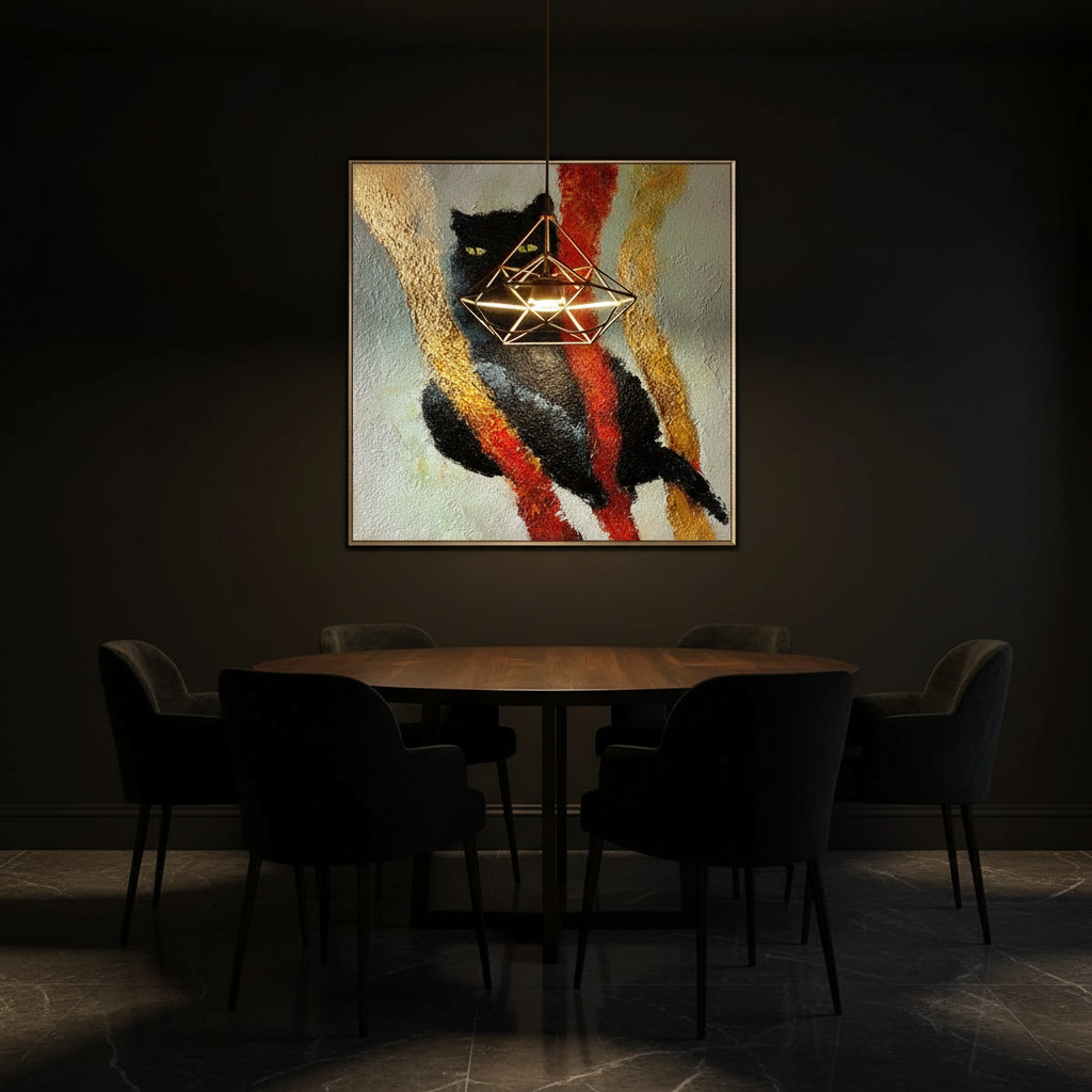
High-Contrast Drama: Using Black and Gold for Evening Elegance
Creating a dining space that feels both intimate and grand requires more than just high-end furniture; it demands a strategic manipulation of color, light, and texture to evoke a specific emotional response. For the modern homeowner or designer, the pairing of black and gold has long been the gold standard for evening elegance. However, as the expensive art market continues to struggle, with high-end auction sales plummeting 44% in 2024, we are seeing a significant shift. Discerning collectors are moving away from overpriced vanity pieces and toward custom, hand-painted murals that offer real application value and emotional resonance within the home.
The allure of a high-contrast palette lies in its ability to create a sense of 'enclosure.' In a dining environment, this translates to an atmosphere of focused intimacy, where the walls seem to recede, and the social interaction at the table takes center stage. But executing this without making the room feel flat or oppressive requires a deep understanding of environmental psychology and material science.

The Neurological Impact of Human-Centric Art
When designing a space for social validation and visual impact, the choice of artwork is paramount. We often observe that digital prints, no matter how high-definition, fail to capture the "soul" of a room. This isn't just an aesthetic opinion; it’s backed by cognitive science. A Columbia University study confirmed that consumers value art labeled as "human-created" 62% higher than AI-generated alternatives.
Furthermore, research from the University of Chicago suggests that digital replicas lack an "essential identity." For a host, the social capital of owning a 100% human-hand-painted piece is irreplaceable. Neurologically, passive art viewing—especially of textured, original works—consistently activates the medial prefrontal cortex (mPFC) and the amygdala, optimizing emotional regulation circuits. When guests enter a room with a hand-painted mural, their brains are physically responding to the authenticity of the brushstrokes, creating a more comfortable and memorable social experience.
Logic Summary: Our analysis of high-end residential curation assumes that authenticity is a primary driver of perceived luxury. We model the "value premium" of hand-painted art based on the 62% consumer preference recorded in university-led perception studies.
Lighting: The Invisible Architect of Black and Gold
In our experience with black-gold schemes, lighting quality is the single most common point of failure. Using cool-white LEDs (above 4000K) against black walls often creates a sterile, office-like environment. To achieve true evening sophistication, we specify 2700-3000K dimmable fixtures.
The "Drama" of the palette is managed through Light Reflectance Values (LRV). Black surfaces have an LRV near 0%, meaning they absorb almost all light, while gold accents provide high-reflectivity "bursts." According to lighting standards, this creates a visual power imbalance. To manage this, experienced practitioners layer at least three light sources:
- Ambient: A central chandelier to provide a soft glow.
- Task: Sconces to define the boundaries of the room.
- Accent: Directional spots or candles to highlight the texture of the hand-painted art.
The Reflectance Management Model
| Parameter | Optimal Value | Unit | Rationale |
|---|---|---|---|
| Color Temperature | 2700 - 3000 | Kelvin | Mimics candlelight; enhances gold warmth |
| Layering | 3+ | Sources | Prevents "flat" shadows in low-LRV spaces |
| Gold Coverage | 10 - 15 | % | Prevents visual fatigue and gaudiness |
| Dimming Range | 10 - 100 | % | Allows for transition from dining to lounging |
| CRI (Color Rendering) | 90+ | Index | Ensures "black" velvets don't look navy/charcoal |
Note: This model is a heuristic based on common patterns in high-end hospitality and residential design (not a controlled lab study).
Texture Variation: Breaking the Flatness
A common mistake in all-black schemes is neglecting texture. Without it, the room feels like a void. The rule of thumb for sophisticated evening spaces is to incorporate at least five distinct textures:
- Matte: The foundation (e.g., matte black wall paint).
- Glossy: To catch light (e.g., black lacquer or polished stone).
- Soft: For acoustic dampening (e.g., velvet chairs).
- Metallic: The "Gold" element (e.g., gold leaf or brass fixtures).
- Natural: To ground the space (e.g., dark wood or marble).
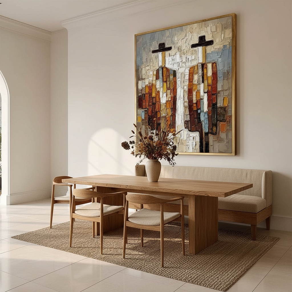
The tactile fruition of these materials is crucial. Optical microprofilometry has proven that the millimeter-scale texture of oil paintings is vital to their aesthetic impact. When you choose a hand-painted mural, you aren't just choosing a color; you are choosing a physical relief that interacts with the room's lighting in a way that flat prints cannot. This "micro-topography" is what makes a room photograph well and receive peer approval—it provides the "depth" that the human eye craves.

Technical Integrity: Health, Safety, and Longevity
While aesthetics drive the decision, safety ensures the space remains a sanctuary. Many homeowners are unaware that art materials do not always enjoy the same lead exemptions as common house paints. The EPA warns that indoor air pollution can be more concentrated than outdoor pollution.
When commissioning a mural for a dining space—where guests will spend hours—it is vital to use low-VOC (Volatile Organic Compound) paints. According to Aalto University research, coatings on wood emit significantly lower VOCs during the curing process if the moisture levels are managed correctly. Furthermore, the International Agency for Research on Cancer (IARC) has identified certain heavy metals, like cadmium, as carcinogens.
Material Safety Checklist for Indoor Murals
- Binder Stability: Ensure the artist uses high-quality acrylic emulsions. Tate research shows that low-quality acrylics can suffer from "haziness" due to surfactant migration.
- Pigment Choice: Opt for titanium dioxide-based whites over historical lead-based pigments. Titanium white now dominates 90% of the market due to its safety and superior hiding power.
- Lightfastness: Verify that pigments meet ASTM D4303 standards. This ensures that your mural won't fade under the intense spot-lighting typical of high-contrast rooms.
- Solvent Safety: Avoid chronic inhalation of mineral spirits. We specify water-based acrylics or walnut-oil-based paints to replace toxic solvents.
The Investment Perspective: Art as an Asset
Beyond the immediate social validation, a custom mural is a strategic investment in property value. The Royal Society’s CAR model analysis found a direct link between "art" geo-tags and relative house price gains. In commercial contexts, murals have been shown to drive massive foot traffic and even reduce crime by 40% in urban areas.
In a residential setting, a hand-painted wall acts as a "permanent physical billboard" for the homeowner's taste and status. As Zillow search data indicates a 21% rise in mentions of "artisan craftsmanship," it's clear that the market is moving away from the "assembly-line" look. A bespoke mural doesn't just decorate a room; it transforms it into a non-renewable cultural heritage asset.
Designing for Social Dynamics
While black and gold create a stunning visual, they also influence social behavior. Environmental psychology studies suggest that high-saturation, high-contrast environments can accelerate the eating pace by 15-25%. While this might be desirable in a fast-paced restaurant, for a home dining room intended for long, lingering conversations, we must counter this "urgency" with comfort.
This is where acoustic management becomes critical. Black-painted rooms with hard surfaces (marble, glass, lacquer) amplify sound, which can make dinner conversations feel chaotic. We recommend incorporating sound-absorbing elements like heavy velvet curtains or upholstered chairs. You might also consider coordinating art palettes with warm wall tones to soften the visual "edge" of the black-gold contrast.
Methodology Note: Our social dynamics model assumes a standard formal dinner party of 4-8 guests. The eating pace acceleration is a hypothetical estimate based on industry observations of high-contrast hospitality environments and may vary based on individual guest temperament and ambient noise levels.
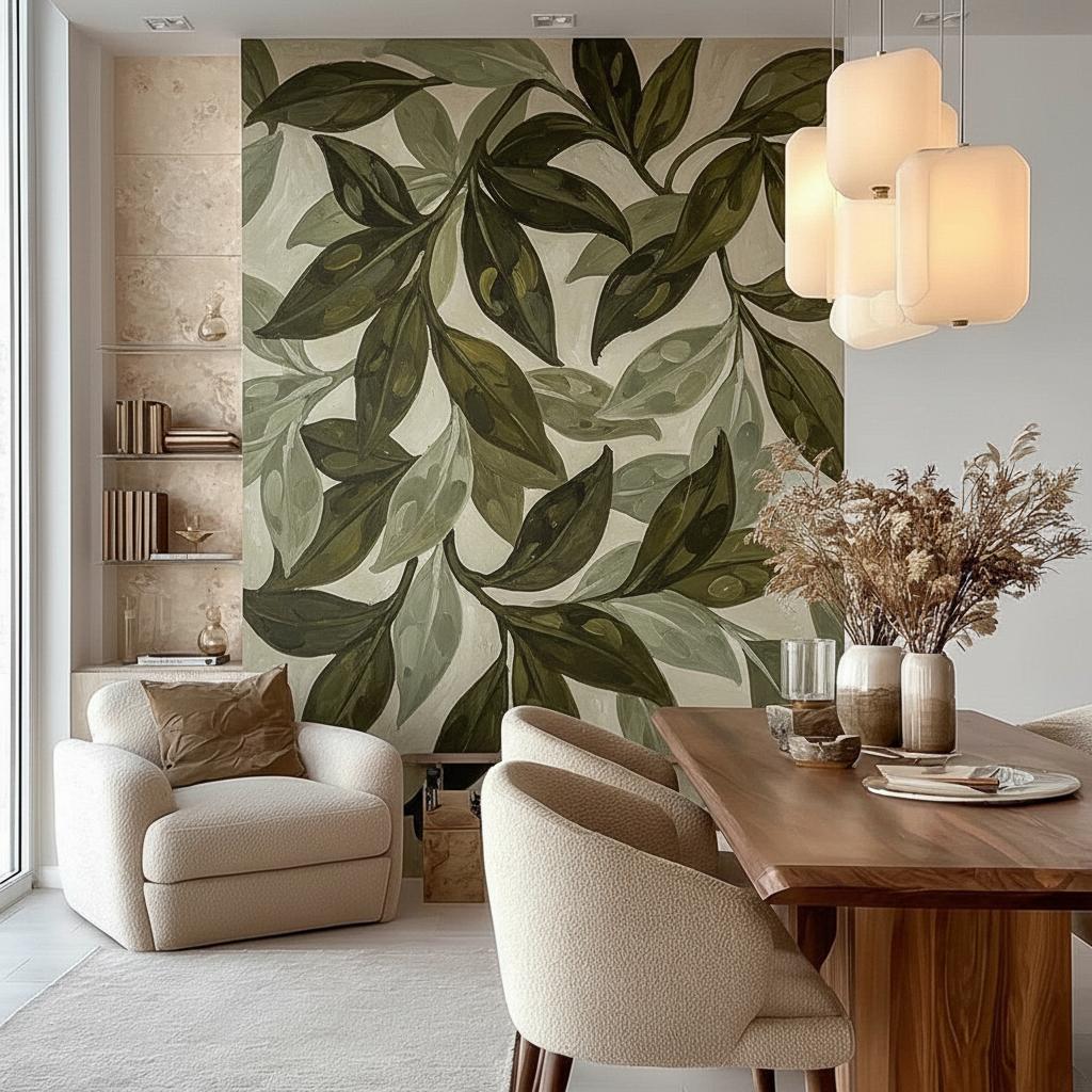
2026 Trends: The Rise of "Whimsical Surrealism"
Looking ahead to 2026, high-end interior design is trending toward "understated elegance" with texture as its soul. We are seeing a massive spike in interest for Dali-inspired surrealist custom pieces. These "whimsical" elements provide a necessary counterpoint to the seriousness of a black and gold palette, preventing the space from feeling too formal or stiff.
One emerging "blue ocean" niche is the use of panoramic hand-painted murals in powder rooms, creating a sense of immersive escapism. By wrapping the mural entirely around the walls, you create a "jewel box" effect that surprises and delights guests.
Practical Maintenance and Reality Checks
High-contrast schemes require a commitment to maintenance. Black surfaces show dust more readily than lighter tones, and gold fixtures are magnets for fingerprints. For those with busy lifestyles, we suggest focusing the gold accents on higher-placed elements (like chandeliers or wall art) and using matte finishes on high-touch surfaces.
When selecting fabrics, always test swatches under evening lighting. As we've noted in our guide on low-light bedrooms, many "black" velvets can read as navy or charcoal under artificial light. Ensuring a true black foundation is essential for maintaining the intended contrast with your gold accents.
Final Design Checklist for Evening Elegance
- Light Temperature: Are your bulbs 2700-3000K?
- Texture Count: Do you have at least 5 distinct tactile surfaces?
- Art Authenticity: Is the focal piece a textured, human-made work?
- Acoustics: Have you included soft materials to dampen sound?
- Safety: Are the paints used in your mural low-VOC and ASTM-certified?
By balancing these technical requirements with aspirational design, you can create a dining space that is not only visually striking but also neurologically soothing and socially engaging. Whether you are hosting a formal gala or an intimate dinner, the drama of black and gold—when executed with precision—remains the ultimate expression of sophisticated evening living.
YMYL Disclaimer: This article is for informational purposes only and does not constitute professional medical, health, legal, or financial advice. The safety data regarding pigments and VOCs is based on available research and should be verified with specific product manufacturers. Always consult with a certified interior designer or environmental health professional when undertaking significant home renovations.
Sources
- Columbia University: Human-Made vs. AI Art Study
- The Art Basel and UBS Art Market Report 2024
- EPA: Indoor Air Quality and Low-VOC Paints
- Royal Society: Quantifying the link between art and property prices
- National Gallery: Fading of Prussian blue in various binding media
- CDC NIOSH: Paint and Coating Hazards
Leave a comment
This site is protected by hCaptcha and the hCaptcha Privacy Policy and Terms of Service apply.