Wabi-sabi textured art brings calm to a minimalist room when it softens the space instead of filling it. The best pieces feel quiet, earthy, and slightly imperfect, which is why wabi sabi wall art often works better than flat minimal decor in rooms that need warmth without clutter.
What Wabi-Sabi Textured Art Does in a Room
Wabi-sabi works because it gives a restrained room something the eye can rest on. Texture breaks up flatness, and organic irregularity keeps the piece from feeling too polished or mechanical. In that sense, the style often reads as calmer than a blank canvas with no surface variation, especially in living rooms or bedrooms that already lean sparse. Background design writing on wabi-sabi interiors describes that soft, imperfect look as one reason the style feels settled in a room.
The look is not about decoration for its own sake. It is about visual softness: muted color, imperfect edges, and a surface that feels more human than glossy. That is why wabi sabi wall art can suit shoppers who want calm decor without the sterile feel that sometimes comes with minimalism.

A useful way to think about it is this: the room should still feel edited, but not empty. If the art adds texture without adding noise, it is doing the right job. For a neutral-styling follow-up, our calm neutral styling guide shows how beige stays interesting when texture carries the composition.
How to Read the Style: Wabi-Sabi Versus Japandi
Wabi-sabi and Japandi overlap, but they are not the same choice. Wabi-sabi is rooted in imperfection and transience, while Japandi is a more structured style that blends Japanese restraint with Scandinavian warmth and function. That difference matters when you are shopping, because two pieces can both look neutral while only one actually feels like wabi-sabi. Japandi vs Wabi-Sabi is a useful background reference for that distinction.
For buyers, the clearest cues are texture, tone, shape, and overall visual quietness. Wabi-sabi textured art usually tolerates more irregularity, more surface presence, and a slightly more lived-in feel. Japandi often looks cleaner and more edited. Both can work in the same home, but if the room already feels spare, Wabi-Sabi textured art usually adds more warmth per square inch.

The trap is buying generic neutral art and calling it Wabi-Sabi. A plain beige canvas can be calm, but if it lacks surface variation, it may read flat instead of intentional. Likewise, very glossy, busy, or high-contrast abstracts can start to fight the room instead of settling into it. If you are comparing broader abstract options, the abstract fit for modern interiors article is a helpful next step.
Choose Texture, Tone, and Scale
The shopping decision gets easier when you separate three questions: how much texture is present, how warm the palette feels, and whether the size fits the wall. Earthy neutrals usually do the heavy lifting here. Warm beige, taupe, sand, charcoal, soft white, muted green, and earthy gray tend to stay in the Wabi-Sabi lane because they feel grounded rather than bright or decorative. That color guidance lines up with Wabi-Sabi's muted palette in Wabi-Sabi vs Japandi.
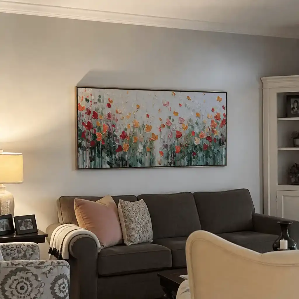
For scale, a practical rule of thumb is that art above furniture often works best when it spans roughly two-thirds to three-quarters of the width of the piece below it. The size rule for furniture walls is only a heuristic, but it is useful when you are sizing a sofa wall or console. If the art is much smaller, it can look accidental; if it is much larger, it can dominate a calm room.
| Decision Factor | What Usually Fits | What It Usually Avoids |
|---|---|---|
| Texture depth | Visible surface variation that still feels quiet | Flat prints with no surface presence |
| Color temperature | Warm neutrals, muted green, earthy gray, soft white | Cool white that feels stark or high-contrast color |
| Composition | Simple, organic, slightly irregular forms | Busy abstract marks or overly polished symmetry |
| Scale | About 2/3 to 3/4 of the furniture width in many setups | Pieces that feel too small for the wall or overpower the seating |
If you are comparing categories rather than single pieces, large neutral options are a sensible place to start, while abstract wall art is better when you want more movement in the composition.
Room Scenes That Work Best
-
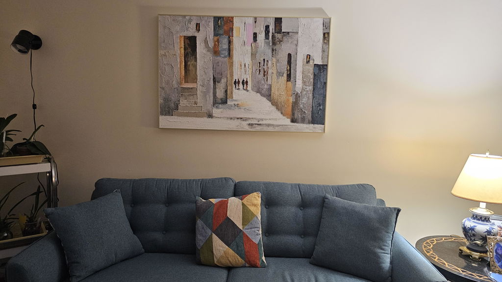
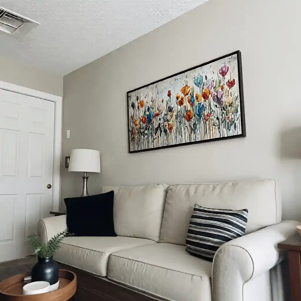
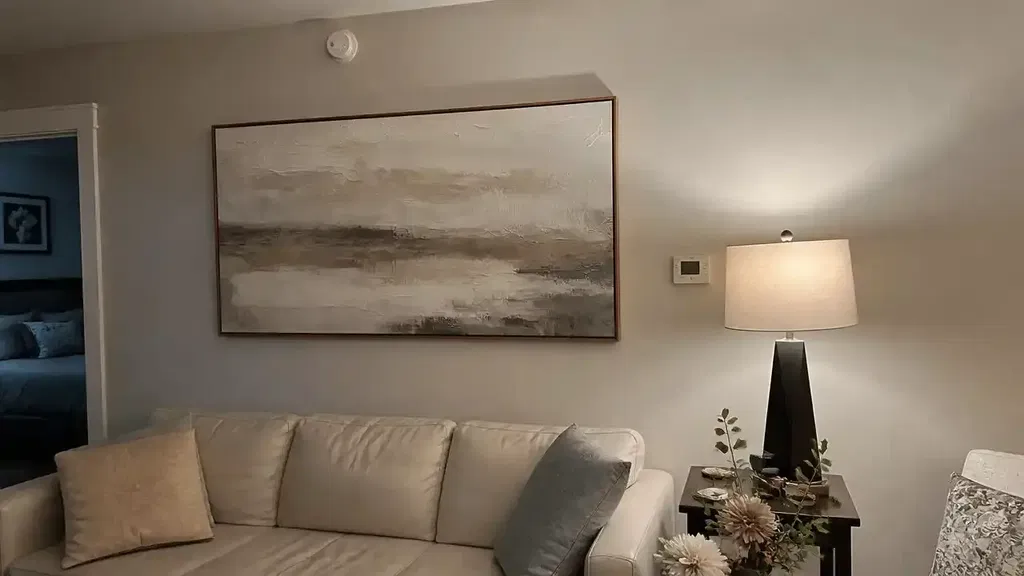
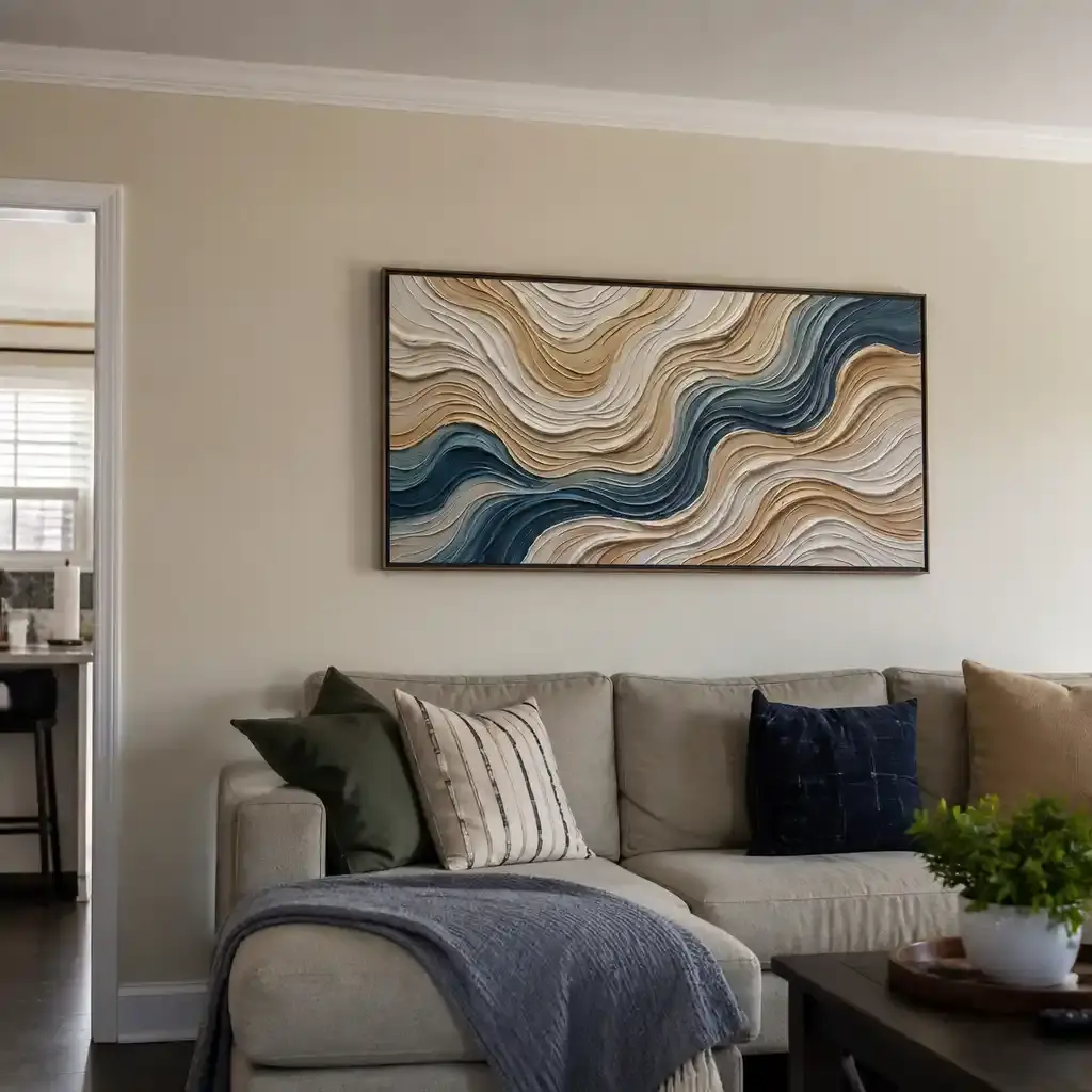
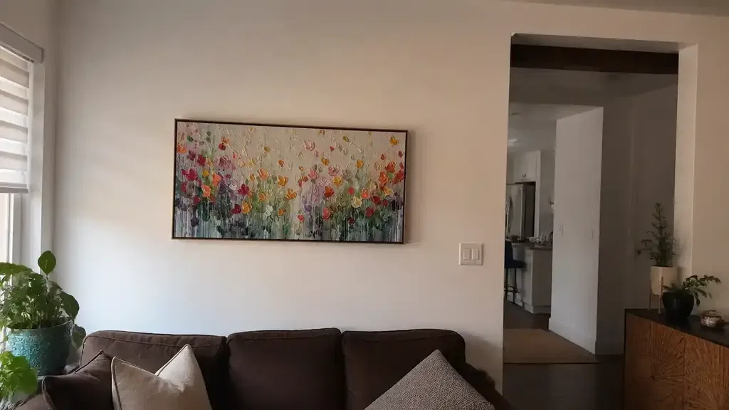
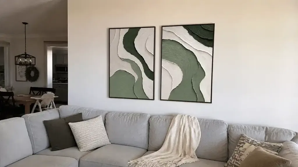
In a living room sofa wall, choose a piece that can act as the main soft focal point. The wall usually needs one calm anchor, not several competing objects. Centering the art and keeping a little breathing room above the sofa usually helps the room feel finished.
-
In a bedroom, go lighter on contrast and heavier on quiet color. The goal is to soften the wall behind the bed without turning it into a feature wall that feels loud at night.
-
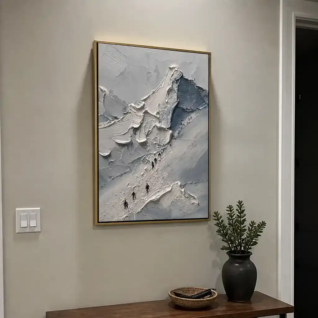
In an entryway or hallway, pick a piece that reads quickly from a distance. Narrow walls are easy to crowd, so the art should stay restrained and not rely on dense texture to carry the whole look.
-
In a home office corner, use the piece to reduce visual stiffness. One organic surface can make the room feel less severe without pulling focus from the desk.
-
In a small room, think twice before choosing heavy texture or oversized scale. The style can still work, but the piece needs more negative space around it so the room does not feel packed.
For placement, a practical reference is to keep wall art centered at eye level and leave modest space above furniture. The neutral living room placement rule is a helpful starting point when you are hanging above a sofa or console.
A Calm Shortlist for Shopping
Use a simple stop-check: does the piece look calm from across the room and more interesting up close? If the answer is yes, it may fit the brief. If the texture is so heavy that it looks hard to dust, or the surface seems so uniform that the handmade feel disappears, keep browsing. Visible side-angle detail is useful online because it helps you judge whether the texture is real visual presence or just a flat listing image.
Before you buy, check four things: the color stays in an earthy, muted range; the texture adds warmth without making the wall feel busy; the size matches the furniture or wall it sits above; and the shipping details are clear enough for a heavier textured piece. If any of those feel off, it is better to wait.
Do not buy if the listing only uses vague handmade language but shows no side-angle or close detail. Do not buy if the surface looks so thick or irregular that routine cleaning would be annoying in the room you plan to use it in. And do not buy if the composition feels too high-contrast for a calm interior, even if the style label says Wabi-Sabi.
If you are ready to browse wabi sabi wall art, start with the Wabi Sabi edit and compare a few calm-fit options against the checklist above. That is the fastest way to move from inspiration to a piece that suits the room.
FAQs
How Do You Style Wabi-Sabi Textured Art Without Making a Room Feel Busy?
Keep the surrounding decor simple and let the wall art do the softening. One or two nearby materials, such as wood or linen, are usually enough. If the room already has a lot of pattern or contrast, choose a quieter composition and let negative space do some of the work.
What Colors Work Best With Neutral Wabi-Sabi Wall Art?
Warm beige, taupe, sand, soft white, muted green, charcoal, and earthy gray are the easiest pairings. The main check is temperature: if the room already leans cool and stark, a warmer piece usually blends better. If you have strong wood tones, keep the art muted so it does not compete with them.
Can Wabi-Sabi Textured Art Work in a Small Living Room?
Yes, as long as the scale stays controlled and the texture does not feel dense. In a small room, one medium or large piece usually works better than several small ones. The signal to watch is breathing room. If the wall still feels open after the art is hung, the size is probably in range.
What Makes Wabi-Sabi Art Different From Generic Minimalist Decor?
Generic minimal decor can be flat, while Wabi-Sabi art usually keeps some irregularity, surface presence, or organic movement. That difference changes the room's mood. If the piece is calm but has no texture or variation at all, it may look minimal, but it will not necessarily read as Wabi-Sabi.
How Do You Choose the Right Size for a Sofa or Console Wall?
A good starting point is a piece that spans about two-thirds to three-quarters of the furniture width below it. That is not a hard rule, but it helps prevent the two common mistakes: art that looks too small to matter and art that crowds the wall. Measure the furniture first, then compare the art width before checkout.