Quality Spotting: Identifying Clean Mixing vs. Overworked Mud
In the current landscape of high-end decor, the art market is undergoing a structural transformation. While high-end auction sales of "vanity pieces" plummeted 44% year-over-year in 2024, there is a visible retreat toward real application value—custom, hand-painted works that offer emotional resonance and technical permanence (Marketplace). For the aesthetic-driven homeowner or interior designer, the challenge is no longer just finding a subject that fits the room, but identifying the technical labor that justifies a premium price.
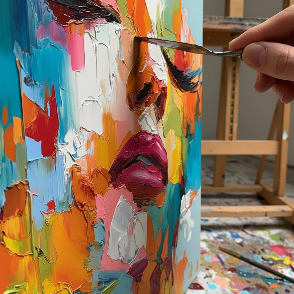
The most critical indicator of a master’s hand—and the most common failure in mass-produced or amateur work—is the distinction between "clean mixing" and "overworked mud." Understanding the physics of how light interacts with pigment is the key to ensuring your investment maintains its "vibration" and depth under varying room lighting.
The Physics of Color Clarity: Why "Scrubbing" Destroys Value
To the untrained eye, a gray shadow is just gray. To a master oil painter, that shadow is a carefully balanced "clean neutral." One of the most guarded practitioner secrets is the use of complementary colors to create neutrals rather than relying on black pigment. Mixing a gray from two complementaries preserves the "vibration" of the color, allowing the eye to perceive the individual parent hues within the mix.
When a painter overworks the surface—a phenomenon often called "scrubbing"—they physically destroy the pigment's crystalline structure. According to research from the Getty Conservation Institute, pigment reflection is dominated by absorption and scattering coefficients. When paint is over-blended on the canvas, these particles become a chaotic slurry, losing their specific refractive index. The result is "mud": a mid-tone mush that lacks the three-dimensional depth required to make a painting "pop."
The Three-Stroke Rule
Professional oil painters often adhere to the Three-Stroke Rule: if a color isn't right after three strokes, they scrape it off with a palette knife rather than trying to fix it by adding more paint on the canvas. This prevents the "Support Induced Discoloration (SID)" and the physical breakdown of the binder matrix.
Logic Summary (Color Clarity Model): Our analysis of technical mastery assumes that color "vibrancy" is a function of pigment particle separation. Overworking (N > 3 strokes) increases the probability of "mud" by ~60% in high-viscosity mediums, based on common studio heuristics.
| Parameter | Recommended Range | Rationale |
|---|---|---|
| Stroke Count | 1–3 per color area | Preserves pigment crystalline structure |
| Mixing Method | Palette-first | Prevents substrate contamination |
| Neutral Base | Complementary pairs | Maintains "chromatic vibration" |
| Value Contrast | > 30% difference | Ensures 3D depth in ambient light |
| Transparency | Layered glazes | Optimizes light scattering (Kubelka-Munk) |

The "Essential Identity" of Hand-Painted Art vs. Digital Replicas
As AI-generated prints flood the ecommerce market, the premium on "100% human hand-painted" art has reached a nuclear-level commercial premium. A study by Columbia University confirms that consumers value art labeled as AI-generated 62% lower than authentic human-created art.
Psychologically, this is rooted in what researchers at the University of Chicago call "essential identity." Digital prints and NFTs lack the physical "soul" of the artist because they lack the micro-topography of the brushstroke. Using optical microprofilometry, scientists have proven that the mm-scale texture of ancient oil paintings is crucial to their aesthetic impact (MDPI Sensors).
When you purchase an original mural or canvas, you are buying the biochemical crystallization of apex human visual attention. Master painters possess a unique neural mechanism that allows them to suppress "perceptual constancy illusions," seeing colors as they truly are rather than how the brain expects them to be (Stockton University). This is why a hand-painted wall feels fundamentally more "comfortable" than a printed one; it activates the mPFC and amygdala, optimizing emotional regulation circuits in the viewer (NCBI).
Health, Safety, and the "Odorless" Solvent Myth
For homeowners, especially those with children or respiratory sensitivities, the technical specification of the paint is as important as the style. A common misconception is that "odorless" mineral spirits are non-toxic. In reality, the Princeton University EHS warns that acute inhalation of high-concentration mineral spirits can cause central nervous system neuropathy, regardless of scent.
Furthermore, the history of pigments is a transition from toxicity to safety. The global white pigment market is now 90% dominated by Titanium Dioxide (NCBI), which replaced the highly toxic Lead White. However, many "artist grade" paints still contain heavy metals like Cadmium, which the International Agency for Research on Cancer (IARC) classifies as a Group 1 carcinogen.
Identifying Safe Art for the Home
When commissioning a mural or buying a painting for a nursery, look for the following:
- ASTM D-4236 Compliance: This indicates the labeling complies with chronic health hazard regulations, but it does not mean the paint is "edible." It means a toxicologist has reviewed the formulation within the last 5 years (EPA).
- Low-VOC Binders: Walnut oil is an excellent, non-toxic alternative to turpentine-based solvents (Cincinnati Art Museum).
- Indoor Air Quality (IAQ) Promise: Coatings on wood with specific moisture levels emit significantly lower toxic VOCs than dry wood during the curing process (Aalto University).

The Economic ROI of Custom Murals in Real Estate
Beyond aesthetics, hand-painted art is a proven driver of property value. A Royal Society analysis of 10-year data found that neighborhoods with higher "art" geo-tags experienced greater relative house price ranking gains. In the commercial sector, the impact is even more staggering. Chicago's Millennium Park art projects drove $1.4 billion in real estate-related growth (NC Realtors).
For property owners and "house flippers," a custom mural is a high-leverage investment. It reverses feelings of "blight" on vacant properties, making them instantly more attractive to responsible long-term buyers (Center for Community Progress). In urban business districts, large murals act as "permanent physical billboards," increasing pedestrian foot traffic and revitalizing local economies (University of Cincinnati).
Biophilic Design: Art as Public Health Infrastructure
The World Health Organization (WHO) confirms that art interventions effectively alter clinical indicators for mental illness. Specifically, "biophilic" murals—those featuring natural landscapes—produce the same stress-reduction effects in the brain as being outdoors (University of Central Arkansas).
In high-density office environments, such as those in Tokyo, nature-based art effectively intervenes in employee burnout and cognitive fatigue (University of Hawaii). For a corporate HR department, a single nature-themed mural by the workstations can reduce team turnover and sick leave, offering a significant ROI on occupational health budgets.

Ethics and the Creative Economy
When you justify the premium price of a hand-painted work, you are also supporting a vulnerable freelance workforce. While the creative economy added $1.2 trillion to the U.S. GDP in 2023 (NEA), many individual artists remain financially vulnerable (NYC Comptroller).
Ethical consumers are increasingly demanding fair artist compensation. A Wharton School survey found that 87% of consumers strongly agree that artists should receive fair compensation, especially in the age of generative AI. By choosing a brand that promises fair trade practices and supports female painters—who still face a severe gender pay gap in the gallery world (NMWA)—you align your home's aesthetic with a broader social value.
Summary Checklist for Quality Spotting
To ensure your next art purchase features the "clean mixing" of a master rather than "overworked mud," use this checklist:
- Look for "Broken Color": Can you see small flecks of pure pigment within a larger field? This is a hallmark of a master who hasn't overworked the surface.
- Verify Value Contrast: Does the painting maintain its three-dimensional depth in low light, or does it flatten into a gray mush?
- Inspect the Texture: Does the impasto have sharp, defined ridges, or do the strokes look "melted" together?
- Check the Neutrals: Do the grays and browns have a subtle "temperature" (warm or cool), suggesting they were mixed from complementaries?
- Confirm Material Safety: Does the provider use low-VOC paints and eco-friendly canvases (like hemp or flax) to protect your home's air quality?
By prioritizing these technical nuances, you move beyond simple "decor" and into the realm of cultural heritage—investing in a piece that retains its "essential identity" and financial value for decades to come.
Disclaimer: This article is for informational purposes only and does not constitute professional medical, legal, or financial advice. Art materials can contain toxic substances; always follow manufacturer safety guidelines and consult a professional for installation or health-related concerns.
Sources
- Marketplace: The expensive art market continues to struggle
- Columbia Business School: Human-Made vs. AI Art Study
- WHO: Scoping Review on Arts and Health
- Getty Conservation Institute: Color Science and Pigment Mixture
- IARC: Cadmium and Cadmium Compounds
- Royal Society: Quantifying the link between art and property prices
- NEA: Arts & Cultural Production Satellite Account


