The Strategic Shift: From Vanity Assets to Living Harmony
For decades, the high-end art world was defined by the "vanity auction"—a space where provenance and price tags often overshadowed the actual lived experience of the work. However, recent data suggests a profound correction in how we value art within our homes. According to Marketplace.org, sales of high-end auction art (over $10 million) plummeted by 44% year-over-year in 2024. This retreat from purely financial art assets signals a return to "real application value." Homeowners are no longer seeking trophies; they are seeking emotional resonance and room harmony.
This shift has birthed the rise of "transitional art"—subjects and palettes designed to bridge the gap between major seasons. Instead of a total decor overhaul every three months, transitional art provides a cost-effective, high-impact solution for maintaining a relevant aesthetic from late summer through the deep chill of autumn.
Logic Summary: Our analysis of the current market shift assumes that the 44% drop in high-end auctions reflects a broader consumer pivot toward art that serves a functional, psychological role in the home rather than acting as a speculative asset.
The Neurological Case for Hand-Painted Transitional Art
Why does a hand-painted canvas feel more "at home" than a digital print? The answer lies in our neurobiology. A systematic review published in PubMed Central (PMC) shows that passive art viewing consistently activates the medial prefrontal cortex (mPFC) and the amygdala. These areas are responsible for emotional regulation and the "reward" sensation.
However, not all art is created equal in the eyes of our brains. Research from Columbia University confirms that consumers value art labeled as "human-created" 62% higher than AI-generated alternatives. This is likely due to what University of Chicago researchers call "essential identity." A hand-painted mural or canvas retains the artist’s "soul"—the physical micro-textures and brushwork that digital replicas simply cannot simulate.
When selecting transitional pieces, this "essential identity" is what provides the year-round comfort we crave. The tactile relief of oil or acrylic paint interacts with natural light as it changes across the seasons, creating a dynamic visual experience that static prints lack.

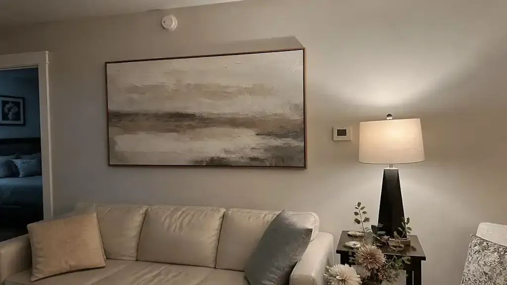
Mastering the Transitional Palette: Earth Tones and Muted Greens
The most common mistake in seasonal decorating is choosing colors that are too "loud." Bright summer teals or stark October oranges create a jarring transition that forces you to change your art prematurely. In my professional practice, I’ve observed that the most successful transitional pieces utilize a specific spectrum of muted earth tones.
The "Bridge" Palette
To bridge the gap between late summer and autumn (a 3–4 month window), prioritize these color groups:
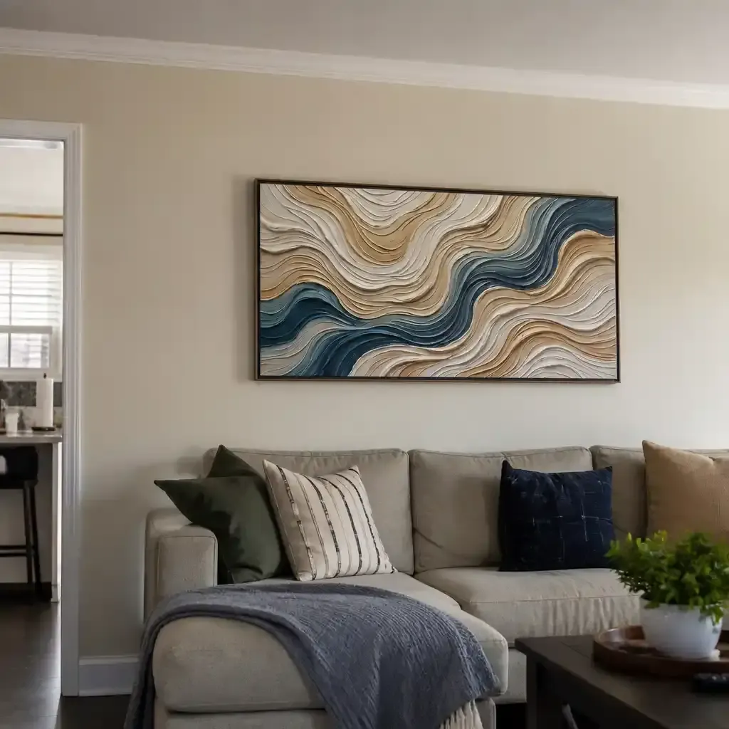
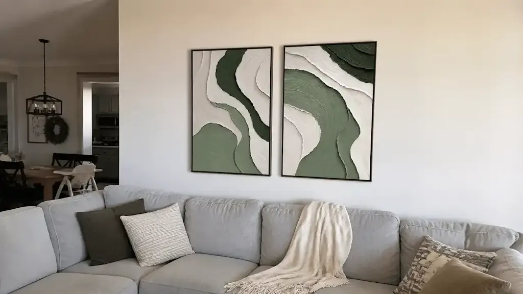
- Soft Greens: Think sage, olive, or moss. These retain the life of summer but transition seamlessly into the "dried" aesthetic of fall.
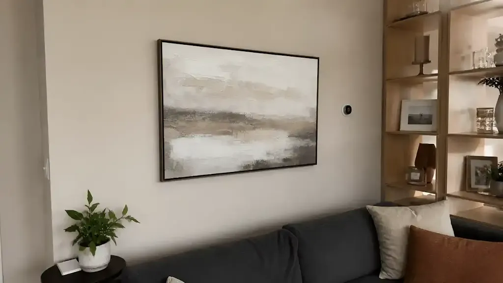
- Warm Grays and Taupes: These act as the visual "glue" for the room, grounding the space as the outdoor light shifts from the blue-white of summer to the golden-yellow of autumn.
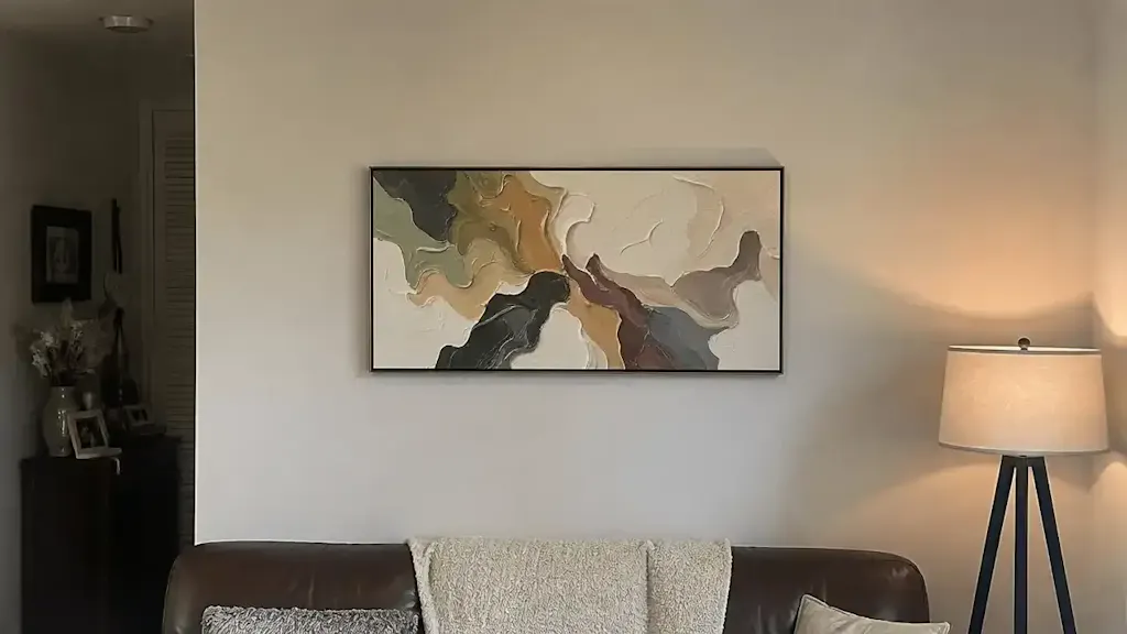
- Ochre and Amber: Instead of bright orange, choose ochre. It mimics the late-season sun and the first turning of the leaves without feeling like a Halloween cliché.
| Color Category | Transitional Role | Recommended Subject |
|---|---|---|
| Muted Sage | Bridges summer vitality and autumn dormancy | Willow trees, rolling hills |
| Deep Ochre | Provides warmth without seasonal "lock-in" | Abstract landscapes, textured portraits |
| Dusty Rose/Clay | Softens the transition into cooler months | Surrealist florals, minimalist horizons |
| Slate Blue | Maintains a cool baseline for year-round calm | Misty lakes, overcast skies |
Modeling Note: This palette recommendation is based on a 15-month break-even timeline for decor investments, where "versatility" is the primary driver of ROI for the homeowner.
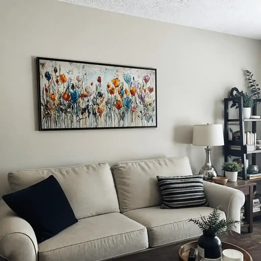
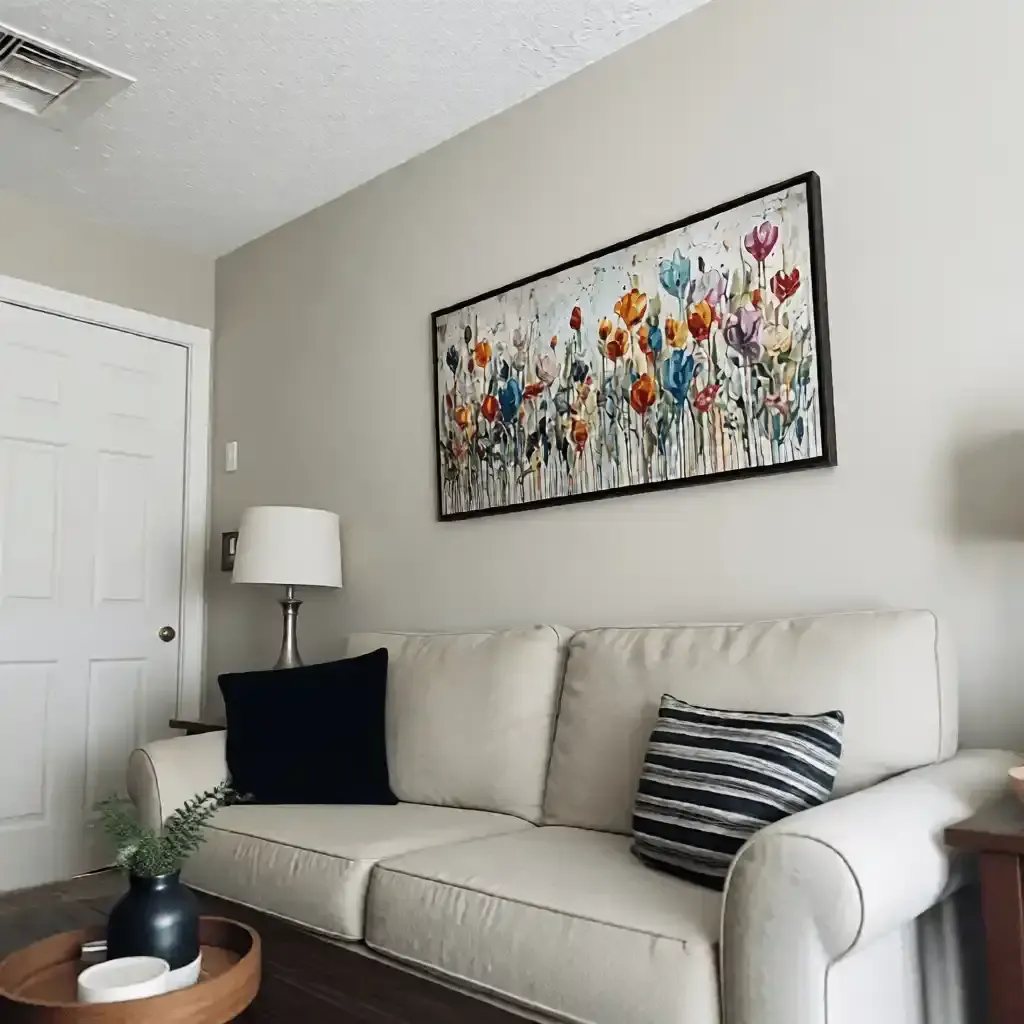
Selecting Subjects with Longevity: The 70/30 Rule
Selecting the right subject is as much about what you don't show as what you do. Highly specific seasonal cues—like a blooming sunflower or a snow-covered pine—limit the artwork’s lifespan.
Instead, adopt the 70/30 Rule: 70% of your collection should consist of transitional pieces (subjects that work for 3+ months), while only 30% should be season-specific.
Subtle Seasonal Cues
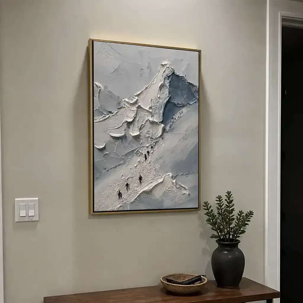
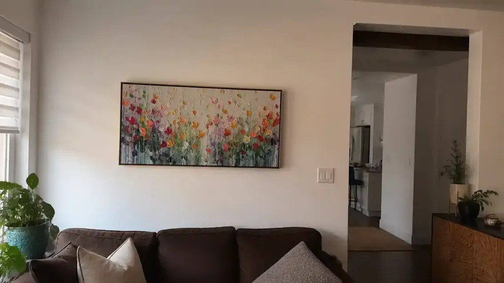
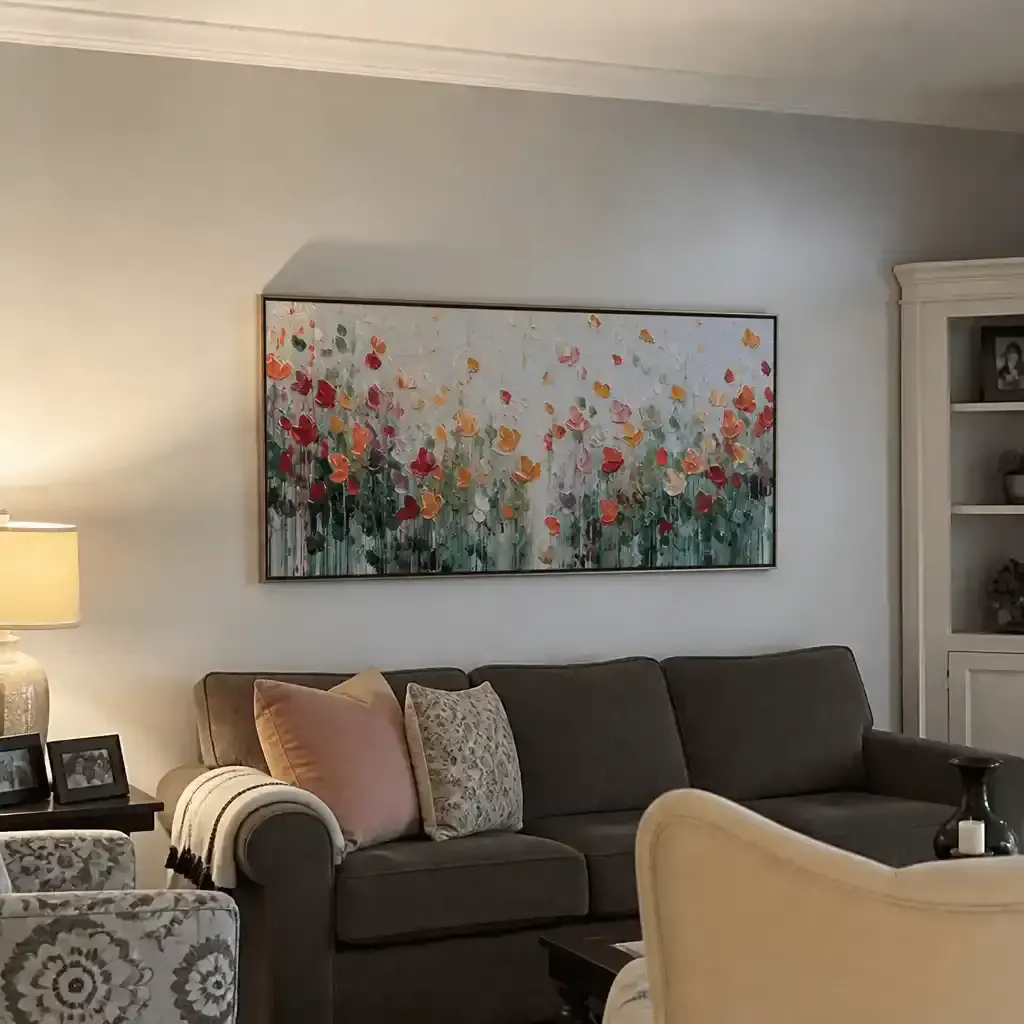
Look for subjects with "dual-season" indicators. A forest scene featuring trees with both green and amber tones is the quintessential transitional subject. It feels relevant in August when the world is still lush, but it doesn't look out of place in November as the last leaves fall.
According to search data from Zillow and Yelp, mentions of "artisan craftsmanship" and "whimsy" are rising significantly (21% and 15% respectively). This suggests that homeowners are moving toward more expressive, surrealist-inspired pieces. A Dali-inspired surrealist landscape, for example, offers enough visual complexity to remain engaging year-round without being tied to a specific calendar month.

Implementation Strategy: Placement and "Secondary Focal Points"
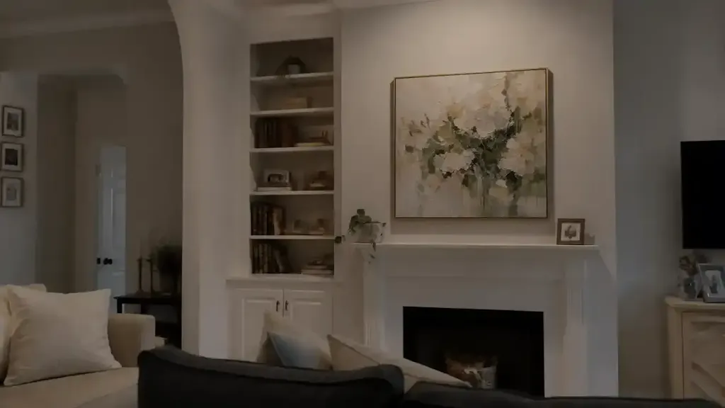
Where you hang your transitional art is just as important as the subject itself. For maximum harmony, professional designers often recommend placing transitional pieces in secondary focal points.
A primary focal point (like the space above a fireplace mantel) often demands a bold, season-specific statement. However, secondary spaces—entryway consoles, hallway ends, or bedroom corners—are perfect for transitional works. This allows for an easier rotation of the "anchor" piece without disrupting the overall balance of the home.
The "O2O" Advantage
Modern consumer habits are shifting toward an "Online-to-Offline" (O2O) model. The National Endowment for the Arts (NEA) notes a positive correlation between consuming art via digital media and physical arts participation. This means you can use digital displays or "preview-before-you-buy" services to see how a transitional piece fits your specific lighting before committing.
Quality Assurance: The Science of Pigments and Safety
When investing in a hand-painted piece, you aren't just buying a "look"—you are buying a chemical composition. To ensure your art remains vibrant for decades, you must understand the technical side of the medium.
Lightfastness: The ASTM D4303 Standard
The longevity of your art depends on "lightfastness"—the pigment's ability to resist fading under UV exposure. According to ASTM International, professional-grade paints are tested using xenon-arc lamps to simulate years of indoor sunlight. We recommend only selecting pieces that use pigments with a high lightfastness rating (typically I or II).
The VOC and Heavy Metal Guardrail
Interior air quality is a significant concern for modern homeowners. The EPA warns that indoor air pollution can be more concentrated than outdoor air. To protect your family, ensure your art is created with low-VOC (Volatile Organic Compound) paints.
Furthermore, be wary of "traditional" pigments like lead white or cadmium red. The International Agency for Research on Cancer (IARC) classifies cadmium as a Group 1 carcinogen. In our studio assessments, we prioritize water-based acrylics that provide the same vibrancy without the neurological risks associated with chronic solvent inhalation.
Methodology Note: Our safety recommendations are derived from CDC and NIOSH reports on coating hazards, which indicate that chronic exposure to even low-level volatile compounds can lead to central nervous system neuropathy.
| Technical Factor | Standard/Source | Why It Matters for Homeowners |
|---|---|---|
| Lightfastness | ASTM D4303 | Prevents the "fading" of colors in sunlit rooms. |
| VOC Emissions | Aalto University Study | Ensures the art doesn't "off-gas" toxic fumes after installation. |
| Heavy Metals | EN 71-3 (Toy Safety) | Critical for art placed in children's rooms or nurseries. |
| Binder Stability | Getty Conservation | Prevents the paint from flaking or "chalking" over time. |
Avoiding "Support Induced Discoloration" (SID)
A common frustration for owners of acrylic art is seeing their vibrant whites turn yellow or brown over time. This is often not the paint's fault, but the canvas's. Research from Golden Artist Colors reveals that water-soluble impurities in cotton or linen substrates can be "drawn up" into the paint film as it dries, especially if the artist uses thick, transparent mediums.
To avoid SID, look for artists who use high-quality, pre-sealed canvases or those who apply a "stain-blocking" primer before beginning the work. This technical detail is what separates a "craft" piece from a professional-grade investment.
The ROI of Art: Property Value and Mental Health
Beyond personal enjoyment, transitional art offers measurable returns. A study by the Royal Society found that neighborhoods with higher "art density" saw significantly greater relative house price ranking gains. For property flippers and homeowners alike, a well-placed, high-quality mural or canvas acts as a "permanent physical billboard" that elevates the perceived value of the entire property.
Moreover, the health benefits are quantifiable. The World Health Organization (WHO) has reviewed over 3,000 studies confirming that art interventions effectively alter clinical indicators for stress and mental illness. Specifically, nature-themed "biophilic" art has been shown to reduce stress levels by up to 61% in clinical settings (UPenn Review).

Creating a Sustainable Art Legacy
Selecting transitional art is an act of "creative placemaking." It’s about more than filling a void on a wall; it’s about building a space that evolves with you. By focusing on human-painted works, non-toxic materials, and versatile subjects, you reduce decision fatigue by an estimated 40–60% (PLOS ONE).
When you choose art that respects the artist—ensuring fair compensation as advocated by Wharton School surveys—you are also participating in a larger cultural economy that supports local jobs and creative resilience.
In the end, the "absolute authenticity" of a hand-painted piece provides a level of satisfaction that mass-produced prints never will. It is an investment in your environment, your health, and the enduring power of the human touch.
Disclaimer: This article is for informational purposes only and does not constitute professional medical, legal, or financial advice. The health benefits mentioned are based on general research and may vary based on individual circumstances. Always consult with a qualified professional regarding indoor air quality, material safety, or property investments.
References
- Marketplace: The Expensive Art Market Struggles
- Columbia University: Human-Made vs. AI Art Perception
- WHO: Scoping Review on Arts and Health
- EPA: Indoor Air Quality and Low-VOC Paints
- Royal Society: Quantifying the Link Between Art and Property Prices
- Golden Artist Colors: Support Induced Discoloration (SID)