Textured bedroom wall art works best when it feels grounded, quiet, and proportionate to the wall, not when it tries to do all the decorating at once. The strongest choices use structured texture, muted color, and a size that relates to the bed or accent wall. If a piece needs a lot of explaining to feel restful, it is usually the wrong fit for the room.
Why Texture Works in a Bedroom
Texture gives a bedroom wall more depth without needing loud color or a busy subject. That matters because the room already has enough visual load from bedding, lamps, pillows, and furniture. In research on bedroom interiors, structured natural textures were preferred over irregular or fragmented ones, and neutral bedroom colors were tied to lower visual complexity in the same general design context.
The takeaway is simple: texture can help a room feel more composed when it reads as layered and controlled. Soft brushwork, natural-looking surfaces, and restrained contrast usually work better than glossy, highly broken, or overly sharp texture. That is why textured bedroom wall art is often more successful as a quiet focal point than as a high-drama statement.

What to check first is the room's overall density. In a sparse primary bedroom, moderate texture can carry the wall. In a compact apartment room or a guest room with several strong patterns already in play, the same piece can start to feel busy fast. If the bedding already has a lot of pattern or contrast, choose a calmer surface so the wall art supports the room instead of competing with it.
For a related comparison, textured versus smooth canvas is worth thinking through once you know whether the room needs depth or visual quiet.
How to Size Artwork Above the Bed
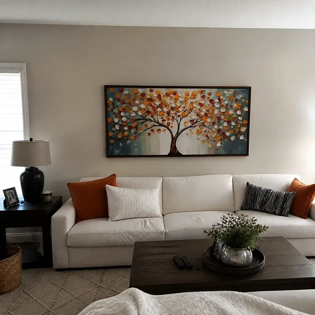
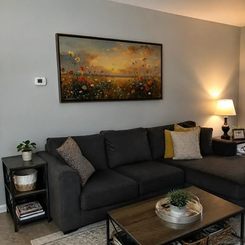
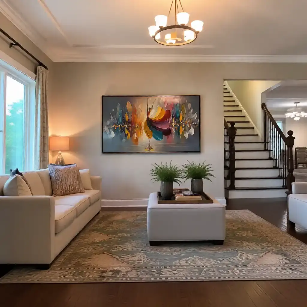
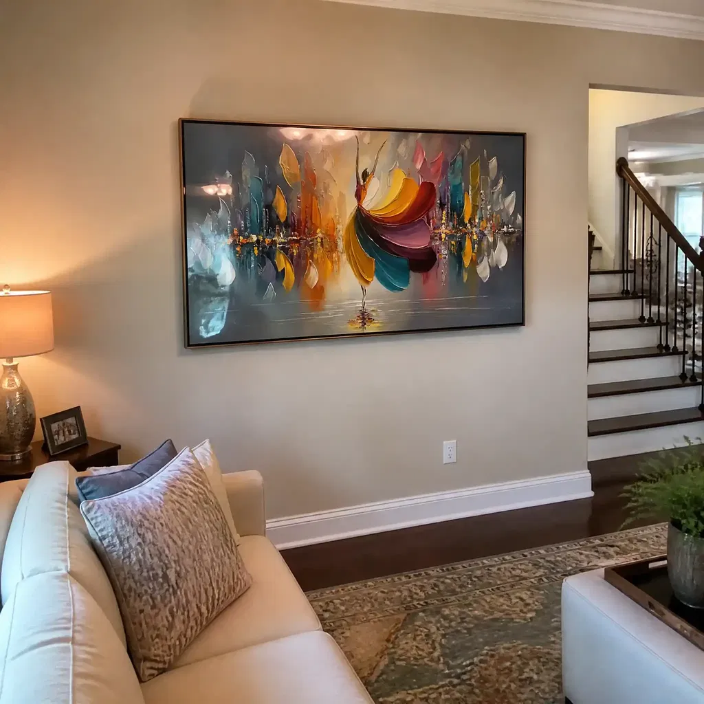
Above-bed sizing is mostly a proportion question. A common starting point is to aim for artwork that spans roughly 60% to 75% of the headboard width, which keeps the piece connected to the bed instead of floating or looking undersized. That range is a style heuristic, not a universal rule, so use it as a starting place and then adjust for ceiling height, wall width, and the amount of empty space around the bed.
If the bed wall is wide and the headboard is substantial, a horizontal piece usually reads more naturally. If the room has a tall, narrow wall zone or a smaller headboard, a vertical piece can make better use of the space. For larger walls, a diptych or triptych can work when one oversized panel would feel too heavy.

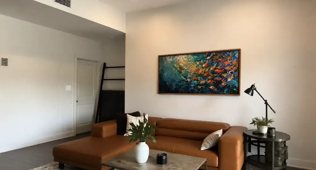
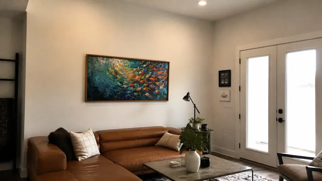
The spacing matters too. The artwork should relate to the furniture first, not the ceiling line. If it sits too high, the bed and art stop feeling connected. If it sits too low or stretches too wide, the wall can feel crowded. A practical check is to stand at the foot of the bed and ask whether the art feels anchored to the bed zone or whether it is drifting into ceiling-first placement.
A good rule of thumb: if the piece looks right from across the room but feels too small from the bed, the scale is probably off. In that case, move up in width or switch to a format that carries more visual weight. For shoppers who know they need a taller format, vertical artwork is the cleaner path to browse.
Palette Choices That Keep the Room Calm
Color is usually the fastest way to either protect or break the calm brief. In bedroom-focused research, neutral light colors such as ivory, white, and soft gray were preferred because they reduce visual complexity. That does not mean the room has to be all beige, but it does mean muted palettes are the safest starting point for textured art for bedroom settings.
A calm palette usually falls into one of three lanes. First are soft neutrals such as ivory, taupe, warm white, and gentle gray. Second are muted earth tones, such as sand, clay, stone, and softened brown. Third are low-contrast combinations where the colors are close enough to let the texture do the work. In each case, the art feels quieter because the eye does not have to process a lot of color conflict.
Use the room itself as your filter. If the bedding, rug, or wall paint already has a strong color story, choose art that repeats one or two of those undertones. If the room is already neutral, you can add slightly more depth through texture, but keep saturation modest. High-contrast black-and-white pieces, bright primaries, and very saturated accent colors tend to make the wall feel more active, which can be a poor match in a restful bedroom.
A good decision sentence is this: if the art has to fight the bedding to be noticed, it is too loud for the room. If it blends too much and disappears completely, you may need a bit more texture or a slightly deeper tonal range. For readers who want to browse by color family, neutral abstract wall art is the safest category starting point.
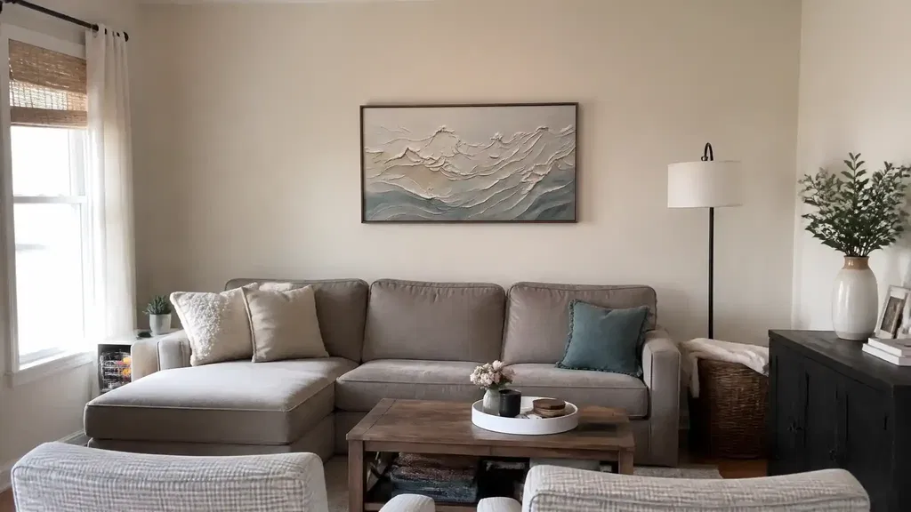
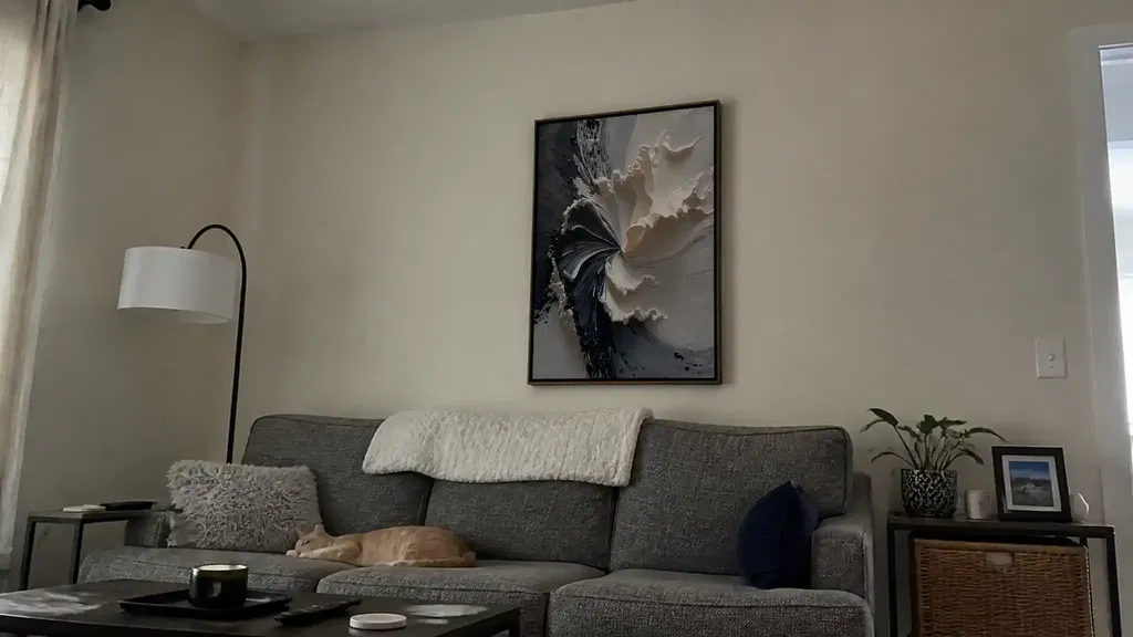
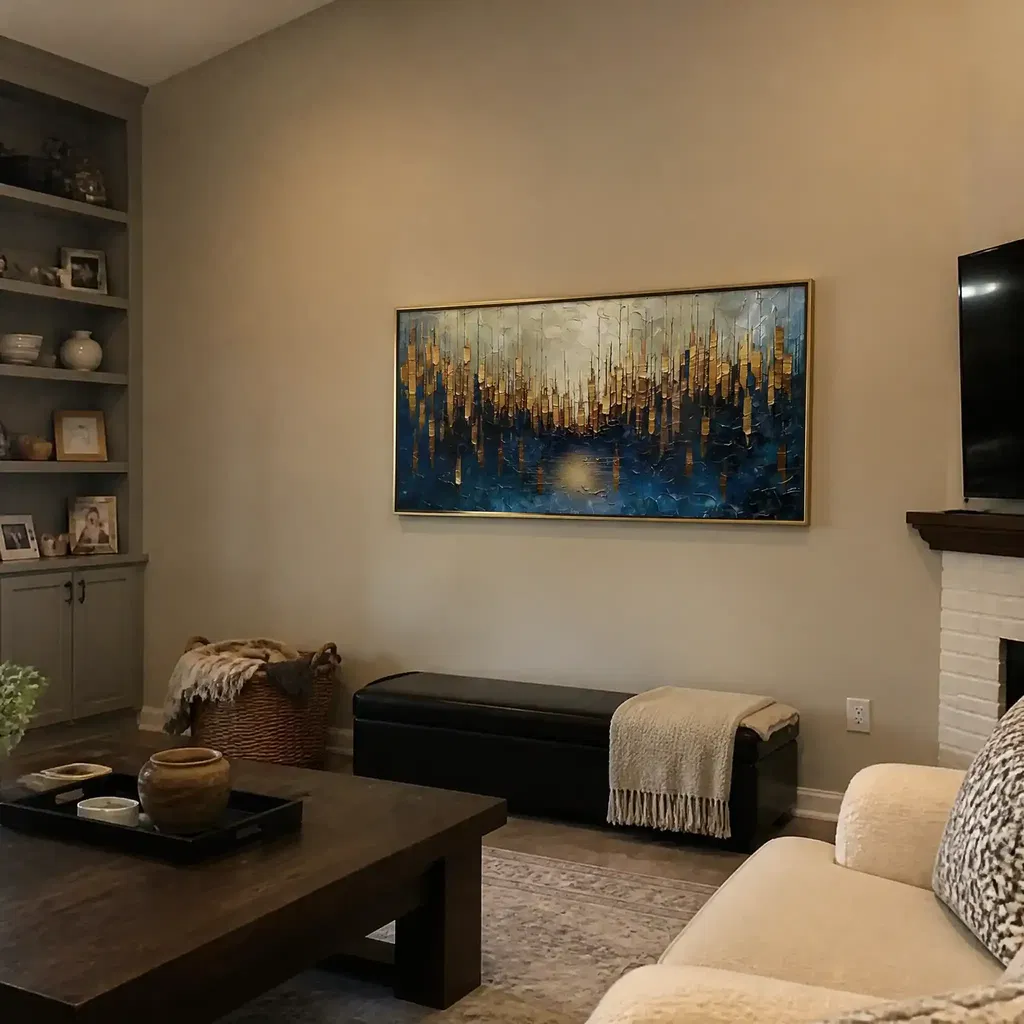
Placement Ideas for Beds and Accent Walls
Placement changes how textured art is read. Above the bed, the piece acts like a visual anchor and should feel centered on the sleeping zone. On an accent wall, it can do more of the mood-setting work for the whole room. In a reading nook or on a dresser wall, it becomes a supporting accent instead of the main focal point.
| Placement Option | Best Room Condition | Visual Effect | Works Best When | Common Mistake To Avoid |
|---|---|---|---|---|
| Above the bed | You want one clear focal point | Grounds the bed and finishes the wall | The headboard and wall width are balanced | Hanging art that is too small or too high |
| Accent wall | The room needs a stronger design moment | Adds depth and can shape the whole mood | The wall has enough open space to breathe | Choosing a piece that fights existing patterns |
| Dresser or reading nook wall | You want a quieter secondary accent | Gives texture without dominating the room | The main bed wall already feels complete | Treating a small wall like the main display zone |
Small rooms need extra restraint. Wall texture can change how spacious a room feels, and perceived spaciousness becomes more sensitive when square footage is limited. In a compact bedroom, that usually means fewer pieces, lighter tonal contrast, and less visual fragmentation. In a larger room, the art can handle more depth because the wall has room to hold it.
If you are choosing between one statement piece and a grouped arrangement, pick the single piece when the furniture already creates a strong horizontal line, and use a pair or triptych when the wall is wide enough to support repetition. For shoppers who want a taller visual profile, vertical artwork is often the better fit than trying to force a wide format into a narrow wall.
A Simple Bedroom Artwork Checklist
- Measure the headboard or wall zone first, then choose art that feels connected to that width.
- Check the piece from three views: lying in bed, standing at the doorway, and facing the wall straight on.
- Match at least one major room element, such as bedding, rug, or wall paint, so the palette feels intentional.
- Keep the texture level in line with the room's restraint. If the bedroom is already busy, choose softer layering.
- For online orders, verify packaging, return policy, and how the piece will be mounted before checkout.
- If you want easy wipe-clean decor, textured art is usually the wrong category.
That last point matters because maintenance is a compatibility issue, not a quality issue. Textured surfaces can collect visible dust over time, and the safest care is usually dry brushing or light feather-dusting rather than scrubbing or soaking. If you want a bedroom wall piece that is treated more like a cleanable surface than an art object, look elsewhere.
Shipping deserves the same kind of check. Heavy texture can be more vulnerable in transit, so strong packaging, careful handling, and visible proof such as pre-shipment photos are reassuring signs. If a seller cannot show how the piece is protected, that is a reason to slow down before you buy.
Final Takeaway
Textured art for bedroom spaces works best when scale, palette, and placement all point in the same direction: calm, not cluttered. Start with the bed width, keep the palette muted enough to support the room, and choose a texture level that feels layered rather than busy. If you are still deciding, browse bedroom-friendly neutral art or check the current vertical formats to compare room-fit before you buy.
FAQs
What Kind of Art Looks Best in a Bedroom?
Bedroom art usually looks best when it feels calm, proportionate, and easy to live with day after day. For most rooms, that means muted color, balanced texture, and a size that does not overpower the bed. If the piece competes with bedding or feels too loud from the doorway, it is probably not the right bedroom fit.
How Big Should Artwork Be Above a Bed?
A practical starting point is about 60% to 75% of the headboard width. That keeps the artwork tied to the bed instead of floating on the wall. If your ceiling is tall or the wall is especially wide, you may need a larger format or a grouped arrangement to keep the scale from looking too small.
Should Bedroom Wall Art Be Horizontal or Vertical?
Horizontal art usually fits wider headboards and low, broad wall zones. Vertical art works better when the wall feels taller than it is wide or when you want to tighten a narrow space visually. If the furniture already creates a strong horizontal line, a vertical piece can add useful contrast without making the room feel crowded.
What Colors Make Bedroom Wall Art Feel Calmer?
Muted neutrals and softened earth tones are the safest choices when the goal is a quieter bedroom look. Ivory, soft gray, taupe, sand, and similar tones usually keep the eye from working too hard. If the rest of the room is already colorful, choose art that repeats one undertone rather than adding a new high-contrast palette.
Can Textured Art Work in a Small Bedroom?
Yes, but it needs a lighter touch. In a small bedroom, keep the palette softer, the texture more controlled, and the number of competing patterns lower. If the piece looks dramatic in a large room but starts to crowd the wall in a small one, scale down or choose a less fragmented surface.