
Choosing between a symmetrical art set and a single statement painting is one of the most significant decisions in interior design. It defines the energy of a room, dictates how furniture is perceived, and ultimately settles the visual "weight" of a wall. To choose correctly, you must balance the desired psychological vibe of the space with the mathematical constraints of your wall dimensions.
For a structured, serene, and formal environment—such as a master bedroom or a traditional library—symmetrical art sets like triptychs or grids are superior. They provide a sense of order and rhythmic balance. Conversely, if you want to create a bold, energetic focal point in a high-traffic area like a modern living room, a single statement painting is the better choice. Large-scale individual pieces command immediate attention and project a sense of confidence and personality.
Quick Comparison: Symmetrical Sets vs. Statement Paintings
When deciding on your next framed wall art, the following table provides a high-level view of how these two configurations compare across several key metrics. For a related format decision, compare oversized wall art vs sets of 2 or 3.
| Feature | Symmetrical Art Sets (Diptychs/Grids) | Single Statement Painting |
|---|---|---|
| Visual Vibe | Formal, Serene, Disciplined | Dramatic, Modern, Energetic |
| Best Room Type | Bedrooms, Libraries, Narrow Hallways | Living Rooms, Entryways, Dining Rooms |
| Installation Effort | High (Requires precise measuring/leveling) | Medium (Single point of focus) |
| Cost Profile | Often lower (Sets are frequently prints) | Higher (Oversized originals are investments) |
| Primary Goal | Creating visual rhythm and calm | Creating a singular, powerful focal point |
| Common Formats | Diptychs, Triptychs, 4-piece or 9-piece grids | Oversized landscape or portrait canvases |
The Golden Rule of Scale: Applying the 2/3 Width Principle

One of the most frequent reasons interior decor feels "off" is a failure to respect the scale of the furniture below the art. Whether you are hanging a set of three canvases or one massive large abstract wall art piece, the total width of the arrangement should occupy approximately two-thirds to three-quarters of the width of the furniture piece it sits above. The large wall art buying guide expands this rule into a full buying checklist.
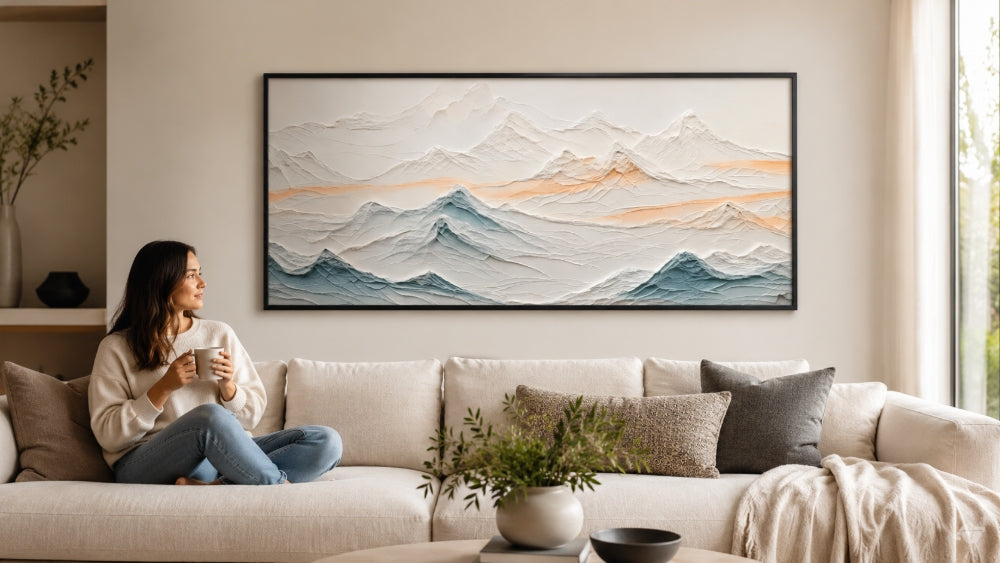
The 120-Inch Sectional Example
If you have a 120-inch sectional sofa, your goal is to have a total art width of roughly 80 to 90 inches.
- For a Statement Painting: You would look for an oversized landscape canvas roughly 84 inches wide. This creates a cohesive block of color that anchors the massive sofa.
- For a Symmetrical Set: You might choose a triptych consisting of three 24-inch wide frames. When you add 3 inches of spacing between the frames, the total width reaches 78 inches—perfectly within the target range for a balanced look.
Calculating Spacing for Sets
When hanging multi-piece sets, the air between the frames is as important as the frames themselves. The standard design rule is to leave 2 to 3 inches between each piece. If the spacing is too narrow, the set looks like a single piece that was accidentally broken; if it is too wide, the eye loses the connection between the images, and the wall begins to look cluttered rather than curated.
When to Choose Symmetrical Art Sets for a Balanced Vibe
Symmetrical art sets—including diptychs (two pieces), triptychs (three pieces), and grids (four or more)—are the preferred choice for rooms where the primary goal is relaxation or formal organization. Symmetry in decor has been psychologically linked to a reduction in visual stress, as the brain can easily process the repeating patterns and balanced weights. For set terminology and spacing basics, review diptych and triptych painting sets.
Benefits of the Triptych and Grid
Triptychs are particularly effective for wide horizontal walls. They allow you to fill a large space without the heavy weight (or high cost) of a single massive canvas. Grids, such as a 2x2 or 3x3 layout, work exceptionally well in formal libraries or dining rooms. They provide a "gallery" feel while maintaining a strict architectural order.
Avoiding the "Rigid" Aesthetic
A common risk with symmetrical sets is that they can feel dated or overly stiff. To keep the look modern, choose frames with a slim, minimalist profile. Using black or natural wood thin-edge frames for your canvas wall art ensures the focus remains on the imagery rather than the structure. Expert designers often suggest using slightly different but related images within the set—such as a series of botanical sketches or varying angles of the same landscape—to add subtle visual interest without breaking the symmetry.
The Power of One: Using Statement Paintings as a Focal Point
A statement painting is more than just decor; it is the "anchor" of a room. This approach is most successful in energetic spaces like the living room or a grand entryway, where you want to immediately establish a specific mood. For styling a single large work, see how to style a large painting without clutter.
Identifying a Feature Wall
A statement piece needs a feature wall—a surface with enough surrounding negative space to let the artwork breathe. If the wall is crowded with windows, thermostats, or light switches, a single large piece can look cramped. However, on a clean, expansive wall, a large-scale work commands the room and eliminates the need for further accessorizing.
Horizontal vs. Vertical Orientations
- Horizontal Landscapes: These are best suited for placement above long furniture items like sofas, beds, or credenzas. They guide the eye across the room, emphasizing width and openness.
- Vertical Portraits: These are ideal for narrow walls or rooms with exceptionally high ceilings. A tall vertical piece can make a standard room feel loftier by drawing the eye upward.
One common pain point for homeowners is the "lost" art look. This occurs when a statement piece is too small for the wall it occupies, causing it to appear as an afterthought rather than a deliberate choice. When in doubt, it is almost always better to go larger than you think you need.
Matching Art Layouts to Your Wall Shape and Geometry

The architectural constraints of your room often dictate the best layout. Understanding the geometry of your wall is the first step toward selecting the right living room wall art.
- Wide, Low Walls: Use triptychs or wide horizontal landscapes. These mirror the wall's shape and reinforce the horizontal lines of the room.
- Narrow, Tall Walls: A single, large vertical painting is almost always the winner here. Attempting to fit a set onto a narrow vertical strip often results in a cluttered "ladder" effect.
- Square Walls: A 4-piece grid (2x2) is a sophisticated way to fill a square space. It mimics the wall's proportions while offering the rhythmic benefits of symmetry.
- Entryways and Hallways: Because these are high-traffic areas, simple is better. A single statement piece in a hallway provides a clear destination for the eye, whereas a complex grid may feel too "busy" for a space intended for transition.
Common Installation Mistakes and How to Avoid Them
Installing high-end art is as much about engineering as it is about aesthetics. Large pieces and multi-frame sets introduce technical challenges that, if ignored, can lead to structural damage or a sloppy finish.
The Risks of Poor Hardware
According to the Canadian Conservation Institute, falling damage often results from aged hanging hardware or wall-attachment failure. When hanging an oversized statement painting, do not rely on a single nail. Use heavy-duty wall anchors or find a stud to ensure the weight is properly supported. For multi-piece sets, use a laser level; even a quarter-inch discrepancy in height between frames in a triptych will be immediately noticeable and ruin the intended symmetry.
Protection and Maintenance
To ensure your investment lasts for decades, consider the following technical protections:
- Backing Boards: Using protective backing boards for framed paintings helps protect the canvas from dust, vibration, and accidental physical contact from the rear.
- Light Exposure: Be mindful of placement relative to windows. The Library of Congress warns that light damage is cumulative and irreversible, causing fading and darkening over time. If possible, use UV-filtering glass for sets or keep original oils out of direct sunlight.
Installation Checklist
- [ ] Measure the furniture width and apply the 2/3 rule.
- [ ] Use a laser level for symmetrical sets to ensure perfectly horizontal alignment.
- [ ] Space multi-piece sets exactly 2 to 3 inches apart.
- [ ] Ensure hardware is rated for the weight of the frame.
- [ ] Add rubber bumpers to the bottom corners of frames to prevent scuffing and allow airflow.
Conclusion: Symmetrical Art Sets vs One Statement Painting
Ultimately, the choice between Symmetrical Art Sets vs One Statement Painting comes down to the function of the space and the proportions of your furniture. If you are decorating a 120-inch sectional and want a high-energy, modern focal point, a large-scale landscape painting is the gold standard. If you are looking to bring peace and order to a master bedroom or a dining room, a symmetrical triptych or grid provides the necessary rhythm to calm the senses.
By respecting the 2/3 rule of scale and matching the artwork's geometry to the wall's architectural shape, you can avoid the common pitfall of art looking "lost" or poorly planned. Whether you choose the drama of a single piece or the balance of a set, the key is intentionality and precise execution.
Safety Notice
This article provides general guidance only. Always follow the manufacturer's instructions, applicable local requirements, and appropriate safety practices. For installations involving electrical systems, structural loads, fire safety, or other significant risks, consult a qualified professional.
FAQs
Is it cheaper to buy an art set or one large painting?
Generally, art sets are more budget-friendly because they are often high-quality prints or reproductions. A single oversized statement painting, especially if it is an original oil or acrylic work, typically commands a much higher investment due to the artist's labor and the materials required for large-scale pieces.
How much space should I leave between frames in a symmetrical set?
The standard design rule is to leave 2 to 3 inches of space between each frame. This creates a cohesive visual flow that allows the eye to view the set as a unified whole rather than separate, disconnected items.
Which is better for above a fireplace mantel?
A single statement piece is almost always better for a fireplace mantel. Mantels are already architectural focal points with complex details; adding a multi-piece set can create visual clutter. A single painting provides a clear, powerful anchor that respects the structural lines of the hearth.

Leave a comment
This site is protected by hCaptcha and the hCaptcha Privacy Policy and Terms of Service apply.