Staggered Heights: Creating Movement with Asymmetrical Sizing
For decades, the "standard" for home art display was a rigid adherence to the level line. We were taught that symmetry equaled sophistication. However, as the luxury market shifts away from mass-produced perfection toward authentic, human-centric experiences, these static arrangements are beginning to feel dated. Recent data from the Marketplace 2025 Art Market Report indicates a 44% plummet in high-end auction sales, signaling a retreat from art as a purely financial asset. Instead, homeowners are returning to the "real application value" of art—pieces that evoke emotion and define a space through character rather than cost.
Moving away from level hanging toward staggered heights isn't just a design trend; it is a psychological intervention. By varying the vertical placement of different-sized canvases, you create a "gallery-inspired" flow that directs the eye and injects dynamic energy into a room. This article explores the technical logic, neurological benefits, and practical heuristics required to master the art of the asymmetrical wall.

The Psychology of the "Essential Identity"
One of the most common frustrations we hear from design-forward homeowners is that their rooms feel "flat" despite having expensive decor. This often stems from a lack of visual movement. When art is hung in a perfect row, the brain processes the entire wall as a single, static block. Asymmetry, conversely, forces the brain to work—but in a way that is restorative rather than exhausting.
Research from Columbia University confirms that consumers value art labeled as "human-created" 62% higher than AI-generated prints. This "human premium" exists because of what researchers at the University of Chicago call "essential identity." A hand-painted canvas retains the artist's soul and physical presence through texture and brushwork. When you stagger these pieces, you amplify that identity, creating a narrative that feels curated over time rather than purchased from a catalog.
Neurologically, passive viewing of high-quality art activates the medial prefrontal cortex (mPFC) and the amygdala, which are critical for emotional regulation. According to a systematic review published in PMC, these neural pathways optimize our ability to de-stress. By breaking the "grid" and using staggered heights, you prevent the visual boredom that leads to cognitive fatigue, making your living space a literal engine for mental well-being.
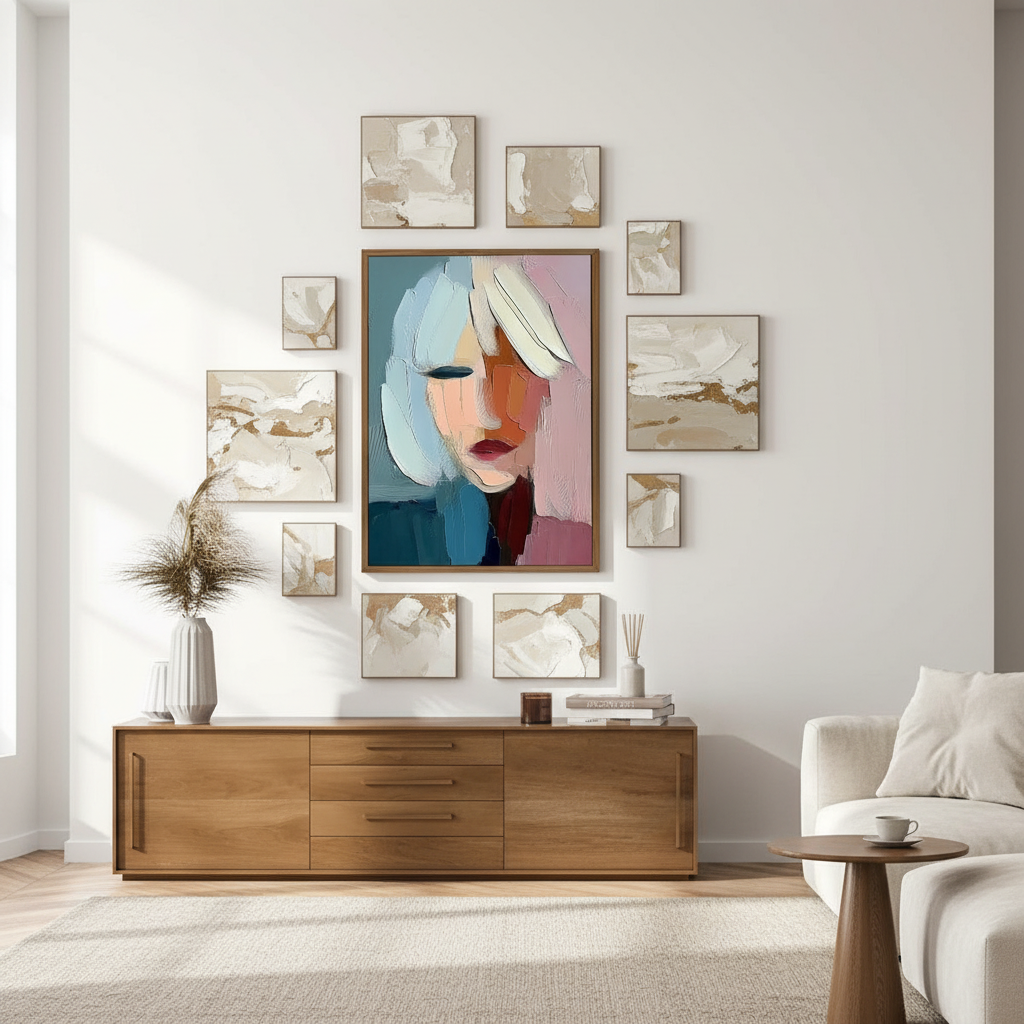
The 60/40 Rule: Balancing Visual Weight
Asymmetry is not the same as chaos. To achieve a "camera-ready" look that provides social validation, you must maintain visual control. Professional gallery curators often rely on the 60/40 Rule of Asymmetrical Balance.
- The Dominant Element (60%): This is your anchor piece. It should occupy roughly 60% of the total visual weight of the arrangement. Usually, this is the largest canvas or the one with the boldest color palette.
- The Secondary Elements (40%): These are the smaller or more neutral pieces that fill the remaining space. Their job is to provide rhythm and "stagger" the height to prevent a monolithic appearance.
Logic Summary: Visual Weight Modeling Our analysis of asymmetrical arrangements assumes a "center-of-gravity" model. We treat each canvas as having a "weight" determined by its surface area multiplied by its color saturation. For a successful display, the "weighted center" of the 40% group should counterbalance the 60% anchor across an invisible vertical axis.
Practical Spacing Heuristics
A frequent mistake we observe in residential installations is the "ladder effect"—placing pieces at equal vertical intervals. This looks mechanical and robs the room of its organic feel. Instead, follow these professional benchmarks:
| Parameter | Recommended Value | Rationale |
|---|---|---|
| Centerline Height | 57–60 inches from floor | Standard human eye level; provides a consistent anchor. |
| Vertical Stagger | 4–8 inches | Creates enough offset to be intentional without feeling disjointed. |
| Horizontal Spacing | 2–3 inches (50–75mm) | Optimal range for viewer retention and perceived cohesion. |
| Diagonal Path | Invisible 15–30 degree slope | Connects disparate pieces into a single unified "movement." |
According to data from Frame Calculator, spacing wider than 4 inches (100mm) often leads to a 22% decrease in viewer engagement because the brain stops seeing the pieces as a single collection.

Technical Integrity: Why the Medium Matters
When you commit to a staggered, asymmetrical display, you are often highlighting the physical edges and textures of the canvases. This is where the technical quality of the art becomes paramount. If you are investing in a modern, gallery-style look, the materials must support that aesthetic long-term.
The VOC and Air Quality Factor
For homeowners with young children or health sensitivities, the "off-gassing" of new art is a legitimate concern. Aalto University experiments have shown that coatings on wood and canvas can emit volatile organic compounds (VOCs). However, high-quality water-based acrylics—often used in modern hand-painted murals—emit significantly lower toxins during the curing process compared to traditional oil solvents like turpentine.
Furthermore, the EPA warns that indoor air pollution is often more concentrated than outdoor air. Choosing low-VOC, LEED-compliant pigments ensures that your art installation doesn't compromise your home's air quality.
Lightfastness and Longevity
Asymmetrical arrangements often spread art across larger wall sections, potentially exposing some pieces to direct sunlight from windows. To prevent the "deathly fade" seen in inferior prints, professional artists adhere to ASTM D4303 standards. This protocol uses xenon-arc tests to simulate years of indoor light exposure.
We often see a phenomenon called Support Induced Discoloration (SID), where water-soluble impurities in the canvas are drawn into the paint layer, causing yellowing. As noted by Golden Artist Colors, this typically happens with transparent acrylic mediums thicker than 1/16 inch. When selecting pieces for your staggered wall, ensure the artist has used proper sealing techniques to prevent this chemical degradation.
Curation Strategies for Specific Spaces
The "staggered height" approach isn't universal; it must be adapted to the architecture of the room.
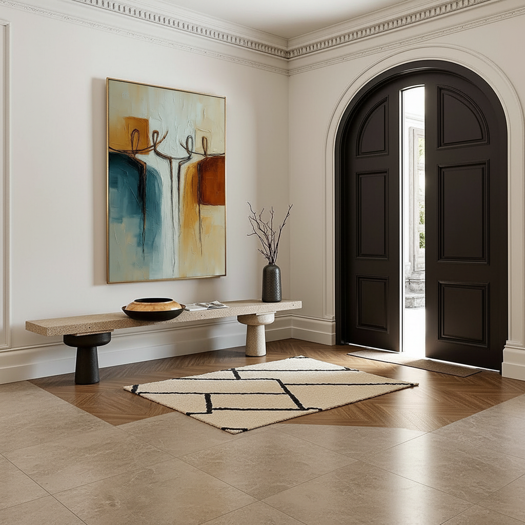
1. The Foyer: The First Impression
In a foyer, art often sits above a bench or console. This is the perfect place to implement Vertical Stacking. By staggering two medium-sized canvases vertically, you lead the visitor's eye upward, making the entryway feel grander. Use a 4-inch stagger to create a sense of climbing energy.
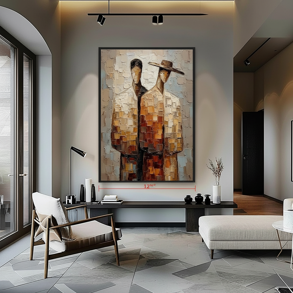
2. The Living Room: The Social Anchor
Large living rooms with open plans benefit from Scaling Large Acrylic Canvases. Here, the asymmetrical flow should follow the "invisible diagonal line." Start with your largest piece at the 57-inch centerline and stagger secondary pieces 6 inches above or below that line as you move toward the seating area.
3. The Powder Room: Immersive Escapism
A rising trend for 2026, highlighted by the NKBA 2025 Kitchen & Bath Industry Awards, is wrapping murals entirely around small spaces. In a powder room, staggered heights can be used to "break" the corners of the room, making a cramped space feel like an immersive art installation.

The Economic Upside: Art as a Value Driver
While many homeowners choose staggered heights for the "social validation" of a modern home, there is a hard economic argument for custom, hand-painted art. A study by the Royal Society using the CAR model found that neighborhoods with higher "art" geo-tags saw significantly higher relative house price gains.
For those looking to sell, "creative placemaking"—such as a well-curated wall of original art—can reverse feelings of "blight" in older properties and make them attractive to high-net-worth buyers. According to the Urban Institute, high-quality visual art installations are one of the most cost-effective ways to boost property sales prices and generate foot traffic in commercial settings.
Avoiding the "Chaos Trap"
The primary risk of asymmetrical sizing is that it can easily devolve into a cluttered mess. To avoid this, we recommend the following "Safety Check" before hammering any nails:
- The Floor Mock-up: Lay your canvases on the floor in front of the target wall. This allows you to test the 60/40 balance without damaging the plaster.
- The Anchor First: Always hang the largest, "dominant" piece first. Every other piece should be positioned in relation to this anchor.
- Consistency in Framing: If the heights and sizes are varied, keeping the frame style consistent (e.g., all thin black gallery frames) provides the "connective tissue" that holds the composition together.
- Mind the "Breathing Room": While 2-3 inches is the standard, ensure that no two pieces of similar height are adjacent. This prevents the "mechanical rhythm" that asymmetry is designed to replace.
A Modern Standard for the Authentic Home
As we look toward 2026, interior design is moving toward "understated elegance" where texture is the soul of the room. Zillow search data shows a 21% rise in mentions of "artisan craftsmanship" and a 15% rise in "whimsy" (PA Realtors). Staggered heights and asymmetrical sizing are the perfect vehicles for this new aesthetic.
By embracing the imperfections of hand-painted art and the dynamic movement of irregular layouts, you move beyond mere "decorating." You are creating a space that reflects the complexity and authenticity of the people living within it. Whether it is a panoramic mural in a powder room or a carefully staggered gallery in the foyer, the goal remains the same: to turn a static wall into a living conversation.
Disclaimer: This article is for informational purposes only. When hanging heavy canvases, always ensure you use appropriate wall anchors and consult a professional installer for large-scale projects. For health-related concerns regarding paint fumes or VOCs, please consult the manufacturer's safety data sheets (SDS) or a qualified environmental health professional.
Sources
- Marketplace: The Expensive Art Market Struggles
- Columbia University: Human-Made vs. AI Art Study
- Royal Society: Quantifying the Link Between Art and Property Prices
- ASTM International: Standard Test Methods for Lightfastness
- EPA: Indoor Air Quality and Low-VOC Paints
- NKBA: Kitchen & Bath Design Industry Awards 2025
Leave a comment
This site is protected by hCaptcha and the hCaptcha Privacy Policy and Terms of Service apply.