The Luxury of Less: Reclaiming the Large Room
Walking into a voluminous, high-ceilinged room often triggers a paradoxical reaction. While we crave space, an expansive, empty wall can feel less like a luxury and more like a cold, institutional void. For the modern homeowner—those seeking a camera-ready aesthetic that balances designer sophistication with a lived-in soul—the instinct is often to "fill" the silence. We buy larger rugs, more chairs, and increasingly massive art pieces.
However, the most sophisticated interiors don't rely on more "stuff." They rely on the intentional management of what designers call negative space. In the current art market, we are seeing a significant shift in how these spaces are curated. According to Marketplace, high-end auction sales for vanity pieces plummeted 44% year-over-year in 2024. Buyers are retreating from purely financial art assets and returning to "real application value"—pieces that provide emotional resonance and spatial harmony rather than just a price tag.
Using negative space as a deliberate design element allows a room to breathe. It transforms a wall from a "problem to be solved" into a canvas for asymmetrical curation, creating a dynamic energy that symmetrical, "centered" arrangements often lack.

The Psychology of the Void: Why Empty Space Matters
The way we perceive a room is deeply rooted in our neurological response to visual stimuli. It isn't just about "looking pretty"; it’s about how the environment regulates our internal state. A systematic review of 85 records published by NCBI shows that passive art viewing consistently activates the medial prefrontal cortex (mPFC) and the amygdala, optimizing our emotional regulation circuits.
When a room is overcrowded, the brain suffers from cognitive fatigue. Conversely, when negative space is used correctly, it acts as a "visual palate cleanser." Research from the University of Pennsylvania (UPenn) found that 73% of individuals reported significant mood improvements when exposed to environmental artworks that respected spatial balance.
However, there is a fine line. Excessive, unguided negative space in large rooms can trigger "institutional anxiety," a sense of isolation that makes a home feel like a gallery or a hospital corridor. The goal of spatial harmony is to find the "active void"—space that feels intentional rather than forgotten.
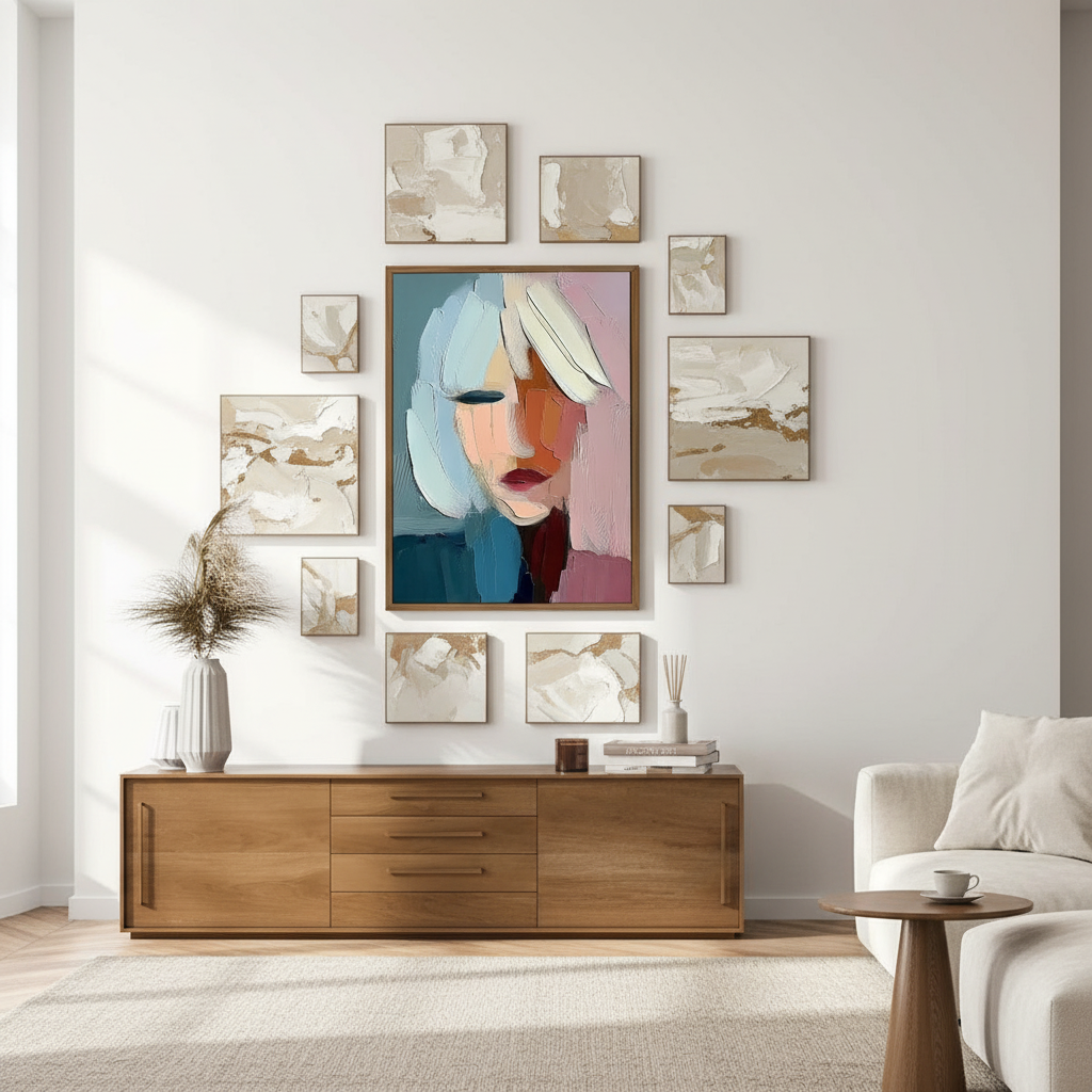
The 60/40 Heuristic: A Designer’s Framework for Proportion
In our collaborations with interior designers on large-scale residential projects, we’ve observed that the most common mistake is treating negative space as "wasted" area. To combat this, practitioners often use a 60/40 ratio as a foundational heuristic.
The Spatial Balance Model
This model suggests that 60% of a wall's visual field should be "filled" (via art, furniture, or architectural features), while 40% remains as negative space. However, this isn't a rigid law. As ceilings climb, the ratio must evolve.
Modeling Note (Scenario Analysis): Our spatial balance recommendations are based on deterministic parameterized modeling of common residential room volumes. This is a design heuristic, not a controlled laboratory study.
Parameter Standard Room Grand Volume Unit Rationale Ceiling Height 8–9 10–14 Feet Industry standard vs. Luxury height Target Fill Ratio 60% 50% Percentage Higher ceilings handle more "void" Negative Space 40% 50% Percentage Prevents "clutter" in large volumes Art-to-Furniture Width 70% 75% Percentage Anchors the visual weight Observation Period 48 72 Hours Time needed to assess light shifts
For rooms with ceilings over 10 feet, we recommend moving toward a 50/50 ratio. The verticality of the room itself becomes a "piece" of the design. A key rule of thumb we use: measure your largest furniture piece first (usually the sofa or console), then ensure your art arrangement occupies at least 70% of that width. If the art is too small, it creates the "lost art" problem—where a beautiful piece looks like a postage stamp on an envelope.

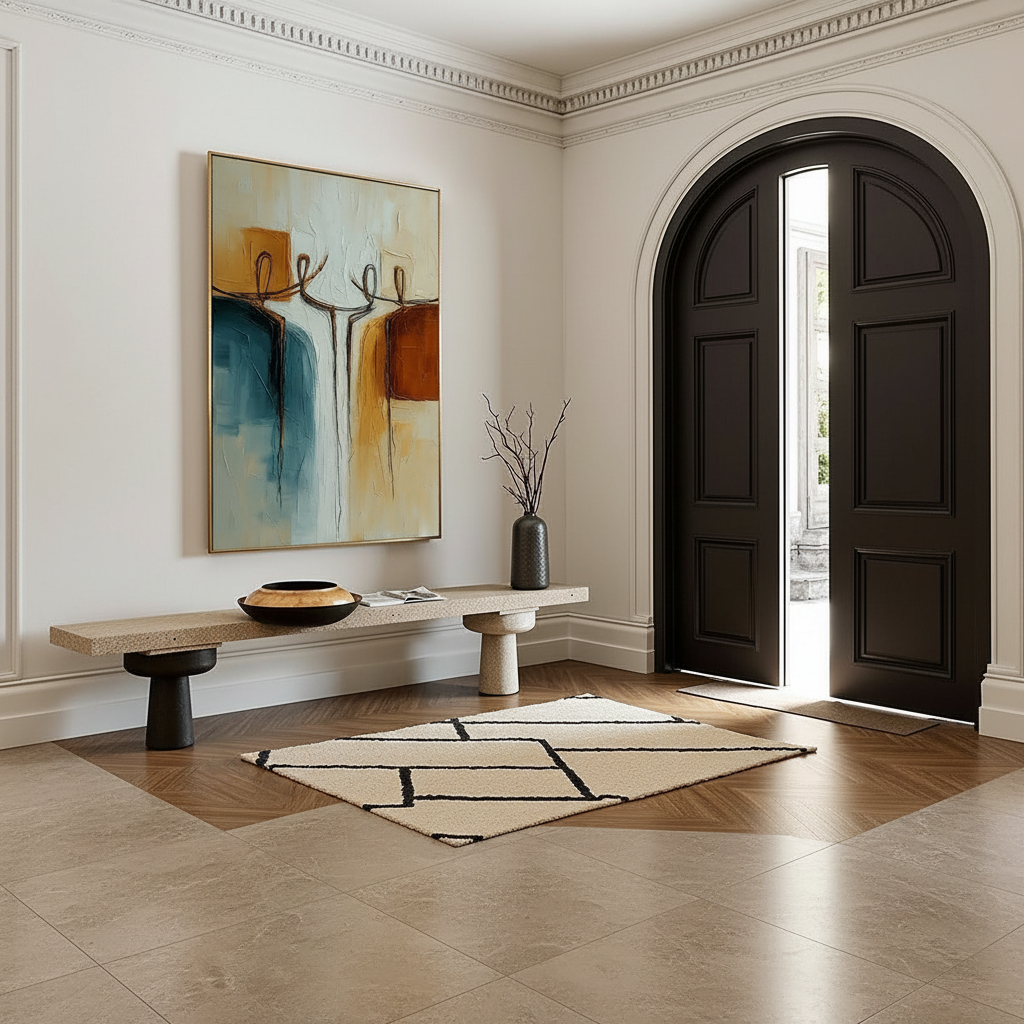
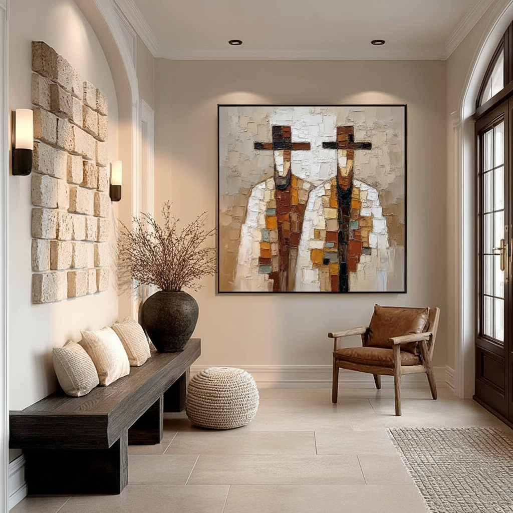
Asymmetrical Curation: Creating Dynamic Energy
While formal symmetry (placing one large piece exactly in the center) provides stability and a sense of tradition, it can sometimes feel static or "safe." Asymmetrical curation—placing art off-center or using clusters with varied spacing—introduces a contemporary energy that feels curated over time rather than "purchased as a set."
The Logic of Asymmetry
Asymmetry relies on "visual weight" rather than literal measurement. A large, dark-toned painting on the left can be balanced by a smaller, highly textured piece on the right, provided there is enough negative space between them to let the eye travel.
This approach aligns with the Rule of Thirds, a principle often used in photography and now dominant in high-end interior trends for 2026. According to Design State of Mind, 2026 trends are leaning toward "understated elegance" where texture is the soul of the room. Asymmetrical layouts allow these textures—the heavy impasto of a palette knife or the weave of a canvas—to catch the light at different angles throughout the day.
Human-Made vs. AI: The Value of the "Essential Identity"
As we navigate the rise of digital decor, the "human touch" has become a luxury commodity. A landmark study by Columbia University confirmed that consumers value art labeled as "AI-generated" 62% lower than authentic, human-created art.
Why? It comes down to what University of Chicago researchers call "essential identity." Digital prints and NFTs lack the physical soul of the artist. A hand-painted mural or a large-scale canvas retains the micro-topography of the pigment—the mm-scale texture that Optical Microprofilometry proves is crucial to our aesthetic satisfaction. When you stand in a large room, your eyes subconsciously seek these tactile "reliefs." A flat print in a large space often feels "thin," whereas a hand-painted piece with physical depth "holds" the wall.
Biophilic Design: Healing Through Large-Scale Art
For homeowners looking to reduce stress, the content of the art is as important as its placement. Biophilic design—integrating natural landscapes and organic forms—has been shown to produce the same stress-reduction effects in the brain as being outdoors.
The World Health Organization (WHO) scoping review of over 3,000 studies confirms that art interventions effectively alter clinical indicators for mental health. In a large living room, a nature-themed mural or a series of organic, textured abstracts can act as "public health infrastructure" for the home, accelerating healing and sparking creativity.

The Technical Reality: Safety and Material Integrity
When dealing with large-scale art, especially murals or oversized canvases, air quality becomes a critical concern. Many homeowners are unaware that the "new art smell" can be a cocktail of volatile organic compounds (VOCs).
The Indoor Air Quality (IAQ) Promise
The EPA warns that indoor air pollution can be significantly higher than outdoor levels. For large-scale installations, using low-VOC or zero-VOC paints is a prerequisite.
- Titanium White vs. Lead White: While lead white was historically prized for its opacity, it is a potent neurotoxin. Today, Titanium Dioxide dominates 90% of the market due to its chemical inertness and superior hiding power.
- The Solvent Myth: Many "odorless" mineral spirits are still hazardous. Princeton University EHS guidelines warn that chronic inhalation of turpentine vapors can lead to brain damage.
We recommend that homeowners verify that their artists use water-based acrylics or walnut-oil-based paints, which replace toxic solvents with eco-friendly alternatives. This is particularly vital in homes with children, where heavy metal migration from pigments like burnt umber (which can contain high concentrations of zinc) poses a respiratory risk.
The Economic Case for Large-Scale Art
Investing in high-quality, hand-painted art isn't just an aesthetic choice; it’s a financial one. Data from the Royal Society found that neighborhoods with higher "art" geo-tags saw greater relative house price ranking gains.
In the commercial sector, the ROI is even more pronounced. Americans for the Arts reports that government and private investments in the arts yield a 7:1 ROI. For a homeowner, a well-executed large-scale mural or custom canvas acts as a "permanent physical billboard" for the property's value, distinguishing it in a crowded real estate market.
Implementation: From Paper Templates to Permanent Curation
Before committing to a large-scale piece, we suggest a low-risk testing phase.
- Paper Templates: Cut brown craft paper to the size of your proposed art. Tape them to the wall using painter's tape.
- The 72-Hour Rule: Leave the templates up for at least three days. Observe how the light from your windows hits the space at 10 AM, 3 PM, and 8 PM. Light changes can make a piece feel overwhelming in the morning but "lost" in the evening shadows.
- The Walk-Through: Walk into the room from every entrance. Does the "visual weight" of the template pull you into the room, or does it feel like an obstacle?
By treating negative space as a partner in your design rather than an enemy to be defeated, you create a home that feels both expansive and intimate—a true reflection of sophisticated, modern living.
YMYL Disclaimer: This article is for informational purposes only and does not constitute professional medical, health, or financial advice. The chemical safety data provided is based on general industry standards and should be verified with specific product manufacturers. Always consult with a qualified professional regarding indoor air quality or the installation of heavy art pieces in residential settings.
Sources
- Marketplace: The expensive art market continues to struggle
- Columbia Business School: Human-Made vs. AI Art Study
- UPenn: Visual Art in the Built Environment Review
- NCBI: Neurological mechanisms of creative arts
- WHO: Scoping Review on Arts and Health
- EPA: Indoor Air Quality and Low-VOC Paints
- Royal Society: Quantifying the link between art and property prices
- Americans for the Arts: Arts & Economic Prosperity III
Leave a comment
This site is protected by hCaptcha and the hCaptcha Privacy Policy and Terms of Service apply.