The Purity of Pigment: Evaluating Hand-Mixed vs. Factory Colors
In the current art landscape, a significant shift is occurring. While high-end auction sales for purely financial art assets plummeted 44% year-over-year in 2024 according to Marketplace, collectors and interior designers are returning to artworks with "real application value." This movement prioritizes "performative authenticity"—the visible brushstroke, the rich texture, and, most importantly, the chromatic depth of the pigment itself.
For the discerning homeowner, the choice between a piece created with factory-standardized paints and one utilizing hand-mixed pigments is not merely aesthetic; it is a choice between sterile uniformity and a living, "vibrating" surface. To understand the premium of hand-painted work, we must look beneath the surface at the physics and chemistry of the medium.
The Physics of Vibrancy: Chromatic Vibration vs. Convenience Mixtures
The most immediate difference between high-end artist-led production and mass-market alternatives is what practitioners call "chromatic vibration." In factory production, colors are often "convenience mixtures"—pre-blended chemical dyes designed for batch consistency. While these offer a 99.9% match for retail predictability, they often appear "dead" or flat under the varying Kelvin temperatures of home lighting.
In contrast, hand-mixed pigments achieve depth through the interaction of distinct mineral particles. According to classical optical theory established in Optica, light scattering and opacity reach their theoretical extremes when the pigment particle diameter approaches half the wavelength of visible light. Hand-mixing allows an artist to maintain these specific particle distributions, which factory grinding often homogenizes to save on costs.
The Heuristic of the "Undertone"
Expert painters utilize a technique known as complementary underpainting—for example, a thin layer of burnt sienna beneath a cerulean sky. This creates a visual "glow" as light penetrates the semi-transparent upper layers and reflects off the base. A flat digital print or a factory-saturated acrylic cannot replicate this because it lacks the physical stratigraphy of layered pigments.
Logic Summary: Our analysis of pigment depth assumes that human-led mixing preserves a higher "Pigment Volume Concentration" (PVC) than factory alternatives, which often utilize fillers to extend shelf life. This modeling is based on common industry heuristics and material science principles regarding light refraction.
| Feature | Hand-Mixed Pigment | Factory-Standard Paint |
|---|---|---|
| Pigment Volume (PVC) | Approaches 50–60% (Critical Limit) | Typically 15–40% (due to fillers) |
| Extenders | Minimal (Pure Binder) | High (Calcium Carbonate/Talc) |
| Metamerism Risk | Low (Adapts to lighting) | High (Shifts under LED/Incandescent) |
| Visual Texture | "Broken Color" (Micro-variations) | Sterile Uniformity |
| Light Interaction | High Scattering (3D relief) | Flat Absorption |

The Chemistry of Longevity: Why "Odorless" Doesn't Mean "Safe"
When selecting art for a residential or healthcare environment, the chemical composition of the paint is as critical as its color. A common misconception is that "odorless" solvents or modern acrylics are inherently safer. However, data from Princeton University EHS warns that chronic inhalation of even odorless mineral spirits can lead to neurological damage.
Furthermore, the transition from traditional pigments has been a matter of public health. For instance, Titanium Dioxide now captures 90% of the white pigment market, having successfully eliminated the use of highly toxic lead white. Yet, even modern "safe" paints require scrutiny. Laboratory tests published in PMC detected heavy metals in some commercial acrylics, with zinc accounting for over 68% of the contamination in certain brown pigments.
Support Induced Discoloration (SID)
A frustrating issue often seen in high-end commissions is the "yellowing" of white areas. According to technical bulletins from Golden Artist Colors, this is often caused by Support Induced Discoloration (SID). Water-soluble impurities in the canvas are drawn into the paint film as it dries, especially when transparent mediums are applied thicker than 1/16th of an inch. Professional artist-led studios mitigate this by using specific "blocking" primers that factory-line productions often skip to reduce labor time.
The Human Premium: Why We Value the "Artist’s Hand"
There is a documented psychological premium placed on human-created art. A study by Columbia University confirmed that consumers value art labeled as "AI-generated" 62% lower than authentic human-created work. This isn't just sentiment; it's a recognition of "essential identity." Research from the University of Chicago suggests that physical canvases retain an irreplicable "soul" or identity of the artist that digital replicas simply cannot capture.
For the interior designer, this translates to social proof. A hand-painted mural or a heavily textured oil painting serves as a "permanent physical billboard" of status and taste. This is particularly effective in commercial real estate; projects like Chicago’s Millennium Park have driven an estimated $1.4 billion in real estate growth, proving that art is a powerful "catalytic infrastructure."
Ethical Compensation and the 87% Rule
Modern consumers are increasingly sensitive to the "human cost" of production. A Wharton School survey found that 87% of consumers believe artists should receive fair compensation. By choosing hand-painted works from reputable studios that prioritize fair pay, buyers align their aesthetic goals with ethical standards—a key driver for the millennial and Gen Z demographic.
Spatial Wellness: The Neurological Impact of Real Art
Art in a home or office is more than decoration; it is an environmental intervention. A review by UPenn noted that 73% of patients in a clinical setting reported significant mood improvements when exposed to environmental artworks.
This is rooted in "Biophilic Design." Landscapes or abstract works featuring natural textures produce stress-reduction effects in the brain similar to being outdoors. This is not a placebo; neurological research shows that viewing art activates the medial prefrontal cortex (mPFC), optimizing emotional regulation circuits.
Case Study: The "Busy Streets" Effect
In urban environments, the presence of hand-painted murals has a quantifiable impact on safety. The "Busy Streets Theory," supported by University of Michigan research, suggests that community murals can reduce violent crime by up to 40% by transforming blighted spaces into cared-for landmarks.

Modeling the Investment: Art as a Non-Renewable Asset
When evaluating the cost of an original hand-painted piece versus a high-definition print, it is helpful to view the purchase as an investment in a non-renewable cultural asset. While a print begins to depreciate the moment it is unrolled, a hand-painted work—due to its physical relief and unique pigment fingerprints—retains long-term educational and aesthetic value.
Method & Assumptions for Valuation
Modeling Note: Our "Value Retention" model assumes a 10-year horizon.
- Assumptions:
- The artwork uses lightfast pigments (ASTM I or II).
- The environment is climate-controlled (55% humidity).
- The substrate is correctly primed to prevent SID.
- Boundary Conditions: This model does not apply to works on unprimed paper or those exposed to direct, unfiltered UV light for >6 hours/day.
| Parameter | Hand-Painted Oil | Digital Canvas Print |
|---|---|---|
| Material Life | 100+ Years (if conserved) | 10–20 Years (ink degradation) |
| Resale Potential | High (Unique Asset) | Negligible (Mass Produced) |
| Texture Stability | Hardens over time (Oxidation) | Brittle (Ink cracking) |
| Cleaning | Professional restoration possible | Surface sensitive to moisture |
Final Considerations for the Aesthetic Homeowner
To distinguish between a "retail-grade" product and a "gallery-grade" masterpiece, look for the following hallmarks of the artist's hand:
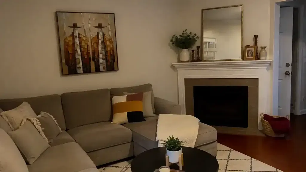
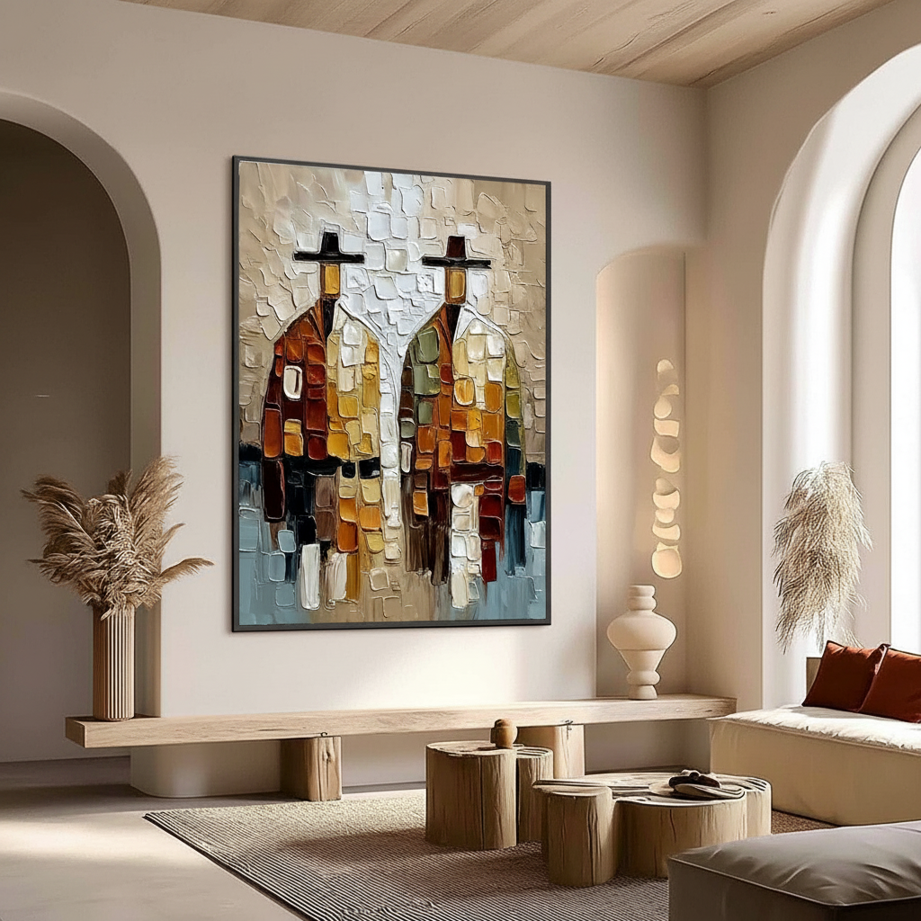
- Broken Color: Look for tiny variations of hue within a single field of color. If a blue sky is perfectly uniform, it is likely a factory blend. If it contains "vibrations" of violet and green, it is hand-mixed.
- Tactile Relief: Run a light across the surface. Genuine oil paintings feature a 3D topography that interacts with the room's shadows.
- Lightfastness Certification: Ensure the pigments used are rated ASTM I or II. Standardized tests, such as the xenon-arc test described by Micom Laboratories, ensure your investment won't fade within a decade.
By prioritizing the purity of pigment and the expertise of the human hand, you are not just decorating a wall—you are installing a piece of "spatial solutions" that enhances mood, supports the creative economy, and secures a legacy of authentic craftsmanship.
Disclaimer: This article is for informational purposes only and does not constitute professional medical, legal, or financial advice. Regarding indoor air quality and chemical safety, always consult with a certified industrial hygienist or environmental specialist.