Beyond the Frame: The Shift from Auction Vanity to Architectural Utility
The high-end art market is undergoing a structural correction. In 2024, sales of auction pieces exceeding $10 million plummeted by 44% year-over-year, according to Marketplace.org. This retreat from purely financial art assets indicates a profound shift: homeowners and designers are moving away from "vanity" acquisitions toward art with real application value—pieces that integrate seamlessly into the architectural fabric of the home.
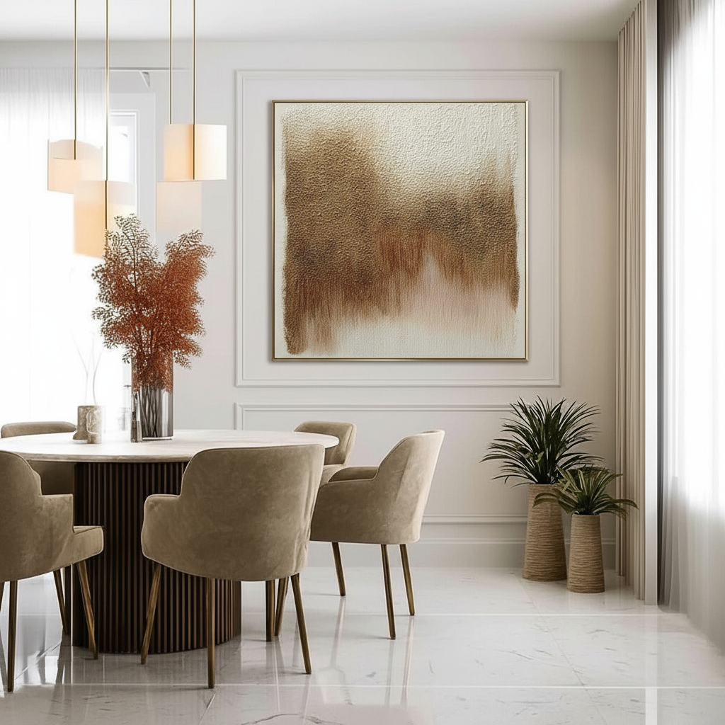
In formal dining rooms, where wainscoting and decorative molding define the character of the space, the challenge is no longer just finding a beautiful painting; it is about technical scaling. A mismatch in proportions doesn't just look "off"—it disrupts the architectural profile of the room, creating visual crowding and distracting shadow lines.
We have observed through years of design practice that 'decision safety' in art procurement stems from understanding the mathematical relationship between the canvas and the wall's millwork. This guide provides the technical framework to ensure your hand-painted oils feel like an intentional extension of the architecture, not an afterthought.
The Geometry of Balance: Technical Rules for Paneled Walls
Wainscoting creates a "frame within a frame." Standard art-hanging rules, such as the common advice to center a piece 57 to 60 inches from the floor, often fail in these environments. Above wainscoting, art must be positioned relative to the chair rail or the specific panel boundaries, creating a new baseline that disregards the floor entirely.
The 2.5-Inch Buffer Rule
The most frequent mistake we see is "visual crowding." To prevent the art from feeling cramped, we implement the 2.5-inch buffer rule. This mandates maintaining at least 2.5 inches of visible wall space between the art frame and the wainscoting molding on all sides. This gap allows the eye to distinguish between the art and the architecture, preventing the two from merging into a cluttered mess.
The 60-75% Width-to-Panel Ratio
For rectangular panels, the "sweet spot" for width is 60-75% of the panel’s interior width. According to research insights on art scaling, this range provides enough presence to anchor the wall without overwhelming the panel. If you drop below 50%, the art appears "lost"; if you exceed 80%, the buffer zone disappears, and the piece feels suffocated.
The 6/7ths Rule for Verticality
In tall, vertical panels, art often suffers from a "sinking" effect if centered geometrically. We use the 6/7ths rule: the top of the art should sit at the 6/7ths height mark of the panel. This ensures the piece sits at a comfortable optical eye level for a standing viewer while maintaining a balanced relationship with the ceiling molding.

Logic Summary: Our proportional guidelines are derived from architectural scenario modeling. We assume a standard residential ceiling height of 9-10 feet and a chair rail height of 30-36 inches. These heuristics prioritize optical balance over simple geometric centering (not a controlled lab study).
| Parameter | Value / Range | Unit | Rationale |
|---|---|---|---|
| Buffer Zone | 2.5 - 4.0 | Inches | Prevents visual crowding and shadow line interference |
| Width Ratio | 60 - 75 | % of Panel | Standard aesthetic balance for rectangular features |
| Height Anchor | 6/7ths | Ratio | Prevents 'sinking' effect in tall vertical panels |
| Frame Profile | < 75% | Depth | Must not exceed wainscoting projection |
| Eye Level | 58 - 62 | Inches | Standard optical center for seated/standing viewing |
Material Integrity: Why Hand-Painted Oils Command a Premium
In an era of digital replication, the "human premium" is more quantifiable than ever. A study by Columbia University confirmed that consumers value art labeled as "AI-generated" 62% lower than authentic human-created art. This isn't just sentiment; it is a response to the physical complexity of the medium.
The Science of Micro-Texture
Authentic oil paintings possess a mm-scale microtopography that prints cannot replicate. Research published in MDPI Sensors using optical microprofilometry proves that the micro-physical texture of paint is crucial to its aesthetic impact. The way light scatters across the physical relief of oil pigments creates a depth of color that changes as you move through the room.
Lightfastness and Longevity
When investing in art for a high-visibility dining room, longevity is a technical requirement. We look to ASTM D4303 standards, which quantify how pigments react to indoor illumination. High-end hand-painted oils utilize pigments that have undergone xenon-arc testing to ensure they won't fade behind filtered glass. In contrast, many retail-grade prints use dyes that begin to shift in color within 5-10 years of UV exposure.

Environmental Health and the "Clean Art" Standard
Formal dining rooms are sensitive environments. The materials used on your walls directly impact indoor air quality (IAQ). We prioritize pigments and binders that meet modern safety thresholds, moving beyond the toxic history of the art world.
VOC Emissions and Curing
Traditional oil painting often relied on turpentine and lead-based driers. Today, we utilize advanced formulations. A study by Aalto University demonstrated that coatings on moisture-controlled substrates emit significantly lower volatile organic compounds (VOCs) during the curing process than traditional industrial paints. For clients seeking LEED or WELL certification, using low-VOC, artist-grade acrylics or walnut-oil-based paints is often a prerequisite, as noted by the EPA.
Biophilic Benefits
Beyond air quality, the subject of the art affects occupant wellness. The University of Central Arkansas highlights that biophilic design—art featuring natural landscapes—produces stress-reduction effects in the brain similar to real outdoor exposure. In a dining environment, this translates to improved mood and social cohesion. A review by the University of Pennsylvania found that 73% of patients in clinical settings reported significant mood improvements when exposed to nature-themed murals.
The Economic Case: Art as Property Infrastructure
While the $65 billion global art market (Art Basel/UBS 2024) shows stability at the macro level, the real "win" for homeowners is the localized property value.
The Correlation with Property Prices
Data analysis by the Royal Society found a direct link between "art" geo-tags and relative house price gains. High-quality, custom-scaled art signals a level of craftsmanship and "artisan luxury" that search data from Zillow (up 21% for "artisan craftsmanship") confirms buyers are actively seeking.
Investing in a hand-painted mural or a large-scale oil piece is not just a decorative choice; it is the installation of a cultural heritage asset. Unlike furniture, which depreciates, original art—especially when integrated into the architectural features of a home—acts as a "permanent physical billboard" for the property's value.
Implementation Guide: Avoiding the "Gotchas"
To achieve a gallery-grade installation within wainscoting, we recommend a disciplined technical approach.
1. The Depth Check
The art frame should ideally be lower-profile than the wainscoting's molding. If the frame projects further than the chair rail, it disrupts the room's architectural profile and creates awkward shadows. Aim for a frame depth that is 75% or less of the molding's projection.
2. The Spacing Rule for Triptychs
If you are placing multiple pieces within a single large panel, the standard 2-5 inch spacing rule must be tightened. To maintain visual unity against the competing grid of the wainscoting, we recommend 1-2 inches of spacing between pieces. This ensures the triptych reads as a single focal point rather than scattered elements.
3. Avoiding Support Induced Discoloration (SID)
For large canvases, ensure the artist has properly primed the substrate. As noted by Golden Artist Colors, water-soluble impurities in cotton or linen can be drawn out during the drying of transparent mediums, causing "Support Induced Discoloration." This manifests as yellowing or browning over time—a catastrophic failure for a high-value installation.

Architectural Harmony and the Future of Curation
The shift toward "real application value" in the art market is a win for the design-conscious homeowner. By prioritizing technical scaling and material integrity over auction-house hype, you create a space that is both aesthetically superior and psychologically grounding.
The global creative economy now adds $1.2 trillion in value to the U.S. GDP alone (NEA 2025). As this industry grows, the ability to bridge the gap between "fine art" and "architectural feature" will become the hallmark of sophisticated interior design. By following these proportional rules, you ensure your dining room remains a benchmark of understated elegance.
Method & Assumptions (Modeling Proportions)
- Modeling Type: Deterministic parameterized model for residential interior aesthetics.
- Boundary Conditions: These rules apply to standard rectangular or square wainscoting panels. They may require adjustment for arched niches or non-standard geometric molding.
- Assumptions: Lighting is assumed to be overhead or wall-sconced, creating shadow lines that the 2.5-inch buffer is designed to mitigate.
| Parameter | Value | Unit | Source Category |
|---|---|---|---|
| Panel Fill Ratio | 0.60 - 0.75 | % | Design Heuristic |
| Horizontal Buffer | 2.5 | Inches | Practical Field Rule |
| Frame Depth Limit | 0.75 | Ratio of Molding | Architectural Continuity |
| Vertical Top Anchor | 0.85 | Ratio (6/7ths) | Optical Center Theory |
| Color Difference | < 2.0 | Delta E | ASTM D4303 Standard |
Disclaimer: This article is for informational purposes only. When installing heavy artwork, always consult with a professional installer to ensure wall stability and safety. For health-related concerns regarding paint fumes or pigments, consult a qualified environmental health professional.
Sources
- Marketplace: The expensive art market continues to struggle
- Columbia Business School: Human-Made vs. AI Art Study
- Royal Society: Quantifying the link between art and property prices
- ASTM D4303: Standard Test Methods for Lightfastness
- EPA: Indoor Air Quality and Low-VOC Paints
- University of Central Arkansas: Biophilic Design and Well-being
- NEA: Arts and Cultural Industries Economic Impact 2025
- Tate: Conservation Concerns for Acrylic Emulsion Paints


