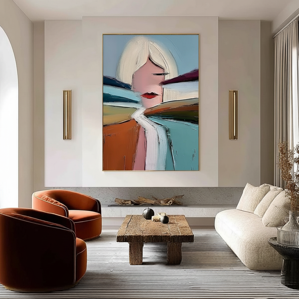
The 75% Rule: Scaling Art to Your Living Room Sofa
The sofa is the undisputed anchor of the living room. It defines the room's layout, dictates the flow of movement, and serves as the primary stage for social interaction. However, even the most luxurious sofa can feel unmoored if the wall space above it is poorly utilized. A common frustration we see in our design consultations is "floating art syndrome"—where a beautiful piece looks lost, dwarfed by the furniture below it, or conversely, feels so massive that it "squashes" the seating area.
To solve this, professional designers rely on a specific heuristic: The 75% Rule. This guideline suggests that the total width of your artwork (or gallery arrangement) should be approximately 75% of the width of the sofa. While often presented as an aesthetic law, our research into the origin of scale proportions suggests this rule likely emerged from commercial standardization needs. Furniture retailers and art sellers developed these ratios to simplify customer decision-making, creating a "safe" baseline that works in most residential volumes.
In this guide, we will move beyond the basic math to explore the visual weight, psychological impact, and technical integrity of the art you choose to scale.

The Mechanics of the 75% Heuristic
The 75% rule is a tool for achieving visual balance, ensuring that the sofa and the art are perceived as a single, cohesive unit rather than two competing elements.
How to Calculate Your Ideal Size
- Measure the Sofa Width: Measure from the outer edge of one arm to the other.
- Apply the Ratio: Multiply the width by 0.75. For a standard 84-inch sofa, your ideal art width is approximately 63 inches.
- Define the Range: In practice, we typically recommend a range of 60% to 80%. Going below 60% makes the art look like an afterthought; exceeding 80% risks making the sofa look undersized.
Modeling Note: The Proportional Balance Scenario This model assumes a standard ceiling height of 8 to 9 feet and a sofa with a standard back height.
Parameter Value/Range Unit Rationale Target Width Ratio 0.60 – 0.80 % of Sofa Industry standard for visual anchoring Vertical Placement 6 – 10 Inches Distance from top of sofa to bottom of frame Visual Weight Offset +/- 15 % Adjustment for dark vs. light color palettes Ceiling Clearance > 12 Inches Minimum space required from top of art to ceiling Spacing (Gallery) 2 – 4 Inches Standard gap between individual pieces Boundary Conditions: This model may not apply to L-shaped sectionals where the "visual center" is offset, or to rooms with vaulted ceilings exceeding 12 feet.
Beyond Width: The Impact of Visual Weight and Color
While width is the primary metric, it is not the only factor. The "visual weight" of a piece—how heavy it feels to the eye—can drastically alter how the 75% rule should be applied.
According to insights on scale and proportion in interior design, color psychology creates a 15-20% difference in perceived weight. A dark, moody oil painting appears significantly "heavier" than a light, airy watercolor of the identical size.
- Dark Art: If your piece features deep charcoals, navies, or heavy impasto, consider scaling down toward the 60-65% mark to prevent it from overwhelming the room.
- Light Art: For minimalist or high-key pieces, you can safely push toward 85% of the sofa width. The lack of visual density allows the piece to occupy more physical space without feeling "loud."
Furthermore, the sofa's geometry matters. A low-profile, "leggy" sofa has less visual mass and can be easily overpowered by tall art. Conversely, a deep-seated, bulky velvet sofa requires a piece with significant presence to hold its own. If you are working with an L-shaped sectional, the 75% rule should be applied to the primary seating section rather than the total footprint of the furniture.
The Shift Toward Authentic "Essential Identity"
As the high-end auction market experiences a retreat—with sales of vanity pieces over $10 million plummeting 44% in 2024 according to Marketplace.org—consumers are returning to art with real application value. This shift is driven by a desire for "essential identity."
Research from the University of Chicago indicates that consumers perceive a lack of "soul" in digital replicas and NFTs. In contrast, hand-painted canvases retain an irreplicable connection to the artist. This is supported by a Columbia University study which found that art labeled as "AI-generated" is valued 62% lower than authentic human-created art.
When you select a large-scale piece for your living room, the medium matters as much as the size. A mass-produced print of the "right size" will often feel flat and clinical. A hand-painted mural or canvas, however, offers micro-topography—minute variations in paint thickness—that interact with your room’s lighting. Optical microprofilometry has proven that this mm-scale texture is crucial to aesthetics, providing a tactile richness that digital prints cannot replicate.

Technical Integrity: Pigments, Safety, and Longevity
Scaling art for a living room also means introducing a significant amount of chemical material into your primary living environment. As experts in spatial solutions, we believe that "Expertise" (the E in E-E-A-T) requires a deep dive into the safety and chemistry of the materials you bring home.
The VOC and Air Quality Factor
Indoor air pollution is a critical concern, often exceeding outdoor levels. For homeowners, especially those with children or respiratory sensitivities, the choice of paint is vital. Aalto University research has shown that VOC emissions from painted wood plummet during the curing process, but the initial selection of low-VOC or zero-VOC acrylics is a prerequisite for a healthy home. This is particularly important for large-scale pieces that cover a significant portion of a wall.
Pigment Safety: The Case of Titanium White
When looking at the bright highlights of a painting, you are likely seeing Titanium Dioxide. According to the National Center for Biotechnology Information (NCBI), titanium dioxide dominates 90% of the white pigment market because of its superior hiding power and chemical inertness. It successfully replaced the highly toxic Lead White, which is now strictly restricted under EU REACH regulations.
However, not all modern pigments are risk-free. Cadmium compounds, used for vibrant reds and yellows, are classified as Group 1 carcinogens by the International Agency for Research on Cancer (IARC). While the industry argues that these pigments are safe when trapped in a polymer matrix, Australian officials have used OECD transformation protocols to show that even "stable" pigments can release ions in slightly acidic environments.
Pro Tip: When purchasing large-scale art, look for the ASTM D-4236 label. However, be aware that this only means warning labels comply with regulations, not that the pigment is non-toxic. For maximum safety, we recommend water-based acrylics over solvent-heavy oils, as EPA guidelines warn that art materials do not enjoy the same lead exemptions as common household paints.
The ROI of Art: From Property Value to Mental Health
Investing in the right scale and quality of art isn't just about decor; it's a strategic move for your property and your well-being.
- Property Value: A Royal Society CAR model analysis found a direct link between art and property prices, noting that neighborhoods with higher "art" geo-tags saw greater relative house price ranking gains. Inside the home, "artisan craftsmanship" mentions in real estate listings rose 21% in 2024, according to Zillow data.
- Mental Health and Productivity: The World Health Organization (WHO) has reviewed over 3,000 studies confirming that art interventions effectively alter clinical indicators for mental health. Specifically, biophilic design—art featuring natural landscapes—produces stress-reduction effects in the brain similar to being outdoors.
- The Neurological Mechanism: Passive viewing of art consistently activates the medial prefrontal cortex (mPFC) and the amygdala, optimizing emotional regulation circuits. When art is scaled correctly to your sofa, it creates a "visual sanctuary" that lowers cortisol levels.
Implementation: Gallery Walls vs. Single Statements
If a single large canvas feels too daunting, a gallery wall can fulfill the 75% rule through a collection of smaller pieces.
- The 75% Calculation for Gallery Walls: The total width of the arrangement, including the gaps between frames, should equal 75% of the sofa.
- Spacing Rules: For standard living rooms, maintain 2–4 inches between frames. In large, open-concept spaces, you can expand this to 6–8 inches to match the room's volume.
- The "Anchor" Piece: Even in a gallery wall, one piece should act as the visual anchor, usually placed slightly off-center or at the eye-level "horizon line" (roughly 57-60 inches from the floor).

Troubleshooting Common Scale Errors
In our experience handling returns and design queries, we've identified three "friction points" that frequently lead to dissatisfaction:
- Ignoring the Ceiling Height: While width is the focus of the 75% rule, height is the "silent killer." If the space between the top of your art and the ceiling is less than 12 inches, the room will feel cramped. For homes with low ceilings, horizontal panoramic pieces are often more effective than vertical ones.
- The "Support Induced Discoloration" (SID) Trap: If you choose a large-scale acrylic piece with transparent mediums, be aware of SID. Golden Artist Colors warns that water-soluble impurities in cotton/linen canvases can be drawn out when applying thick layers of medium, causing yellowing. Ensure your artist uses a high-quality primer or "size" to block these impurities.
- The "Hazy" Acrylic Phenomenon: Many advanced art collectors are frustrated when their expensive acrylics turn hazy. This is often caused by PEG-type surfactants migrating to the surface in high humidity. A gentle wipe with a water-based cotton swab—a technique confirmed by the Tate Museum—can restore the clarity.
Final Checklist for Scaling Art to Your Sofa
Before committing to a purchase, use this practical checklist to ensure visual harmony:
- [ ] Width Check: Is the art between 60% and 80% of the sofa's width?
- [ ] Height Check: Is there at least 12 inches of "breathing room" between the art and the ceiling?
- [ ] Visual Weight: Does the color palette complement the sofa's "heaviness"?
- [ ] Authenticity Check: Does the piece offer the physical relief and texture required for long-term satisfaction?
- [ ] Safety Check: Is the paint low-VOC and free from dangerous heavy metals like lead or un-encapsulated cadmium?
By following the 75% rule not as a rigid law, but as a flexible heuristic grounded in visual science and material integrity, you can transform your living room into a balanced, healthful, and aesthetically superior space.
YMYL Disclaimer: This article is for informational purposes only. The discussion of paint toxicity and VOC emissions is based on available research and does not constitute professional medical or environmental safety advice. Always consult with a certified industrial hygienist or medical professional if you have specific health concerns regarding indoor air quality or material exposure.
Sources
- The Art Scale Guide - Ana Salazar Atelier
- The expensive art market continues to struggle - Marketplace
- Human-Made vs. AI Art: Consumer Perception Study - Columbia Business School
- WHO Scoping Review on Arts and Health
- ASTM D4303 Standard Test Methods for Lightfastness
- EPA: Indoor Air Quality and Low-VOC Paints
- Royal Society: Quantifying the link between art and property prices
- Tate: Conservation Concerns for Acrylic Emulsion Paints
- Golden Artist Colors: Stopping Support Induced Discoloration


