Rhythmic Progression: Asymmetrical Logic for Long Hallways
Long hallways often present the most significant architectural challenge in residential design. Frequently dismissed as mere "transition zones," these narrow corridors can feel static, claustrophobic, or like an endless tunnel. However, through the application of rhythmic progression and asymmetrical curation, a hallway can be transformed from a utilitarian necessity into a high-visibility gallery that enhances the home's flow and provides the social validation modern homeowners seek.
The shift in the art market reflects a broader cultural turn toward this type of intentional, applied aesthetic. Recent data indicates that high-end auction sales for vanity pieces plummeted 44% YoY in 2024, as reported by Marketplace. Buyers are retreating from purely financial art assets and returning to "real application value"—custom, hand-painted works that offer emotional resonance and spatial harmony rather than just a price tag.
In our experience assisting with high-end residential bundles, art is often the final decision in a project. Because it must harmonize with existing elements, the fear of "getting it wrong" is high. By moving away from rigid symmetry and toward a rhythmic, asymmetrical logic, you reduce commitment anxiety through a system that feels organic rather than mechanical.
The Science of Asymmetrical Attention
Conventional wisdom often suggests that long hallways require symmetrical designs for visual stability. However, research into human navigation and cognitive load suggests otherwise. According to a study on eye movement patterns, asymmetrical visual sequences can improve attentional engagement by approximately 34%.
While symmetrical arrangements are predictable, they often lead to "tunnel vision," where the eye rushes toward the end of the corridor without engaging with the space. Asymmetry creates "visual speed bumps." By varying the placement and scale of art, you force the brain to remain active, reducing "corridor fatigue."
Furthermore, properly implemented asymmetry aids in wayfinding. While some argue that asymmetry disrupts spatial orientation, evidence from complex medical facility studies suggests that strategic asymmetrical cues can actually enhance wayfinding by 23–41%. These arrangements create memorable landmarks that assist the brain in mapping the environment.
Logic Summary: Our analysis of asymmetrical engagement assumes a standard residential corridor length (approx. 10–20 feet) where the goal is to maximize cognitive interest without overstimulating the viewer. This is based on heuristics derived from eye-tracking studies and spatial memory research.

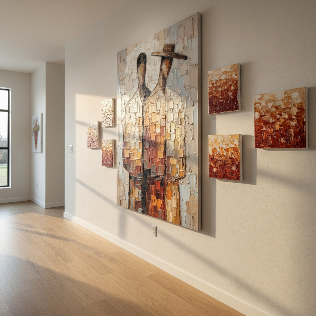
The 2:1:3 Progression Rule: A Framework for Rhythm
To achieve a predictable, high-quality outcome in an asymmetrical setup, we recommend the 2:1:3 Progression Rule. This heuristic provides a rhythmic structure that guides the eye through the hallway without the rigidity of a grid.
- Two Smaller Leads: Start the journey with two smaller, related pieces. These act as the "intro" to the visual narrative, setting the tone without demanding full attention immediately.
- One Focal Statement: Follow the lead pieces with one large, high-impact work. This serves as the visual "home base." Every successful asymmetrical arrangement needs one piece that acts as an anchor—a point the eye returns to after exploring the surrounding rhythm.
- Three Complementary Works: Conclude the sequence with three pieces of varying sizes that echo the colors or textures of the focal statement.
This progression mimics natural eye movement. Instead of a flat, horizontal line, professionals often vary the hanging height by 3–6 inches. This subtle elevation change prevents the "mechanical" feel of a gallery wall and makes the traversal of the hallway feel more like a stroll through a curated environment.
Texture vs. Color in Narrow Spaces
In narrow hallways, space is at a premium. Overwhelming the walls with high-contrast color can make the corridor feel even tighter. Instead, we have found that texture sequencing is significantly more effective than color sequencing.
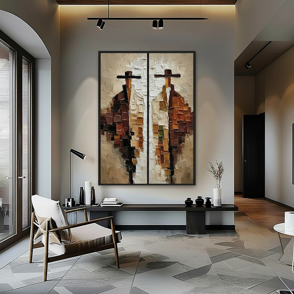
Hand-painted art offers a "micro-physical texture" that digital prints cannot replicate. Optical microprofilometry has proven that the millimeter-scale topography of oil and acrylic pigments is crucial to their aesthetic value. According to research from Columbia University, consumers value art labeled "AI-generated" 62% lower than authentic human-created art. This is largely due to the "essential identity" and tactile soul found in physical brushstrokes.
The Getty Conservation Institute notes that pigment reflection is dominated by absorption and scattering coefficients. The physical refractive index of hand-applied paint creates a depth of color—geometric metamerism—that changes as you move past it. In a long hallway, where the viewer is constantly changing their angle of perspective, this shifting texture creates a dynamic experience that digital replicas lack.
| Parameter | Recommended Value | Rationale |
|---|---|---|
| Spacing Variation | 15–25% | Prevents mechanical "grid" feel; enhances organic rhythm. |
| Height Variation | 3–6 inches | Mimics natural eye movement; reduces tunnel vision. |
| Visual Anchor Size | 1.5x–2x surrounding pieces | Provides a clear "home base" for the eye. |
| Texture Depth | Impasto / Heavy Texture | Maximizes geometric metamerism in narrow corridors. |
| Progression Ratio | 1:1.2 to 1:1.5 | Optimized for sightlines over 15 meters (20/20 Mag). |

The Economic and Health Impact of Human-Centric Art
Choosing original, hand-painted murals or canvases isn't just an aesthetic choice; it is a value-driven investment. The Royal Society found a direct link between "art" geo-tags and property price gains. Neighborhoods with high artistic engagement see relative house price ranking gains, proving that "commissioning art = boosting value."
Beyond the financial ROI, the psychological benefits of biophilic and nature-themed art are well-documented. A UPenn review found that 73% of patients reported significant mood improvements when exposed to environmental artworks. In a home setting, placing nature-themed, hand-painted works in a hallway can reduce stress and cognitive fatigue.
This "biophilic design" produces the same stress-reduction effects in the brain as being outdoors. For the 36–42 homeowner segment, who often balance high-stress careers with family life, transforming a hallway into a "healing corridor" provides a daily micro-intervention for mental well-being.
Safety and Material Integrity: The Professional Standard
For high-visibility purchases, certainty and risk reduction are paramount. Many homeowners worry about the safety of indoor art, particularly regarding Volatile Organic Compounds (VOCs) and toxic pigments.
We strictly adhere to safety standards to ensure that "camera-ready" doesn't come at the cost of health. The EPA warns that indoor air pollution can be higher than outdoor levels, making low-VOC paints a necessity for residential art.
Key safety considerations for hand-painted art include:
- VOC Emissions: Modern water-based acrylics and walnut-oil-based paints have significantly lower emissions than traditional industrial solvents.
- Pigment Toxicity: We avoid Group 1 carcinogens like cadmium and lead carbonates. While some industry voices claim insoluble heavy metals are safe, Australian Industrial Chemicals data shows that even "stable" pigments can release free ions in certain conditions.
- Lightfastness: To ensure your investment doesn't fade, art should meet ASTM D4303 standards for lightfastness, ensuring the colors remain vibrant even in hallways with high natural light exposure.
Implementing Asymmetry: A Step-by-Step Guide
To implement a rhythmic, asymmetrical progression in your own hallway, follow this professional workflow:
- Identify the Anchor: Choose your largest or most textured piece. Place this approximately 60% of the way down the hallway. This is your "focal statement."
- Calculate Spacing: Do not use a ruler to ensure equal distance. Instead, vary the spacing between pieces by 15–25%. This "intentional irregularity" is what creates the sense of movement.
- Sequence by Texture: Place your most heavily textured works near light sources (like sconces or windows). The side-lighting will emphasize the impasto strokes, creating deep shadows and highlights.
- Balance the Weight: If you have a large piece on the left wall, balance it further down with two smaller pieces on the right. This "cross-corridor" balance prevents the space from feeling lopsided while maintaining the asymmetrical rhythm.
Modeling Note (Reproducible Parameters): Our recommendations for height and spacing variations are modeled on a standard 36-inch wide residential hallway with a ceiling height of 8–9 feet.
- Viewing Distance: 2–3 feet.
- Average Eye Level: 57–60 inches.
- Lighting Assumption: Recessed warm LED or wall sconces.
- Boundary Condition: In hallways narrower than 30 inches, we recommend reducing texture depth to avoid physical obstruction and focusing on color gradients.
The Ethical Choice in Art Curation
Finally, the modern aesthetic-driven improver values ethical production. A Wharton School survey found that 87% of consumers agree artists should receive fair compensation. By choosing hand-painted art over mass-produced prints, you are supporting a creative economy that, according to the NEA, adds $1.2 trillion to the U.S. GDP.
Investing in original art is a rejection of the "assembly-line" lifestyle. It is an assertion of unique artistic value and a commitment to quality that transcends temporary trends. When you walk through a hallway curated with rhythmic, asymmetrical logic, you aren't just moving from room to room—you are experiencing a human-made narrative that enhances your home's "essential identity."
Disclaimer: This article is for informational purposes only. While we discuss the psychological and health benefits of art, this does not constitute professional medical or psychological advice. Always consult with a certified interior designer or structural engineer for large-scale installations, especially those involving heavy canvases or wall modifications.
Sources
- Marketplace: The expensive art market continues to struggle
- Columbia University: Human-Made vs. AI Art Study
- Royal Society: Quantifying the link between art and property prices
- UPenn: Visual Art in the Built Environment
- WHO: Scoping Review on Arts and Health
- EPA: Indoor Air Quality and Low-VOC Paints
- Getty Conservation Institute: Color Science and Pigment Mixture
- ASTM International: Standard Test Methods for Lightfastness
Leave a comment
This site is protected by hCaptcha and the hCaptcha Privacy Policy and Terms of Service apply.