The Shift Toward Functional Grandeur
In the current art market, we are witnessing a profound correction. While high-end auction sales for vanity pieces over $10 million plummeted 44% year-over-year in 2024, the demand for art with "real application value" has remained remarkably resilient. According to Marketplace, collectors are retreating from purely financial assets and returning to art that serves an emotional and architectural purpose within the home.
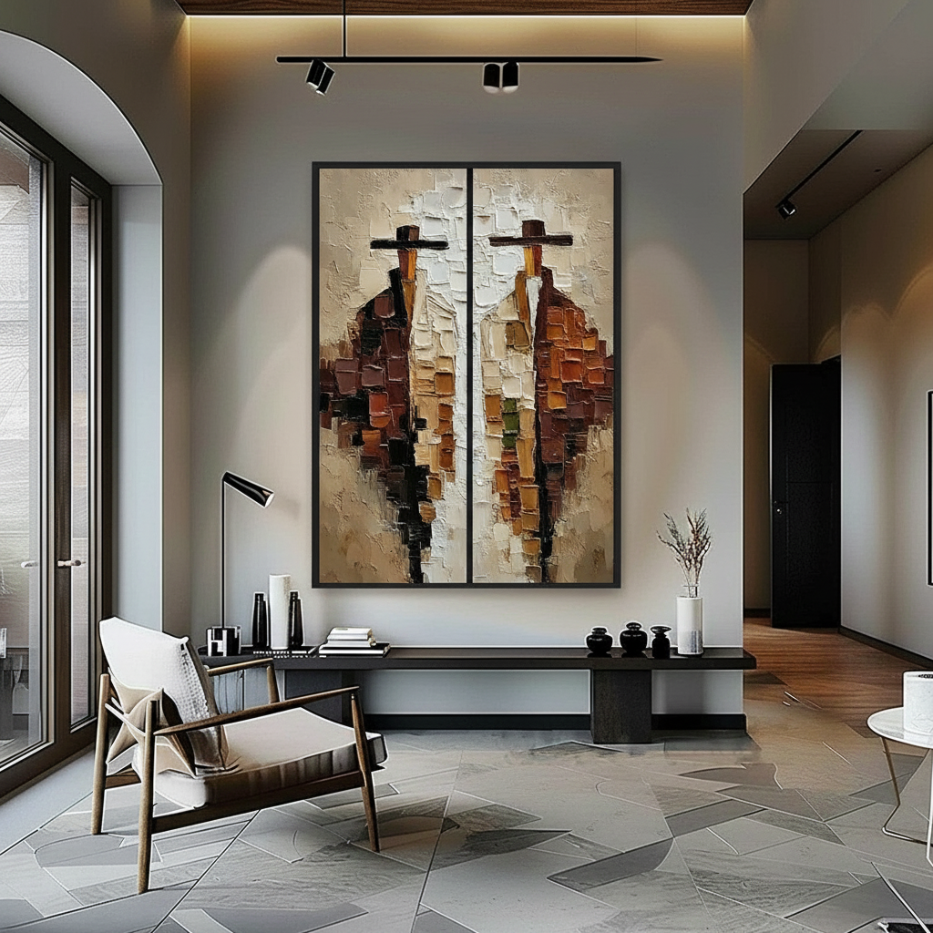
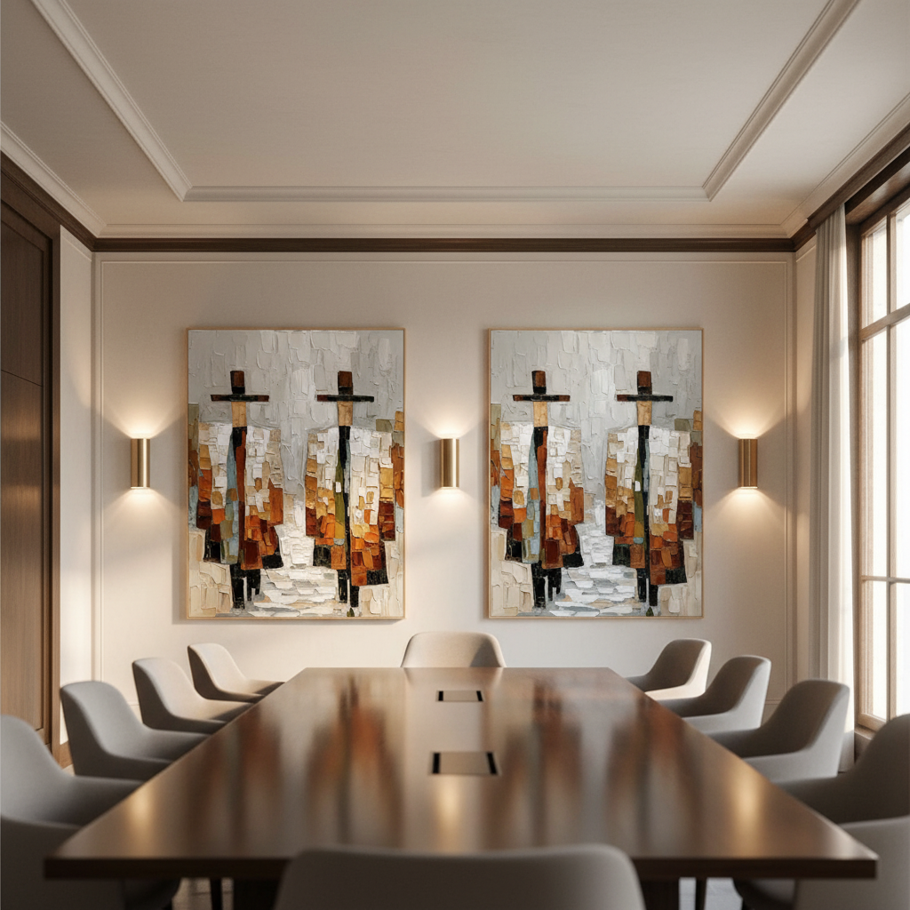
For the modern homeowner, this shift means that art is no longer just a line item on a balance sheet; it is a tool for spatial transformation. One of the most effective ways to wield this tool is through the "Pivot Point"—the strategic use of portrait-oriented (vertical) paintings in symmetrical pairings. This arrangement does more than balance a room; it acts as an architectural lever, pulling the eye upward to create a sense of height and grandeur that a single, horizontal piece often fails to achieve.
The Logic of Formal Balance: Why Symmetry Works
Symmetry is the visual shorthand for stability. In interior design, a symmetrical arrangement provides a "safe" anchor for the eyes, reducing the cognitive load required to process a space. However, the most common pitfall we see in our design consultations is a "stiff" or "sterile" execution.
To avoid the "waiting room" effect, we follow a specific heuristic for selecting paired pieces. A successful symmetrical pair must share at least two out of three key visual elements:
- Color Temperature: Do both pieces lean toward the warm (terracotta, gold) or cool (teal, slate) spectrum?
- Brushstroke Density: Is the impasto texture consistent across both canvases?
- Compositional Weight: Does the "heavy" part of the image (the focal point) sit at a similar height or quadrant in both pieces?
Logic Summary: These selection criteria are based on common patterns observed in professional gallery curation and high-end residential staging. They aim to create a "visual rhyme" rather than a literal carbon copy.

The Human-Painted Premium: Why "Identity" Matters
When you choose a symmetrical pair, the quality of the medium becomes twice as important because the viewer is naturally invited to compare the two. This is where the "human element" becomes a critical differentiator.
Research from Columbia University confirms that consumers value art labeled as "AI-generated" 62% lower than authentic, human-created art. Furthermore, empirical research from the University of Chicago suggests that digital replicas lack an "essential identity." A hand-painted mural or canvas retains the artist's "soul" through the micro-topography of the paint—the minute, mm-scale textures that reflect light in ways a flat print cannot.
In our experience, the physical relief of oil or acrylic paint is what prevents a symmetrical arrangement from feeling like a hotel corridor. The slight variations in the artist's hand ensure that while the balance is formal, the experience is organic.
Engineering Height: The Proportional Hanging Guide
The most common mistake homeowners make is hanging portrait pairs too high. We often see art placed based on standing height, but in a living room, the "primary seating position" should dictate the vertical center.
The 57-60 Inch Rule (Modified for Pairs)
While the standard gallery rule is to hang art with a center point at 57 inches, symmetrical pairs require a modified approach. According to Park West Gallery, the center point between the two pieces should act as the anchor.
However, this height must scale with your architecture. Based on our scenario modeling for various ceiling heights, we suggest the following adjustments:
| Ceiling Height | Recommended Center Point (from floor) | Rationale |
|---|---|---|
| 8 Feet | 57 Inches | Standard eye level; maintains intimacy. |
| 9 Feet | 60–62 Inches | Compensates for the additional "white space" above. |
| 10 Feet+ | 64–66 Inches | Prevents the art from looking "lost" on a massive wall. |
The "Ceiling Pull" Ratio
To truly enhance the perceived height of a room, the space between the top of the frame and the ceiling should be roughly 1/6 to 1/8 of the wall's total height. If the gap is any smaller, the room feels cramped; if it is larger, you lose the upward "pull" that vertical portraits provide.
Methodology Note: These proportions are derived from architectural drafting standards and deterministic scenario modeling. They are intended as heuristics for quick self-checking during installation.
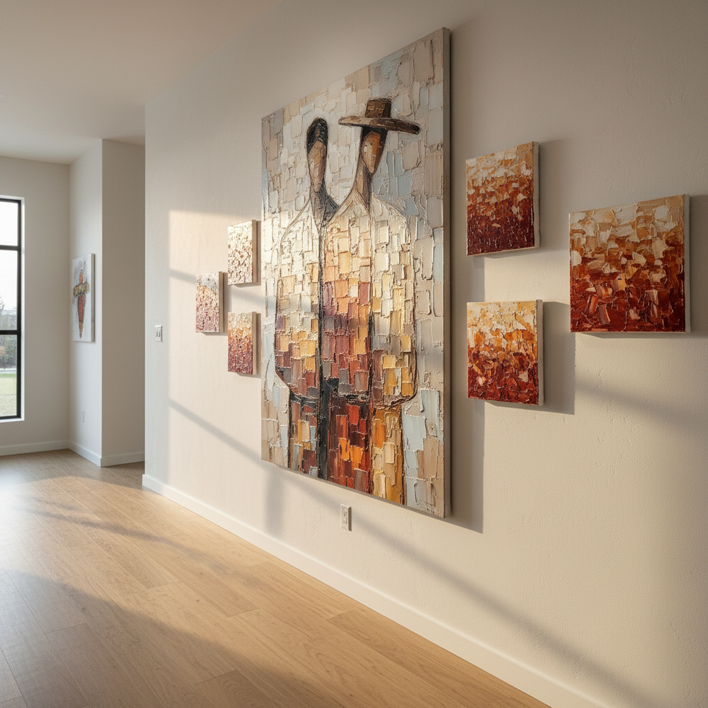
Breaking the Grid: The Asymmetry Fix
If a symmetrical arrangement feels too rigid, we recommend introducing a single asymmetrical element within the framework. This "controlled chaos" maintains the formal balance while adding contemporary energy.
- The Offset Console: Place a console table slightly off-center beneath the symmetrical pair.
- The Organic Element: Add a large, organic-shaped floor plant (like a Fiddle Leaf Fig) to one side.
- The Lighting Shift: Use a single, asymmetrical floor lamp to break the geometric lines.
The Science of Living Art: Health and Biophilia
Choosing art isn't just an aesthetic decision; it's a wellness intervention. A review by the University of Pennsylvania found that 73% of patients reported significant mood improvements when exposed to environmental artwork.
This is particularly true for "Biophilic" hand-painted art—pieces that mimic natural landscapes or organic forms. Passive art viewing consistently activates the medial prefrontal cortex (mPFC) and the amygdala, which are core components of our emotional regulation circuits. By placing a symmetrical pair of nature-inspired portraits in a high-traffic area, you aren't just decorating; you are creating a "healing infrastructure" that reduces stress and cognitive fatigue.
Material Integrity: The Technical Deep Dive
As an expert in the field, I must emphasize that the longevity of your investment depends on the chemistry of the paint. When selecting custom hand-painted pieces, you should look for compliance with ASTM D4303 standards for lightfastness.
Pigment Safety and Air Quality
Indoor air quality is a significant concern for our demographic. The EPA warns that indoor air pollution can be more concentrated than outdoor levels. This is why we prioritize low-VOC (Volatile Organic Compound) paints.
- Titanium White: Modern high-quality paints use Titanium Dioxide, which captured 90% of the market after the phase-out of toxic Lead White.
- Acrylic vs. Oil: While oil paints offer a traditional luster, they often require solvents like turpentine, which can emit harmful vapors. Water-based acrylics are generally safer for residential environments and offer superior anti-aging properties, though they are less solvent-resistant.
The "Haze" Phenomenon
Advanced collectors often ask why their acrylic paintings sometimes develop a cloudy appearance. This is typically due to PEG-type surfactants migrating to the surface during temperature or humidity spikes. According to research from the Tate Modern, gently wiping the surface with a water-based cotton swab can remove these microcrystals and restore the paint's original depth.
The Economic Case for Custom Art
Beyond personal enjoyment, art is a proven driver of property value. A Royal Society analysis found a direct correlation between neighborhoods with high "art density" and relative house price gains.
In the commercial sector, the ROI is even more staggering. Americans for the Arts reports that government tax investments in the arts yield a 7:1 return. For a homeowner, a custom-commissioned symmetrical pair isn't just "decor"—it is a cultural heritage asset that enhances the "absolute authenticity" of the home, a quality that Hospitality Design 2025 white papers identify as the rarest and most sought-after luxury in the modern world.
Final Installation Checklist
Before you commit to the "Pivot Point" in your own space, run through this final expert checklist:
- Check the 1.618 Ratio: For dynamic symmetry, space your portraits approximately 1.618 times the width of one portrait apart. This uses the Golden Ratio to ensure the spacing feels "natural" rather than forced.
- Verify Pigment Stability: Ask your artist for the ASTM lightfastness rating of the pigments used, especially if the art will be in direct sunlight.
- Audit the Lighting: Are you using UV-protective glass or varnish? Acrylic polymers are resistant to embrittlement, but UV light can still cause "chalking" over decades.
- Confirm the "Stiffness Fix": Do you have at least one organic or asymmetrical element nearby to ground the formal arrangement?
By following these principles, you transform a simple wall into a sophisticated architectural statement. Symmetrical portrait pairings offer the perfect balance of formal elegance and vertical energy, ensuring your home feels both grounded and aspirational.
Disclaimer: This article is for informational purposes only and does not constitute professional interior design, financial, or health advice. Always consult with a qualified professional before making structural changes to your home or significant financial investments in art.
Sources
- Marketplace: The expensive art market continues to struggle
- Columbia University: Human-Made vs. AI Art Study
- University of Pennsylvania: Visual Art in the Built Environment
- EPA: Indoor Air Quality and Low-VOC Paints
- Royal Society: Quantifying the link between art and property prices
- ASTM D4303: Standard Test Methods for Lightfastness
- Tate: Conservation Concerns for Acrylic Emulsion Paints
- Park West Gallery: Three Simple Rules for Hanging Art
Leave a comment
This site is protected by hCaptcha and the hCaptcha Privacy Policy and Terms of Service apply.