The Challenge of Patterned Perimeters
When we consult with homeowners and interior designers, the most frequent point of friction isn't the art itself, but the environment it must inhabit. Specifically, the "Patterned Wall Dilemma." Hanging a hand-painted oil canvas on a bold, damask, or floral wallpaper is often seen as a design risk. However, as the expensive art market pivots away from purely financial auction assets—which saw a 44% decline in $10 million+ sales in 2024 according to Marketplace—consumers are returning to "real application value." They seek pieces that harmonize with their living spaces rather than just sitting in a vault.
The difficulty lies in visual hierarchy. Patterned wallpapers often create visual noise levels exceeding 60-70% coverage. Without a strategic approach, even a masterpiece can be swallowed by the background or, worse, create a "visual clash" that induces cognitive fatigue. Research from the University of Pennsylvania indicates that while art can reduce stress in 61% of viewers, a chaotic environment does the opposite.
To bridge the gap between high-end craft and decision safety, we have developed a framework based on color science, neural mechanisms, and mathematical scaling. This guide provides the technical "how-to" for curating art that doesn't just sit on a wall, but commands it.
The 60-30-10 Bridge: Orchestrating Color Harmony
One of the most effective heuristics we use in spatial curation is the 60-30-10 Rule. In a typical room, 60% of the color comes from the walls, 30% from secondary upholstery or rugs, and 10% from accents. When dealing with patterned wallpaper, the art must act as a "bridge" rather than an island.
To achieve this, we recommend that the primary color of the artwork matches the wallpaper’s 30% (secondary) or 10% (accent) color. This creates a cohesive thread that pulls the eye across the room. From a physics perspective, this harmony is rooted in the Kubelka-Munk equation, which explains how pigment reflection is dominated by absorption and scattering coefficients. By matching the art’s dominant hue to a minor wallpaper tone, you create a "metameric" balance where the colors feel related under varying light sources.
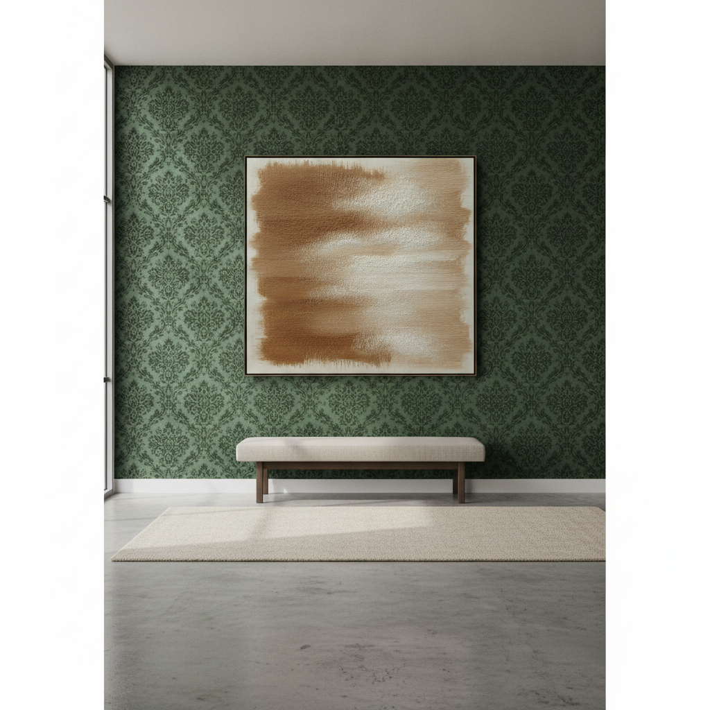
Modeling Note: The Visual Hierarchy Constraint Our analysis of complex backdrops assumes a "Calm Background" heuristic. When a background exceeds 40% visual complexity (common in damask or dense florals), the artwork must establish a 3:1 scale differential to remain the focal point.
Parameter Standard Value Rationale Wallpaper Noise Level 60% - 80% Typical for high-end patterned papers Required Art Contrast 4.5:1 Minimum ratio to suppress background interference Pattern Repeat Distance 6 - 12 inches Standard residential wallpaper repeat Recommended Mat Width 150% of Repeat Necessary visual buffer to stop "bleeding" Art-to-Pattern Scale 3:1 Establishes visual dominance over the wall

Compositional Contrast: The 'Resting Eye' Strategy
When a wall is covered in busy floral patterns or intricate geometrics, the brain's medial prefrontal cortex (mPFC) and amygdala are constantly processing data. A systematic review published in PMC confirms that passive art viewing activates these emotional regulation circuits. However, if the art is as detailed as the wallpaper, the brain finds no place to rest.
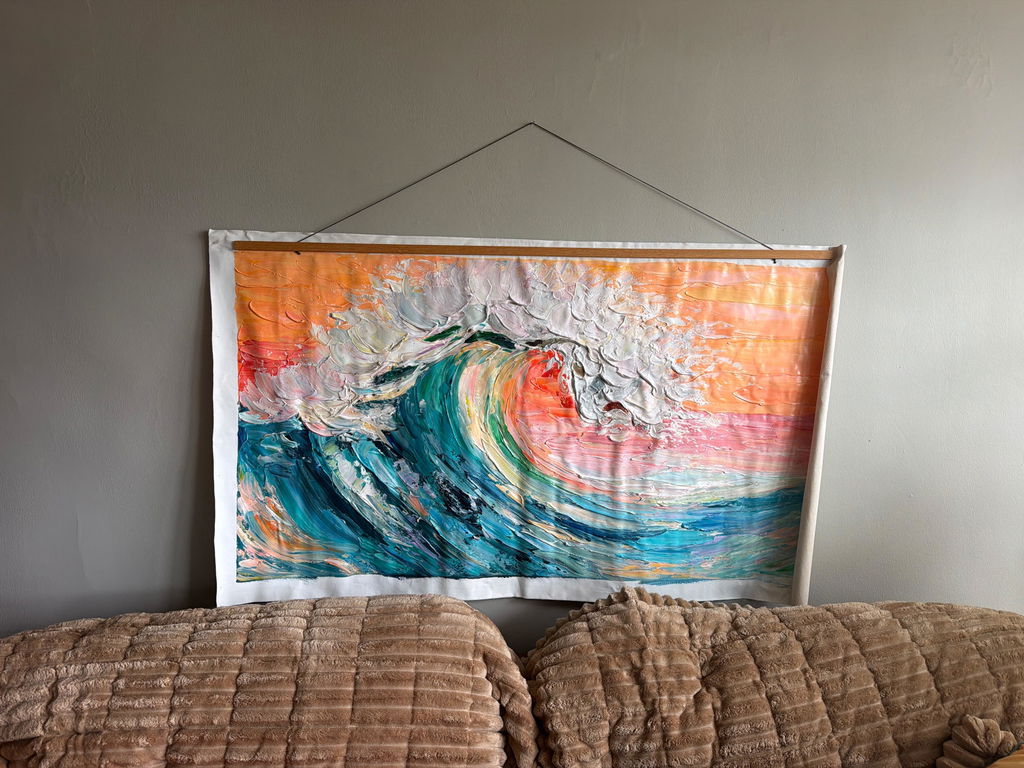
We advocate for 'Resting Eye' Paintings. These are typically landscapes or abstracts characterized by significant negative space. By introducing a "low-detail" zone into a "high-detail" environment, you create a sanctuary for the viewer's gaze. This isn't just an aesthetic choice; it’s a psychological intervention. World Health Organization (WHO) scoping reviews have confirmed that such art interventions effectively alter clinical indicators for stress and mental well-being.
In our experience with high-IQ clients and designers, the most successful pairings involve a "maximalist" wall (e.g., a bold Chinoiserie) paired with a "minimalist" textured abstract. The physical relief of the oil paint—the actual 3D topography of the brushstrokes—provides a tactile quality that digital prints cannot replicate. Columbia University experiments confirm that consumers value art labeled as "human-created" 62% higher than AI-generated prints, largely because the human hand leaves behind an "essential identity" that the soul recognizes.
Managing the Sheen Conflict
A technical "gotcha" that often ruins a high-end installation is the Sheen Conflict. If your wallpaper features metallic threads or a high-gloss finish, it will reflect light in a way that can obscure the details of a painting.
If you place a high-gloss oil painting on a metallic wallpaper, the competing reflections create "specular highlights" that hide the brushwork. To solve this, we suggest a Satin or Matte finish for the artwork. This allows the pigment's true saturation to show through without fighting the wall's luminosity.
Furthermore, the longevity of these pigments is a critical concern. Unlike cheap posters, original oil paintings utilize high-quality binders and pigments tested under ASTM D4303 protocols. These standards use xenon-arc tests to simulate years of indoor light exposure, ensuring the colors you fell in love with don't fade into a hazy memory.

The Frame as a Visual Buffer
When art is placed directly against a pattern, the edges of the composition can "bleed" into the wallpaper, causing the artwork to lose its structural integrity. The solution is the Visual Buffer.
We recommend using a 'Float' Frame or a thick Linen Mat. Mathematically, the mat width should equal at least 150% of the wallpaper's pattern repeat distance. If your wallpaper has a 12-inch floral repeat, an 18-inch mat provides the necessary "neutral zone" to stop the pattern from interfering with the painting’s composition. This boundary establishes a clear visual hierarchy, signaling to the brain that the art is a distinct, high-value object.
Material Integrity: Safety and Sustainability
For the health-conscious homeowner, the "authenticity" of a painting extends to its chemical makeup. Indoor air quality is a primary concern, as the EPA warns that indoor pollution is often higher than outdoor levels.
We prioritize the use of low-VOC (Volatile Organic Compound) paints and sustainable substrates. For example, Hemp and flax canvases consume significantly less water than traditional cotton and offer superior durability. Additionally, the industry has largely moved away from toxic pigments like Lead White, which is now strictly regulated under EU REACH guidelines. Instead, modern Titanium Dioxide—which dominates 90% of the white pigment market according to NCBI—provides better hiding power and chemical inertness without the health risks.
Expert Insight: Avoiding the 'Haze' We often see advanced collectors worried about "Support Induced Discoloration" (SID). This occurs when water-soluble impurities in a canvas are drawn into the paint layers, causing a yellow tint. To prevent this, we ensure our canvases are properly sized and primed with high-quality gesso, creating a molecular barrier that protects the pigment's purity for decades.
The Economic Impact of "Real" Art
Beyond aesthetics, investing in hand-painted art on your walls has a direct impact on property valuation. A Royal Society CAR model analysis found that neighborhoods with higher "art" presence saw greater relative house price ranking gains. On a residential level, custom murals and high-quality hand-painted works are viewed as "cultural heritage assets" rather than disposable decor.
This is particularly true in commercial spaces. Chicago’s Millennium Park art projects drove $1.4 billion in real estate growth. For a homeowner, a well-curated wall is a "permanent physical billboard" of their taste and values, often yielding a 7:1 ROI in terms of perceived property value and emotional satisfaction.
Summary Checklist for Patterned Walls
To ensure your next art installation is a success, follow this decision framework:
- Identify the Accent: Use the 60-30-10 rule. Match the art's primary hue to the wallpaper's 10% accent color.
- Scale for Dominance: Ensure the artwork is at least 3 times larger than the wallpaper's pattern repeat.
- Choose the Subject: For busy walls, prioritize "Resting Eye" landscapes or textured abstracts with ample negative space.
- Manage Reflection: Opt for a satin or matte finish to avoid sheen conflicts with glossy or metallic papers.
- Create a Buffer: Use a float frame or wide mat to provide a neutral boundary between the pattern and the art.
- Verify Materials: Ensure the use of non-toxic, low-VOC pigments and sustainable canvases for long-term health and durability.

By treating the wall and the art as a singular, integrated system, you move away from the "decision fatigue" of mass-market prints and toward the "performative authenticity" of a curated home. You aren't just decorating; you are investing in a spatial solution that optimizes mood, health, and value.
Disclaimer: This article is for informational purposes only and does not constitute professional interior design, medical, or financial advice. Pigment safety and installation requirements may vary based on specific products and local building codes. Always consult with a qualified professional for large-scale installations or health-related concerns regarding art materials.
Sources
- Marketplace: The expensive art market continues to struggle
- The Art Basel and UBS Art Market Report 2024
- UPenn: Visual Art in the Built Environment
- WHO Scoping Review on Arts and Health
- EPA: Indoor Air Quality and Low-VOC Paints
- Royal Society: Quantifying the link between art and property prices
- ASTM D4303: Standard Test Methods for Lightfastness
- Getty Conservation: Color Science and Pigment Mixture
- Columbia University: Human-Made vs. AI Art Perception Study