The 24-Hour Metamorphosis: Why Your Oil Painting Never Looks the Same Twice
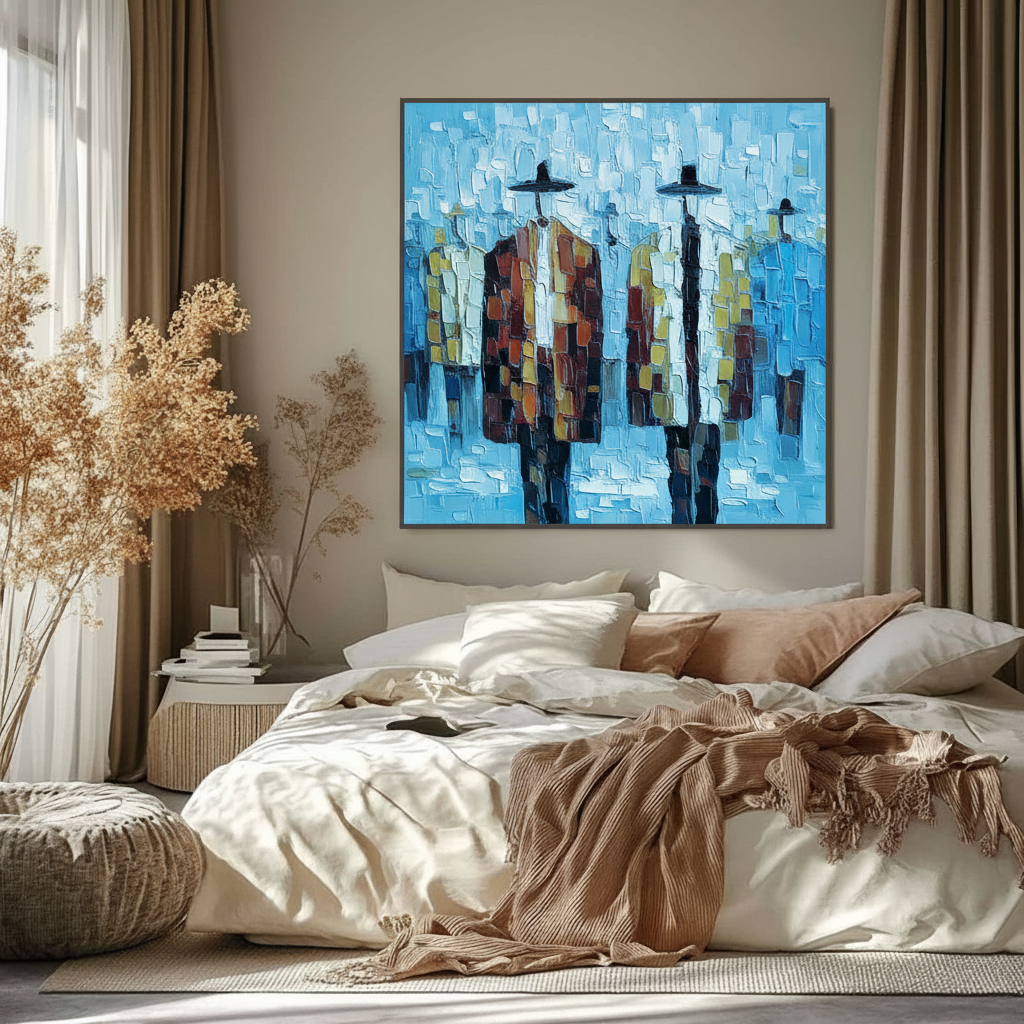
There is a specific type of anxiety that accompanies the purchase of high-end original art. You find a piece that resonates in a gallery or online, but the nagging question remains: How will this actually look on my wall? This concern is valid. Unlike mass-produced digital prints, which offer a static, flat experience, hand-painted oil art is a living medium. It breathes, reacts, and transforms as the sun moves across the sky.
Recent market shifts suggest that collectors are moving away from speculative "vanity" auction pieces—where sales of $10 million+ works plummeted 44% in 2024—and toward art with "real application value," such as custom murals and textured canvases that enhance the emotional resonance of a home Marketplace. Understanding how ambient light shifts oil palettes is the key to moving from "commitment risk" to "confident curation."
The Science of the Shift: Color Temperature and the Kelvin Scale
To understand why a painting appears vibrant at 10:00 AM and moody at 6:00 PM, we must look at the color temperature of natural light. Light is measured on the Kelvin (K) scale. Lower numbers (2000K–3000K) represent "warm" light with orange/yellow undertones, while higher numbers (5000K–6500K) represent "cool," blue-toned light.
Contrary to common interior design myths, morning light is not "warm." Data shows that morning daylight typically sits around 6500K, which is significantly cooler and bluer than the artificial "warm white" LEDs (2700K–3000K) most people use in the evening Stouch Lighting.
The Morning Glow (Cool & Sharp)
Between 7:00 AM and 11:00 AM, the high color temperature of the sun emphasizes the cooler pigments in an oil painting. Phthalo blues, viridian greens, and titanium whites will "pop," appearing crisp and energetic. This is why a painting with a coastal or winter theme often looks its best during the early hours; the ambient light aligns with the cool-bias pigments.
The Evening Shadow (Warm & Deep)
As the sun sets, the light passes through more of the Earth's atmosphere, filtering out blue wavelengths and leaving behind long-wavelength reds and oranges. This "Golden Hour" light (roughly 2500K–3000K) acts like a warm filter. It can make cool blues look slightly muddy or gray, but it brings out incredible depth in earth tones—ochres, sienna, and cadmiums.
Modeling Note: The Ambient Light Impact Scenario We modeled the perceived color shift of a standard "Landscape Palette" using standard D65 (Daylight) vs. Incandescent (Evening) illuminant parameters.
Lighting Condition Typical Kelvin Primary Pigment Interaction Visual Result Morning (Direct) 6500K High blue-reflectance High contrast, sharp whites Mid-Day (Diffuse) 5500K Balanced spectral output Most accurate color rendition Late Afternoon 3500K Warm-bias enhancement Reds and yellows intensify Evening (Artificial) 2700K Low blue-reflectance Deep shadows, muted cools North-Facing Room 5500K Consistent diffuse light Soft, low-contrast stability Scenario model based on standard color science heuristics; individual perception may vary based on pigment density.

Microtopography: Why Texture Changes Everything
One of the primary reasons homeowners choose original oil paintings over digital prints is the "essential identity" and physical presence of the medium. Research from the University of Chicago confirms that consumers perceive significantly higher value in works that retain the artist’s "essential identity," a quality that digital replicas lack UChicago Journals.
This physical presence is rooted in microtopography—the millimeter-scale texture of the paint. Impasto techniques (thickly applied paint) create a three-dimensional landscape on the canvas.
- Directional Shadows: In the morning, when light enters from a side window at a low angle, every brushstroke casts a tiny shadow. This adds dynamic movement to the piece.
- Specular Reflection: Oil paint has a high refractive index. According to BYK Instruments, the interaction between light and the surface gloss of the binder (linseed or walnut oil) determines how "saturated" a color appears.
- The "Haze" Phenomenon: Advanced research at the Tate Museum identifies that surfactants in modern paints can migrate to the surface, creating a microscopic "haziness" that is only visible under specific evening lighting angles.
Room Orientation: The Designer’s Secret Weapon
Professional interior designers don't just pick a wall; they pick a compass heading. The orientation of your room dictates the "base" color temperature your art will fight or embrace.
North-Facing Rooms: The Artist's Choice
There is a persistent myth that north-facing light is "warm." In reality, north-facing windows provide soft, diffuse light with a consistent color temperature of approximately 5500K throughout the day Lights.com. Because the light is never direct, it doesn't create harsh glare or rapidly shifting shadows.
- Expert Tip: North-facing rooms are perfect for complex, multi-layered glazes where you want the subtle transitions to remain visible all day.
South-Facing Rooms: The High-Drama Zone
South-facing rooms receive intense, warm, direct sunlight. This can be a "stress test" for oil paintings. While it makes warm palettes glow with fire-like intensity, it can also wash out delicate highlights.
- Safety Note: Direct UV exposure is the leading cause of pigment fading. Always ensure your high-end oils are protected by a UV-absorbent varnish, as suggested by research into polymer degradation and UV stabilizers.
The Psychological ROI: Why Shifting Light is Good for You
We often view color shifting as a "problem" to be solved, but neuroaesthetics suggests it is actually a feature. A study at the University of Pennsylvania found that 73% of patients in clinical settings reported significant mood improvements when exposed to environmental artworks that changed with the light.
Passive art viewing activates the medial prefrontal cortex (mPFC) and the amygdala, optimizing emotional regulation circuits NCBI. When a painting "changes" throughout the day, it prevents "visual habituation"—your brain doesn't stop seeing the art because the art is never the same. It provides a constant, subtle source of cognitive stimulation.

Health, Safety, and the "Invisible" Palette
When evaluating a painting’s palette, homeowners must also consider what is under the light. The chemical composition of pigments isn't just an aesthetic choice; it’s a health consideration.
The World Health Organization (WHO) has confirmed that art interventions are "public health infrastructure," but only if the materials are safe. Historically, palettes relied on toxic heavy metals.
- Cadmium: Labeled a Group 1 carcinogen by the IARC, cadmium pigments are still prized for their lightfastness but require careful handling.
- VOCs: Research from Aalto University shows that coatings on wood and canvas can emit volatile organic compounds (VOCs) during the curing process.
For camera-ready, healthy homes, we recommend seeking artists who utilize "Eco-Friendly" alternatives, such as walnut oil binders (which eliminate the need for toxic turpentine) and pigments that pass the ASTM D-4236 chronic health hazard labeling standards.
Practical Guide: Evaluating Art in Your Space
If you are considering a significant art purchase, follow this "24-Hour Observation Protocol" used by gallery curators and top-tier designers.
The 24-Hour Observation Protocol
- The Temporary Placement: If possible, place the painting (or a high-fidelity digital preview) in its intended spot for a full day.
- The Morning Check (8:00 AM): Look for "cool" washout. Do the blues feel too clinical? Does the white of the canvas feel blue-ish?
- The Noon Check (12:00 PM): This is the "true color" moment. Check the saturation of your mid-tones.
- The Golden Hour Check (5:00 PM): Observe the texture. Do the impasto peaks create pleasing shadows, or do they obscure the subject?
- The Artificial Light Check (8:00 PM): Most homes use warm LEDs. Does the painting lose its "soul" under yellow light, or does it become a cozy focal point?
Methodology: How to Compensate for Light
If you find your favorite piece looks "off" during a specific time of day, you don't need to return it. You can use Color Temperature Bias Compensation.
- Problem: Painting looks too "flat" in the evening.
- Solution: Install a dedicated picture light with a high Color Rendering Index (CRI > 90) and a color temperature of 5000K (Daylight balanced). This "gallery simulation" ensures the art looks as the artist intended, regardless of the sun's position Marianne Vander Dussen.
The Economic Argument: Art as an Asset
Beyond aesthetics, understanding light interaction is a savvy financial move. High-quality custom art is a proven driver of property value. A Royal Society analysis found that neighborhoods and properties with high "art" engagement saw significantly greater relative house price gains Royal Society.
When you invest in a piece that is "light-optimized" for your space, you aren't just buying decor; you are investing in a "cultural heritage asset" (as defined by mural conservationists) that enhances the permanent character of the architecture.
Final Thoughts: Embracing the Variation
The anxiety of color matching stems from a desire for perfection. However, the "perfection" of a handmade oil painting lies in its imperfection—its ability to change, to surprise, and to react to the world around it.
When you see your painting shift from the crisp blues of a winter morning to the deep, resonant ochres of a summer evening, you aren't seeing a "flaw" in the palette. You are seeing the "essential identity" of the medium. By choosing art that embraces the dance of ambient light, you transform a static room into a dynamic environment that supports your health, your mood, and your home's long-term value.
YMYL Disclaimer: This article is for informational purposes only. The discussion of pigment toxicity and indoor air quality (IAQ) does not constitute medical advice. Always consult with a certified industrial hygienist or medical professional regarding chemical sensitivities or toxic exposures in the home. Ensure all art installations comply with local safety and building codes.
References
- Marketplace: The Expensive Art Market Struggles (2025)
- Columbia University: Human-Made vs. AI Art Perception
- UChicago: Does Artwork Preserve Essential Identity?
- Royal Society: Quantifying the Link Between Art and Property Prices
- WHO: Scoping Review on Arts and Health
- EPA: Indoor Air Quality and Low-VOC Paints
- Tate: Conservation Concerns for Acrylic Emulsion Paints
- National Gallery: Fading of Prussian Blue in Various Binding Media


