Suitable modern law office decor should feel composed, intentional, and suited to each room's role. Start by defining two or three visual cues—such as quiet, architectural, warm, or selectively expressive—then match the artwork to each room's sightlines, usable wall area, furnishings, and lighting. A reception piece should read from the arrival path; conference-room art should stay controlled behind seated participants; partner offices can show more individuality; and corridors should create continuity without looking repetitive.
The most reliable process is to set the firm-wide tone first, give each piece a room-specific job, measure and mock up the wall, compare color with existing finishes, and review the complete route before ordering. This modern law office art brief keeps those decisions visual and conditional rather than treating any style as universal.
Set the Firm's Visual Tone Before Choosing Art
Appropriate wall art for a modern law office is not defined by one mandatory style. It should reflect a composed visual direction that the firm can use consistently without making every room identical. Judge each candidate with the surrounding wall, furnishings, finishes, and lighting—not as an isolated product. This point is also reflected in this interior-design guidance on displaying artwork.
Use Subject Matter as a Restraint Check
Subject matter changes how literal, active, or personal a room feels. Screen each direction for movement, contrast, texture, and how easily it can coexist with client-facing sightlines.
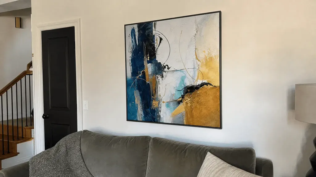
- Abstract: Look for controlled movement and a composition that remains readable without demanding constant attention. Abstract paintings can be a useful browsing category, but the collection itself does not establish suitability for a particular office.
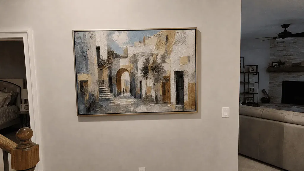
- Architectural or city-oriented: These subjects can support a more structured or place-based direction when the imagery is not overly busy or literal. Compare the lines and contrast with nearby millwork, glazing, signage, and furniture.
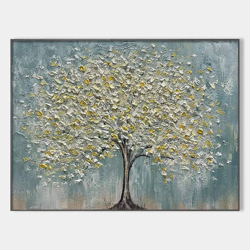
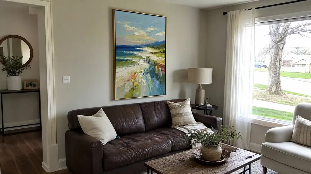
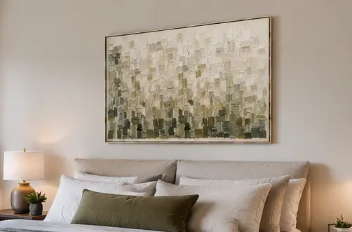
- Restrained neutral work: Beige, gray, black, white, and muted earth tones can provide a quieter starting point, but inspect texture and contrast so the result does not disappear against a pale wall. Browse neutral abstract wall art as a visual category, then verify each candidate's actual dimensions and details.
- Highly personal, novelty-driven, or busy imagery: Give it extra scrutiny in reception and conference areas. A piece may be attractive on its own yet compete with signage, screens, faces, circulation, or the conversation taking place nearby.
The rejection test is simple: if the subject is unusually literal, saturated, intricate, or personal, identify its exact wall and viewing distance before treating it as a general office direction.

Choose the Level of Expression the Firm Can Repeat
Choose a level of color, texture, and movement that can recur in at least two rooms. This does not mean buying matching artwork; it means deciding whether the office will generally lean quiet and neutral, structured and architectural, or selectively expressive.
Reserve stronger expression for a deliberate focal role. If one isolated piece is much more colorful, textured, or dramatic than everything around it, it may set a direction the rest of the office cannot repeat. A small firm may use one statement piece, while a larger firm may need a broader visual system that works across several floors or room types.
Match the Artwork to Each Office Zone
Each zone has a different visual responsibility. Reception calls for one composed arrival focal point, conference rooms need a controlled conversation backdrop, partner offices can carry measured individuality, and corridors can use recurring cues that remain readable along a walking route.
Reception: Make One Clear First Impression
Give the arrival area one clear focal role rather than scattering attention across the desk, signage, seating, and artwork. Review the piece from the entrance, the waiting area, the reception desk, and the circulation path. If the art competes with the firm name, directional signs, or the person greeting visitors, reduce its visual movement or move it to a less crowded wall.
A single vertical or horizontal work may suit the wall better than a set, but orientation should follow the wall and furniture rather than a universal rule. Keep the intended sightline clear when people enter and when they sit while waiting.

Conference Rooms: Protect the Conversation Backdrop
Conference-room art should remain controlled from seated participant positions and from the virtual-meeting camera angle. Check how the piece interacts with faces, screens, doors, lighting, and the speaker's position before selecting it.
- Review the primary seated views from both sides of the table.
- Check the camera frame with the display and any visible speaker position.
- Favor a composition that does not compete with faces, shared content, or the conversation backdrop.
A colorful or highly textured piece is not automatically unsuitable, but it needs a defined focal role and enough visual separation from screens and people. If the only available wall is behind a display or a frequently opened door, that wall may be a poor candidate regardless of the artwork's style.
Partner Offices: Allow Measured Individuality
A partner or attorney office can carry more personal character than reception or a conference room, provided the choice still relates to at least one shared firm cue. Connect the piece through palette, framing approach, texture level, orientation, or compositional restraint.
Choose the meaningful sightline first: the wall behind the desk, the view seen by a visitor, or the wall facing a small meeting area may each call for a different scale and level of expression. A private office can tolerate more individuality, but an unrelated focal piece may still feel disconnected when viewed from the corridor or adjacent meeting space.
Corridors: Build a Quiet Visual Thread
Corridors work best when the artwork can be read while walking and when the sequence relates to nearby rooms. Repeat a palette, orientation, contrast level, or texture cue only where the wall length and spacing support it.
Avoid assigning unrelated visual weight to every section of a hallway. A large, high-contrast piece followed by several faint or crowded pieces can make the route feel accidental. Review the corridor as a sequence, including views toward reception, conference-room doors, and partner offices, rather than buying each work independently.
Size and Place Each Piece for Its Wall
There is no universal size for law-office art or hanging height that works behind every conference table, credenza, or reception desk. Measure the usable wall, account for furniture and openings, compare orientation, create a paper or digital mockup, and inspect it from the room's important standing, seated, and camera positions before ordering.
- Measure the usable wall after accounting for furniture, doors, screens, signage, lighting, and circulation.
- Compare vertical, horizontal, square, or panoramic orientation with the remaining wall shape.
- Create a paper or digital mockup at the intended size and inspect it from standing, seated, and video-call views.
- Review spacing, placement, lighting, composition, and the proposed installation approach before ordering.
Check Orientation Against the Wall
Start with the wall's proportions and the objects already competing for space. The comparison below is a selection prompt, not a fixed rule.
| Wall condition | Orientation to test | Selection check |
|---|---|---|
| Tall, narrow wall or vertical pier | Tall vertical work | Confirm that doors, trim, signage, and nearby openings do not make the piece feel squeezed. |
| Wide wall above furniture | Horizontal, square, or a carefully grouped arrangement | Compare the artwork's visual width with the furniture and preserve a clear relationship to the seating or credenza. |
| Hallway run or repeated transition wall | Vertical sequence, horizontal work, or alternating orientation | Check walking-speed readability, spacing, door swings, lighting, and the view toward adjacent rooms. |
Measure width and height after marking doors, screens, signage, lighting, furniture, circulation, and any areas that cannot be used. Then compare the candidate's orientation with the remaining shape. A wall-art orientation guide can provide additional visual vocabulary, but its generic rules should not replace project measurements.
Test Height, Clearance, and Viewing Distance
Use the actual furniture and sightlines to adjust placement. Artwork above a desk, credenza, or reception counter should remain visually connected to that furniture without interfering with doors, screens, lighting, signage, or circulation. Any spacing guideline is flexible; the artwork's proportions, furniture height, wall composition, and viewing distance matter more than a universal number. A wall-art placement reference is useful only as background guidance, not as a required measurement.
Before buying, create a full-size paper outline or digital mockup. Review it from the primary standing position, the primary seated position, and the video-call camera position when the wall appears on screen. Also review spacing, lighting, composition, and the proposed installation approach. Confirm product dimensions, framing, mounting requirements, shipping details, and return terms from the current product information; these facts are not established by a visual category or listing title.
Use Color in Modern Law Office Art Without Making the Office Flat
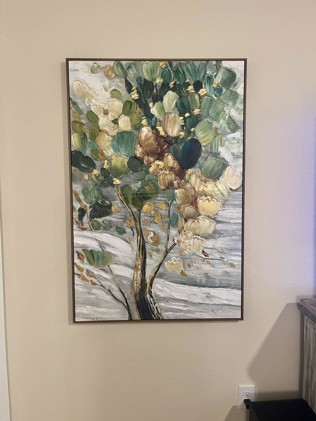
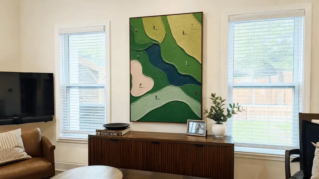
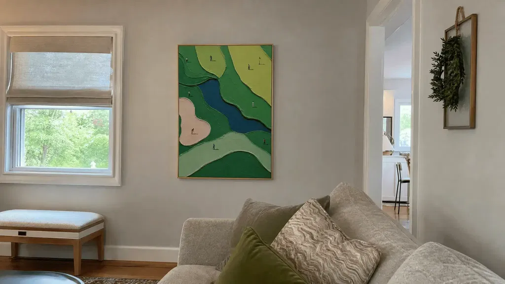
A restrained palette does not have to mean plain beige or gray. Compare neutral texture, controlled blue/green or earth accents, and stronger multicolor expression against the room's flooring, upholstery, millwork, lighting, and approved finishes. Focus on practical questions: How much contrast is present? Does the color add warmth or movement? Does it compete with a screen or sign?
| Palette direction | Visual effect to evaluate | Likely room application |
|---|---|---|
| Neutral and textured | Depth, warmth, and surface interest without excessive contrast or visual weight | Reception, corridors, or rooms with already prominent finishes |
| Restrained blue, green, or earth accent | Whether the accent connects to upholstery, flooring, or adjacent rooms without introducing an unrelated color | Conference rooms or partner offices needing controlled variation |
| Stronger multicolor expression | Saturation, movement, and competition with faces, screens, signage, and nearby artwork | A deliberate focal wall after testing the full sightline |
Review samples or mockups under the room's actual lighting. A palette that looks restrained online may read as high contrast beside dark millwork or disappear against a warm neutral wall. Keep accent colors deliberate across adjacent rooms so variation feels selected rather than accidental.
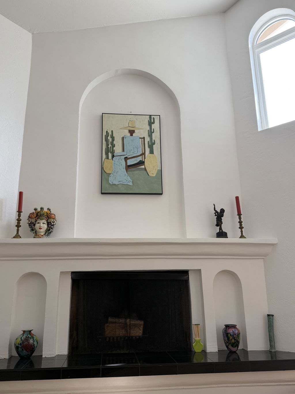
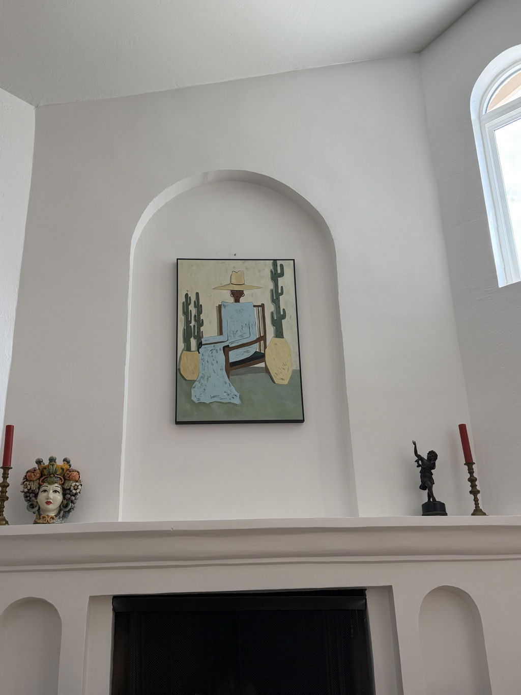
For product exploration, an expressive abstract portrait can illustrate a higher-movement direction, while a neutral category can show a quieter one. Neither visual category proves that a piece belongs in a law office; the room, size, sightline, and surrounding finishes still decide that.
Create Consistency Without Making Every Room Identical
Coordinate the office through one or two repeated cues—such as palette, framing, texture, orientation, or overall restraint—then vary the focal role by room. A small office can use a compact visual system, while a larger firm should map the complete route so individually appealing purchases do not create abrupt shifts.
- Choose one or two shared cues, such as palette, framing, texture, orientation, or compositional restraint.
- Assign variation by room role instead of repeating identical subjects or focal weights.
- Lay out the planned pieces by room and sightline before placing items in the cart.
- Review the full route from reception through conference rooms, offices, and corridors before buying.
Coordinate by Palette, Texture, or Framing
Repeat a cue, not necessarily a subject or matching set. Use the table to choose a limited system and identify when it starts to feel overused.
| Shared cue | How to apply it | Common overuse warning |
|---|---|---|
| Palette | Repeat a narrow family of neutrals or one controlled accent across selected rooms. | Every room uses the same contrast and loses its distinct role. |
| Texture | Use similar surface energy in focal areas while allowing quieter walls elsewhere. | Heavy texture appears beside every seat, screen, or sign. |
| Framing | Repeat a frame tone or visual edge where it supports the architecture. | Matching frames make unrelated pieces look artificially uniform. |
| Orientation | Use a recurring vertical, horizontal, or sequence pattern where the walls allow it. | The format is forced onto walls with different proportions. |
Choose one or two cues rather than all four. Connecting rooms without exact matching can be a helpful planning approach, but a home-focused collection concept should not be treated as a law-office specification.
Audit the Full Sequence Before Buying
Lay out the planned pieces by room, wall, orientation, and dominant sightline. Then look for duplicate focal roles, unrelated jumps in color or texture, and pieces that have no clear relationship to nearby furniture, signage, or screens.
For a small firm, a single page showing reception, conference rooms, offices, and corridors may be enough. For a larger firm, review the route from reception through the main client path and mark where visual emphasis should increase, decrease, or pause. Before placing items in the cart, confirm that every candidate has a defined wall, a measured usable area, a viewing direction, and verified current product facts.
Define the firm's visual cues, measure each intended wall, and test the route before ordering. Browse collections or visual examples only as navigation options, then verify current dimensions, framing, mounting, shipping, and return information for each selected item.
FAQs
These questions address the decisions that matter most when you choose, place, and coordinate art in a law office. The right choice depends on the room's function, usable wall, and sightlines.
What Art Is Appropriate for a Law Office?
Screen the subject's literalness, movement, contrast, texture, and scale from the room's actual viewing positions. Reserve highly personal or busy work for a deliberately selected focal wall.
How Do You Decorate a Law Firm Reception Area?
Give the artwork one focal role and test it from the entrance, waiting area, reception desk, signage, and circulation path. Move it or choose a quieter composition if it competes with operational information.
What Size Art Works Best Behind a Conference Room Table?
Assume no universal size. Measure around the table, display, doors, and circulation; then mock up the piece and review it from seated, standing, and camera views.
Should Every Room in a Law Office Have Matching Artwork?
No. Repeat a framing or palette cue, then vary focal roles by room. Audit the full route so the pieces connect without making every space interchangeable.