The Shift from Vanity Assets to Visual Comfort
For decades, the high-end art market was defined by the "vanity asset"—pieces bought more for their auction potential than their aesthetic placement. However, recent data suggests a fundamental shift in consumer behavior. High-end auction sales for art over $10 million plummeted by 44% year-over-year in 2024, according to Marketplace. Buyers are retreating from purely financial art assets and returning to pieces with "real application value."
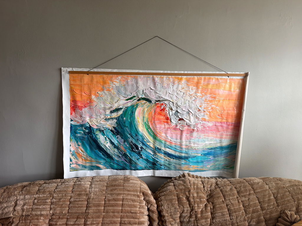
In our experience working with interior designers and homeowners, this "application value" is increasingly defined by how art performs within the home's architecture. In modern, sun-drenched interiors, the prestige of a hand-painted oil piece often battles a frustrating functional enemy: specular reflection. A glossy oil painting placed opposite a floor-to-ceiling window can become a blinding white rectangle, obscuring the artist's work and disrupting the room's carefully curated mood.
Selecting "matte" oils—or more accurately, managing the sheen of hand-painted media—is no longer just an artistic choice; it is a technical necessity for the "camera-ready" home.
The Physics of Glare: Why Sunlit Rooms Challenge Traditional Art
To solve the problem of reflection, we must first understand the two types of light behavior on a canvas: specular and diffuse. Specular reflection occurs when light hits a smooth, glossy surface and bounces off at a single angle, creating "glare." Diffuse reflection occurs when light hits a matte or textured surface and scatters in many directions, allowing the eye to see color and form regardless of the light source's position.
The 45-Degree Rule and Visual Interference
Experienced designers often employ the "45-degree rule" for art placement. This heuristic suggests placing art so that the primary light source hits the surface at an angle rather than head-on. While effective, this isn't always possible in open-concept homes where light sources are omnidirectional.
Furthermore, gloss is not just a binary "on or off" setting. It is measured in Gloss Units (GU) using standardized test methods like ASTM D3928.
| Sheen Level | Gloss Units (GU) at 60° | Visual Characteristic | Optimal Placement |
|---|---|---|---|
| High Gloss | >70 | Mirror-like, intense color depth | Dimly lit hallways, accent spots |
| Semi-Gloss | 35–70 | Subtle sheen, easy to clean | Versatile, but prone to window glare |
| Satin | 10–35 | Soft glow, "eggshell" feel | General residential zones |
| Matte | <10 | Flat, non-reflective, velvet-like | Directly opposite large windows |
Logic Summary: The table above is a heuristic based on ASTM D3928 and ISO 2813 standards. We estimate these "optimal placements" based on typical residential light levels (approx. 300–500 lux).

The Technical Challenge of "Matte" Oil Painting
Achieving a true matte finish in oil painting is technically demanding. Natural binders like linseed or poppy oil are inherently glossy. When we speak of "matte oils," we are usually referring to one of three professional interventions:
- Wax-Based Mediums: Adding beeswax or specialized matte mediums to the paint during the creation process.
- Matte Varnishing: Applying a final protective layer, such as Gamvar Matte, which contains silica to scatter light.
- Pigment-to-Binder Ratio: Increasing the pigment load so the surface remains porous and "thirsty," though this can risk the structural integrity of the paint film if not handled by a master.
The "Sinking" Effect: When Matte Dulls Color
A common "gotcha" in matte oil finishes is the sinking of certain pigments. Ultramarine Blue and deep Earth tones (like Raw Umber) tend to lose their vibrancy and look "chalky" when the glossy binder is minimized. Master painters compensate for this by over-saturating these specific areas during the painting process, ensuring that the final, non-reflective surface retains the intended depth.
Beyond Aesthetics: The ROI of Hand-Painted Art
While the primary goal might be mitigating reflection, the decision to invest in human-made, hand-painted art over digital prints carries significant economic and psychological weight.
The "Essential Identity" Premium
A study by University of Chicago researchers found that digital replicas and NFTs lack what consumers perceive as the "essential identity" of the artist. This lack of "soul" leads to a collapse in perceived long-term value. Conversely, Columbia University research confirms that consumers value art labeled as "human-created" 62% higher than AI-generated equivalents.
Property Value and Commercial Foot Traffic
Art isn't just a personal joy; it's a financial lever. Regression analysis from the Royal Society found that neighborhoods with higher "art" geo-tags saw greater relative house price ranking gains. In commercial spaces, the impact is even more dramatic. Public art projects, such as those in Chicago's Millennium Park, have driven an estimated $1.4 billion in real estate-related growth (NC Realtors).

Wellbeing and the "Nature Effect" in the Home
In high-stress environments, the choice of art becomes a matter of public health. A review by the University of Pennsylvania noted that 73% of patients in clinical settings reported significant mood improvements when exposed to environmental artworks.
This is rooted in neurological mechanisms. Passive viewing of realistic art consistently activates the medial prefrontal cortex (mPFC) and the amygdala, optimizing emotional regulation circuits (PMC11480958). For the homeowner, a large nature-themed mural in a sunlit room isn't just decor—it’s a "biophilic" intervention that produces the same stress-reduction effects as being outdoors (University of Central Arkansas).
The Invisible Risks: Safety and Sustainability in Art
As we prioritize "camera-ready" rooms, we must not overlook the chemistry of the materials we bring into our living spaces.
VOCs and Indoor Air Quality
Traditional oil painting often involves turpentine or mineral spirits, which emit high levels of Volatile Organic Compounds (VOCs). The EPA warns that indoor air pollution can be significantly more concentrated than outdoor air. To mitigate this, we recommend:
- Walnut Oil Binders: A non-toxic alternative to turpentine that produces a beautiful, durable finish.
- Low-VOC Curing: Research from Aalto University shows that coatings on wood with specific moisture content emit significantly fewer VOCs during the curing process.
The Heavy Metal "Nuclear Option"
Some of the most vibrant colors in the oil palette—Cadmium Yellow and Lead White—carry severe health risks. The International Agency for Research on Cancer (IARC) classifies cadmium as a Group 1 carcinogen. While the industry has largely shifted to Titanium Dioxide (which now holds 90% of the white pigment market share, according to NCBI), many "student grade" paints still contain detectable heavy metals. Laboratory tests have found zinc and lead contamination in various art supplies (PMC8073559).
The Microplastic Crisis
Modern acrylic paints, while popular, are essentially liquid plastics. Stanford University scholars warn that coatings and pigment breakdowns are a core source of the 10 to 40 million tons of microplastics shed globally each year. Choosing high-quality, sustainably sourced oil paints on hemp or flax canvases (which consume half the water of cotton) is a significant step toward an eco-friendly home (Cincinnati Art Museum).
Practical Selection Guide: Art for High-Light Zones
When selecting or commissioning a piece for a sun-drenched room, follow this expert checklist to ensure "decision safety."
1. Request a "Matte-Satin" Finish
Pure matte can sometimes look "dead" in certain lighting. A "satin" finish (10–35 GU) often provides the best balance, offering enough sheen to make colors "pop" without creating distracting glare.
2. Leverage Impasto for Diffuse Reflection
Heavy texture (impasto) can actually help break up light. However, be cautious: if the "peaks" of the paint are glossy, they will catch light from multiple angles. We recommend a matte varnish over heavy texture to create a truly diffuse surface. This aligns with the MUNCH Museum findings that physical relief textures exponentially increase viewer satisfaction.
3. Check for Lightfastness
Sunlit rooms are the ultimate test of a pigment's longevity. Ensure your artist uses paints rated under ASTM D4303. This standard uses xenon-arc tests to simulate years of window-filtered sunlight.
4. The Powder Room Trend
According to the NKBA 2025 Design Awards, "wrapping mural wallpaper entirely around the walls" to create immersive escapism is a dominant trend. For a truly high-end version, a hand-painted panoramic mural with a matte finish can turn a small, bright powder room into a landmark of the home.

Longevity and Care: Acrylic vs. Oil
There is a persistent myth that oil paintings are more fragile than acrylics. In reality, ResearchGate data shows that while acrylics are more flexible, they are susceptible to "swelling" in high humidity. Oil paintings, once fully cured (which can take 6–12 months), form a durable, oxidative cross-linked film.
For cleaning, the Tate Modern's research suggests that gently wiping surfaces with specific water-based swabs can remove surfactants that cause "haziness" in modern paints. However, for matte oils, we recommend only dry dusting with a soft microfiber cloth to avoid altering the surface sheen.
A Legacy of Authenticity
Investing in a hand-painted mural or canvas is an investment in "cultural heritage" rather than disposable decor (PMC10040258). By selecting matte finishes and understanding the chemistry of your materials, you ensure that your art remains a source of comfort and prestige, even in the brightest of rooms.
Beyond the walls of your home, supporting hand-painted art has a "catalytic effect" on the creative economy. The arts industry adds $1.2 trillion to the U.S. GDP (NEA), and every custom commission helps close the gender pay gap for the 60% of female artists who remain underrepresented in traditional galleries (NMWA).
YMYL Disclaimer: This article is for informational purposes only. When handling professional art materials or pigments, especially those containing heavy metals or solvents, always follow the manufacturer's safety data sheets (SDS) and consult with a certified industrial hygienist if necessary. The health and safety data provided is based on current epidemiological research and should not replace professional medical advice.
References & Sources
- Marketplace: The expensive art market continues to struggle
- Columbia Business School: Human-Made vs. AI Art Study
- Royal Society: Quantifying the link between art and property prices
- WHO: Scoping Review on Arts and Health
- ASTM D4303: Standard Test Methods for Lightfastness
- EPA: Indoor Air Quality and Low-VOC Paints
- Stanford University: The deal with microplastics
- Tate Modern: Conservation Concerns for Modern Paints